


36. 环状条形图绘制
清除当前环境中的变量
rm(list=ls())
设置工作目录
setwd("C:/Users/Dell/Desktop/R_Plots/36circular-barplot/")
加载所需的R包
library(tidyverse)
## -- Attaching packages -------------------------------- tidyverse 1.2.1 --
## √ ggplot2 3.3.2     √ purrr   0.3.2
## √ tibble  2.1.3     √ dplyr   1.0.2
## √ tidyr   1.1.2     √ stringr 1.4.0
## √ readr   1.3.1     √ forcats 0.4.0
## Warning: package 'ggplot2' was built under R version 3.6.3
## Warning: package 'tidyr' was built under R version 3.6.3
## Warning: package 'dplyr' was built under R version 3.6.3
## -- Conflicts ----------------------------------- tidyverse_conflicts() --
## x dplyr::filter() masks stats::filter()
## x dplyr::lag()    masks stats::lag()
绘制基础环状条形图
# 构建示例数据
data <- data.frame(
id=seq(1,60),
individual=paste( "Mister ", seq(1,60), sep=""),
value=sample( seq(10,100), 60, replace=T)
)
#查看示例数据
head(data)
## id individual value
## 1 1 Mister 1 97
## 2 2 Mister 2 67
## 3 3 Mister 3 32
## 4 4 Mister 4 86
## 5 5 Mister 5 84
## 6 6 Mister 6 96
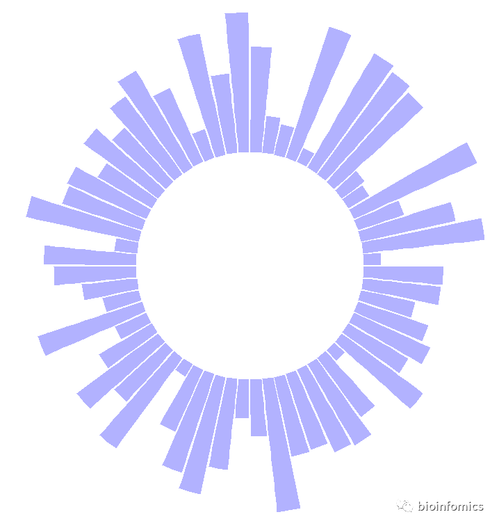
# 绘制基础环状条形图
p <- ggplot(data, aes(x=as.factor(id), y=value)) +
# This add the bars with a blue color
geom_bar(stat="identity", fill=alpha("blue", 0.3)) +
# Limits of the plot = very important. The negative value controls the size of the inner circle, the positive one is useful to add size over each bar
ylim(-80,120) +
# Custom the theme: no axis title and no cartesian grid
theme_minimal() +
theme(
axis.text = element_blank(),
axis.title = element_blank(),
panel.grid = element_blank(),
plot.margin = unit(rep(-2,4), "cm") # This remove unnecessary margin around plot
) +
# This makes the coordinate polar instead of cartesian.
coord_polar(start = 0)
p
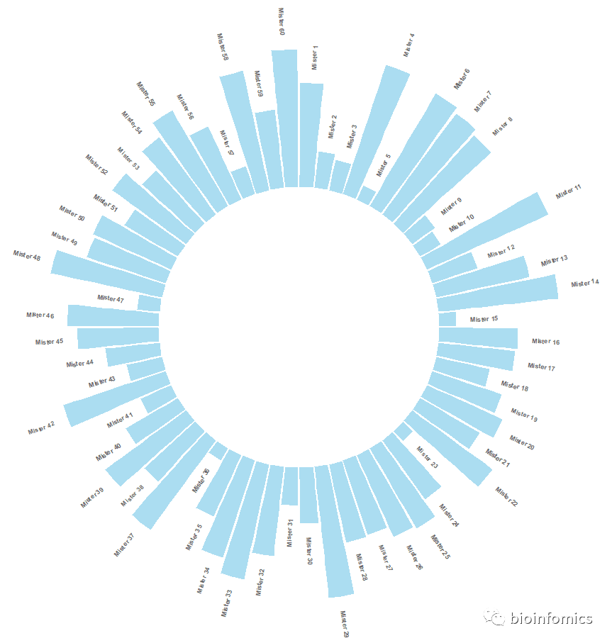
# 添加label标签
# ----- This section prepare a dataframe for labels ---- #
# Get the name and the y position of each label
label_data <- data

# calculate the ANGLE of the labels
number_of_bar <- nrow(label_data)
angle <-  90 - 360 * (label_data$id-0.5) /number_of_bar     # I substract 0.5 because the letter must have the angle of the center of the bars. Not extreme right(1) or extreme left (0)

# calculate the alignment of labels: right or left
# If I am on the left part of the plot, my labels have currently an angle < -90
label_data$hjust<-ifelse( angle < -90, 1, 0)

# flip angle BY to make them readable
label_data$angle<-ifelse(angle < -90, angle+180, angle)
#查看标签数据
head(label_data)
##   id individual value hjust angle
## 1  1   Mister 1    97     0    87
## 2  2   Mister 2    67     0    81
## 3  3   Mister 3    32     0    75
## 4  4   Mister 4    86     0    69
## 5  5   Mister 5    84     0    63
## 6  6   Mister 6    96     0    57
# ----- ------------------------------------------- ---- #

# 绘制带标签的环状条形图
p <- ggplot(data, aes(x=as.factor(id), y=value)) +       # Note that id is a factor. If x is numeric, there is some space between the first bar

  # This add the bars with a blue color
  geom_bar(stat="identity", fill=alpha("skyblue", 0.7)) +

  # Limits of the plot = very important. The negative value controls the size of the inner circle, the positive one is useful to add size over each bar
  ylim(-100,120) +

  # Custom the theme: no axis title and no cartesian grid
  theme_minimal() +
  theme(
    axis.text = element_blank(),
    axis.title = element_blank(),
    panel.grid = element_blank(),
    plot.margin = unit(rep(-1,4), "cm")      # Adjust the margin to make in sort labels are not truncated!
  ) +

  # This makes the coordinate polar instead of cartesian.
  coord_polar(start = 0) +

  # Add the labels, using the label_data dataframe that we have created before
  geom_text(data=label_data, aes(x=id, y=value+10, label=individual, hjust=hjust),
            color="black", fontface="bold",alpha=0.6, size=2.5,
            angle= label_data$angle, inherit.aes = FALSE )

p
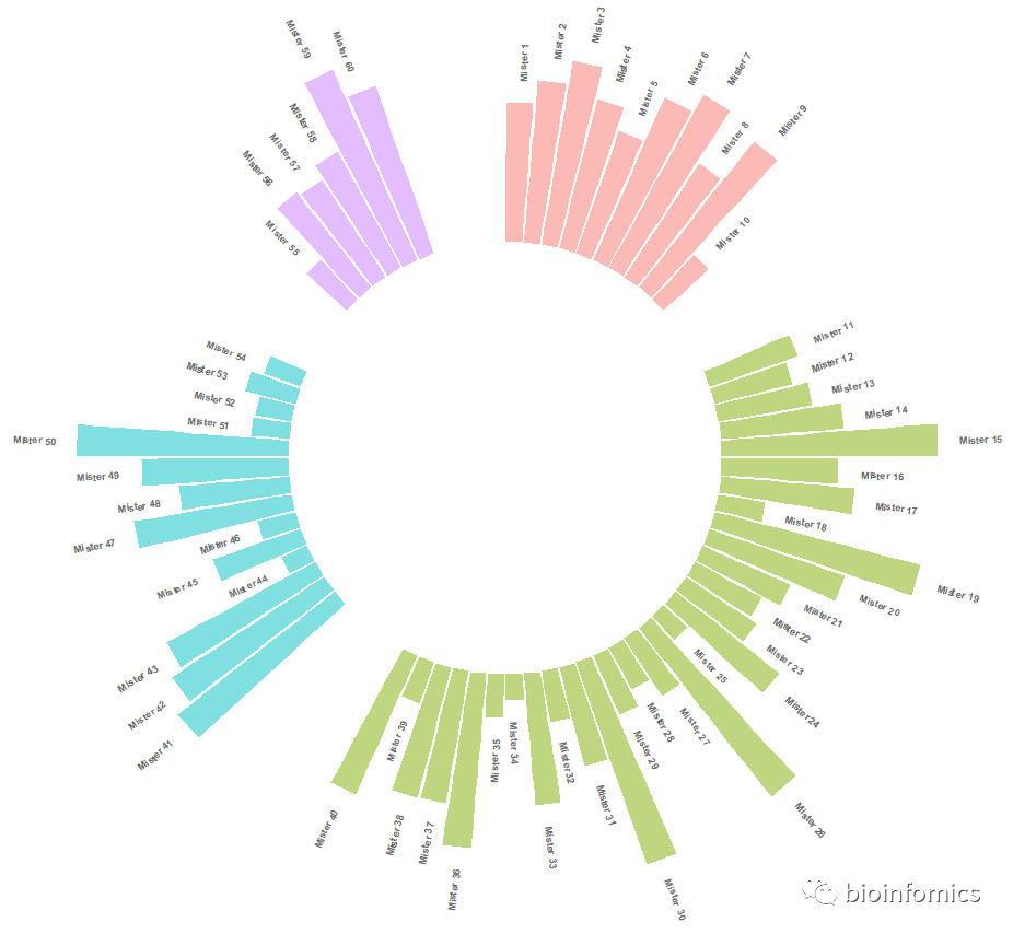
绘制分组环状条形图
# 构建示例数据
data <- data.frame(
  individual=paste( "Mister ", seq(1,60), sep=""),
  group=c( rep('A', 10), rep('B', 30), rep('C', 14), rep('D', 6)) ,
  value=sample( seq(10,100), 60, replace=T)
)
# 查看示例数据
head(data)
##   individual group value
## 1   Mister 1     A    59
## 2   Mister 2     A    31
## 3   Mister 3     A    64
## 4   Mister 4     A    34
## 5   Mister 5     A    23
## 6   Mister 6     A    48

# 设置在每组之间添加间隔
# Set a number of 'empty bar' to add at the end of each group
empty_bar <- 4
to_add <- data.frame( matrix(NA, empty_bar*nlevels(data$group), ncol(data)) )
colnames(to_add) <- colnames(data)
to_add$group <- rep(levels(data$group), each=empty_bar)
data <- rbind(data, to_add)
data <- data %>% arrange(group)
data$id <- seq(1, nrow(data))
head(data)
##   individual group value id
## 1   Mister 1     A    59  1
## 2   Mister 2     A    31  2
## 3   Mister 3     A    64  3
## 4   Mister 4     A    34  4
## 5   Mister 5     A    23  5
## 6   Mister 6     A    48  6

# 设置添加label标签信息
# Get the name and the y position of each label
label_data <- data
number_of_bar <- nrow(label_data)
angle <- 90 - 360 * (label_data$id-0.5) /number_of_bar     # I substract 0.5 because the letter must have the angle of the center of the bars. Not extreme right(1) or extreme left (0)
label_data$hjust <- ifelse( angle < -90, 1, 0)
label_data$angle <- ifelse(angle < -90, angle+180, angle)
head(label_data)
##   individual group value id hjust    angle
## 1   Mister 1     A    59  1     0 87.63158
## 2   Mister 2     A    31  2     0 82.89474
## 3   Mister 3     A    64  3     0 78.15789
## 4   Mister 4     A    34  4     0 73.42105
## 5   Mister 5     A    23  5     0 68.68421
## 6   Mister 6     A    48  6     0 63.94737

# 绘制分组环状条形图
p <- ggplot(data, aes(x=as.factor(id), y=value, fill=group)) +       # Note that id is a factor. If x is numeric, there is some space between the first bar
  geom_bar(stat="identity", alpha=0.5) +
  ylim(-100,120) +
  theme_minimal() +
  theme(
    legend.position = "none",
    axis.text = element_blank(),
    axis.title = element_blank(),
    panel.grid = element_blank(),
    plot.margin = unit(rep(-1,4), "cm")
  ) +
  coord_polar() +
  geom_text(data=label_data, aes(x=id, y=value+10, label=individual, hjust=hjust), color="black", fontface="bold",alpha=0.6, size=2.5, angle= label_data$angle, inherit.aes = FALSE )
p
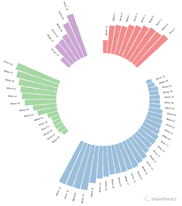
# 对每个组内数据进行排序
# Order data:
data = data %>% arrange(group, value)
data$id <- seq(1, nrow(data))
head(data)
##   individual group value id
## 1   Mister 5     A    23  1
## 2   Mister 8     A    25  2
## 3   Mister 2     A    31  3
## 4   Mister 4     A    34  4
## 5   Mister 6     A    48  5
## 6   Mister 1     A    59  6

# 设置添加label标签信息
# Get the name and the y position of each label
label_data <- data
number_of_bar <- nrow(label_data)
angle <- 90 - 360 * (label_data$id-0.5) /number_of_bar     # I substract 0.5 because the letter must have the angle of the center of the bars. Not extreme right(1) or extreme left (0)
label_data$hjust <- ifelse( angle < -90, 1, 0)
label_data$angle <- ifelse(angle < -90, angle+180, angle)
head(label_data)
##   individual group value id hjust    angle
## 1   Mister 5     A    23  1     0 87.63158
## 2   Mister 8     A    25  2     0 82.89474
## 3   Mister 2     A    31  3     0 78.15789
## 4   Mister 4     A    34  4     0 73.42105
## 5   Mister 6     A    48  5     0 68.68421
## 6   Mister 1     A    59  6     0 63.94737

# 绘制排序分组环状条形图
p <- ggplot(data, aes(x=as.factor(id), y=value, fill=group)) +       # Note that id is a factor. If x is numeric, there is some space between the first bar
  geom_bar(stat="identity", alpha=0.5) +
  ylim(-100,120) +
  theme_minimal() +
  scale_fill_brewer(palette = "Set1") +
  theme(
    legend.position = "none",
    axis.text = element_blank(),
    axis.title = element_blank(),
    panel.grid = element_blank(),
    plot.margin = unit(rep(-1,4), "cm")
  ) +
  coord_polar() +
  geom_text(data=label_data, aes(x=id, y=value+10, label=individual, hjust=hjust), color="black", fontface="bold",alpha=0.6, size=2.5, angle= label_data$angle, inherit.aes = FALSE )
p
# 添加自定义分组信息
# 构建示例数据
data <- data.frame(
individual=paste( "Mister ", seq(1,60), sep=""),
group=c( rep('A', 10), rep('B', 30), rep('C', 14), rep('D', 6)) ,
value=sample( seq(10,100), 60, replace=T)
)
# 查看示例数据
head(data)
## individual group value
## 1 Mister 1 A 98
## 2 Mister 2 A 29
## 3 Mister 3 A 12
## 4 Mister 4 A 10
## 5 Mister 5 A 94
## 6 Mister 6 A 57
# 设置添加分组间隔
# Set a number of 'empty bar' to add at the end of each group
empty_bar <- 2
to_add <- data.frame( matrix(NA, empty_bar*nlevels(data$group), ncol(data)) )
colnames(to_add) <- colnames(data)
to_add$group <- rep(levels(data$group), each=empty_bar)
data <- rbind(data, to_add)
data <- data %>% arrange(group)
data$id <- seq(1, nrow(data))
head(data)
## individual group value id
## 1 Mister 1 A 98 1
## 2 Mister 2 A 29 2
## 3 Mister 3 A 12 3
## 4 Mister 4 A 10 4
## 5 Mister 5 A 94 5
## 6 Mister 6 A 57 6
# 设置添加label标签信息
# Get the name and the y position of each label
label_data <- data
number_of_bar <- nrow(label_data)
angle <- 90 - 360 * (label_data$id-0.5) /number_of_bar # I substract 0.5 because the letter must have the angle of the center of the bars. Not extreme right(1) or extreme left (0)
label_data$hjust <- ifelse( angle < -90, 1, 0)
label_data$angle <- ifelse(angle < -90, angle+180, angle)
head(label_data)
## individual group value id hjust angle
## 1 Mister 1 A 98 1 0 87.35294
## 2 Mister 2 A 29 2 0 82.05882
## 3 Mister 3 A 12 3 0 76.76471
## 4 Mister 4 A 10 4 0 71.47059
## 5 Mister 5 A 94 5 0 66.17647
## 6 Mister 6 A 57 6 0 60.88235
# prepare a data frame for base lines
base_data <- data %>%
group_by(group) %>%
summarize(start=min(id), end=max(id) - empty_bar) %>%
rowwise() %>%
mutate(title=mean(c(start, end)))
head(base_data)
## # A tibble: 4 x 4
## # Rowwise:
## group start end title
## <fct> <int> <dbl> <dbl>
## 1 A 1 10 5.5
## 2 B 13 42 27.5
## 3 C 45 58 51.5
## 4 D 61 66 63.5
# prepare a data frame for grid (scales)
grid_data <- base_data
grid_data$end <- grid_data$end[ c( nrow(grid_data), 1:nrow(grid_data)-1)] + 1
grid_data$start <- grid_data$start - 1
grid_data <- grid_data[-1,]
head(grid_data)
## # A tibble: 3 x 4
## # Rowwise:
## group start end title
## <fct> <dbl> <dbl> <dbl>
## 1 B 12 11 27.5
## 2 C 44 43 51.5
## 3 D 60 59 63.5
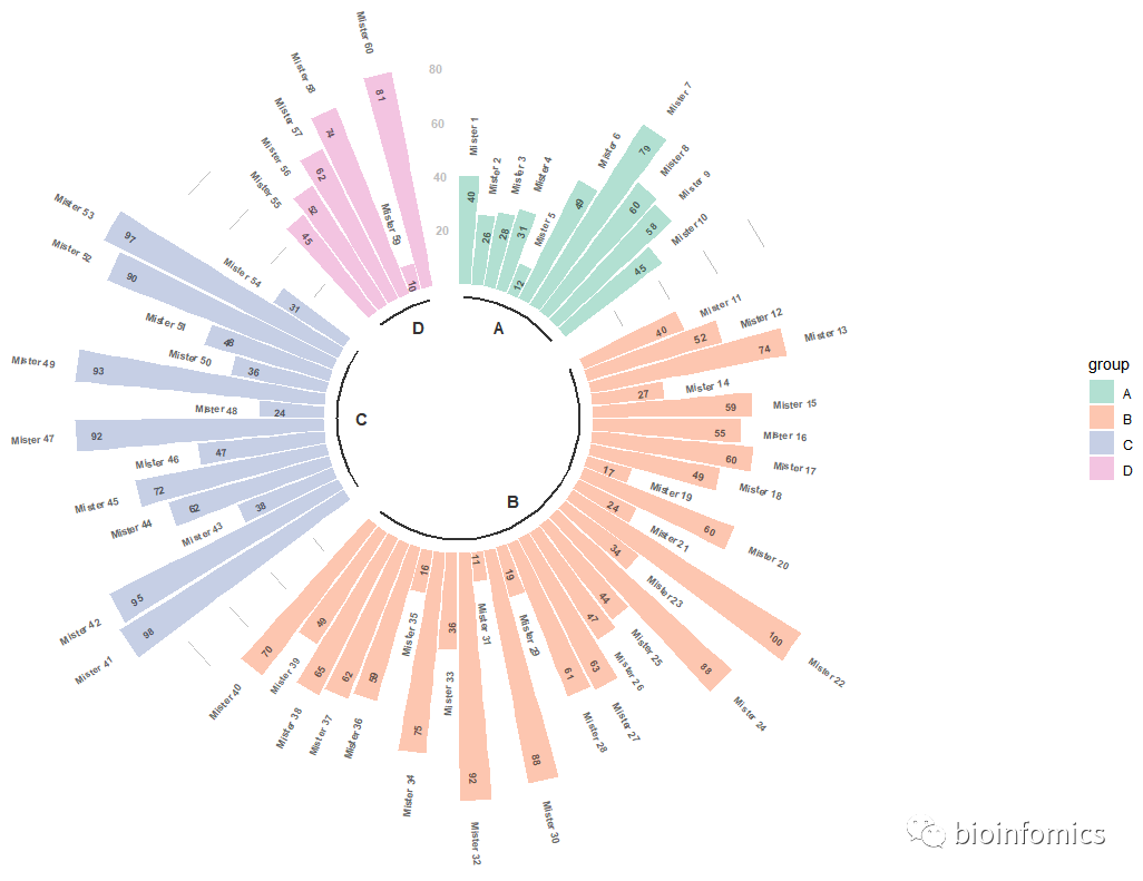
# Make the plot
p <- ggplot(data, aes(x=as.factor(id), y=value, fill=group)) + # Note that id is a factor. If x is numeric, there is some space between the first bar
geom_bar(aes(x=as.factor(id), y=value, fill=group), stat="identity", alpha=0.5) +
ylim(-50,max(na.omit(data$value))+30) +
# Add a val=100/75/50/25 lines. I do it at the beginning to make sur barplots are OVER it.
geom_segment(data=grid_data, aes(x = end, y = 80, xend = start, yend = 80), colour = "grey", alpha=1, size=0.3 , inherit.aes = FALSE ) +
geom_segment(data=grid_data, aes(x = end, y = 60, xend = start, yend = 60), colour = "grey", alpha=1, size=0.3 , inherit.aes = FALSE ) +
geom_segment(data=grid_data, aes(x = end, y = 40, xend = start, yend = 40), colour = "grey", alpha=1, size=0.3 , inherit.aes = FALSE ) +
geom_segment(data=grid_data, aes(x = end, y = 20, xend = start, yend = 20), colour = "grey", alpha=1, size=0.3 , inherit.aes = FALSE ) +
# Add text showing the value of each 100/75/50/25 lines
annotate("text", x = rep(max(data$id),4), y = c(20, 40, 60, 80), label = c("20", "40", "60", "80") , color="grey", size=3 , angle=0, fontface="bold", hjust=1) +
theme_minimal() +
theme(
#legend.position = "none",
axis.text = element_blank(),
axis.title = element_blank(),
panel.grid = element_blank(),
plot.margin = unit(rep(-1,4), "cm")
) +
coord_polar() +
# 添加标签注释信息
geom_text(data=label_data, aes(x=id, y=value+8, label=individual, hjust=hjust), color="black", fontface="bold",alpha=0.6, size=2.5, angle= label_data$angle, inherit.aes = FALSE ) +
geom_text(data=label_data, aes(x=id, y=value-10, label=value, hjust=hjust), color="black", fontface="bold",alpha=0.6, size=2.5, angle= label_data$angle, inherit.aes = FALSE ) +
# Add base line information
# 添加下划线
geom_segment(data=base_data, aes(x = start, y = -5, xend = end, yend = -5), colour = "black", alpha=0.8, size=0.8 , inherit.aes = FALSE ) +
# 添加各组的名字
geom_text(data=base_data, aes(x = title, y = -12, label=group), hjust=c(1,1,0,0), colour = "black", alpha=0.8, size=4, fontface="bold", inherit.aes = FALSE) +
# 更改颜色
scale_fill_brewer(palette = "Set2")
p
绘制堆叠环状条形图
# 构建示例数据
data <- data.frame(
  individual=paste( "Mister ", seq(1,60), sep=""),
  group=c( rep('A', 10), rep('B', 30), rep('C', 14), rep('D', 6)) ,
  value1=sample( seq(10,100), 60, replace=T),
  value2=sample( seq(10,100), 60, replace=T),
  value3=sample( seq(10,100), 60, replace=T)
)
head(data)
##   individual group value1 value2 value3
## 1   Mister 1     A     41     50     25
## 2   Mister 2     A     81     33     92
## 3   Mister 3     A     81     55     50
## 4   Mister 4     A     94     37     98
## 5   Mister 5     A     12     46     63
## 6   Mister 6     A     73     15     92

# 转换数据格式
# Transform data in a tidy format (long format)
data <- data %>% gather(key = "observation", value="value", -c(1,2))
head(data)
##   individual group observation value
## 1   Mister 1     A      value1    41
## 2   Mister 2     A      value1    81
## 3   Mister 3     A      value1    81
## 4   Mister 4     A      value1    94
## 5   Mister 5     A      value1    12
## 6   Mister 6     A      value1    73

# 设置添加分组间隔
# Set a number of 'empty bar' to add at the end of each group
empty_bar <- 2
nObsType <- nlevels(as.factor(data$observation))
to_add <- data.frame( matrix(NA, empty_bar*nlevels(data$group)*nObsType, ncol(data)) )
colnames(to_add) <- colnames(data)
to_add$group <- rep(levels(data$group), each=empty_bar*nObsType )
data <- rbind(data, to_add)
data <- data %>% arrange(group, individual)
data$id <- rep( seq(1, nrow(data)/nObsType) , each=nObsType)
head(data)
##   individual group observation value id
## 1   Mister 1     A      value1    41  1
## 2   Mister 1     A      value2    50  1
## 3   Mister 1     A      value3    25  1
## 4  Mister 10     A      value1    90  2
## 5  Mister 10     A      value2    32  2
## 6  Mister 10     A      value3    39  2

# 设置添加label标签信息
# Get the name and the y position of each label
label_data <- data %>% group_by(id, individual) %>% summarize(tot=sum(value))
number_of_bar <- nrow(label_data)
angle <- 90 - 360 * (label_data$id-0.5) /number_of_bar     # I substract 0.5 because the letter must have the angle of the center of the bars. Not extreme right(1) or extreme left (0)
label_data$hjust <- ifelse( angle < -90, 1, 0)
label_data$angle <- ifelse(angle < -90, angle+180, angle)
head(label_data)
## # A tibble: 6 x 5
## # Groups:   id [6]
##      id individual   tot hjust angle
##   <int> <fct>      <int> <dbl> <dbl>
## 1     1 Mister 1     116     0  87.4
## 2     2 Mister 10    161     0  82.1
## 3     3 Mister 2     206     0  76.8
## 4     4 Mister 3     186     0  71.5
## 5     5 Mister 4     229     0  66.2
## 6     6 Mister 5     121     0  60.9

# prepare a data frame for base lines
base_data <- data %>%
  group_by(group) %>%
  summarize(start=min(id), end=max(id) - empty_bar) %>%
  rowwise() %>%
  mutate(title=mean(c(start, end)))

# prepare a data frame for grid (scales)
grid_data <- base_data
grid_data$end <- grid_data$end[ c( nrow(grid_data), 1:nrow(grid_data)-1)] + 1
grid_data$start <- grid_data$start - 1
grid_data <- grid_data[-1,]

# Make the plot
p <- ggplot(data) +

  # Add the stacked bar
  geom_bar(aes(x=as.factor(id), y=value, fill=observation), stat="identity", alpha=0.5) +
  scale_fill_brewer(palette = "Paired") +

  # Add a val=100/75/50/25 lines. I do it at the beginning to make sur barplots are OVER it.
  geom_segment(data=grid_data, aes(x = end, y = 0, xend = start, yend = 0), colour = "grey", alpha=1, size=0.3 , inherit.aes = FALSE ) +
  geom_segment(data=grid_data, aes(x = end, y = 50, xend = start, yend = 50), colour = "grey", alpha=1, size=0.3 , inherit.aes = FALSE ) +
  geom_segment(data=grid_data, aes(x = end, y = 100, xend = start, yend = 100), colour = "grey", alpha=1, size=0.3 , inherit.aes = FALSE ) +
  geom_segment(data=grid_data, aes(x = end, y = 150, xend = start, yend = 150), colour = "grey", alpha=1, size=0.3 , inherit.aes = FALSE ) +
  geom_segment(data=grid_data, aes(x = end, y = 200, xend = start, yend = 200), colour = "grey", alpha=1, size=0.3 , inherit.aes = FALSE ) +

  # Add text showing the value of each 100/75/50/25 lines
  ggplot2::annotate("text", x = rep(max(data$id),5), y = c(0, 50, 100, 150, 200), label = c("0", "50", "100", "150", "200") , color="grey", size=6 , angle=0, fontface="bold", hjust=1) +

  ylim(-150,max(label_data$tot, na.rm=T)) +
  theme_minimal() +
  theme(
    #legend.position = "none",
    axis.text = element_blank(),
    axis.title = element_blank(),
    panel.grid = element_blank(),
    plot.margin = unit(rep(-1,4), "cm")
  ) +
  coord_polar() +

  # Add labels on top of each bar
  geom_text(data=label_data, aes(x=id, y=tot+10, label=individual, hjust=hjust), color="black", fontface="bold",alpha=0.6, size=5, angle= label_data$angle, inherit.aes = FALSE ) +

  # Add base line information
  geom_segment(data=base_data, aes(x = start, y = -5, xend = end, yend = -5), colour = "black", alpha=0.8, size=0.6 , inherit.aes = FALSE )  +
  geom_text(data=base_data, aes(x = title, y = -18, label=group), hjust=c(1,1,0,0), colour = "black", alpha=0.8, size=4, fontface="bold", inherit.aes = FALSE)
p
sessionInfo()
## R version 3.6.0 (2019-04-26)
## Platform: x86_64-w64-mingw32/x64 (64-bit)
## Running under: Windows 10 x64 (build 18363)
##
## Matrix products: default
##
## locale:
## [1] LC_COLLATE=Chinese (Simplified)_China.936
## [2] LC_CTYPE=Chinese (Simplified)_China.936
## [3] LC_MONETARY=Chinese (Simplified)_China.936
## [4] LC_NUMERIC=C
## [5] LC_TIME=Chinese (Simplified)_China.936
##
## attached base packages:
## [1] stats     graphics  grDevices utils     datasets  methods   base
##
## other attached packages:
## [1] forcats_0.4.0   stringr_1.4.0   dplyr_1.0.2     purrr_0.3.2
## [5] readr_1.3.1     tidyr_1.1.2     tibble_2.1.3    ggplot2_3.3.2
## [9] tidyverse_1.2.1
##
## loaded via a namespace (and not attached):
##  [1] Rcpp_1.0.5         RColorBrewer_1.1-2 cellranger_1.1.0
##  [4] pillar_1.4.2       compiler_3.6.0     tools_3.6.0
##  [7] digest_0.6.20      lubridate_1.7.4    jsonlite_1.6
## [10] evaluate_0.14      lifecycle_0.2.0    nlme_3.1-139
## [13] gtable_0.3.0       lattice_0.20-38    pkgconfig_2.0.2
## [16] rlang_0.4.7        cli_1.1.0          rstudioapi_0.10
## [19] yaml_2.2.0         haven_2.3.1        xfun_0.8
## [22] withr_2.1.2        xml2_1.2.0         httr_1.4.0
## [25] knitr_1.23         generics_0.0.2     vctrs_0.3.2
## [28] hms_0.4.2          grid_3.6.0         tidyselect_1.1.0
## [31] glue_1.4.2         R6_2.4.0           fansi_0.4.0
## [34] readxl_1.3.1       rmarkdown_1.13     modelr_0.1.4
## [37] magrittr_1.5       ellipsis_0.2.0.1   backports_1.1.4
## [40] scales_1.0.0       htmltools_0.3.6    assertthat_0.2.1
## [43] rvest_0.3.4        colorspace_1.4-1   labeling_0.3
## [46] utf8_1.1.4         stringi_1.4.3      munsell_0.5.0
## [49] broom_0.5.2        crayon_1.3.4
参考来源:https://hiplot.com.cn/books-static/r-graph-gallery/circular-barplot.html

END


文章转载自bioinfomics,如果涉嫌侵权,请发送邮件至:contact@modb.pro进行举报,并提供相关证据,一经查实,墨天轮将立刻删除相关内容。
