


前言
Vaddin 是一个Web应用程序框架,用其开发的浏览器应用界面可以达到和桌面应用类似的效果,但和Flash ,Silverlight不同的是,Vaddin应用无需再浏览器上安装任何插件。它是一个纯Java开发环境,开发人员无需深入了解HTML,XML或是Javascipt。如果你曾经使用Java开发过Swing,SWT等应用,可以非常容易开始使用Vaddin开发Web应用。
版本信息
书中演示代码基于以下版本:
框架言 | 版本信息 |
Vaadin | 6.8.1 |
1
Vaadin Web 开发教程
Vaddin 是一个 Web 应用程序框架,用其开发的浏览器应用界面可以达到和桌面应用类似的效果,但和Flash,Silverlight 不同的是,Vaddin 应用无需再浏览器上安装任何插件。它是一个纯 Java 开发环境,开发人员无需深入了解 HTML,XML 或是 Javascipt。如果你曾经使用 Java 开发过 Swing,SWT 等应用,可以非常容易开始使用 Vaddin 开发 Web 应用。
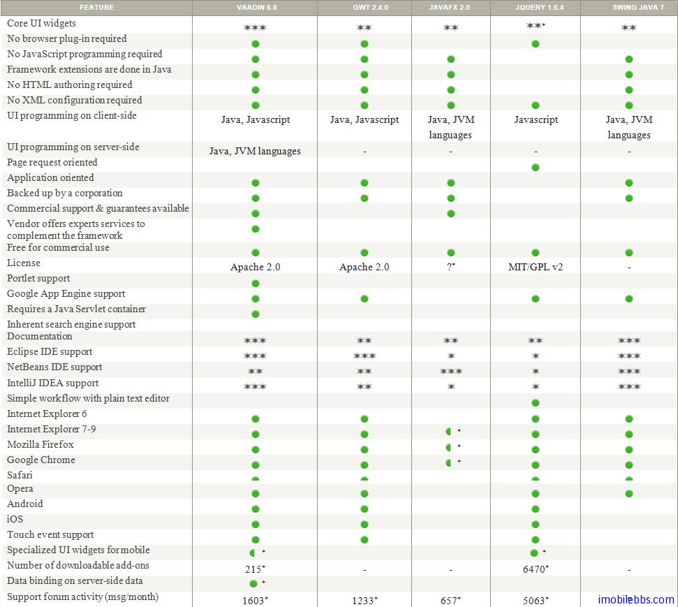
下表为 Vaddin 应用程序框架和其它一些应用程序框架的比较:
Vaddin 应用程序框架具有如下特点:
- Comprehensive Component Framework 提供大量的 UI 控件,支持托放,支持移动设备(触摸事件),数据绑定 MVC,支持代码或 HTML 定义界面。支持自定义控件等。
- Web Compatibility Vaddin UI 控件基于 GWT,因此具有很好的浏览器兼容性,无需安装浏览器插件。支持分页,回退按键,支持 URL 参数等。
- Customizable Look and Feel 很好的 CSS 支持,多种内置 Theme 和 Style,并可以自定义主题和风格。
- Java Web Development 纯 Java 开发环境,强大的服务器端技术开发模式,部署只需单个 Jar 文件,兼容多种 Java 虚拟机。
- Secure Web Application Architecture 服务器端状态管理,应用程序代码运行在服务器端,内置输入校验,安全请求检测等。
- Extensible Component Architecture 支持 GWT 扩展,提供多种插件以满足应用程序开发需求。
- Tools 支持多种开发环境如 Eclipse, Netbean, Maven 并提供 Vaadin TestBench 测试框架。
- Deployment 支持 JSR154 Java EE Sevlet 2.3+ 部署框架。 支持 JSR 168,JSR286 Portlet 部署。支持Google App Engine 部署。
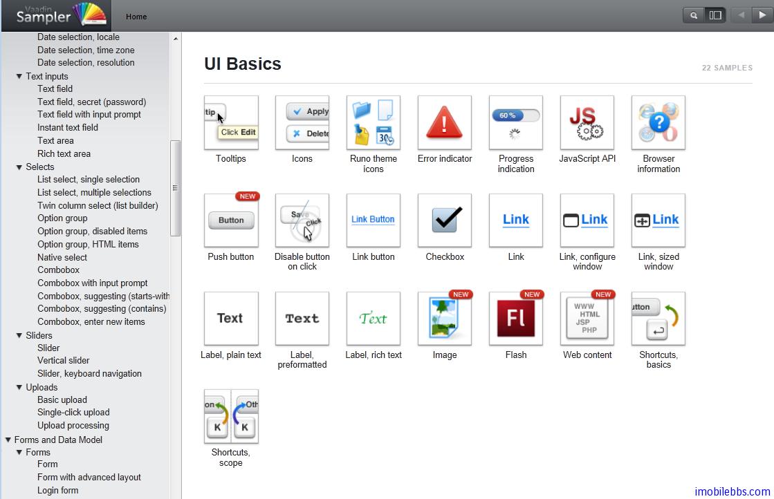
最后看看 Vaadin 提供的 Sampler 的界面。在线演示
部分截图如下:
Vaddin 支持多種開發環境,如 Eclipse,NetBean 等,這裡使用 Eclipse 開發環境,也是最常用的Vaddin 開發環境。 這裡假定你對開發 Java 程序有一定的了解,對 Eclipse 開發也比較熟悉。如果你在做 Android 開發,希望開發一些 Client/Server 的 Android 應用,Vaddin 是一個比較好的選擇,Vaddin 使用純 Java 開發環境,也使用 EclipseIDE,可以用來開發伺服器端應用。
Vaddin 開發環境使用如下工具:
- Windows, Linux, or Mac OS X
- Sun Java 2 Standard Edition 6.0(Java 1.5 or newer is required)
- Eclipse IDE for Java EE Developers
- Apache Tomcat 7.0 (Core) or newer
- Mozilla Firefox browser
- Firebug debug tool (optional)
- Vaadin Framework
- 安裝 Eclipse Java EE 版 http://www.eclipse.org/downloads/packages/eclipse-ide-java-ee-developers/junor
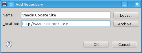
- 安裝 Vaadin 插件
啟動 Eclipse. 選擇菜單 Help → Software Updates…. 選擇 the Available Software tab. 添加 Vaadin 插件 URL http://vaadin.com/eclipse
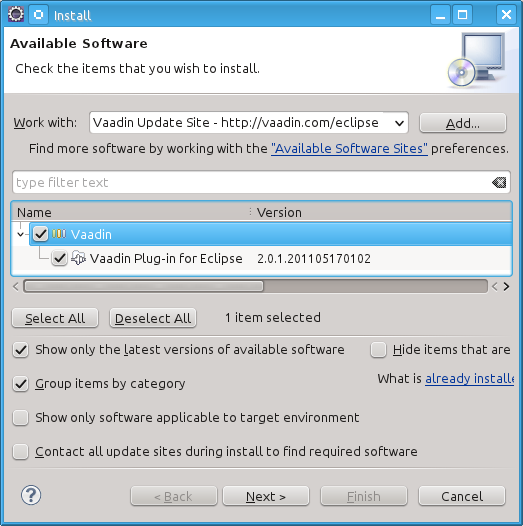
選擇 Vaadin 插件,然後安裝.
下面來創建一個 Hello World 項目,如果你的項目能正確運行,說明你安裝好 Vaadin 開發環境。
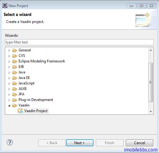
- 創建新 Project -> Vaadin -> Vaadin Project
項目名稱:Helloworld, 其它使用預設值,Vaadin 當前版本為 6.8.1 , 如果你沒有下載,可以選擇Download ,自動下載到本地。
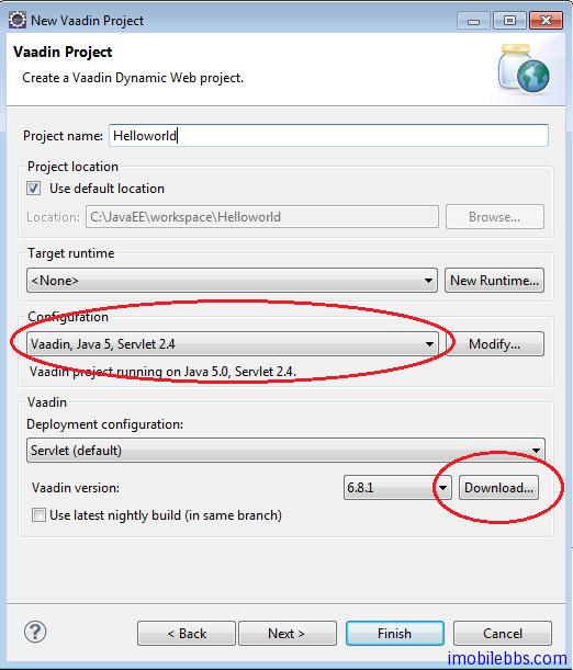
點擊「Finish」,完成新項目的創建。
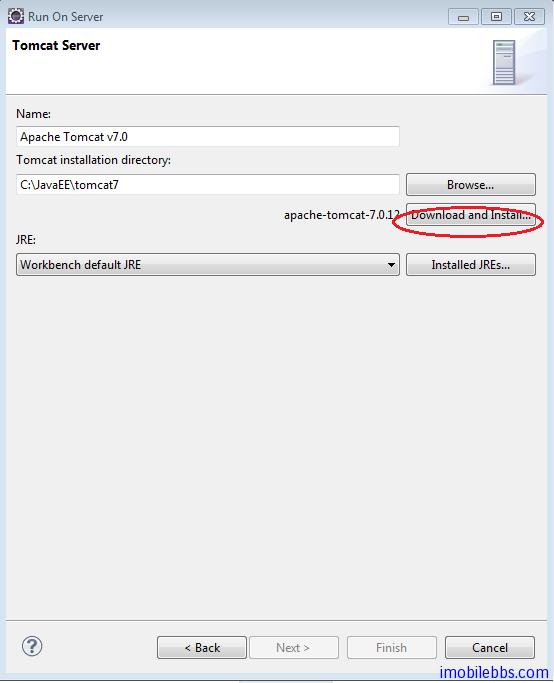
- 運行 這個項目,在項目瀏覽器中選擇 Helloworld, 點擊右鍵,選擇 Run As ->Run on Server,
如果你第一次運行 Vaadin 項目,可能需要創建一個伺服器實例,提供選擇 Manually define a new server ,如果你希望使用 Tomcat 作為伺服器測試環境,可以選擇”Download additional server adapters” 然後選擇下載 Apache Geronimo V3.0 server. 然後選擇你要使用的 Tomcat 版本,最新的版本為 Tomcat 7. 你可以使用”Download and Install” 自動下載 Tomcat 到本地:
- 修改 HelloworldApplication.java 代碼如下:
public class HelloworldApplication extends Application {
@Override
public void init() {
Window mainWindow = new Window(“Helloworld Application”);
Label label = new Label(“Hello world“);
mainWindow.addComponent(label);
setMainWindow(mainWindow);
}
}
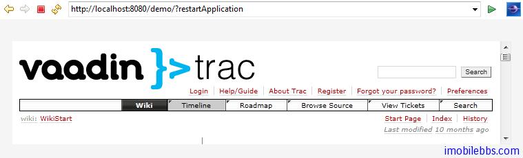
如果你可以得到如下結果,就表示你 Vaadin 環境安裝成功:
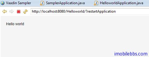
註: 你可能需要在 url 後面加上?restartApplication 通知 Vaddin /Tomcat 使用新編譯的代碼。
後面將逐步詳細介紹 Vaadin 開發。
Vaadin 應用程序框架為一伺服器端技術,允許開發人員採用和開發桌面應用類似的方法開發 Web 應用。儘管 Vaadin 底層採用了 HTML,JavaScript,AJAX 等 Web 技術,Vaadin 應用程序框架很好的隱藏了這些細節,開發人員一般無需了解上述 Web 技術來開發 Vaadin 應用。
下圖為 Vaadin 總體結構圖:
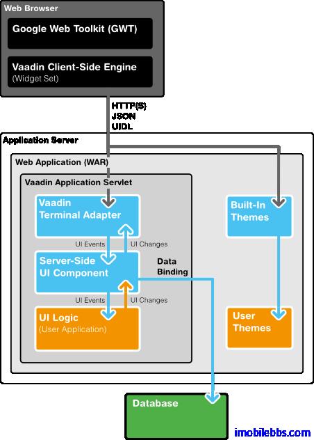
Vaadin 包含了一組 Web 應用開發的 API,大量的 UI 組件,多種內置主題,以及數據綁定允許將數據源直接綁定到 UI 組件。
一個 Vaadin 應用實際為運行在 Java Web 伺服器上的 Serverlet,Vaadin 的 Terminal Adapter 接受來自客戶端瀏覽器發來的請求並解釋用戶事件(Event),Event 由 UI 組件發送給應用,應用通過 Listener 來響應用戶事件。這和桌面應用非常類似。 如果應用程序需要修改 UI 顯示,這是通過 Terminal Adapter 向瀏覽器發迴響應(Response)來實現的。
所以 Vaadin 應用都由 com.vaadin.Application 派生。應用創建用戶界面,響應用戶事件等。
Vaadin 應用程序框架的幾個主要組成部分如下:
用戶界面組件( User Interface Components)
包括界面布局(Layout),UI 控制項(如 Button,Link,Lable 等),和 Swing 提供的 UI 組件類似。Vaadin 的 UI 組件由兩部分組成:Client-Side 和 Server-Side。每個客戶端部分對應一個伺服器部分。他們之間通信通過 Terminal Adapter 來完成。
客戶端引擎(Client-side Engine)
Vaadin 的客戶端引擎使用 GWT(Google Web Toolkit)來渲染顯示 UI 組件,它通過 Terminal Aapater 與伺服器端UI組件部分通信。UI 變化使用 UIDL(User Interface Definition Language)語言來描述。UIDL 基於 JSON 表述。
終端適配器 (Terminal Adapter)
Vaadin 的 UI 組件不直接顯示在網頁上,而是通過終端適配器。有了這個額外的抽象層使得 Vaadin 應用可以運行於大部分的瀏覽器上。最新的 Vaadin 應用使用 GWT 來顯示 UI 控制項。UI 組件向Terminal Adapter 報告界面變化,當用戶觸發某個事件(比如點擊按鈕),這個事件由 Client-Side Engine 以 AJAX 請求的方法報告給伺服器端的 Terminal Adapter。服務端處理事件後再通過Terminal Adapter 以 Response 的方式返回給 Client-Side Engine,從而進一步修改 UI 顯示。
顯示主題(Theme)
Vaadin 將UI 顯示的表述(Presentation)和邏輯(Logic)分開. 其中 UI 邏輯由對應的 Java 代碼處理。而採用主題通過 CSS 來定義 UI 顯示。Vaadin 內置多種顯示主題,開發人員也可自定義主題。
用戶界面定義語言(UIDL)
Terminal Adapter 使用 UIDL 來描述 UI 控制項及其變化。UIDL 本身通過 JSON 來描述。所有的 UI 變化,如 Check 按鈕選擇與否的狀態都是通過 UIDL 來描述的。
事件(Events)
用戶交互觸發事件,如滑鼠按鍵,事件首先由 Client-Side Engine 處理,然後以 HTTP 請求的方式發送多到伺服器,Terminal Adapter, 伺服器端 UI 組件部分等。
數據模型(Data Model)
Vaadin 定義了數據模型,使用這種數據模型,UI 組件可以綁定到數據源,比如變數,數組,資料庫的表。
在前面 Vaadin Web 應用開發教程(2):安裝開發環境 我們創建了一個 Helloworld 項目,現在回過頭詳細說明一個這個簡單 Web 應用。
使用 Eclipse Vaadin 插件創建項目,自動生成的項目目錄如下:
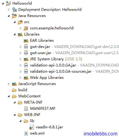
可以看到,Vaadin 庫文件放在目錄 Webcontent/WEB-INF/lib 下,生成的 Web 應用主程序放在 src 目錄下,而部署描述文件 web.xml 則放在 Webcontent/WEB-INF 目錄下。
有 Vaadin 插件創建的初始 Application 類定義如下:
package com.example.helloworld;
import com.vaadin.Application;
import com.vaadin.ui.*;
public class HelloworldApplication extends Application {
@Override
public void init() {
Window mainWindow = new Window("Helloworld Application");
Label label = new Label("Hello Vaadin user");
mainWindow.addComponent(label);
setMainWindow(mainWindow);
}
}
所有的 Vaadin Web 應用都必須派生 com.vaadin.Application 類作為 Web 應用的主入口。而派生類必須實現 init 用於初始化工作(比如定義應用的主界面,設置應用的顯示主題,訪問 Window 對象等)。類 Application 提供的方法和 Java Servlet 提供的 API 非常類似,但這只是個表象,Vaadin 提供的 Application 類是很 Session 類相關的。實際上 Application 對象為一 Session對象,因此上實現 Vaadin 編寫 Web 應用和使用 Java SE Swing 編寫桌面應用非常相像。
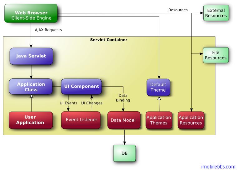
Vaadin 應用中運行是為運行在伺服器端 Servlet 容器中的一個 HTTP Servlet ,下圖為 Vaadin Web 應用程序的總體框架圖:
應用的入口點為 Application 類,一般在 Application 的 init 方法中定義程序的 UI,設置應用的顯示主題,定義事件處理函數。UI 控制項可以通過數據綁定來操作數據的讀寫等。這和編寫一般的桌面應用非常類似。
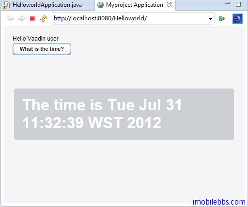
修改一下 Application 的 init 方法,添加一個按鈕,點擊這個按鈕之後,顯示當前時間。代碼如下:
public class HelloworldApplication extends Application {
@Override
public void init() {
final Window mainWindow =
new Window("Myproject Application");
Label label = new Label("Hello Vaadin user");
mainWindow.addComponent(label);
mainWindow.addComponent(
new Button("What is the time?",
new Button.ClickListener() {
public void buttonClick(ClickEvent event) {
mainWindow.showNotification(
"The time is " + new Date());
}
})); setMainWindow(mainWindow);
}
}
為應用定義 UI ,首先創建一個根 View,通常為 Windows 對象,然後創建其它 UI 組件,如 Label,Button,通過 addComponent 添加到 windows 對象中(使用預設的布局方法)。然後使用addListener 為 Button 添加按鍵處理方法。最後使用 setMainWindow(mainWindow) 為應用設置主窗口。這和編寫桌面應用沒什麼不同。開發人員無需了解底層的 HTML, AJAX, JavaScript ,這些都有 Vaadin 庫來管理。
運行結果如下:
編寫測試應用之後,就是如何部署 Web 應用,由 Vaadin 編寫的應用最後打包成單一的 War 文件,可以使用 Tomcat 或其它 Application 應用伺服器直接部署這個 war 文件。
web.xml 為部署描述文件,本例如下:
<?xml version=”1.0″ encoding=”UTF-8″?>
<web-app id=”WebApp_ID” version=”2.4″
xmlns=”http://java.sun.com/xml/ns/j2ee”
xmlns:xsi=”http://www.w3.org/2001/XMLSchema-instance”
xsi:schemaLocation=”http://java.sun.com/xml/ns/j2ee
http://java.sun.com/xml/ns/j2ee/web-app_2_4.xsd“>
<display-name>Helloworld</display-name>
<context-param>
<description>
Vaadin production mode</description>
<param-name>productionMode</param-name>
<param-value>false</param-value>
</context-param>
<servlet>
<servlet-name>Helloworld Application</servlet-name>
<servlet-class>com.vaadin.terminal.gwt.server.ApplicationServlet</servlet-class>
<init-param>
<description>
Vaadin application class to start</description>
<param-name>application</param-name>
<param-value>com.example.helloworld.HelloworldApplication</param-value>
</init-param>
</servlet>
<servlet-mapping>
<servlet-name>Helloworld Application</servlet-name>
<url-pattern>/*</url-pattern>
</servlet-mapping>
<welcome-file-list>
<welcome-file>index.html</welcome-file>
<welcome-file>index.htm</welcome-file>
<welcome-file>index.jsp</welcome-file>
<welcome-file>default.html</welcome-file>
<welcome-file>default.htm</welcome-file>
<welcome-file>default.jsp</welcome-file>
</welcome-file-list>
</web-app>
一般無需修改,後面將有詳細描述。
使用 Apache Tomcat 部署 Vaadin 應用的一般步驟如下:
- 在 Eclipse 中使用 File->Export->Web ->War File 生成 應用的打包文件. war 文件。
- 使用 tomcat 的控制台 ,預設 URL 為 http://[web site]:8080
- 使用 tomcat 部署成功後,就可以使用 http://[web url]:8080/[web app]
來訪問這個 Web應用。比如 http://www.guidebee.net:8080/sampler - 如果你不希望使用:8080 來訪問這個應用,可以通過修改 apache 的配置文件 ,一般目錄為 /etc/apache2/apache2.conf
添加一行類似 ProxyPass /sampler http://www.guidebee.net:8080/sampler
然後你就可以用 http://www.guidebee.net/sampler
來訪問這個 Web 應用了。
上篇博客 Vaadin Web 應用開發教程(4):開始編寫 Web 應用 介紹了一個最簡單的 Vaadin 應用。一般來說,一個 Vaadin 應用由下面幾個部分構成:
- Windows 每個 Web 應用都有一個主窗口。主窗口(Main windows) 為應用程序級窗口,或是指 UI層次的根元素。實際上 Web 應用可以包含多個應用程序級(application level)窗口,這些窗口都和Application 對象關聯。 每個根窗口還可以包含多個子窗口。
- UI 組件 ,每個應用的用戶界面都由這些UI組件組合而成,用戶通過這些 UI 組件和應用程序交互,用戶通過 UI 組件觸發事件,Web 應用通過事件處理函數來響應用戶。大部分的 UI 組件支持數據綁定。這些 UI 組件包括 Label,Button,Checkbox 等,程序員可以通過繼承或組合來定義用戶界面。
- Events 和 Listener Event 為事件,Listener 用來處理事件。
- 資源 應用程序可以在頁面上顯示圖像,超鏈接等,這些為資源文件,Vaadin 支持多種資源種類。
- 顯示主題 Vaadin 將 UI 顯示的表述(Presentation)和邏輯(Logic)分開. 其中 UI 邏輯由對應的 Java 代碼處理。而採用主題通過 CSS 來定義 UI 顯示。Vaadin 內置多種顯示主題,開發人員也可自定義主題。
- 數據綁定 Vaadin 定義了數據模型,使用這種數據模型,UI 組件可以綁定到數據源,比如變數,數組,資料庫的表。### 主窗口
一般來說一個 Vaadin Web 應用只有一個主窗口(Main Windows)。 一般在 Application 對象中通過 setMainWindow() 設置主窗口。
import com.vaadin.ui.*;
public class HelloWorld extends com.vaadin.Application {
public void init() {
Window main = new Window("The Main Window");
setMainWindow(main);
... fill the main window with components ... }}
定義了主窗口之後,可以通過主窗口的 addComponent 為主窗口添加其它 UI 組件。這些 UI 組件將使用主窗口的預設布局來排列 UI 組件,如果你需要使用其它布局方法,可以通過 setContent()定義新的布局。
子窗口
Vaadin 的窗口有兩種類型,一種為應用程序級(Application level)的窗口,如上面的主窗口,另外一種為子窗口,顯示在某個應用程序級的窗口中。
子窗口的創建和關閉,子窗口也是 Window 對象,通過 addWindow 添加到主窗口中,關閉子窗口是通過 Application 對象的 removeWindow() 方法。
//open a window
mywindow = new Window("My Window");
mainwindow.addWindow(mywindow);
...
//close a window
myapplication.removeWindow (mywindow);
子窗口預設可以通過右上方的關閉按鈕關閉,可以通過將子窗口設為 readonly 禁止用戶提供關閉按鈕關閉子窗口。
可以通過 setHeight, setWidth ,setPositionX,setPositionY 來設置窗口的大小和在屏幕的位置。
/* Create a new window. */
mywindow = new Window("My Dialog");
/* Set window size. */
mywindow.setHeight("200px");
mywindow.setWidth("400px");
/* Set window position. */
mywindow.setPositionX(200);
mywindow.setPositionY(50);
如果子窗口的大小為固定或者通過比例定義,當它顯示的內容過大時,會自動出現滾動條。但如果子窗口某方向大小為定義時,則其大小會自動適應需顯示的內容而不會出現滾動條。
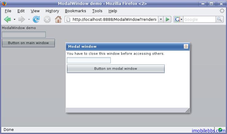
Vaadin 的窗口也支持所謂模式窗口,通常對話框顯示為模式窗口。下圖為一模式窗口,其父窗口為灰色顯示:
事件處理
Vaadin 事件處理也是通過為UI組件添加 Listener 的方法來實現的,使用 Listener 有三種基本用法,下面以一個 Button 為例來說明這幾種基本用法。
這裡定義一個事件處理類來處理 Button 的 Click 事件
public class TheButton implements Button.ClickListener {
Button thebutton;
/** Creates button into given container. */
public TheButton(AbstractComponentContainer container) {
thebutton = new Button ("Do not push this button");
thebutton.addListener(this);
container.addComponent(thebutton);
}
/** Handle button click events from the button. */
public void buttonClick (Button.ClickEvent event) {
thebutton.setCaption ("Do not push this button again");
}
}
一個應用中通常需要處理來自同一個類的多個UI對象觸發的事件,比如多個 Button,此時在 Listener中需要區分事件是由哪個 Button 觸發的。Vaadin 支持多種方法來解決這個問題。一是通過 event 的getButton 方法,如下:
public class TheButtons implements Button.ClickListener {
Button thebutton;
Button secondbutton;
/** Creates two buttons in given container. */
public TheButtons(AbstractComponentContainer container) {
thebutton = new Button ("Do not push this button");
thebutton.addListener(this);
container.addComponent(thebutton);
secondbutton = new Button ("I am a button too");
secondbutton.addListener(this);
container.addComponent (secondbutton);
}
/** Handle button click events from the two buttons. */
public void buttonClick (Button.ClickEvent event) {
if (event.getButton() == thebutton)
thebutton.setCaption("Do not push this button again");
else if (event.getButton() == secondbutton)
secondbutton.setCaption("I am not a number");
}
}
第二種方法是使用 addListener 的另外一個重載方法,這個方法可以將事件處理方法做為參數。如下例,參數類型為字元串,為事件處理函數的名稱。
public class TheButtons2 {
Button thebutton;
Button secondbutton;
/** Creates two buttons in given container. */
public TheButtons2(AbstractComponentContainer container) {
thebutton = new Button ("Do not push this button");
thebutton.addListener(Button.ClickEvent.class, this,
"theButtonClick");
container.addComponent(thebutton);
secondbutton = new Button ("I am a button too");
secondbutton.addListener(Button.ClickEvent.class, this,
"secondButtonClick");
container.addComponent (secondbutton);
}
public void theButtonClick (Button.ClickEvent event) {
thebutton.setCaption ("Do not push this button again");
}
public void secondButtonClick (Button.ClickEvent event) {
secondbutton.setCaption ("I am not a number!");
}
}
第三種方法為匿名函數方法,這也是最簡單的一種方法,無需定義新的類來處理事件。如下:
public class TheButtons3 {
Button thebutton;
Button secondbutton;
/** Creates two buttons in given container. */
public TheButtons3(AbstractComponentContainer container) {
thebutton = new Button ("Do not push this button");
/* Define a listener in an anonymous class. */
thebutton.addListener(new Button.ClickListener() {
/* Handle the click. */
public void buttonClick(ClickEvent event) {
thebutton.setCaption (
"Do not push this button again");
}
});
container.addComponent(thebutton);
secondbutton = new Button ("I am a button too");
secondbutton.addListener(new Button.ClickListener() {
public void buttonClick(ClickEvent event) {
secondbutton.setCaption ("I am not a number!");
}
});
container.addComponent (secondbutton);
}
}
事件通常由系統觸發,但也可以通過方法 fireEvent 來觸發某個事件。
Web 應用使用多種資源,比如圖像或是供下載的文件。Vaadin 中的Embeded UI 通常顯示圖像而Link提供可供下載的文件,其它的 UI 組件,比如 TabSheet 可以使用圖標資源。
Web 伺服器通常無需 Application 對象的幫助就可以處理對靜態資源的請求,對於一些可以動態生成的資源(圖像,或文件等)Application 則需動態創建這些資源。Vaadin 支持多種資源類型的創建,比如動態創建文件。
下圖為 Vaadin 提供的資源管理的介面類:
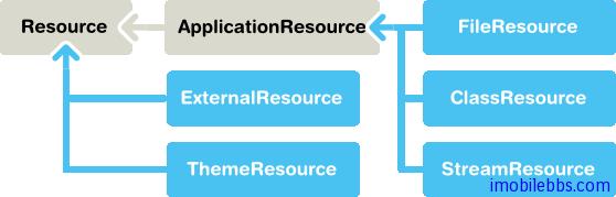
Vaadin 提供兩大類資源介面,一為通用的資源 Resource 介面,另外一個為特定的應用程序資源ApplicationResource.
應用程序資源 ApplicationResource 的管理是通過 Application 對象來完成的。當創建該類資源時,Application 對象做為構造函數的參數傳入。構造函數使用 addResource 向 Application 對象註冊該資源。
Application 對象提供 URI 來管理對資源的訪問。URI 的基本格式為 “APP/”+resourceid+”/”+filename, 其中 resourceid 為自動生成的用於唯一指定資源的 ID 號。
文件資源(File Resources) 文件資源指文件系統的文件,一般可以分為兩種,供顯示的圖像和供下載的文件。 可以使用標準的java.io.File API 來訪問文件。可以使用相對路徑或是絕對路徑來訪問某個文件。
包資源 (Class Loader Resources) 隨打包文件.war 打包的文件中可以包含圖像等資源,此時可以通過 ClassLoader 來訪問這些資源文件。比如下面代碼使用 ClassLoader 來訪問打包文件中的一個圖像資源。
mainwindow.addComponent(new Embedded ("",
new ClassResource("smiley.jpg",
mainwindow.getApplication())));
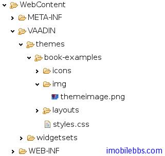
主題資源 (Theme Resources) 由類 ThemeResource 管理的主題資源文件,通常為一些圖像文件。Vaadin 的主題在項目中存放在目錄 VAADIN/themes/themename 下。下面代碼片段用來獲取當前主題的一個圖像資源。
// A theme resource in the current theme ("book-examples")
// Located in: VAADIN/themes/book-examples/img/themeimage.png
ThemeResource resource = new ThemeResource("img/themeimage.png");
// Use the resource
Embedded image = new Embedded("My Theme Image", resource);
對應項目資源目錄如下圖:
關於資源的詳細使用將在後面的文章中介紹。
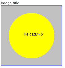
流資源(Stream Resources) 使用流資源允許應用動態創建資源。比如動態創建圖表。可以通過實現StreamResource.StreamSource 介面來定義一個流資源。這個方法返回一個 InputStream。
下面的例子動態創建一個 PNG 圖像。
import java.awt.image.*;
public class MyImageSource
implements StreamResource.StreamSource {
ByteArrayOutputStream imagebuffer = null;
int reloads = 0;
/* We need to implement this method that returns
* the resource as a stream. */
public InputStream getStream () {
/* Create an image and draw something on it. */
BufferedImage image = new BufferedImage (200, 200,
BufferedImage.TYPE_INT_RGB);
Graphics drawable = image.getGraphics();
drawable.setColor(Color.lightGray);
drawable.fillRect(0,0,200,200);
drawable.setColor(Color.yellow);
drawable.fillOval(25,25,150,150);
drawable.setColor(Color.blue);
drawable.drawRect(0,0,199,199);
drawable.setColor(Color.black);
drawable.drawString("Reloads="+reloads, 75, 100);
reloads++;
try {
/* Write the image to a buffer. */
imagebuffer = new ByteArrayOutputStream();
ImageIO.write(image, "png", imagebuffer);
/* Return a stream from the buffer. */
return new ByteArrayInputStream(
imagebuffer.toByteArray());
} catch (IOException e) {
return null;
}
}
}
使用資源的方法可以多種多樣。某些 UI 組件比如 Embeded,Link 可以直接使用資源作為參數。 下面代碼使用 MyImageSource 作為 Embeded 的圖像資源。
// Create an instance of our stream source.
StreamResource.StreamSource imagesource = new MyImageSource ();
// Create a resource that uses the stream source and give it a name.
// The constructor will automatically register the resource in
// the application.
StreamResource imageresource =
new StreamResource(imagesource, "myimage.png", this);
// Create an embedded component that gets its contents
// from the resource.
main.addComponent(new Embedded("Image title", imageresource));
顯示結果如下:
這個資源我們取名為 myimage.png ,Application 對象為其添加一個資源ID使得資源標識唯一。 此時可以通過 http://localhost:8080/testbench/APP/1/myimage.png 來訪問這個圖像。 其中 APP/1/myimage.png 為資源的相對路徑,可以通過方法 Application.getRelativeLocation()來取得資源的相對路徑。
和 Swing 一樣,Vaadin 也提供了大量的 UI 組件(控制項)給程序員用於定義用戶界面。下圖為Vaadin 中 UI 組件的類圖。
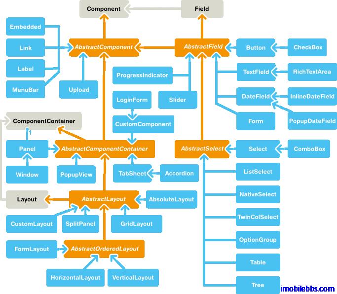
所用 UI 組件都實現 Component 介面,AbstractComponent 為所有 UI 組件的根類,它有兩個直接子類: AbstractField(實現 Field 介面),它提供了對數據綁定的支持。另外一個子類為AbstractComponentContainter,為所有容器類(Container)和布局類(Layout)的父類。對於一些不需要支持數據綁定的類,如 Label,Link 等直接由 AbstractComponent 派生。
布局(Layout)類用於管理其包含的其它 UI 組件的位置及大小。常見的布局有 GridLayout,VerticalLayout 等和 Swing 提供的非常類似。 此外 Vaadin 提供了一個 CustomLayout 組件,支持使用 XHTML 模板來描述用戶界面。
由上圖可以看到 Windows 類引用到 ComponentContainer,ComponentContainer 實現了 Layout介面。因此 Window 對象可以包含UI組件樹來顯示用戶界面。
Vaadin 庫內置了大量 UI 組件,此外很多 UI 組件可以以插件的形式添加到項目中,或者使用自定義的 UI 組件。
Vaadin UI 組件通過定義一些所用 UI 組件都支持的介面和抽象類實現UI組件通用的邏輯。以及這些 UI組件的狀態在 Client/Server 之間如何 serialized/deserialized.
下圖為 Component 的相關介面及抽象類之間的類關係圖:
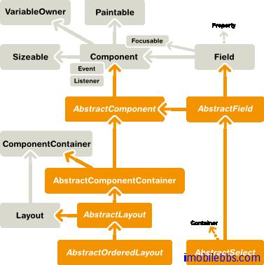
所有 Component 都實現 Paintable 介面,這個介面用來把 UI 組件 serializing (「繪製」)到 客戶端。 而介面 VariableOwner 則為方向 deserializing UI 組件的狀態到伺服器端。
使用 UI 組件定義用戶界面,所涉及到的 UI 組件構成一個樹結構。可以通過 getParent() 取得某個UI 組件的父組件。 將一個 UI 組件添加到某個容器時將觸發 UI 組件的 attach() 方法,反之,移除某個 UI 組件時則觸發 detach() 方法。通常在 UI的 attach() 方法中獲取 UI 組件所需資源,例如:
public class AttachExample extends CustomComponent {
public AttachExample() {
}
@Override
public void attach() {
super.attach(); // Must call.
// Now we know who ultimately owns us.
ClassResource r = new ClassResource("smiley.jpg",
getApplication());
Embedded image = new Embedded("Image:", r);
setCompositionRoot(image);
}
}
AbstractComponent 為所有 Component 的基類,它的 getTag 方法可以取得該 component 用於序列化的唯一標識符。
Field 組件 和某個值關聯,用戶可以修改這個值,比如 Text 組件的文字。下圖為 Field 組件的類關係圖:
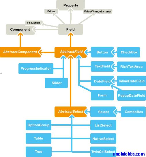
Field 組件實現了 Field 介面以支持數據綁定。 可以使用 getValue, setValue 修改或獲取 Field 組件組件關聯的值。Field 組件具有下面屬性:
- description 所有 Field 組件都有說明域。
- required 當為真時,必填標識(一般為*)會顯示在對於的 UI 組件的左邊,上方(取決於對應的布局類)。如過 Field 組件必需有值而未提供時,此時 requiredError 不空時將顯示錯誤標識。
- requiredError 必填 Field 組件為空顯示個用戶的錯誤提示。
Field 介面繼承 Property.ValueChangeListener 允許應用監控 UI 組件值的變化。
此外所用 Component 具有的屬性還有 Caption(標題),Tooltip(提示),Enabled,Icon,Locale,ReadOnly 等,在後面將有介紹。
從本篇開始介紹 Vaadin 提供的 UI 組件的基本用法,這些 UI 組件包括 Label, Link, TextField, TextArea, PasswordField, RichTextArea, DateField, Button, CheckBox, Select, Table, Tree ,MenuBar, Embeded, Upload, Form, ProgressIndicator, Slider, LoginForm 以及自定義 CustomComponent。 這些 UI 控制項基本上都可以找到 Java Swing 或其它桌面系統對應的 UI 組件,功能上也類似。
在 Vaadin Web 應用中影響 UI 組件外觀的除了使用代碼,還可以通過 Theme 中的 CSS 來定義,這一點和一般的桌面系統稍有不同,不過如果使用 Vaadin 預設的風格,你也可以暫時不要去關心如何使用 CSS。如果你想修改某個 UI 組件的 CSS 風格,可以參考 sampler ,styles.css 定義在某個的Theme 下,如下圖項目結構所示:
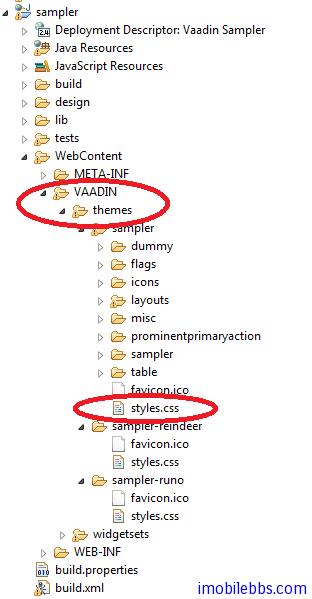
而 Vaadin CSS 的 CSS 選擇標識一般以 v- 為前綴,比如 Label 的 CSS 風格為 v-label ,TextField 使用點劃線邊框 使用 .v-textfield-dashing 等。具體可以參 Vaadin 文檔。
儘管 Vaadin 提供的 UI 組件的用法和一般桌面 UI 的開發非常類似,你可以選擇跳過這些教程,但建議你還是看一遍,了解一下 Vaadin UI 組件這使用方法上可能的不同。
Label 一般用來顯示一些不需要編輯的文本,可以格式化顯示文字,這取決於 Label 的 Content 模式。最好的學習UI組件的方法是通過創建一個項目,寫一些代碼看看每個 UI 組件所能提供的功能和外觀。Label 預設可以通過長文字的自動換行,這就要求 Label 的父容器定義了寬度,對應某些沒有定義預設寬度的 Layout,如 HorizontalLayout 需要多加註意。
Label 的基本用法:
// A container that is 100% wide by default
VerticalLayout layout = new VerticalLayout();
Label label = new Label("Labeling can be dangerous");
layout.addComponent(label);
定義父容器的寬度,顯示長文字時,Label 自動換行:
// A container with a defined width. The default content layout
// of Panel is VerticalLayout, which has 100% default width.
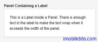
Panel panel = new Panel("Panel Containing a Label");
panel.setWidth("300px");
panel.addComponent(
new Label("This is a Label inside a Panel. There is " +
"enough text in the label to make the text " +
"wrap when it exceeds the width of the panel."));
結果如下所示:
Label 的預設寬度為100%,此時 Label 會自動換行,如果將 Label 的寬度設為 undefined ,Label 不會自動換行,如果過長,一般會被截斷。
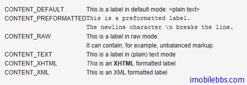
- Content 模式 ,Label 顯示文字的結果還取決於 Label 的 Content 模式,Label 的預設模式為純文字,可以顯示任何字元,包括 XML 標記符 。Label 支持的 Content 模式有如下幾種:
- CONTENT_DEFAULT:預設模式,同 CONTENT_TEXT.
- CONTENT_PREFORMATTED:Label 顯示預定義格式的文本,一般使用固定寬度的打字機字體顯示,可以顯示換行符,製表符等。
- CONTENT_RAW:可以顯示原始的 HTML 字元串。 顯示的字元串沒有必要為合法的 XM。一般用來顯示對格式沒有嚴格要求的原始的 HTML 字元串。
- CONTENT_TEXT: 純文本顯示,可以顯示任何字元,包括<,>,& 等特殊的 XML,HTML實體。這些字元顯示時會自動使用引號進行轉義以正確顯示。
- CONTENT_XHTML: 顯示 XHTML 字元串,
- CONTENT_XML: 所顯示的字元串為規範的 XML 文檔。 下面示例使用上述幾種模式來顯示文字:
GridLayout labelgrid = new GridLayout (2,1);
labelgrid.addComponent (new Label ("CONTENT_DEFAULT"));
labelgrid.addComponent (
new Label ("This is a label in default mode: <plain text>",
Label.CONTENT_DEFAULT));
labelgrid.addComponent (new Label ("CONTENT_PREFORMATTED"));
labelgrid.addComponent (
new Label ("This is a preformatted label.\n"+
"The newline character \\n breaks the line.",
Label.CONTENT_PREFORMATTED));
labelgrid.addComponent (new Label ("CONTENT_RAW"));
labelgrid.addComponent (
new Label ("This is a label in raw mode.<br>It can contain, "+
"for example, unbalanced markup.",
Label.CONTENT_RAW));
labelgrid.addComponent (new Label ("CONTENT_TEXT"));
labelgrid.addComponent (
new Label ("This is a label in (plain) text mode",
Label.CONTENT_TEXT));
labelgrid.addComponent (new Label ("CONTENT_XHTML"));
labelgrid.addComponent (
new Label ("<i>This</i> is an <b>XHTML</b> formatted label",
Label.CONTENT_XHTML));
labelgrid.addComponent (new Label ("CONTENT_XML"));
labelgrid.addComponent (
new Label ("This is an <myelement>XML</myelement> "+
"formatted label",
Label.CONTENT_XML)); main.addComponent(labelgrid);
使用 XHTML 模式,可以在文字中嵌入圖像。如下例:
ClassResource labelimage = new ClassResource ("labelimage.jpg",
this);
main.addComponent(new Label("Here we have an image <img src=\"" +
this.getRelativeLocation(labelimage) +
"\"/> within text.",
Label.CONTENT_XHTML));
顯示如下:

Label 的另外一種用法可以 幫助布局,以空 Label 的形式分隔其它 UI 組件。
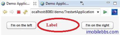
// A wide component bar
HorizontalLayout horizontal = new HorizontalLayout();
horizontal.setWidth("100%");
// Have a component before the gap (a collapsing cell)
Button button1 = new Button("I'm on the left");
horizontal.addComponent(button1);
// An expanding gap spacer
Label expandingGap = new Label();
expandingGap.setWidth("100%");
horizontal.addComponent(expandingGap);
horizontal.setExpandRatio(expandingGap, 1.0f);
// A component after the gap (a collapsing cell)
Button button2 = new Button("I'm on the right");
horizontal.addComponent(button2);
顯示如下:
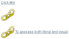
組件 Link 為超鏈接。指向一個外部資源。 Link 實際為一HTML 鏈接。和 Button 不同的是,Link 不會在伺服器端觸發一個事件。你也可以使用 setIcon 為 Link 添加一個圖標:
// Textual link
Link link = new Link("Click Me!",
new ExternalResource("http://vaadin.com/"));
...
// Image link
Link iconic = new Link(null,
new ExternalResource("http://vaadin.com/"));
iconic.setIcon(new ThemeResource("img/nicubunu_Chain.png"));
// Image + caption
Link combo = new Link("To appease both literal and visual",
new ExternalResource("http://vaadin.com/"));
combo.setIcon(new ThemeResource("img/nicubunu_Chain.png"));
上面代碼顯示結果如下:
打開超鏈接時可以支持超鏈接打開的目標模式(Target),可以通過 setTargetName 來指定,比如 _blank 在新窗口中顯示超鏈接。 此外,可以通過 setTargetWidth, setTargetHeight, setTargetBorder 指定顯示窗口的大小和邊框。如下面代碼:
// Open the URL in a popup
link.setTargetName("_blank");
link.setTargetBorder(Link.TARGET_BORDER_NONE);
link.setTargetHeight(300);
link.setTargetWidth(400);
除 Link 組件之外,Vaadin 也可以通過 Button (使用 Reindeer.BUTTON_LINK 風格)來定義一個超鏈接,也可以使用 XHTML 模式使用 Label 來顯示一個超鏈接。
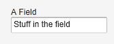
TextField 文本框,可以接受用戶輸入文字。它實現 Field 介面,支持數據綁定。基本用法:
// Create a text field
TextField tf = new TextField("A Field");
// Put some initial content in it
tf.setValue("Stuff in the field");
顯示如下:
支持 Field 介面的 UI 組件,可以通過 Property.ValueChangeListener 來監視 Value 的變化。可以通過方法 getValue()來取代 TextField 的當前值。參考下面代碼片段:
// Handle changes in the value
tf.addListener(new Property.ValueChangeListener() {
public void valueChange(ValueChangeEvent event) {
// Assuming that the value type is a String
String value = (String) tf.getValue();
// Do something with the value
getWindow().showNotification("Value is:", value);
}
});
// Fire value changes immediately when the field loses focus
tf.setImmediate(true);
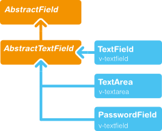
TextField 由 AbstractTextField 派生而來,因此繼承了 AbstractTextField 的大部分 API。下圖為 AbstractTextField 的類關係圖:
數據綁定
實現 Field 介面的 UI 組件支持數據綁定,TextField 可以綁定到支持和 String 互換的數據類型。比如下面代碼將 TextField 綁定到一個 Double 數據變數。
// Have an initial data model. As Double is unmodificable and
// doesn't support assignment from String, the object is
// reconstructed in the wrapper when the value is changed.
Double trouble = 42.0;
// Wrap it in a property data source
final ObjectProperty<Double> property =
new ObjectProperty<Double>(trouble);
// Create a text field bound to it
TextField tf = new TextField("The Answer", property);
tf.setImmediate(true);
// Show that the value is really written back to the
// data source when edited by user.
Label feedback = new Label(property);
feedback.setCaption("The Value");
字元串長度
可以通過 setMaxLenght() 指定文本框可以輸入的字元串長度。為安全起見,TextField 的值傳到伺服器端時會截去超過最大長都的部分。
處理 Null 值
TextField 可以綁定到某些支持 Null 值的數據源,如資料庫的某個欄位。此時,你可能想以某種特殊方式表示 Null 值,可以通過 setNullRepresentation() 設置但當數據源為 Null 時顯示內容。 setNullSettingAllowed 可以控制是否允許用客輸入 null 值,當 setNullSettingAllowed 為假時,輸入的 Null 代表字元串 null,而非 Null 值。
比如:
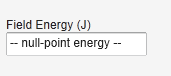
// Create a text field without setting its value
TextField tf = new TextField("Field Energy (J)");
tf.setNullRepresentation("-- null-point energy --");
// The null value is actually the default
tf.setValue(null);
// Allow user to input the null value by
// its representation
tf.setNullSettingAllowed(true);
// Feedback to see the value
Label value = new Label(tf);
value.setCaption("Current Value:");
結果如下:
Text 文本變化事件
除了通用的 Property.ValueChangeListener 之外,TextField 可以使用 TextChangeListner 來監視 Text 內容的變化。immediate 模式實際上並非是立即觸發 Text 內容變化事件,而是發生在TextField 失去 Focus 後。 TextField 文本變化事件觸發的時機有三種模式:TextChangeEventMode.LAZY (預設模式),TextChangeEventMode.TIMEOUT 和 TextChangeEventMode.EAGER 。 TextChangeEventMode.EAGER 表示每次按鍵都會觸發事件,而 TextChangeEventMode.TIMEOUT 表示每隔指定時間段時觸發事件,而 TextChangeEventMode.LAZY 則表示在輸入暫停的某個時刻觸發事件。 對於 Web 應用來說,使用預設模式可以適用大部分情況。
前面 TextField 一般為單行顯示,而 TextArea 為多行顯示。基本用法如下:
/ Create the area
TextArea area = new TextArea("Big Area");
// Put some content in it
area.setValue("A row\n"+
"Another row\n"+
"Yet another row");
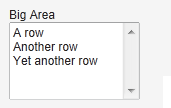
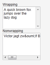
setRows() 定義 TextArea 的行數。 setHeight() 定義其高度,如過顯示的內容超過其行數,則自動出現垂直滾動條。 setWordwrap() 用於控制自動換行。預設為 true。如果為假,如果顯示文字過寬,則出現水平滾動條。
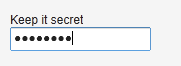
PasswordField 為 TextField 的一個變種,主要用來獲取用戶密碼。
PasswordField tf = new PasswordField("Keep it secret");
RichTextArea 允許輸入帶格式的文本。 RichTextArea 內容以 HTML 格式顯示。它繼承自TextArea,本身沒有提供什麼附加功能,你可以通過擴展 VRichTextArea, VRichTextToolbar 的方法來為 RichTextArea 添加客戶端功能。
// Create a rich text area
final RichTextArea rtarea = new RichTextArea();
rtarea.setCaption("My Rich Text Area");
// Set initial content as HTML
rtarea.setValue("<h1>Hello</h1>\n" +
"<p>This rich text area contains some text.</p>");
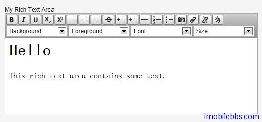
可以看到 RichTextArea 控制項本身帶有一個工具條,其中的選擇框使用英語而不支持本地化,但你可以通過派生或重新定義 VRichTextToolbar 來實現本地化。 而工具條上按鈕可以通過 CSS 重新定義來實現本地化。 例如:
.v-richtextarea-richtextexample .gwt-ToggleButton
.gwt-Image {
background-image: url(img/richtextarea-toolbar-fi.png)
!important;
}
下圖為英語和本地化的 RichTextArea 工具條上按鈕。
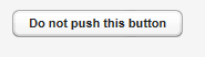
Button 按鈕,在前面 Vaadin Web 應用開發教程(5):Vaadin Web 應用的基本組成部分中介紹事件處理時已經對 Button 的用法做了說明。當用戶點擊按鈕時會觸發 Button.ClickEvent ,可以使用 Button.ClickListener 來偵聽這個事件。
public class TheButton extends CustomComponent
implements Button.ClickListener {
Button thebutton;
public TheButton() {
// Create a Button with the given caption.
thebutton = new Button ("Do not push this button");
// Listen for ClickEvents.
thebutton.addListener(this);
setCompositionRoot(thebutton);
}
/** Handle click events for the button. */
public void buttonClick (Button.ClickEvent event) {
thebutton.setCaption ("Do not push this button again");
}}
為多個按鈕使用同一個 Listener 時,可以通過 Event 的 getButton() 方法來區分不同的按鈕。
Checkbox 的狀態可以為 checked 和 unchecked. 其值可以通過 getValue, setValue 來操作。基本用法如下:
// A check box with default state (not checked, false).
final CheckBox checkbox1 = new CheckBox("My CheckBox");
main.addComponent(checkbox1);
// Another check box with explicitly set checked state.
final CheckBox checkbox2 = new CheckBox("Checked CheckBox");
checkbox2.setValue(true);
main.addComponent(checkbox2);
``` // Make some application logic. We use anonymous listener // classes here. The above references were defined as final // to allow accessing them from inside anonymous classes. checkbox1.addListener(new ValueChangeListener() { public void valueChange(ValueChangeEvent event) { // Copy the value to the other checkbox. checkbox2.setValue(checkbox1.getValue()); } }); checkbox2.addListener(new ValueChangeListener() { public void valueChange(ValueChangeEvent event) { // Copy the value to the other checkbox. checkbox1.setValue(checkbox2.getValue()); } }); checkbox1.setImmediate(true); checkbox2.setImmediate(true);
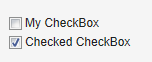
Checkbox 除了單獨使用之外,還可以應用到 OptionGroup 和 Tabel 中,具體參見後續文章。
Tags:
Java EE
,
Vaadin
,
Web
UI组件-Select 组件
Vaadin 中提供了多种组件允许用户从多个选项中选择某个或多个选项。比如列表,下拉框,一组RadioButton 或 CheckBox,表格或 Tree 等。
下面为由 Vaddin 提供的核心选项组件,都是从基类 AbstractSelect 派生而来。
- Select 在单选模式时,提供一个文本框和一个下拉框,用户可以通过输入文字来筛选选项。在多选模式下等同 ListSelect。
- ComboBox 当选时为一下拉框选择。否则等同 Select,但可以允许用户输入新的选项。
- ListSelect 垂直下拉框选项支持单选和多选。
- NativeSelect 使用由浏览器提供的选择框,通常为一下拉框控件,支持单选和多选。实际为为 HTML 中的 select 元素。
- OptionGroup 单选时使用 RadioButton, 多选时使用 CheckButton 的垂直选项组。
- TwinColSelect 并列显示两个列表,用户可以选取其中一个列表中可选项,移动到另外一个列表中。
除此之外,Vaddin 也提供 Tree 和 Table 组件用于选择,它们也都是由 AbstractSelect 继承而来,将在后续文章中单独介绍。
绑定数据
Vaadin 的选项组件与 Vaadin 的数据模型关系密切。选项组件中每个可选项都实现 Item 接口,并包含在 Container 对象中,当前选中项绑定到一个 Property 接口对象。
Vaadin 的数据绑定模型 Item, Container, Property 就在后面详细介绍,对于 Select 组件来说,它们都和一个缺省的 Container 类型绑定,而无需自己重新定义实现一个 Container。
Container 接口中的 addItem() 用来添加一个选择项:
// Create a selection component Select select = new Select ("Select something here");
// Add some items and give each an item ID select.addItem("Mercury"); select.addItem("Venus"); select.addItem("Earth");
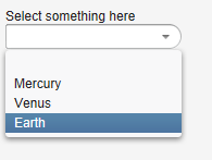
addItem() 创建一个新的 Item 对象,这个 Item 对象由唯一的 Item 表示符(IID)指定,通常这个IID 也是这个选择项的标题,为一字符串类型。
但 IID 实际可以为任何对象类型。我们可以为某个 Item 指定整数型 IID,再使用 setItemCaption为这个 Item 指定标题显示。
使用不带参数的 addItem() 返回自动生成的 IID。
// Create a selection component Select select = new Select("My Select");
// Add an item with a generated ID Object itemId = select.addItem(); select.setItemCaption(itemId, "The Sun");
// Select the item select.setValue(itemId);
对于其它类型的 Container,比如 BeanItemContainer 可以使用该 Container 自己的方法如addBean 添加一个选择项。
选项的标题的显示有多种模式,可以使用 setItemCaption 明确指定,也可以使用 IID 做为标题或者图标等,
标题的模式通过方法 setItemCaptionMode 来指定。可以有
ITEM_CAPTION_MODE_EXPLICIT_DEFAULTS_ID
ITEM_CAPTION_MODE_EXPLICIT
ITEM_CAPTION_MODE_ICON_ONLY
ITEM_CAPTION_MODE_ID
ITEM_CAPTION_MODE_INDEX
ITEM_CAPTION_MODE_ITEM
ITEM_CAPTION_MODE_PROPERTY
这里就不一一说明。 举例如下:
前面提过 Select 组件的当前选中的项和一个 Property 对象绑定,可以使用 Property 的getValue 来获取当前选项的值。同样可以使用 setValue 来指定当前选取项。
下面逐个介绍下每个 Select 组件的用法:
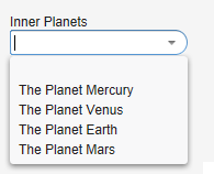
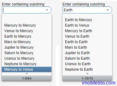
Select 组件 支持选择筛选,用户可以通过输入的文字作为筛选的条件,Select 列表筛选出符合条件的列表项帮助用户快速选择。 它支持两种筛选模式,一为 FILTERINGMODE_CONTAINS 选择所有包含输入文字的列表项,另一为 FILTERINGMODE_STARTSWITH 匹配所有有输入文字开头的列表项。如下列:
Select select = new Select("Enter containing substring");
select.setFilteringMode(AbstractSelect.Filtering.FILTERINGMODE_CONTAINS);
/* Fill the component with some items. */ final String[] planets = new String[] { "Mercury", "Venus", "Earth", "Mars", "Jupiter", "Saturn", "Uranus", "Neptune" };
for (int i = 0; i < planets.length; i++) for (int j = 0; j < planets.length; j++) { select.addItem(planets[j] + " to " + planets[i]); }
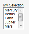
ListSelect 组件 为一垂直下拉框,当列表项过多时自动显示垂直滚动条。setMultiSelect 用来设置单选或多选.
// Create the selection component ListSelect select = new ListSelect("My Selection");
// Add some items select.addItem("Mercury"); select.addItem("Venus"); select.addItem("Earth"); ...
select.setNullSelectionAllowed(false);
// Show 5 items and a scrollbar if there are more select.setRows(5);
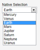
NativeSelect 使用浏览器支持的 HTML select 元素显示列表:
// Create the selection component final NativeSelect select = new NativeSelect("Native Selection");
// Add some items select.addItem("Mercury"); select.addItem("Venus"); select.addItem("Earth"); select.addItem("Mars"); select.addItem("Jupiter"); select.addItem("Saturn"); select.addItem("Neptune"); select.addItem("Uranus");
// Set the width in "columns" as in TextField select.setColumns(10);
select.setNullSelectionAllowed(false);
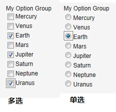
OptionGroup 支持 RadioButton 和 CheckButton 用于单选和多选。
OptionGroup group = new OptionGroup("My Option Group");
// Add some items group.addItem("Mercury"); group.addItem("Venus"); group.addItem("Earth"); group.addItem("Mars"); group.addItem("Jupiter"); group.addItem("Saturn"); group.addItem("Neptune"); group.addItem("Uranus");
// Use the multiple selection mode. group.setMultiSelect(true);
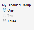
可以使用 setItemEnabled()来 Enable 或 Disable 列表中的某个选项。
// Have an option group OptionGroup group = new OptionGroup("My Disabled Group"); group.addItem("One"); group.addItem("Two"); group.addItem("Three");
// Disable one item group.setItemEnabled("Two", false);
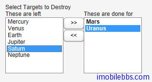
TwinColSelect 组件并列显示两个列表,总是多选模式,因此它当前选项对应的 Property 对象一定是个集合对象(Collection).
final TwinColSelect select = new TwinColSelect("Select Targets to Destroy");
// Set the column captions (optional) select.setLeftColumnCaption("These are left"); select.setRightColumnCaption("These are done for");
// Put some data in the select String planets[] = {"Mercury", "Venus", "Earth", "Mars", "Jupiter", "Saturn", "Uranus", "Neptune"}; for (int pl=0; pl<planets.length; pl++) select.addItem(planets1);
// Set the number of visible items select.setRows(planets.length);
UI 组件-Table 组件
Table 用来显示一个二维表,Table 算是 Vaadin 提供的功能最强大的组件,每个单元格既可以显示字符串也可以显示其它的 UI 组件。你可以实现可编辑的表格,比如点击某个单元格后将其变为可编辑的文本框。
Table 关联的数据采用 Vaadin 的 Container 数据模型。从而使得 Table 可以直接绑定数据库的表或查询。Table 只载入当前需要显示的数据,当数据载入时,Table 会给出提示正在显示的数据表的范围和全部记录的数目。
Table 中每行数据对应 Vaadin 数据模型的 Item 接口 ,每个字段对应到 Property 接口,每行数据由 Item 标识符(IID)唯一指定,而字段由 Property 标识符(PID)指定。
创建一个 Table,首先使用 addContainerProperty 定义表的字段。这个方法有两种调用方式。简单方式是使用 Property ID 做为字段的标题。而复杂方式可以分别制定 Property ID 和字段的标题,这种方式使得应用本地化成为可能。
复杂方式也支持使用图标资源显示字段标题。在定义表的字段时,可以提供一个“缺省值”用在该字段没有赋值的情况下。Table 基本用法如下:
// Create the table with a caption. Table table = new Table("This is my Table");
// Define the names and data types of columns. // The "default value" parameter is meaningless here. table.addContainerProperty("First Name", String.class, null); table.addContainerProperty("Last Name", String.class, null); table.addContainerProperty("Year", Integer.class, null);
// Add a few items in the table. table.addItem(new Object[] { "Nicolaus","Copernicus",new Integer(1473)}, new Integer(1)); table.addItem(new Object[] { "Tycho", "Brahe", new Integer(1546)}, new Integer(2)); table.addItem(new Object[] { "Giordano","Bruno", new Integer(1548)}, new Integer(3)); table.addItem(new Object[] { "Galileo", "Galilei", new Integer(1564)}, new Integer(4)); table.addItem(new Object[] { "Johannes","Kepler", new Integer(1571)}, new Integer(5)); table.addItem(new Object[] { "Isaac", "Newton", new Integer(1643)}, new Integer(6));
在这个例子中,使用了整数值作为 Item 的 IID,作为第二个参数传给 addItem, 每行实际的数据为一个 Object 数组,采用和表字段定义同样的顺序,并且必须采用和由 addContainerProperty 定义的同样的数据类型。
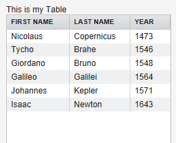
Table 支持的数据规模取决于 Container 的实现,缺省的 Container 在更新数据时可能会由于数据规模过大而造成问题。因此推荐使用优化过的 Container 类型。Table 本身不限制记录的数目,但当前滚动实现有一个50万条记录的限制。
选择 Table 中的项 ,Table 允许用户选择表格中的某个或多个数据项,当用户选取某个 Item 时,Item 的 IID 会作为 ValueChangeEvent 的 Property 传入。要使 Table 支持选取,必须通过方法 setSelectable 将 Table 设为支持选取。同时需将 setImmediate 设为 True。
例如:
// Allow selecting items from the table. table.setSelectable(true);
// Send changes in selection immediately to server. table.setImmediate(true);
// Shows feedback from selection. final Label current = new Label("Selected: -");
// Handle selection change. table.addListener(new Property.ValueChangeListener() { public void valueChange(ValueChangeEvent event) { current.setValue("Selected: " + table.getValue()); } });
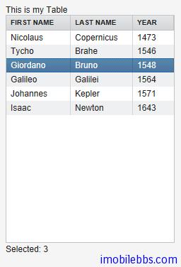
通常用户再次点击已选取的数据行时会取消该行的选取,如果你想修改这种行为,可以将setNullSelectionAllowed 设为 False.
如果需要 Table 支持多行选取,可以将 setMultiSelect 设为 True, 此时可以通过按下 Ctrl/Shift 来实现多选。
Table 缺省支持滚动条,当所显示记录数大于 Table 可见行数时在 Table 右边显示滚动条。可以通过setPageLength 修改 Table 可以区域。将 PageLength 设为0,取消分页,显示所有记录数。
表个字段宽度可以通过 setColumnWidth 来修改,用户也可以通过拖动字段边界更改字段宽度,并会触发 ColumnResizeEvent 事件。
如果设置 setColumnReorderingAllowed(true) ,则允许用户重新排列字段的顺序。
setColumnCollapsingAllowed (true) 允许用户展开或隐藏某些字段。
以上 Table 单元格中都显示的是简单的字符串,Table 单元格也可以显示 UI 组件。此时如果 Table缺省风格的行高不够的话,你需要使用自定义的风格定义合适的行高。
如果需要响应 Table 单元格中某个 UI 组件的事件,需要知道其对应的 Item 标识 IID。简单的方法是使用 setData 方法将某个对象附加到该 UI 组件上。
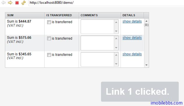
如下例使用了 Label,TextField, CheckBox, Button 作为 Table 单元格元素显示。
// Create a table and add a style to allow setting the row height in theme. final Table table = new Table(); table.addStyleName("components-inside");
//Define the names and data types of columns. // The "default value" parameter is meaningless here. table.addContainerProperty("Sum", Label.class, null); table.addContainerProperty("Is Transferred", CheckBox.class, null); table.addContainerProperty("Comments", TextField.class, null); table.addContainerProperty("Details", Button.class, null);
// Add a few items in the table. for (int i=0; i<100; i++) { // Create the fields for the current table row Label sumField = new Label(String.format( "Sum is $%04.2f
(VAT incl.)", new Object[] {new Double(Math.random()*1000)}), Label.CONTENT_XHTML); CheckBox transferredField = new CheckBox("is transferred");
// Multiline text field. This required modifying the
// height of the table row.
TextField commentsField = new TextField();
commentsField.setRows(3);
// The Table item identifier for the row.
Integer itemId = new Integer(i);
// Create a button and handle its click. A Button does not
// know the item it is contained in, so we have to store the
// item ID as user-defined data.
Button detailsField = new Button("show details");
detailsField.setData(itemId);
detailsField.addListener(new Button.ClickListener() {
public void buttonClick(ClickEvent event) {
// Get the item identifier from the user-defined data.
Integer itemId = (Integer)event.getButton().getData();
getWindow().showNotification("Link "+
itemId.intValue()+" clicked.");
}
});
detailsField.addStyleName("link");
// Create the table row.
table.addItem(new Object[] {sumField, transferredField,
commentsField, detailsField},
itemId);
}
// Show just three rows because they are so high. table.setPageLength(3);
通常情况下 Table 以文本形式显示单元格,如果想让 Table 支持编辑功能,一是使用上面 UI 组件的方式,或者简单的调用 setEditable(true)自动将表格变为可编辑。
setColumnHeader 为表格定义表头,setColumnFooter 定义表尾。Table 的表头和表尾也接受点击事件。
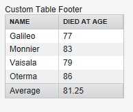
下例显示了一个自定义的表尾显示平均值。
// Have a table with a numeric column Table table = new Table("Custom Table Footer"); table.addContainerProperty("Name", String.class, null); table.addContainerProperty("Died At Age", Integer.class, null);
// Insert some data Object people[][] = {{"Galileo", 77}, {"Monnier", 83}, {"Vaisala", 79}, {"Oterma", 86}}; for (int i=0; i<people.length; i++) table.addItem(people[i], new Integer(i));
// Calculate the average of the numeric column double avgAge = 0; for (int i=0; i<people.length; i++) avgAge += (Integer) people[i][1]; avgAge /= people.length;
// Set the footers table.setFooterVisible(true); table.setColumnFooter("Name", "Average"); table.setColumnFooter("Died At Age", String.valueOf(avgAge));
// Adjust the table height a bit table.setPageLength(table.size());
以上介绍了 Table 的基本用法,表格的用法远不止这些,比如可以通过 ColumnGenerator 通过计算从其它字段生成某个字段或者希望格式化字段等等这里就不在一一介绍,具体可以参考 Vaadin 开发文档。
Tags:
Java EE
,
Vaadin
,
Web
UI 组件-Tree 组件
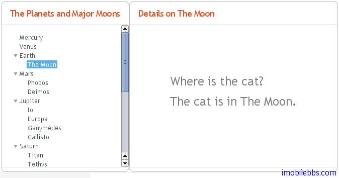
Tree 组件可以用来显示具有层次关系的数据源,比如文件系统。Tree 组件的一个典型应用是作为菜单显示。
final Object[][] planets = new Object[][]{ new Object[]{"Mercury"}, new Object[]{"Venus"}, new Object[]{"Earth", "The Moon"}, new Object[]{"Mars", "Phobos", "Deimos"}, new Object[]{"Jupiter", "Io", "Europa", "Ganymedes", "Callisto"}, new Object[]{"Saturn", "Titan", "Tethys", "Dione", "Rhea", "Iapetus"}, new Object[]{"Uranus", "Miranda", "Ariel", "Umbriel", "Titania", "Oberon"}, new Object[]{"Neptune", "Triton", "Proteus", "Nereid", "Larissa"}};
Tree tree = new Tree("The Planets and Major Moons");
// Add planets as root items in the tree. for (int i=0; i String planet = (String) (planets[i][0]); tree.addItem(planet);
if (planets[i].length == 1) {
// The planet has no moons so make it a leaf.
tree.setChildrenAllowed(planet, false);
} else {
// Add children (moons) under the planets.
for (int j=1; j String moon = (String) planets[i][j];
// Add the item as a regular item.
tree.addItem(moon);
// Set it to be a child.
tree.setParent(moon, planet);
// Make the moons look like leaves.
tree.setChildrenAllowed(moon, false);
}
// Expand the subtree.
tree.expandItemsRecursively(planet);
}
}
main.addComponent(tree);
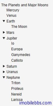
当然你可以选择合适的 Menu 风格使得 Tree 看起来更像菜单,比如:
注:到这里你可能注意到到目前为止在介绍 UI 组件时文章都避免涉及 CSS,Theme 应用,这是为的使Vaadin 应用开发更像开发桌面应用,后面会集中介绍主题的使用,对于一般应用你可以使用缺省主题。
同 Field 组件一样,你可以使用 getValue,setValue 设置或取得 Tree 组件当前选中的 Item 项。Tree 组件对应的 Container 类型为 HierarchicalContainer.
Tags:
Java EE
,
Vaadin
,
Web
MenuBar 组件
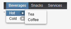
MenuBar 用来创建下拉菜单,类似桌面应用的菜单显示。
使用 MenuBar 首先创建 MenuBar 的实例:
// Create a menu bar final MenuBar menubar = new MenuBar(); main.addComponent(menubar);
然后通过 addItem 为最上一级菜单添加菜单项,addItem 参数为 String,一个图标资源,一个Command 对象(用户点击菜单项后所执行命令)。 icon 和 command 可以为空。
Command 对象为实现了 MenuBar.Command 接口的对象,如:
// A feedback component final Label selection = new Label("-"); main.addComponent(selection);
// Define a common menu command for all the menu items. MenuBar.Command mycommand = new MenuBar.Command() { public void menuSelected(MenuItem selectedItem) { selection.setValue("Ordered a " + selectedItem.getText() + " from menu."); }
};
addItem() 方法返回一个 MenuBar.MenuItem 对象,利用这个返回值,你可以参加子菜单。MenuItem 也有同样的 addItem 方法。
// Put some items in the menu hierarchically MenuBar.MenuItem beverages = menubar.addItem("Beverages", null, null); MenuBar.MenuItem hot_beverages = beverages.addItem("Hot", null, null); hot_beverages.addItem("Tea", null, mycommand); hot_beverages.addItem("Coffee", null, mycommand); MenuBar.MenuItem cold_beverages = beverages.addItem("Cold", null, null); cold_beverages.addItem("Milk", null, mycommand);
// Another top-level item MenuBar.MenuItem snacks = menubar.addItem("Snacks", null, null); snacks.addItem("Weisswurst", null, mycommand); snacks.addItem("Salami", null, mycommand);
// Yet another top-level item MenuBar.MenuItem services = menubar.addItem("Services", null, null); services.addItem("Car Service", null, mycommand);
显示结果如下:
UI 组件-Embedded 组件
Embedded 组件支持者浏览器中嵌入媒体对象,如图像,动画等其它浏览器支持的媒体类型。Embedded组件内容在 Vaadin 中是作为资源来管理的。
Embedded image = new Embedded("Yes, logo:", new ClassResource("vaadin-logo.png", this)); main.addComponent(image);

Embedded 组件支持多种显示内容,可以通过 setType()来设置嵌入对象的类型。
Embedded.TYPE_OBJECT 缺省内容类型,实现渲染时为 HTML
The Embedded.TYPE_OBJECT 支持浏览器嵌入媒体,目前只支持显示 Flash 动画,它的 MIME 类型为application/x-shockwave-flash.
// Create a Shockware Flash resource final ClassResource flashResource = new ClassResource("itmill_spin.swf", getApplication());
// Display the resource in a Embedded compoant final Embedded embedded = new Embedded("Embedded Caption", flashResource);
// This is the default type, but we set it anyway. embedded.setType(Embedded.TYPE_OBJECT);
// This is recorgnized automatically, but set it anyway. embedded.setMimeType("application/x-shockwave-flash");
可以通过方法 setParameter 为对象设置参数。
Embedded.TYPE_IMAGE 用来显示图像,通常无需明确指定其类型。 Embedded 组件缺省未定义宽度和高度,因此可以自动适应所显示图像的大小,如果需要使用滚动条,可以在 Panel 中嵌入 Embedded 组件。
如果需要显示动态生成的图像,比如从 StreamResource 显示图像并且显示对象发生变化,就需要在浏览器重新加载图像,不同浏览器处理缓存 Cache 的方法不同,因此保险的方法是为动态生成的图像使用不同的文件名,
并在创建图像使用 setCacheTime 将 Cache 时间设为0.
// Create the stream resource with some initial filename. StreamResource imageResource = new StreamResource(imageSource, "initial-filename.png", getApplication());
// Instruct browser not to cache the image. imageResource.setCacheTime(0);
// Display the image in an Embedded component. Embedded embedded = new Embedded("", imageResource);
刷新图像使用 requestRepaint() 方法。
// This needs to be done, but is not sufficient. embedded.requestRepaint();
// Generate a filename with a timestamp. SimpleDateFormat df = new SimpleDateFormat("yyyyMMddHHmmssSSS"); String filename = "myfilename-" + df.format(new Date()) + ".png";
// Replace the filename in the resource. imageResource.setFilename(makeImageFilename());
Embedded.TYPE_BROWSER 在 iframe 中显示一个外部链接。
URL url = new URL("http://dev.vaadin.com/"); Embedded browser = new Embedded("", new ExternalResource(url)); browser.setType(Embedded.TYPE_BROWSER); main.addComponent(browser);
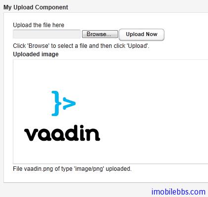
UI 组件-Upload 组件
Upload 组件用于向服务器上传文件。它显示一个文件名输入框,一个文件选择按钮和一个上传确认按钮。
// Create the Upload component. Upload upload = new Upload("Upload the file here", this);
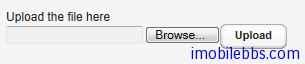
可以通过 setButtonCaption 修改”Upload” 按钮的文字。对于”Browser” 按钮由于浏览器安全方面的考虑,难以修改它的外观,”Brower” 显示语言取决于浏览器本身。 因此如果你想保持”Upload” 语言显示的一致,你必须使用和“Browser”一样的语言。
通常情况上传的文件可以存放在文件系统,数据库或是临时存放在内存中,Upload 组件将上传的文件数据写到一个 java.io.OutputStream 对象中,因此你可以使用你喜欢的方法来处理上传到服务器的文件。
使用 Upload 组件,需要实现 Upload.Receiver 接口来处理文件数据,它将在用户点击”upload”按钮后调用。
当文件上传结束后,成功与否 Upload 组件将触发 Upload.FinishedEvent 事件。可以通过Upload.FinishedListener 接口来处理这个事件,事件参数包括文件名,MIME 类型和文件长度。
下面的例子将上传的图像文件存放在/tmp/uploads 目录下 并显示最后上传的图像。
import java.io.File; import java.io.FileOutputStream; import java.io.OutputStream; import com.vaadin.terminal.FileResource; import com.vaadin.ui.*;
public class MyUploader extends CustomComponent implements Upload.SucceededListener, Upload.FailedListener, Upload.Receiver {
Panel root; // Root element for contained components.
Panel imagePanel; // Panel that contains the uploaded image.
File file; // File to write to.
MyUploader() {
root = new Panel("My Upload Component");
setCompositionRoot(root);
// Create the Upload component.
final Upload upload =
new Upload("Upload the file here", this);
// Use a custom button caption instead of plain "Upload".
upload.setButtonCaption("Upload Now");
// Listen for events regarding the success of upload.
upload.addListener((Upload.SucceededListener) this);
upload.addListener((Upload.FailedListener) this);
root.addComponent(upload);
root.addComponent(new Label("Click 'Browse' to "+
"select a file and then click 'Upload'."));
// Create a panel for displaying the uploaded image.
imagePanel = new Panel("Uploaded image");
imagePanel.addComponent(
new Label("No image uploaded yet"));
root.addComponent(imagePanel);
}
// Callback method to begin receiving the upload.
public OutputStream receiveUpload(String filename,
String MIMEType) {
FileOutputStream fos = null; // Output stream to write to
file = new File("/tmp/uploads/" + filename);
try {
// Open the file for writing.
fos = new FileOutputStream(file);
} catch (final java.io.FileNotFoundException e) {
// Error while opening the file. Not reported here.
e.printStackTrace();
return null;
}
return fos; // Return the output stream to write to
}
// This is called if the upload is finished.
public void uploadSucceeded(Upload.SucceededEvent event) {
// Log the upload on screen.
root.addComponent(new Label("File " + event.getFilename()
+ " of type '" + event.getMIMEType()
+ "' uploaded."));
// Display the uploaded file in the image panel.
final FileResource imageResource =
new FileResource(file, getApplication());
imagePanel.removeAllComponents();
imagePanel.addComponent(new Embedded("", imageResource));
}
// This is called if the upload fails.
public void uploadFailed(Upload.FailedEvent event) {
// Log the failure on screen.
root.addComponent(new Label("Uploading "
+ event.getFilename() + " of type '"
+ event.getMIMEType() + "' failed."));
}
}
UI组件-Form组件
大部分的 Web 应用都包含窗体(Form),Vaadin 中的 Form 组件提供了创建窗体的简洁方法。窗体中的填充域可以直接由绑定的数据源自动生成。BeamItem 适配器(Adapter)支持使用 Java Bean 对象或是普通的 Java 对象做为数据源。 Form 组件支持窗体数据的缓存从而只需在填写 Form 完成后一次性提交。
Form 组件从 Layout 派生,可以有边框,标题,描述以及错误提示标识。
和大部分 UI 组件不同的是,Form 构造函数不支持传入窗体标题参数,因为 From 经常不需要显示标题。你可以使用 setCaption 为窗体添加标题。setDescription 可以为窗体添加帮助提示。Form 组件缺省使用 FormLayout 布局,但你可以使用 setLayout 为 Form 组件设置其它 Layout 对象。
Form 组件可以包含其它UI组件,你可以直接创建 UI 组件如何添加到 Form 组件的 Layout 对象中,但更好的方法是使用数据绑定。
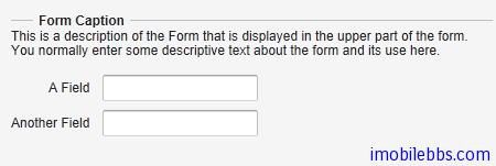
下面代码显示两种方法为 Form 添加其它 UI 输入组件,如何添加到窗体中:
Form form = new Form(); form.setCaption("Form Caption"); form.setDescription("This is a description of the Form that is " + "displayed in the upper part of the form. You normally " + "enter some descriptive text about the form and its " + "use here.");
// Add a field directly to the layout. This field will // not be bound to the data source Item of the form. form.getLayout().addComponent(new TextField("A Field"));
// Add a field and bind it to an named item property. form.addField("another", new TextField("Another Field"));
Form 组件可以显示输入错误标识,它可以显示下面几种错误类型:
- 由 setComponentError 设置的错误内容。
- 由 addValidator 添加到窗体的 Validator 生成的错误。
- 由窗体中 UI 域所关联的 Validator 引起的错误。此时 setValidatorVisible(true)
- 当 setRequired(true) 和 setRequiredError 同时设置时未填写某个必需内容时引发的校验错误。
但 Form 组件同时只能显示单个错误。
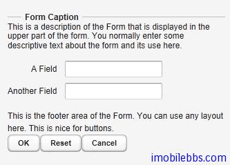
此外 Form 组件还定义了页脚区域(footer),footer 缺省使用 HorizontalLayout 布局。但也可以使用 setFooter 来修改缺省布局。
// Set the footer layout. form.setFooter(new VerticalLayout());
form.getFooter().addComponent( new Label("This is the footer area of the Form. "+ "You can use any layout here. "+ "This is nice for buttons."));
// Have a button bar in the footer. HorizontalLayout okbar = new HorizontalLayout(); okbar.setHeight("25px"); form.getFooter().addComponent(okbar);
// Add an Ok (commit), Reset (discard), and Cancel buttons // for the form. Button okbutton = new Button("OK", form, "commit"); okbar.addComponent(okbutton); okbar.setComponentAlignment(okbutton, Alignment.TOP_RIGHT); okbar.addComponent(new Button("Reset", form, "discard")); okbar.addComponent(new Button("Cancel"));
上面介绍了 Form 组件的基本用法,接着介绍 Form 组件如何利用数据绑定来自动创建 UI 填充域。
数据绑定使用的数据源可以为任何实现 Item 接口的 Java 对象。你可以自行实现 Item 接口或是使用BeamItem Adapter 将 Form 组件绑定到任意的 JavaBean 对象。 也可以使用 PropertysetItem 将 Form 组件绑定到一个 Propert 对象集合。
下面代码定义了个简单的 Java Bean 对象-PersonBean.
/** A simple JavaBean. */ public class PersonBean { String name; String city;
public void setName(String name) { this.name = name; }
public String getName() { return name; }
public void setCity(String city) { this.city = city; }
public String getCity() { return city; } }
如何使用 BeanItem 适配器将一个 PersonBean 对象绑定到 Form 组件。
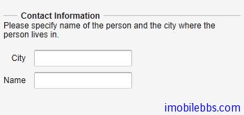
// Create a form and use FormLayout as its layout. final Form form = new Form();
// Set form caption and description texts form.setCaption("Contact Information"); form.setDescription("Please specify name of the person and the city where the person lives in.");
// Create the custom bean. PersonBean bean = new PersonBean();
// Create a bean item that is bound to the bean. BeanItem item = new BeanItem(bean);
// Bind the bean item as the data source for the form. form.setItemDataSource(item);
绑定数据源后,Form 组件使用 FormLayout,并为 Java Bean 的每个属性自动创建对应的 UI 组件(如文本框)。如下图所示:
这种自动创建的 UI 域的顺序可以不是我们所希望的,这时可以使用 setVisibleItemPropertyies 来修改 UI 域的显示顺序,比如:
// Set the order of the items in the form. Vector order = new Vector(); order.add("city"); order.add("name"); form.setVisibleItemProperties(order);
这种自动创建的 UI 组件的标题缺省使用 JavaBean 对应的属性名称,你可以使用 FieldFactory 来修改缺省标题。
自动创建的 UI 域具有一定的局限性,比如 String, int 或 double 类型的属性会自动对应到TextField 组件。而此时你可以希望使用 Combo 组件来输入城市名称。 FormFieldFactory 接口用来解决这些局限。
FieldFactory 的缺省实现 DefaultFieldFactory 也用于 Table 组件。 通常可以通过派生DefaultFieldFactory 的方法来定制 FieldFactory。
下面为 FormFieldFactory 接口的一个简单实现,为 city 使用一个 Select 组件。
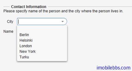
class MyFieldFactory implements FormFieldFactory { public Field createField(Item item, Object propertyId, Component uiContext) { // Identify the fields by their Property ID. String pid = (String) propertyId; if ("name".equals(pid)) { return new TextField("Name"); } else if ("city".equals(pid)) { Select select = new Select("City"); select.addItem("Berlin"); select.addItem("Helsinki"); select.addItem("London"); select.addItem("New York"); select.addItem("Turku"); select.setNewItemsAllowed(true); return select; }
return null; // Invalid field (property) name. } }
...
form.setFormFieldFactory(new MyFieldFactory());
此外使用 Form 组件的一个重要功能是验证用户输入,Vaadin 再 UI 域(Field)可以关联到validator 来验证用户输入以保证输入合法。
Vaadin 的 validator 为实现了 Validator 接口的类。 这个接口定义了两个方法,isValid 和validate.
Vaadin 内置了一些常用的验证类,如 IntegerValidator, DoubleValidator, StringLengthValidator, EmailValidator 以及 RegexValidator 等。
Form 校验发生在用户点击“提交”按钮时,当窗体中任何一个 Validator 失败时,窗体提交都会失败,并显示与之关联的错误标识。如果提交成功,输入数据则写到数据源中。
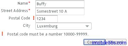
比如下面代码要求邮编满足给定格式。
// Postal code that must be 5 digits (10000-99999). TextField field = new TextField("Postal Code"); field.setColumns(5);
// Create the validator Validator postalCodeValidator = new RegexpValidator( "[1-9][0-9]{4}", "Postal code must be a number 10000-99999."); field.addValidator(postalCodeValidator);
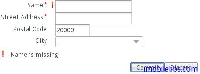
如果需要指定窗体中某些域是必需填写的,可以使用 setRequired(true),并使用setRequiredError 设置错误信息在用户没有填写必填输入内容时显示。
form.getField("name").setRequired(true); form.getField("name").setRequiredError("Name is missing"); form.getField("address").setRequired(true); // No error message
最后提一下 Form 组件的缓存功能,可以只在用户点击”提交“按钮后才将用户输入数据写回数据源。其实 Vaadin 的所有 Field 组件都支持缓存功能。而 Form 的 commit ,discard 实际上是调用对应的 Field 组件的相关功能。当调用 discard 后,将失去之前用户所有修改,UI 输入域恢复到数据源的初始内容。
final Form form = new Form(); ...add components...
// Enable buffering. form.setWriteThrough(false);
// The Ok button calls form.commit(). Button commit = new Button("Ok", form, "commit");
// The Restore button calls form.discard(). Button restore = new Button("Restore", form, "discard");
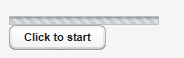
UI组件-ProgressIndicator组件
ProgressIndicator 组件显示进程条,ProgressIndicator 组件定时向服务器查询其当前值,如果值有变化,则更新进程条进度。Web 应用本身无需实现任何查询服务器的操作,查询由ProgressIndicator 组件自动完成。
ProgressIndicator 组件的值域为0.0到1.0之间。缺省的查询(polling)间隔为1秒,可以使用setPollingInterval 修改。
// Create the indicator final ProgressIndicator indicator = new ProgressIndicator(new Float(0.0)); main.addComponent(indicator);
// Set polling frequency to 0.5 seconds. indicator.setPollingInterval(500);
ProgressIndicator 组件通常用来显示一些耗时操作(比如下载文件)的进度。 使用 setValue 为ProgressIndicator 组件设置当前值。
下面代码模拟一个费时操作提供 ProgressIndicator 组件显示进度。
// Create an indicator that makes you look busy final ProgressIndicator indicator = new ProgressIndicator(new Float(0.0)); main.addComponent(indicator);
// Set polling frequency to 0.5 seconds. indicator.setPollingInterval(500);
// Add a button to start working final Button button = new Button("Click to start"); main.addComponent(button);
// Another thread to do some work class WorkThread extends Thread { public void run () { double current = 0.0; while (true) { // Do some "heavy work" try { sleep(50); // Sleep for 50 milliseconds } catch (InterruptedException e) {}
// Show that you have made some progress:
// grow the progress value until it reaches 1.0.
current += 0.01;
if (current>1.0)
indicator.setValue(new Float(1.0));
else
indicator.setValue(new Float(current));
// After all the "work" has been done for a while,
// take a break.
if (current > 1.2) {
// Restore the state to initial.
indicator.setValue(new Float(0.0));
button.setVisible(true);
break;
}
}
}
}
// Clicking the button creates and runs a work thread button.addListener(new Button.ClickListener() { public void buttonClick(ClickEvent event) { final WorkThread thread = new WorkThread(); thread.start();
// The button hides until the work is done.
button.setVisible(false);
}
});
UI 组件-Slider 组件
Slider 组件可以显示为垂直或是水平滑动条,可以使用鼠标拖动来设置其值。 其基本使用如下:
// Create a vertical slider final Slider vertslider = new Slider(1, 100); vertslider.setOrientation(Slider.ORIENTATION_HORIZONTAL);
// Shows the value of the vertical slider final Label vertvalue = new Label(); vertvalue.setSizeUndefined();
// Handle changes in slider value. vertslider.addListener(new Property.ValueChangeListener() {
public void valueChange(
com.vaadin.data.Property.ValueChangeEvent event) {
double value = (Double) vertslider.getValue();
vertvalue.setValue(String.valueOf(value));
}
});
// The slider has to be immediate to send the changes // immediately after the user drags the handle. vertslider.setImmediate(true);

Slider 组件也属于 Field 组件,因此可以通过 ValueChangeListener 来监听 Slider 组件值的变化。同样可以使用 setValue 来修改 Slider 组件的值,此时要注意 Catch 可能的ValueOutOfBoundsException。
// Set the initial value. This has to be set after the // listener is added if we want the listener to handle // also this value change. try { vertslider.setValue(50.0); } catch (ValueOutOfBoundsException e) { }
UI 组件-LoginForm 组件
LoginForm 组件专门用来接受用户输入用户名和密码,并可以自动记住用户输入的用户名和密码。其基本用法如下:
// A wrapper with a caption for the login form Panel loginPanel = new Panel("Login"); loginPanel.setWidth("250px");
LoginForm login = new LoginForm(); loginPanel.addComponent(login);
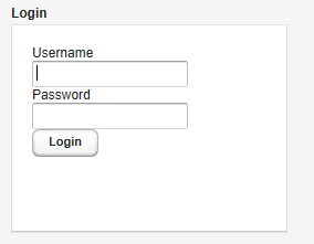
LoginForm 组件内部实现使用了 iframe 和静态 HTML 支持其功能。 如果你想定制 LoginForm 的外观可以重载 getLoginHtml()方法。
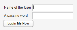
下面介绍如何定制 LoginForm 组件。
class MyLoginForm extends LoginForm { String usernameCaption; String passwordCaption; String submitCaption;
public MyLoginForm(String usernameCaption,
String passwordCaption, String submitCaption) {
this.usernameCaption = usernameCaption;
this.passwordCaption = passwordCaption;
this.submitCaption = submitCaption;
}
然后重载 getLoginHTML()方法:
HTML body 部分包含 Form 定义,包含在一个 iframe 中。form 和 button 必需定义对应的javascripts 响应用户点击”submit’
@Override protected byte[] getLoginHTML() { // Application URI needed for submitting form String appUri = getApplication().getURL().toString() + getWindow().getName() + "/";
String x, h, b; // XML header, HTML head and body
x = "<!DOCTYPE html PUBLIC \"-//W3C//DTD "
+ "XHTML 1.0 Transitional//EN\" "
+ "\"http://www.w3.org/TR/xhtml1/"
+ "DTD/xhtml1-transitional.dtd\">\n";
h = "<head><script type='text/javascript'>"
+ "var setTarget = function() {"
+ " var uri = '" + appUri + "loginHandler';"
+ " var f = document.getElementById('loginf');"
+ " document.forms[0].action = uri;"
+ " document.forms[0].username.focus();"
+ "};"
+ ""
+ "var styles = window.parent.document.styleSheets;"
+ "for(var j = 0; j < styles.length; j++) {\n"
+ " if(styles[j].href) {"
+ " var stylesheet = document.createElement('link');\n"
+ " stylesheet.setAttribute('rel', 'stylesheet');\n"
+ " stylesheet.setAttribute('type', 'text/css');\n"
+ " stylesheet.setAttribute('href', styles[j].href);\n"
+ " document.getElementsByTagName('head')[0]"
+ " .appendChild(stylesheet);\n"
+ " }"
+ "}\n"
+ "function submitOnEnter(e) {"
+ " var keycode = e.keyCode || e.which;"
+ " if (keycode == 13) {document.forms[0].submit();}"
+ "}\n"
+ "</script>"
+ "</head>";
b = "<body onload='setTarget();'"
+ " style='margin:0;padding:0; background:transparent;'"
+ " class='"
+ ApplicationConnection.GENERATED_BODY_CLASSNAME + "'>"
+ "<div class='v-app v-app-loginpage'"
+ " style='background:transparent;'>"
+ "<iframe name='logintarget' style='width:0;height:0;"
+ "border:0;margin:0;padding:0;'></iframe>"
+ "<form id='loginf' target='logintarget'"
+ " onkeypress='submitOnEnter(event)'"
+ " method='post'>"
+ "<table>"
+ "<tr><td>" + usernameCaption + "</td>"
+ "<td><input class='v-textfield' style='display:block;'"
+ " type='text' name='username'></td></tr>"
+ "<tr><td>" + passwordCaption + "</td>"
+ " <td><input class='v-textfield'"
+ " style='display:block;' type='password'"
+ " name='password'></td></tr>"
+ "</table>"
+ "<div>"
+ "<div onclick='document.forms[0].submit();'"
+ " tabindex='0' class='v-button' role='button'>"
+ "<span class='v-button-wrap'>"
+ "<span class='v-button-caption'>"
+ submitCaption + "</span>"
+ "</span></div></div></form></div></body>";
return (x + "<html>" + h + b + "</html>").getBytes();
}
UI 组件-自定义组件
Vaadin 支持自定义组件,典型的用法是将各种 Vaadin 内置的组件组合而成构成自定义组件。 创建自定义组件可以通过派生 CustomComponent 然后调用 setCompositionRoot 为自定义组件设置根容器。
例如:
class MyComposite extends CustomComponent { public MyComposite(String message) { // A layout structure used for composition Panel panel = new Panel("My Custom Component"); panel.setContent(new VerticalLayout());
// Compose from multiple components
Label label = new Label(message);
label.setSizeUndefined(); // Shrink
panel.addComponent(label);
panel.addComponent(new Button("Ok"));
// Set the size as undefined at all levels
panel.getContent().setSizeUndefined();
panel.setSizeUndefined();
setSizeUndefined();
// The composition root MUST be set
setCompositionRoot(panel);
}}
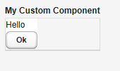
需要注意的是,如果希望自定义的组件自适应其所包含的其它UI组件,必须将容器的大小设为“未定义”,如上面的 setSizeUndefined 方法就是起这个作用。
构造自定义组件,也可以从其它 Vaadin 内置 UI 组件派生,或者利用 Google Web Toolbit 提供的组件创建全新的 Vaadin UI 组件(后面介绍)。
Tags:
Java EE
,
Vaadin
,
Web
UI 布局-概述
Vaadin 提供的 UI 组件大体可以分为两类,一类为之前介绍的 UI 组件主要和用户交互。另外一类为布局类,主要目的是用来管理用户界面中所放置的UI组件的大小和位置。
在创建 Window 对象时,如果你不想使用缺省的布局,可以着手创建根布局对象,如下例:
// Create the main window. Window main = new Window("My Application"); setMainWindow(main);
// Set the root layout (VerticalLayout is actually the default). VerticalLayout root = new VerticalLayout(); main.setContent(root);
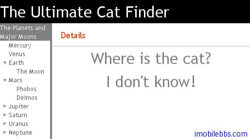
// Add the topmost component. root.addComponent(new Label("The Ultimate Cat Finder"));
// Add a horizontal layout for the bottom part. HorizontalLayout bottom = new HorizontalLayout(); root.addComponent(bottom);
bottom.addComponent(new Tree("Major Planets and Their Moons")); bottom.addComponent(new Panel()); ...
在创建好 Layout 对象后,通常还需要对布局对象进行调整,比如大小,对齐方式,间隔等等。
此外布局的使用和用户界面的主题关系密切,比如背景,边界类型,文字对齐等。这些在后面都有详细介绍。
比如使用上面代码创建的一个界面显示如下:
Vaadin 应用创建用户界面除了使用 Java 代码外,Vaadin 提供了 Eclipse IDE 的一个插件,可以通过拖动 UI 组件的方式帮助开发人员设计用户界面。详见后文。
Tags:
Java EE
,
Vaadin
,
Web
UI 布局-VerticalLayout 和 HorizontalLayout 布局
VerticalLayout 和 HorizontalLayout 分別垂直和水平安排其中的UI組件。這是 Vaadin 框架中兩個最為重要的布局方式。比如 Window 及其父類 Panel 預設的布局就為 VerticalLayout。
這兩種布局的基本用法如下:
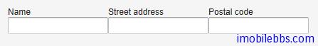
VerticalLayout vertical = new VerticalLayout (); vertical.addComponent(new TextField("Name")); vertical.addComponent(new TextField("Street address")); vertical.addComponent(new TextField("Postal code")); main.addComponent(vertical);
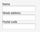
改成使用 HorizontalLayout ,顯示如下:
此外可以通過 setSpacing() 來修改 UI 組件之間的空隙,setComponnetAlignment 來修改 UI 組件的對齊方式。
要注意的是,布局中 UI 組件的實際佔據的大小和位置和 UI 組件自身寬度和長度設置的不同有所不同。
比如對於 VerticalLayout 來說,如果其高度使用 Sizeable.SIZE_UNDEFINED 將其設為「未定義」,則其高度自適應其包含的 UI 組件的高度,同理 HorizontalLayout 布局的寬度為「未定義」HorizontalLayout 寬度也取決於其所包含的其她 UI 組件。
註: 如果布局包含的 UI 組件使用了「百分比」來定義高度或寬度,則要求 Layout 必須定義對應的寬度或高度。但如果通過其中包含的某些 UI 組件可以確定布局的寬度或高度,在這種情況下可以不定義布局類的大小
比如:
// Vertical layout would normally have 100% width VerticalLayout vertical = new VerticalLayout();
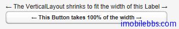
// Shrink to fit the width of contained components vertical.setWidth(Sizeable.SIZE_UNDEFINED, 0);
// Label has normally 100% width, but we set it as // undefined so that it will take only the needed space Label label = new Label("\u2190 The VerticalLayout shrinks to fit "+ "the width of this Label \u2192"); label.setWidth(Sizeable.SIZE_UNDEFINED, 0); vertical.addComponent(label);
// Button has undefined width by default Button butt = new Button("\u2190 This Button takes 100% "+ "of the width \u2192"); butt.setWidth("100%"); vertical.addComponent(butt);
這個例子使用 VerticalLayout 布局,將其寬度設為「未定義」,而 Button 的寬度設為「100%」,此時如果沒有 Label 組件,則必須為這個 VerticalLayout 指定寬度,否則無法知道這個「100%」是哪個的「100%」。Label 組件的寬度為「未定義」,其寬度取決於其顯示字元的長度,在這個例子中,Button 的寬度設為「100%」,因此與 Label 等寬。
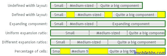
在指定指定布局大小的情況下,預設情況是將其包含的 UI 組件均勻間隔排列。
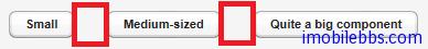
例如使用 HorizontalLayout,並指定其寬度為400px。
HorizontalLayout fittingLayout = new HorizontalLayout(); fittingLayout.setWidth("400px"); fittingLayout.addComponent(new Button("Small")); fittingLayout.addComponent(new Button("Medium-sized")); fittingLayout.addComponent(new Button("Quite a big component")); mainWindow.addComponent(fittingLayout);
有些情況下,你可以希望其中某個 UI 組件佔據所有剩餘空間,可以為 UI 組件設置擴展比例(類似於Android 中權重)。擴展比例由方法 Layout 對象 setExpandRatio()指定,第二個參數為擴展的權重。
比如修改上面代碼,不均勻安排三個按鈕,而是讓阿第三個按鈕佔據所剩餘的空間。
HorizontalLayout fittingLayout = new HorizontalLayout(); fittingLayout.setWidth("400px"); fittingLayout.addComponent(new Button("Small")); fittingLayout.addComponent(new Button("Medium-sized")); // This button will expand. Button expandButton = new Button("Expanding component"); // Use 100% of the expansion cell's width. expandButton.setWidth("100%"); // The component must be added to layout before setting the ratio. fittingLayout.addComponent(expandButton); // Set the component's cell to expand. fittingLayout.setExpandRatio(expandButton, 1.0f); mainWindow.addComponent(fittingLayout);

然而,如果 Layout 所包含的 UI 組件沒有定義大小,(如沒有使用如 setWidth(100%))時,擴展比例則是應用到 UI 組件之間的空間。
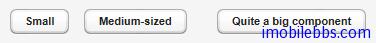
HorizontalLayout layout = new HorizontalLayout(); layout.setWidth("400px");
// Create three equally expanding components. String[] captions = { "Small", "Medium-sized", "Quite a big component" }; for (int i = 1; i <= 3; i++) { Button button = new Button(captions[i-1]); layout.addComponent(button);
// Expand ratios are 1:2:3. layout.setExpandRatio(button, i * 1.0f); }
UI 布局-GridLayout 布局
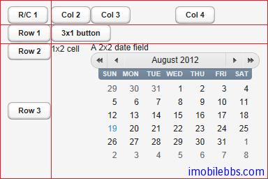
GridLayout 布局使用网格来布置其中的 UI 组件。每个网格提供行,列来定义。每个 UI 组件可以占据一个或多个网格。由网格的坐标(x1,y1,x2,y2)来定义。
GridLayout 布局内部使用一个游标(cursor)来记录当前的网格位置,GridLayout 布局添加 UI 组件的顺序为从左到右,从上到下。如果游标越过当前网格的右下角,GridLayout 布局自动添加一行。
下例为 GridLayout 布局的基本用法,addComponent 第一个参数为所添加的 UI 组件对象,第二个参数可选,指定 UI 组件添加的网格坐标。可以使用单个坐标或是一个区域。网格坐标从0开始。
// Create a 4 by 4 grid layout. GridLayout grid = new GridLayout(4, 4); grid.addStyleName("example-gridlayout");
// Fill out the first row using the cursor. grid.addComponent(new Button("R/C 1")); for (int i = 0; i < 3; i++) { grid.addComponent(new Button("Col " + (grid.getCursorX() + 1))); }
// Fill out the first column using coordinates. for (int i = 1; i < 4; i++) { grid.addComponent(new Button("Row " + i), 0, i); }
// Add some components of various shapes. grid.addComponent(new Button("3x1 button"), 1, 1, 3, 1); grid.addComponent(new Label("1x2 cell"), 1, 2, 1, 3); InlineDateField date = new InlineDateField("A 2x2 date field"); date.setResolution(DateField.RESOLUTION_DAY); grid.addComponent(date, 2, 2, 3, 3);
GridLayout 布局缺省使用“未定义”宽度和高度,因此缺省自适应其所包含的 UI 组件。如果使用指定大小或是比例,其可使用的选项类同
Vaadin Web应用开发教程(29):UI布局-VerticalLayout和HorizontalLayout布局
类似 VerticalLayout 和 HorizontalLayout 布局也可以为 UI 组件指定扩展比例,让某些 UI 组件占据 GridLayout 布局剩余空间。可以通过 setRowExpandRatio()和 setColumnExpandRatio()为行和列分别制定扩展(权重)比例。第一个参数为行或列的坐标,第二个参数为权重。
如下例:
GridLayout grid = new GridLayout(3,2);
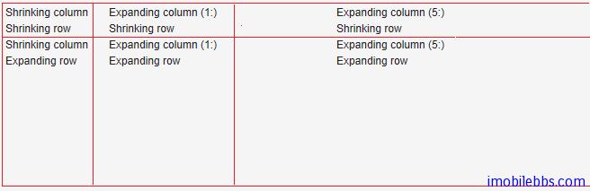
// Layout containing relatively sized components must have // a defined size, here is fixed size. grid.setWidth("600px"); grid.setHeight("200px");
// Add some content String labels [] = { "Shrinking column
Shrinking row", "Expanding column (1:)
Shrinking row", "Expanding column (5:)
Shrinking row", "Shrinking column
Expanding row", "Expanding column (1:)
Expanding row", "Expanding column (5:)
Expanding row" }; for (int i=0; i<labels.length; i++) { Label label = new Label(labels[i], Label.CONTENT_XHTML); label.setWidth(null); // Set width as undefined grid.addComponent(label); }
// Set different expansion ratios for the two columns grid.setColumnExpandRatio(1, 1); grid.setColumnExpandRatio(2, 5);
// Set the bottom row to expand grid.setRowExpandRatio(1, 1);
// Align and size the labels. for (int col=0; col<grid.getColumns(); col++) { for (int row=0; row<grid.getRows(); row++) { Component c = grid.getComponent(col, row); grid.setComponentAlignment(c, Alignment.TOP_CENTER);
// Make the labels high to illustrate the empty
// horizontal space.
if (col != 0 || row != 0)
c.setHeight("100%");
}
}
UI 布局-FormLayout 布局
FormLayout 布局為使用表單(Form)時的預設布局方式。它通常將 Field 組件的標題和輸入域並排以兩列的方式顯示,並可以顯示可選的必填標識。在用戶輸入錯誤時顯示錯誤提示。
Form 本身可以有標題,錯誤提示,表單章節附註等,具體參見
Vaadin Web 應用開發教程(23):UI 組件-Form 組件
FormLayout 布局的基本用法如下:
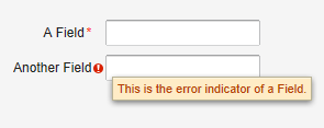
// A FormLayout used outside the context of a Form FormLayout fl = new FormLayout();
// Make the FormLayout shrink to its contents fl.setSizeUndefined();
TextField tf = new TextField("A Field"); fl.addComponent(tf);
// Mark the first field as required tf.setRequired(true); tf.setRequiredError("The Field may not be empty.");
TextField tf2 = new TextField("Another Field"); fl.addComponent(tf2);
// Set the second field straing to error state with a message. tf2.setComponentError( new UserError("This is the error indicator of a Field."));
顯示如下:
UI 布局-Panel
Panel 为带有边框和标题的简单容器类,它的客户区为一布局对象,其缺省布局方式为VerticalLayout,可以通过 setContent 来修改缺省布局。
Panel 的标题可以由图标和文字构成。
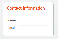
// Create a panel with a caption. final Panel panel = new Panel("Contact Information"); panel.addStyleName("panelexample");
// The width of a Panel is 100% by default, make it // shrink to fit the contents. panel.setWidth(Sizeable.SIZE_UNDEFINED, 0);
// Create a layout inside the panel final FormLayout form = new FormLayout();
// Have some margin around it. form.setMargin(true);
// Add some components form.addComponent(new TextField("Name")); form.addComponent(new TextField("Email"));
// Set the layout as the root layout of the panel panel.setContent(form);
对于 Panel 来说,如果其大小为“未定义”,那么它会自动适应其所包含的 UI 组件的大小。但如果它有固定大小而其中所需显示内容过大,则会自动显示滚动条。
如下例在 Panel 中显示一幅图像:
// Serve the image from the theme Resource rsrc = new ThemeResource("img/embedded-journalist.jpg");
// Display the image without caption Embedded image = new Embedded(null, rsrc); image.setSizeUndefined(); // Actually the default
// The panel will give it scrollbars. The root layout // (VerticalLayout) must have undefined width to make the // horizontal scroll bar appear. Panel panel = new Panel("Embedding"); panel.setWidth("400px"); panel.setHeight("300px"); panel.getContent().setSizeUndefined(); panel.addComponent(image);
layout.addComponent(panel);

Panel 的滚动条也可以使用程序来控制,首先通过 setScrollable(true) 打开滚动条控制,然后使用 setScrollTop()和 setScrollLeft()来控制滚动条的位置。
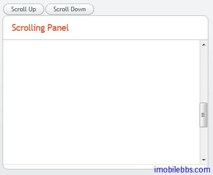
final Panel panel = new Panel("Scrolling Panel"); panel.setHeight("300px"); panel.setWidth("400px"); panel.getContent().setHeight("1000px"); panel.setScrollable(true);
layout.addComponent(panel);
HorizontalLayout scrollButtons = new HorizontalLayout(); layout.addComponent(scrollButtons);
Button scrollUp = new Button("Scroll Up"); scrollUp.addListener(new Button.ClickListener() { public void buttonClick(ClickEvent event) { int scrollPos = panel.getScrollTop() - 250; if (scrollPos < 0) scrollPos = 0; panel.setScrollTop(scrollPos); } }); scrollButtons.addComponent(scrollUp);
Button scrollDown = new Button("Scroll Down"); scrollDown.addListener(new Button.ClickListener() { public void buttonClick(ClickEvent event) { int scrollPos = panel.getScrollTop(); if (scrollPos > 1000) scrollPos = 1000; panel.setScrollTop(scrollPos + 250); } }); scrollButtons.addComponent(scrollDown);
UI 布局-HorizontalSplitPanel 和 VerticalSplitPanel 布局
HorizontalSplitPanel 和 VerticalSplitPanel 為水平和垂直分割窗口,可以將空間分成上下或左右兩部分。用戶可以通過中間的分隔條調整兩部分的大小。
可以通過 setFirstComponent()和 setFirstComponent()為分隔的兩部分設置不同的 UI 組件, addComponent()也可以依次添加兩個UI組件。
// Have a panel to put stuff in Panel panel = new Panel("Split Panels Inside This Panel"); panel.setSizeFull(); // Have a horizontal split panel as its root layout HorizontalSplitPanel hsplit = new HorizontalSplitPanel(); panel.setContent(hsplit);
// Put a component in the left panel hsplit.setFirstComponent(new Label("left panel"));
// Put a vertical split panel in the right panel VerticalSplitPanel vsplit = new VerticalSplitPanel(); hsplit.setSecondComponent(vsplit);
// Put other components in the right panel vsplit.addComponent(new Label("Here's the upper panel")); vsplit.addComponent(new Label("Here's the lower panel")); mainWindow.setContent(panel);
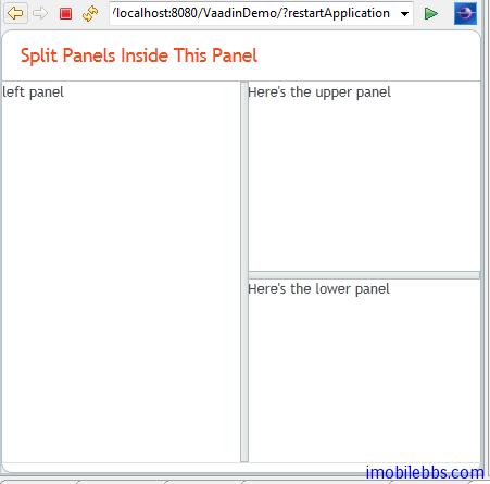
此外可以通過方法 setSplitPosition 設置分隔條的位置,如果不想用戶調整分隔條的位置,可以通過setLocked(true) 禁止用戶移動分隔條。
Tags:
Java EE
,
Vaadin
,
Web
UI 布局-TabSheet 布局
TabSheet 布局支持標籤顯示。TabSheet 布局通過方法 addTab()添加一個標籤頁。
// Create an empty tab sheet. TabSheet tabsheet = new TabSheet();
// Make the tabsheet shrink to fit the contents. tabsheet.setSizeUndefined();
tabsheet.addTab(new Label("Contents of the first tab")).setCaption("first"); tabsheet.addTab(new Label("Contents of the second tab")).setCaption("second"); tabsheet.addTab(new Label("Contents of the third tab")).setCaption("third");
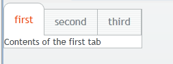
每個標籤頁為一 Tab 對象,可以顯示標題和圖標。
tabsheet.addTab(new Label("Contents of the second tab"), "Second Tab", new ClassResource("images/Venus_small.png", this));
用戶點擊標籤時觸發 TabSheet.SelectedTabChangeEvent 事件,獲取當前選中的標籤的方法為getSelectedTab(),同樣將某個標籤設為當前頁為 setSelectedTab()。
Tags:
Java EE
,
Vaadin
,
Web
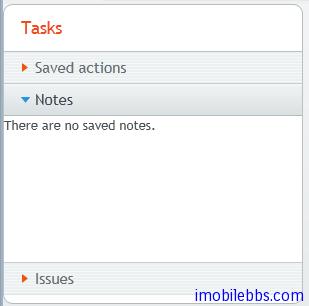
UI 布局-Accordion 布局
Accordion 布局类似 TabSheet,不过是以垂直方式安排多个标签页,其使用方法也和 TabSheet 布局类似。
// Create the Accordion. Accordion accordion = new Accordion();
// Have it take all space available in the layout. accordion.setSizeFull();
// Some components to put in the Accordion. Label l1 = new Label("There are no previously saved actions."); Label l2 = new Label("There are no saved notes."); Label l3 = new Label("There are currently no issues.");
// Add the components as tabs in the Accordion. accordion.addTab(l1, "Saved actions", null); accordion.addTab(l2, "Notes", null); accordion.addTab(l3, "Issues", null);
// A container for the Accordion. Panel panel = new Panel("Tasks"); panel.setWidth("300px"); panel.setHeight("300px"); panel.addComponent(accordion);
// Trim its layout to allow the Accordion take all space. panel.getLayout().setSizeFull(); panel.getLayout().setMargin(false);
UI 布局-AbsoluteLayout 布局
AbsoluteLayout 布局允许将其中的UI组件任意指定其位置。方法 addComponent()可以指定相对于AbsoluteLayout 边界的纵横坐标。还可以指定一个Z方向深度值,用来表示 UI 组件的前后顺序。
UI 组件的位置是通过 left,right,top,bottom 及 z-index 来指定(CSS对应的属性)。
// A 400x250 pixels size layout AbsoluteLayout layout = new AbsoluteLayout(); layout.setWidth("400px"); layout.setHeight("250px");
// A component with coordinates for its top-left corner TextField text = new TextField("Somewhere someplace"); layout.addComponent(text, "left: 50px; top: 50px;");
// At the top-left corner Button button = new Button( "left: 0px; top: 0px;"); layout.addComponent(button, "left: 0px; top: 0px;");
// At the bottom-right corner Button buttCorner = new Button( "right: 0px; bottom: 0px;"); layout.addComponent(buttCorner, "right: 0px; bottom: 0px;");
// Relative to the bottom-right corner Button buttBrRelative = new Button( "right: 50px; bottom: 50px;"); layout.addComponent(buttBrRelative, "right: 50px; bottom: 50px;");
// On the bottom, relative to the left side Button buttBottom = new Button( "left: 50px; bottom: 0px;"); layout.addComponent(buttBottom, "left: 50px; bottom: 0px;");
// On the right side, up from the bottom Button buttRight = new Button( "right: 0px; bottom: 100px;"); layout.addComponent(buttRight, "right: 0px; bottom: 100px;");
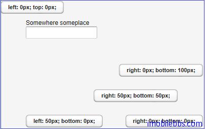
除了使用 px 指定据边界的距离外,也可以使用百分比。
// A panel that takes 30% to 90% horizontally and // 20% to 80% vertically Panel panel = new Panel("A Panel"); panel.setSizeFull(); // Fill the specified area layout.addComponent(panel, "left: 30%; right: 10%;" + "top: 20%; bottom: 20%;");
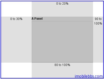
可視化界面編輯插件
前面基本介紹了 Vaadin 提供的各種 UI 組件和布局,所以界面都是通過代碼來完成的。安裝 Vaadin的 Eclipse 插件後,可以通過拖拉的方式來開始話設計用戶界面。設計出的界面為 CustomComponent 的派生類。使用 CustomComponent 的基本方法如下:並可以參見
Vaadin Web 應用開發教程(27):UI組件-自定義組件
public class MyApplication extends Application { public void init() { Window mainWindow = new Window("My Application"); setMainWindow(mainWindow);
// Needed because composites are full size
mainWindow.getContent().setSizeFull();
MyComposite myComposite = new MyComposite();
mainWindow.addComponent(myComposite);
}
}
使用可視化編輯器是提供 Eclipse Vaadin 插件創建 Vaadin Composite : Vaadin->Vaadin Composite
通過嚮導創建的 UI 界面預設使用的是 AbsoluteLayout,其預設大小為100%。
可視化界面編輯具有兩個標籤頁:Source 和 Design,分別對應代碼和設計器。
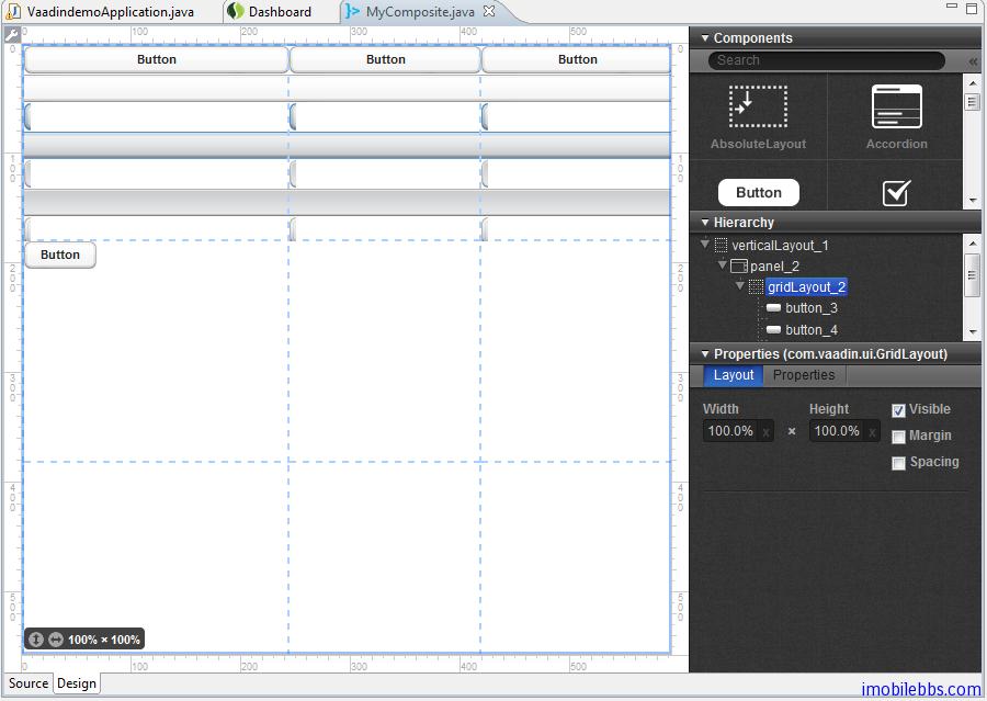
如果你使用過其它界面設計工具,如 Visual Studio 等,也就比較容易使用 Vaadin 的界面編輯器來設計 UI 界面,這裡就不詳述了。
由可視化界面編輯設計出的界面對應的代碼含義特定的結構,對於那些含有@AutoGenerated 標註的部分不要手工修改。
Tags:
Java EE
,
Vaadin
,
Web
使用主题-概述
在前面介绍 Vaadin 的 UI 组件及布局时,特地没有介绍这些UI组件对应的 CSS 设置,而是留在这里介绍 Vaadin 主题时一并说明。
Vaadin 应用可以通过主题(Theme)来修改界面的外观,用户主题包括 Css 文件,自定义的 HTML 布局及使用的图像等。主题资源(Theme Resource)可以通过 ThemeResource 类访问 。
用户自定义的主题必须放置在目录 WebContent/VAADIN/themes/ 下,这个目录名是固定的。
下图显示了 Vaadin 主题的目录的一般结构:
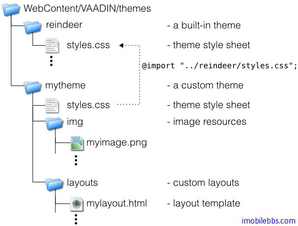
主题的名称由其目录名称指定,比如上面定义了两个主题,一个是 reindeer (Vaadin 内置),另外一个为 mytheme. 每个主题必须包含一个 styles.css 文件。其它的主题资源可以自由命名。但一般的命名习惯为使用 img 目录存放图像文件,layouts 存放自定义 HTML 布局,css 存放 CSS 文件。
使用主题的方法非常简单,调用 setTheme 方法,如下例:
public class MyApplication extends com.vaadin.Application { public void init() { setTheme("mytheme"); ... } }
Vaadin 支持 Web 应用根据不同情况(如不同的用户登录)使用不同的主题。
Tags:
Java EE
,
Vaadin
,
Web
使用主题-创建和应用新主题
Vaadin 中创建的主题必须放置在 VAADIN/themes 目录下。目录名称即为新的主题名称,新主题中必须包含一个 styles.css 文件。新主题也必须继承某个 Vaadin 内置主题,如:
@import "../reindeer/styles.css";
.v-app {
background: yellow;
}
前面介绍的 Vaadin 个 UI 组件和布局都可以通过 CSS 修改它们的显示外观。它们都定义了对应的Vaadin 的 CSS 类名,下表给出了 Vaadin 中标准 UI 组件的 CSS 类名:
Server-Side Component Client-Side Widget CSS Class Name AbsoluteLayout VAbsoluteLayout v-absolutelayout Accordion VAccordion v-accordion Button VButton v-button CheckBox VCheckBox v-checkbox CssLayout VCssLayout v-csslayout CustomComponent VCustomComponent v-customcomponent CustomLayout VCustomLayout v-customlayout DateField VDateField v-datefield VCalendar v-datefield-entrycalendar VDateFieldCalendar v-datefield-calendar VPopupCalendar v-datefield-calendar VTextualDate
Embedded VEmbedded – Form VForm v-form FormLayout VFormLayout – GridLayout VGridLayout – Label VLabel v-label Link VLink v-link OptionGroup VOptionGroup v-select-optiongroup HorizontalLayout VHorizontalLayout v-horizontallayout VerticalLayout VVerticalLayout v-verticallayout Panel VPanel v-panel Select
VListSelect v-listselect VFilterSelect v-filterselect Slider VSlider v-slider SplitPanel VSplitPanel – VSplitPanelHorizontal – VSplitPanelVertical – Table VScrollTable v-table VTablePaging v-table TabSheet VTabSheet v-tabsheet TextField VTextField v-textfield VTextArea
VPasswordField
Tree VTree v-tree TwinColSelect VTwinColSelect v-select-twincol Upload VUpload – Window VWindow v-window – CalendarEntry – – CalendarPanel v-datefield-calendarpanel – ContextMenu v-contextmenu – VUnknownComponent vaadin-unknown – VView – – Menubar gwt-MenuBar – MenuItem gwt-MenuItem – Time v-datefield-time
Vaadin 内置了两种主题,reindeer 和 runo, Vaadin 6.0 缺省使用 reindeer 主题。 有关主题定义的常数定义在包 com.vaadin.ui.themes 中。
setTheme("runo");
Panel panel = new Panel("Regular Panel in the Runo Theme"); panel.addComponent(new Button("Regular Runo Button"));
// A button with the "small" style Button smallButton = new Button("Small Runo Button"); smallButton.addStyleName(Runo.BUTTON_SMALL);
Panel lightPanel = new Panel("Light Panel"); lightPanel.addStyleName(Runo.PANEL_LIGHT); lightPanel.addComponent(new Label("With addStyleName(\"light\")"));
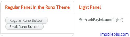
Vaadin 的 Eclipse 插件可以帮助创建新主题,为项目添加一个新主题. New -> Other -> Vaadin -> Vaadin theme
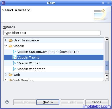
按照向导一步一步,就可以创建一个新的主题,然后修改新主题下的 styles.css ,就可以达到自己预期的显示效果。
Tags:
Java EE
,
Vaadin
,
Web
数据绑定-概述
本篇介绍 Vaadin 的数据模型及数据绑定-将数据源绑定到 UI 组件。
Vaadin 通过数据绑定可以支持用户提供 UI 组件(界面)直接操作数据模型(显示或者直接修改)。
Vaadin 的数据模型分为三个层次: Property, Item 和 Container. 类比 Excel 电子表格,可以分别类比电子表格的单元格,一行和整个表单。
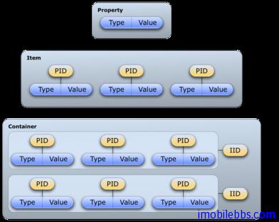
Vaadin 数据某些相关的接口和类定义在包 com.vaadin.data 中。要注意的是 Vaadin 定义的数据模型都是通过接口来定义的,而非实类。这也体现了“编程到接口”的设计模式,因此支持数据绑定的数据源可以多种多样,比如普通 Java 类, 文件系统,数据库等。
Vaadin 的 UI 组件和数据绑定关系密切。 所有实现了 Field 接口的 UI 组件都支持数据绑定。这些UI 组件也可以称为 Field 组件。与其绑定的值可以通过 Property 属性来访问。
下图显示了 Vaadin 数据模型接口之间的关系:
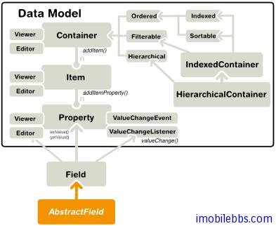
Vaadin 的数据模型支持多种功能,比如支持数据更新通知,支持索引,排序,过滤等。
Vaadin 通过了多种内置的数据模型如 SQL 数据库支持等,也可以通过插件的方式支持其它数据类型,如 JPA 支持。
Tags:
Java EE
,
Vaadin
,
Web
数据绑定-Property 接口
Property 接口
为 Vaadin 数据模型的基本接口,它提供了读写单个数据对象的标准 API。 一个 Property 对象总是有数据类型的,尽管它支持可选的数据类型转换。Property 的数据可以为任意的 Java 对象,Property 也提供了监听数据变化的事件消息。
Property 的读写方法为 getValue()和 setValue() 。getValue() 返回通用的 Object 类型的对象,因此可以强制转换成所需的数据类型。Property 的类型可以通过 getType()取得。
Property 值发生变化说触发 ValueChangeEvent 事件,可以通过 ValueChangeListener 监听这个事件。
final TextField tf = new TextField("Name");
// Set the value tf.setValue("The text field value");
// When the field value is edited by the user tf.addListener(new Property.ValueChangeListener() { public void valueChange(ValueChangeEvent event) { // Get the value and cast it to proper type String value = (String) tf.getValue();
// Do something with it
layout.addComponent(new Label(value));
}
});
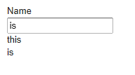
使用 Property 接口,一是实现 Property 接口,而是使用 Vaadin 内置的两个 Property 接口实现:MethodProperty 主要用于 Java Bean,而是 ObjectProperty 用于简单的 Java 对象。
与 Property 接口关系紧密的还有两个接口
Property.Editor
和
Property.Viewer
可以用来显示和编译 Property 值,大部分的 UI 组件,尤其是 Field 组件实现了这两个接口,因此 Field 组件可以直接绑定到 Property 对象,用来显示或编辑 Property 数据。
下例使用 Label 来显示一个
ObjectProperty
对象
// Have a data model ObjectProperty property = new ObjectProperty("Hello", String.class);
// Have a component that implements Viewer Label viewer = new Label();
// Bind it to the data viewer.setPropertyDataSource(property);
同样可以使用一个 TextField 来编辑并显示一个 ObjectProperty 对象
// Have a data model ObjectProperty property = new ObjectProperty("Hello", String.class);
// Have a component that implements Viewer TextField editor = new TextField("Edit Greeting");
// Bind it to the data editor.setPropertyDataSource(property);
前面说过所有 Field 组件也实现了 Property 接口,因此也可以把 Field 组件绑定到实现了Property.Viewer 接口的 UI 组件,如 Label。下例把一个 Label 绑定到一个 TextField,因此Label 显示的内容会和 TextField 的值变化而变化。
Label viewer = new Label(); viewer.setPropertyDataSource(editor);
// The value shown in the viewer is updated immediately // after editing the value in the editor (once it // loses the focus) editor.setImmediate(true);
此外,你也可以自行实现 Property 接口,然后绑定到 Field 组件。
class MyProperty implements Property { Integer data = 0; boolean readOnly = false;
// Return the data type of the model
public Class<?> getType() {
return Integer.class;
}
public Object getValue() {
return data;
}
// Override the default implementation in Object
@Override
public String toString() {
return Integer.toHexString(data);
}
public boolean isReadOnly() {
return readOnly;
}
public void setReadOnly(boolean newStatus) {
readOnly = newStatus;
}
public void setValue(Object newValue)
throws ReadOnlyException, ConversionException {
if (readOnly)
throw new ReadOnlyException();
// Already the same type as the internal representation
if (newValue instanceof Integer)
data = (Integer) newValue;
// Conversion from a string is required
else if (newValue instanceof String)
try {
data = Integer.parseInt((String) newValue, 16);
} catch (NumberFormatException e) {
throw new ConversionException();
}
else
// Don't know how to convert any other types
throw new ConversionException();
// Reverse decode the hexadecimal value
}
}
// Instantiate the property and set its data MyProperty property = new MyProperty(); property.setValue(42);
// Bind it to a component final TextField tf = new TextField("Name", property);
使用 Item 介面管理一組 Property
Item 介面用來管理一組命名的 Property 對象。每個 Property 由一個標識符(PID)來定義,Item通過 PID 使用方法 getItemProperty()來讀寫其中的 Property。
使用 Item 的地方例如 Table 的一行,每個屬性(Property)對應行的每個欄位(列column)。或者是 Tree 的一個節點,以及綁定到表單 From 的數據,此時 Item 中的每個屬性對應的表單中的一個輸入域(Field)。
使用在面向對象概念來說,Item 對應到一個對象,但 Item 可以支持配置及通過事件處理機制(主要是數據變化事件)。
使用 Item 的最簡單的方法是使用 Vaadin 的一些內置實現,比如 PropertysetItem 或 BeanItem。此外 Form 也實現了 Item 介面因此可當作 Item 對象來使用。Form 可以通過 Item 自動創建其中的 UI 組件,可以參見件
Vaadin Web 應用開發教程(23):UI 組件-Form 組
。
Item 介面定義了一些介面來管理其中的 Propert y或監聽 Property 值變化事件。
使用 PropertysetItem
PropertysetItem 是實現了 Item 介面的通用實現,可以用來存放屬性值。屬性通過addItemProperty 添加到集合中。
PropertysetItem item = new PropertysetItem(); item.addItemProperty("name", new ObjectProperty("Zaphod")); item.addItemProperty("age", new ObjectProperty(42));
// Bind it to a component Form form = new Form(); form.setItemDataSource(item);
使用 BeanItem
BeanItem 也實現了 Item 介面可以用來包容一個 JavaBean 對象。實際上只使用 Java Bean 規範中的 setter 和 getter 而未使用其它 JavaBean 功能,因此 BeanItem 也可以用在一般的 Java 對象(POJO)上。
// Here is a bean (or more exactly a POJO) class Person { String name; int age;
public String getName() {
return name;
}
public void setName(String name) {
this.name = name;
}
public Integer getAge() {
return age;
}
public void setAge(Integer age) {
this.age = age.intValue();
}
}
// Create an instance of the bean Person bean = new Person();
// Wrap it in a BeanItem BeanItem item = new BeanItem(bean);
// Bind it to a component Form form = new Form(); form.setItemDataSource(item);
嵌套使用 Bean
在使用聚合類,某個類包含其它某個類,比如下面的 Planet 類定義了一個發現人 Discovery(為Person 類)
// Here is a bean with two nested beans public class Planet implements Serializable { String name; Person discoverer;
public Planet(String name, Person discoverer) {
this.name = name;
this.discoverer = discoverer;
}
... getters and setters ...
}
... // Create an instance of the bean Planet planet = new Planet("Uranus", new Person("William Herschel", 1738));
當需要在 Form 顯示時,你可以希望在顯示 Planet 屬性的同時顯示 Disoveryer 的一些屬性,可以通過 MethodProperty 或 NestedMethodProperty 單獨綁定這些屬性,通常此時需要隱藏嵌套類本身被綁定到屬性,可以在構造函數中只列出需要綁定的屬性,比如只綁定 Planet 的 Name 屬性。
// Wrap it in a BeanItem and hide the nested bean property BeanItem item = new BeanItem(planet, new String[]{"name"});
// Bind the nested properties. // Use NestedMethodProperty to bind using dot notation. item.addItemProperty("discoverername", new NestedMethodProperty(planet, "discoverer.name"));
// The other way is to use regular MethodProperty. item.addItemProperty("discovererborn", new MethodProperty(planet.getDiscoverer(), "born"));
NestedMethodProperty 和 MethodProperty 不同點在於 NestedMethodProperty 只在需要訪問屬性值時才訪問嵌套類,而 MethodProperty 則是在創建這個 Method Property 就訪問嵌套類(如Person)。
下面代碼將 Item 綁定到一個 Form
// Bind it to a component Form form = new Form(); form.setItemDataSource(item);
// Nicer captions form.getField("discoverername").setCaption("Discoverer"); form.getField("discovererborn").setCaption("Born");
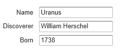
使用 Container 介面管理一組 Item
單個屬性使用 Property 介面,一組 Property 使用 Item 介面來管理,Container 介面則管理一組具有相同屬性的 Item。Container 所包含的 Item 使用 Item 標識符(IID)來區分。
Item 通過方法 addItem()方法向 Container 添加 Item。 查詢某個屬性可以先通過 getItem()取得 Item 對象,然後再使用 getItemProperty()方法,或者直接使用 getContainerProperty 方法來讀取。
Vaadin 在設計 Container 介面考慮到靈活性和高效性,它包括了一些可選的介面一支持內部 Item 的排序,索引或者以層次關係來訪問 Item,從而為實現 Table,Tree,Select 等 UI 組件提供了實現基礎。
和其它數據模型類似,Container 介面也提供了數據變動事件的支持。
Container 可以是無序的,有序的,帶索引或是支持層次關係,因此可以支持幾乎現實中所有數據模型。Vaadin 內部實現支持一些常用的數據源,比如簡單的二維表(IndexedContainer)和文件系統(FileSystemContainer)等。
除了上面通用的 Container實現,一些 UI 組件本身就實現了 Container介面,比如 Select 組件。
使用 BeanContainer
BeanContainer 為使用內存來管理 JavaBean 對象的 Container 類型。每個其中的 Item 為使用BeanItem 封裝的 Java 對象。Item 的屬性會根據 setter, getter 自動識別,因此需要使用的Java Bean 具有 public 修飾符。也只有同類型的 Java Bean 對象才可以添加到 BeanContainer中。
BeanContainer 為一 generic 類型,使用時給出所包含的 Bean 類型和 Item 標識符的類型。參考下面例子:
// Here is a JavaBean public class Bean implements Serializable { String name; double energy; // Energy content in kJ/100g
public Bean(String name, double energy) {
this.name = name;
this.energy = energy;
}
public String getName() {
return name;
}
public void setName(String name) {
this.name = name;
}
public double getEnergy() {
return energy;
}
public void setEnergy(double energy) {
this.energy = energy;
}
}
void basic(VerticalLayout layout) { // Create a container for such beans with // strings as item IDs. BeanContainer<String, Bean> beans = new BeanContainer<String, Bean>(Bean.class);
// Use the name property as the item ID of the bean
beans.setBeanIdProperty("name");
// Add some beans to it
beans.addBean(new Bean("Mung bean", 1452.0));
beans.addBean(new Bean("Chickpea", 686.0));
beans.addBean(new Bean("Lentil", 1477.0));
beans.addBean(new Bean("Common bean", 129.0));
beans.addBean(new Bean("Soybean", 1866.0));
// Bind a table to it
Table table = new Table("Beans of All Sorts", beans);
layout.addComponent(table);
}
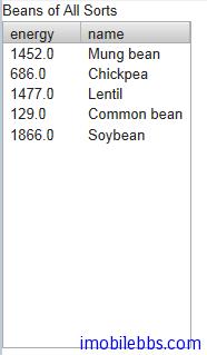
嵌套屬性
如果 Java Bean 有個嵌套的 Java Bean 類型,而且具有和這個嵌套 Java Bean 具有1對1的關係,你可以將這個嵌套類的屬性添加到 Container 中,就如同直接包含在其中 Java Bean 的屬性一樣。同樣此時嵌套的 Java Bean 也必須具有 public 修飾符。
如下例:
先定義兩個 Java Bean 類型,其中 EqCoord 作為 Star 的嵌套類,一個 Star 類對應一個EqCoord,一一對應的關係。
/** Bean to be nested / public class EqCoord implements Serializable { double rightAscension; / In angle hours / double declination; / In degrees */
... constructor and setters and getters for the properties ...
}
/** Bean containing a nested bean / public class Star implements Serializable { String name; EqCoord equatorial; / Nested bean */
... constructor and setters and getters for the properties ...
}
在創建好 Container 之後,可以通過方法 addNestedContainerProperty 將嵌套類的屬性添加到Container 中。
// Create a container for beans final BeanItemContainer stars = new BeanItemContainer(Star.class);
// Declare the nested properties to be used in the container stars.addNestedContainerProperty("equatorial.rightAscension"); stars.addNestedContainerProperty("equatorial.declination");
// Add some items stars.addBean(new Star("Sirius", new EqCoord(6.75, 16.71611))); stars.addBean(new Star("Polaris", new EqCoord(2.52, 89.26417)));
如果將這個 Container 綁定到一個 TableUI 組件,你可能需要為表的列定義列名稱。嵌套類的屬性也作為單獨的列顯示在表格中,如果需要隱藏某個列,可以通過方法 setVisibleColumns 修改例的可見性。
// Put them in a table Table table = new Table("Stars", stars); table.setColumnHeader("equatorial.rightAscension", "RA"); table.setColumnHeader("equatorial.declination", "Decl"); table.setPageLength(table.size());
// Have to set explicitly to hide the "equatorial" property table.setVisibleColumns(new Object[]{"name", "equatorial.rightAscension", "equatorial.declination"});
使用 BeanItemContainer
BeanItemContainer 用來管理一組由 BeanItem 封裝的 Java Bean 對象。Item 的屬性會根據setter, getter 自動識別,因此需要使用的 Java Bean 具有 public 修飾符。也只有同類型的Java Bean 對象才可以添加到 BeanItemContainer 中。
BeanItemContainer 為 BeanContainer 的一個特別版本,它不需要指明 Item 標識符的類型,而直接使用 Item 對象來區分 Item。因此比 BeanContainer 使用更簡單。
// Create a container for the beans BeanItemContainer beans = new BeanItemContainer(Bean.class);
// Add some beans to it beans.addBean(new Bean("Mung bean", 1452.0)); beans.addBean(new Bean("Chickpea", 686.0)); beans.addBean(new Bean("Lentil", 1477.0)); beans.addBean(new Bean("Common bean", 129.0)); beans.addBean(new Bean("Soybean", 1866.0));
// Bind a table to it Table table = new Table("Beans of All Sorts", beans);
遍歷 Container
Container 所包含的 Item 對象並不一定需要排過序,遍歷整個 Container 可以通過 Iterator 介面。Container 的 getItemIds()返回一個 Collection 集合支持枚舉。下例為遍歷一個 Table,檢查其中為 Checkbox 的某個列,選擇出所有選中的 Item。
// Collect the results of the iteration into this string. String items = "";
// Iterate over the item identifiers of the table. for (Iterator i = table.getItemIds().iterator(); i.hasNext();) { // Get the current item identifier, which is an integer. int iid = (Integer) i.next();
// Now get the actual item from the table.
Item item = table.getItem(iid);
// And now we can get to the actual checkbox object.
Button button = (Button)
(item.getItemProperty("ismember").getValue());
// If the checkbox is selected.
if ((Boolean)button.getValue() == true) {
// Do something with the selected item; collect the
// first names in a string.
items += item.getItemProperty("First Name")
.getValue() + " ";
}
}
// Do something with the results; display the selected items. layout.addComponent (new Label("Selected items: " + items));
過濾 Container
對應 Container 的 Item 對象,可以定義一些查詢條件來過濾掉一些 Item。如同數據查詢時使用WHERE 語句來查詢表格。比如下面代碼定義一個簡單的過濾器來匹配 name 列以 Douglas 開頭的 Item
Filter filter = new SimpleStringFilter("name", "Douglas", true, false); table.addContainerFilter(filter);
Filter 可以為單個(atomic)或是組合(Composite)類型。單個 Filter 定義單獨的一個條件,如上面的 SimpleStringFilter,組合的 Filter 有多個單個的 Filter 通過 NOT,OR,AND 組合而成。例如:
filter = new Or(new SimpleStringFilter("name", "Douglas", true, false), new Compare.Less("age", 42));
Vaadin 定義了常用的 Filter 類型,如 SimpleStringFilter,IsNull,Equal, Greater, Less, GreaterOrEqual, LessOrEqual,And, Or 和 Not 等,也可以自定義一個 Filter 類型,如:
class MyCustomFilter implements Container.Filter { protected String propertyId; protected String regex;
public MyCustomFilter(String propertyId, String regex) {
this.propertyId = propertyId;
this.regex = regex;
}
/** Tells if this filter works on the given property. */
@Override
public boolean appliesToProperty(Object propertyId) {
return propertyId != null &&
propertyId.equals(this.propertyId);
}
SQLContainer 概述
Web 應用一個重要的組成部分為訪問資料庫,Vaadin 提供的 SQLContainer 實現了 Container 介面用來連接各種資料庫。
SQLContainer 支持兩種類型的資料庫訪問,通過 TableQuery,使用這一預設的查詢生成器可以通過Container 介面直接讀取,更新,插入資料庫表格中。而使用 FreeformQuery 允許程序員使用自定義的查詢語句來讀取數據,並可以選擇實現如何寫入資料庫,過濾或者排序。
SQLContainer 支持使用 JDBC 連接或是 Java EE 連接池來連接資料庫。
SQLContainer 為 Vaadin Container 介面的一個實現,其中介面 Property 和 Item 的實現類為ColumnProperty 和 RowItem。 Item ID 則對應到 RowId 或是 TemporaryRowId 類。 RowId 的實現則基於資料庫的主鍵。
JDBCConnectionPool 定義 JDBC 連接池介面,Vaadin 內置兩個實現,一為SimpleJDBCConnectionPool 用於 JDBC 資料庫連接,而 J2EEConnectionPool 則用來連接 Java EE 數據源。
query 包定義了 QueryDelegate 介面, 定義了 SQLContainer 所需的 API 以支持資料庫的讀寫操作。 前面說過這個介面有兩個實現:一是 TableQuery ,另外一個是 FreeformQuery 。
query 包還定義了 Filter 和 OrderBy 類,可以支持 Container 的過濾和排序。
最後 generator 包定義了 SQLGenerator 介面,定義了類 TableQuery 所需要的一些查詢。 Vaadin 提供的支持包括 HSQLDB,MySQL, PostgreSQL (DefaultSQLGenerator), Oracle (OracleGenerator) 和 Microsoft SQL Server (MSSQLGenerator).
詳細的 API 定義可以參見 SQLContainer 文檔。
Tags:
Java EE
,
Vaadin
,
Web
开始使用 SQLContainer
在 Vaadin 中使用 SQLContainer 简单而直接,本篇及后面几篇将使用 HSQLDB 为例,HSQLDB 为一纯 JAVA 实现的数据库系统,支持多种模式,如服务器模式(如其它数据库服务器比如 Sql server, MySQL) 或者作为应用程序的一部分,或是直接使用内存。 本例使用 HSQLDB 的主要原因是因其简单,不需要另外安装数据库服务器,只要使用 jar 包,例子使用随 HSQLDB 下载包中提供的示例数据。
其创建数据表的语句如下:
CREATE TABLE Customer(ID INTEGER PRIMARY KEY,FirstName VARCHAR(20),LastName VARCHAR(30),Street VARCHAR(50),City VARCHAR(25)); CREATE TABLE Product(ID INTEGER PRIMARY KEY,Name VARCHAR(30),Price DECIMAL); CREATE TABLE Invoice(ID INTEGER PRIMARY KEY,CustomerID INTEGER,Total DECIMAL, FOREIGN KEY (CustomerId) REFERENCES Customer(ID) ON DELETE CASCADE); CREATE TABLE Item(InvoiceID INTEGER,Item INTEGER,ProductID INTEGER,Quantity INTEGER,Cost DECIMAL,PRIMARY KEY(InvoiceID,Item), FOREIGN KEY (InvoiceId) REFERENCES Invoice (ID) ON DELETE CASCADE, FOREIGN KEY (ProductId) REFERENCES Product(ID) ON DELETE CASCADE);
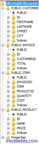
这里我们把 sample 数据库创建在 C:/hsqldb/data 目录下:
显示 Customer 表格的基本代码如下:
void openTable(VerticalLayout layout){ try { JDBCConnectionPool pool = new SimpleJDBCConnectionPool( "org.hsqldb.jdbc.JDBCDriver", "jdbc:hsqldb:file:/hsqldb/data/sample", "SA", "", 2, 5); TableQuery tq = new TableQuery("Customer", pool); tq.setVersionColumn("OPTLOCK"); SQLContainer container = new SQLContainer(tq); // Bind a table to it Table table = new Table("All customers", container); layout.addComponent(table);
} catch (SQLException e) {
// TODO Auto-generated catch block
e.printStackTrace();
}
}
可以看到使用 SQLContainer 的基本步骤如下:
1. 创建数据库连接 ,这里使用 SimpleJDBCConnectionPool
JDBCConnectionPool pool = new SimpleJDBCConnectionPool( "org.hsqldb.jdbc.JDBCDriver", "jdbc:hsqldb:file:/hsqldb/data/sample", "SA", "", 2, 5);
不同的数据可以的连接字符串 jdbc:hsqldb:file:/hsqldb/data/sample 不同,这里连接到一个文件数据库,如果使用内存数据库,连接字符串可以为 jdbc:hsqldb:mem:sqlcontainer。
2. 有了数据库连接之后,就可以创建一个 TableQuery,给出需要查询的数据库表名,本例使用表Customer.
3. 如果需要支持多用户连接数据库,可以设定数码库锁定的方式。 本例使用 OptimisticLock. ( 可选)
4. 最后创建一个 SQLContainer 对象。
显示如下:
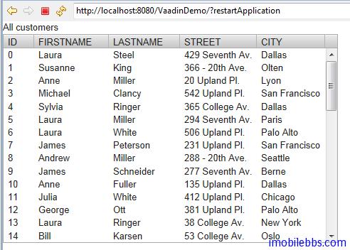
注意: 你需要将下载的 HSQLDB 数据库的 jar 包放在项目的 WebContent/WEB-INF/lib 目录下:
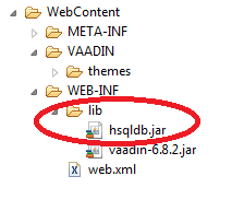
SQLContainer-过滤及排序
SQLContainer 的过滤及排序在设计时总是通过数据库操作来完成,也就是说在使用 Filter 和Sorting 时应用与数据库之间会发生通信。实际上 Filter 对应到 SQL 语句的 WHERE 语句,Sorting 则对应到 ORDER BY 语句。
除了 Container 支持的 Filter 之外(可以参见
Vaadin Web 应用开发教程(44): 使用 Container 接口管理一组 Item
),SQLContainer 也支持 Like 和 Between 过滤器。 它们也对应到WHERE语句。
比如我们要查询名字叫“John” 住在”New York” 的客户。
container.addContainerFilter( new And (new Equal("FIRSTNAME", "John"), new Equal("CITY","New York")));
这实际上是执行:
select * from customer
where FirstName='John' and city='New York'
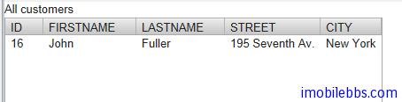
排序可以使用 Vaadin 提供的 Sort 方法,其参数定义如下:
public void sort(Object[] propertyId, boolean[] ascending)
此外还可以使用 addOrderBy 方法。
比如按客户的 FirstName 排序
container.addOrderBy(new OrderBy("FIRSTNAME",true));
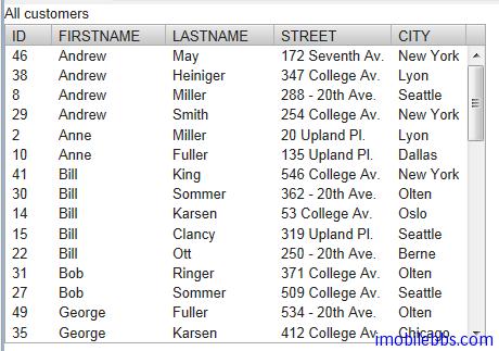
SQLContainer-编辑
和普通 Container 修改其中 Item 项类似,SQLContainer 可以使用类似的方法来编辑其中的Item。RowItem 的 ColumnProperties 会自动通知 SQLContainer 关于数据的变化并应用到数据库。
添加 Item
向 SQLContainer 中添加一项是通过方法 addItem()来完成的。这个方法将创建一个新的 Item,新创建的 Item 可以在内存中缓存或直接添加到数据库中。这取决于 SQLContainer 的 auto commit 模式。
实际也只能通过 addItem() 方法向 SQLContainer 中添加记录,其它由 Container 定义的方法SQLContainer 并不支持:
public boolean addContainerProperty(Object propertyId, Class<?> type, Object defaultValue) public boolean removeContainerProperty(Object propertyId) public Item addItem(Object itemId) public Object addItemAt(int index) public Item addItemAt(int index, Object newItemId) public Object addItemAfter(Object previousItemId) public Item addItemAfter(Object previousItemId, Object newItemId)
此外 RowItem 不支持的 Item 方法有:
public boolean addItemProperty(Object id, Property property) public boolean removeItemProperty(Object id)
下面的例子向 Customer 表中添加一个记录 James ,Shen, Tribute Street, Perth
void addCustomer(SQLContainer sqlContainer){
sqlContainer.setAutoCommit(false);
TemporaryRowId rowId=(TemporaryRowId)sqlContainer.addItem();
if(rowId!=null){
RowItem rowItem=(RowItem)sqlContainer.getItem(rowId);
ColumnProperty firstName=(ColumnProperty)rowItem.getItemProperty("FIRSTNAME");
firstName.setValue("James");
ColumnProperty lastName=(ColumnProperty)rowItem.getItemProperty("LASTNAME");
lastName.setValue("Shen");
ColumnProperty street=(ColumnProperty)rowItem.getItemProperty("STREET");
street.setValue("Tribute Steet");
ColumnProperty city=(ColumnProperty)rowItem.getItemProperty("CITY");
city.setValue("Perth");
ColumnProperty Id=(ColumnProperty)rowItem.getItemProperty("ID");
Id.setValue(50);
rowItem.commit();
}
}
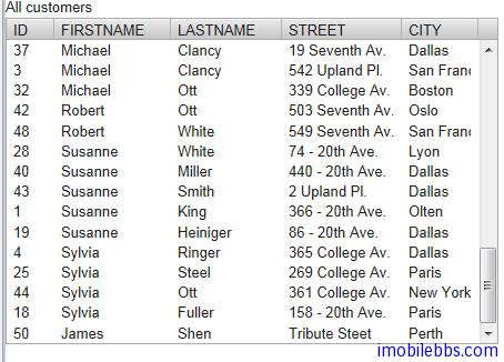
整体感觉使用 SQLContainer 编辑数据并不十分方便,还不如直接使用 SQL 语句或是使用hibernate.来的方便。
Tags:
Java EE
,
Vaadin
,
Web
SQLContainer-引用其它 SQLContainer
数据库表之间存在参考关键,这对应到数据库通常为外键引用。Vaadin 的 SQLContainer 提供了不同SQLContainer 之间引用的有限支持,但其实现主要是通过 Java 代码来实现的,并不需要数据库的表之间一定要有外键定义。
给一个 SQLContainer 添加引用的方法为:
public void addReference(SQLContainer refdCont,
String refingCol, String refdCol);
refdCont 为被引用的 SQLContainer,refingCol 为源 SQLContainer 对应的列名,refdCol 为目标 SQLContainer 被参照的列名。
要注意的是 SQLContainer 不支持同一个 SQLContainer 参照自身。
还是以 Customer ,Invoice 为例。 显示所有 Invoice,但点击某个 Invoice,显示对应的Customer 的姓名。
void openTable(VerticalLayout layout){ try { JDBCConnectionPool pool = new SimpleJDBCConnectionPool( "org.hsqldb.jdbc.JDBCDriver", "jdbc:hsqldb:file:/hsqldb/data/sample", "SA", "", 2, 5); TableQuery customers = new TableQuery("CUSTOMER", pool); customers.setVersionColumn("OPTLOCK"); TableQuery invoices = new TableQuery("INVOICE", pool); customers.setVersionColumn("OPTLOCK"); final SQLContainer customerContainer = new SQLContainer(customers); final SQLContainer invoiceContainer = new SQLContainer(invoices); Table table = new Table("All Invoices", invoiceContainer); table.setSelectable(true);
// Send changes in selection immediately to server.
table.setImmediate(true);
invoiceContainer.addReference(customerContainer,
"CUSTOMERID", "ID");
table.addListener(new ItemClickListener(){
public void itemClick(ItemClickEvent event) {
RowItem rowItem=(RowItem)event.getItem();
RowItem customerItem
=(RowItem)invoiceContainer
.getReferencedItem(rowItem.getId(),
customerContainer);
customerLabel.setValue(customerItem
.getItemProperty("FIRSTNAME")
.toString()
+" "+ customerItem
.getItemProperty("LASTNAME")
.toString());
}});
layout.addComponent(table);
} catch (SQLException e) {
// TODO Auto-generated catch block
e.printStackTrace();
}
}
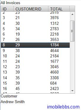
SQLContainer 和参照其它 SQLContainer 的主要方法如下:
public boolean setReferencedItem(Object itemId, Object refdItemId, SQLContainer refdCont) public Object getReferencedItemId(Object itemId, SQLContainer refdCont) public Item getReferencedItem(Object itemId, SQLContainer refdCont) public boolean removeReference(SQLContainer refdCont)
这里不再一一说明了。
Tags:
Java EE
,
Vaadin
,
Web
SQLContainer-使用 FreeformQuery
在大部分情況下使用 TableQuery 就可以滿足應用要求,如果需要使用複雜查詢,比如多表查詢,則可以使用 FreeformQuery。 預設情況下 FreeformQuery 為只讀,如果需要支持寫操作,可以自行實現FreeformQueryDelegate 介面。
// Read-only queries public StatementHelper getCountStatement() public StatementHelper getQueryStatement(int offset, int limit) public StatementHelper getContainsRowQueryStatement(Object... keys)
// Filtering and sorting public void setFilters(List filters) public void setFilters(List filters, FilteringMode filteringMode) public void setOrderBy(List orderBys)
// Write support public int storeRow(Connection conn, RowItem row) public boolean removeRow(Connection conn, RowItem row)
本例使用多表查詢,查詢語句如下:
SELECT C.FIRSTNAME , C.LASTNAME , INV.ID,INV.TOTAL FROM CUSTOMER C INNER JOIN INVOICE INV ON C.ID=INV.CUSTOMERID;
void openTable(VerticalLayout layout){ try { JDBCConnectionPool pool = new SimpleJDBCConnectionPool( "org.hsqldb.jdbc.JDBCDriver", "jdbc:hsqldb:file:/hsqldb/data/sample", "SA", "", 2, 5); FreeformQuery query = new FreeformQuery( "SELECT C.FIRSTNAME , " + "C.LASTNAME , INV.ID,INV.TOTAL " + "FROM CUSTOMER C " + "INNER JOIN INVOICE INV " + "ON C.ID=INV.CUSTOMERID;", pool, "ID"); SQLContainer container = new SQLContainer(query); Table table = new Table("All Invoices", container); table.setSelectable(true);
layout.addComponent(table);
} catch (SQLException e) {
// TODO Auto-generated catch block
e.printStackTrace();
}
}
```
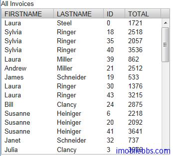
到目前為止,基本介紹完 SQLContainer 的用法,不過整體來說 SQLContainer 雖然使用簡單方便,當功能有限,對應複雜的資料庫應用還是可以直接使用 JDBC 和 JPA 等。


更多信息请访问

http://wiki.jikexueyuan.com/project/vaadin-web-development-tutorial/
