


温馨提示:本篇博客的详细代码已发布到 git : https://gitcode.com/nutpi/HarmonyosNext 可以下载运行哦!

HarmonyOS NEXT系列教程之 TabsConcaveCircle组件交互处理与事件响应
本文将详细介绍TabsConcaveCircle组件的交互处理和事件响应机制,包括点击事件处理、状态更新和视觉反馈。
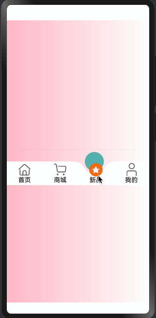
效果演示
1. 菜单项构建与交互
@Builder
TabItem(item: TabMenusInterfaceIRequired, index: number) {
  Column() {
    // 图片部分
    if (item.image) {
      Image(getImageUrl(item as TabMenusInterfaceIRequired, index, this.selectIndex))
        .size({
          width: this.imageWH,
          height: this.imageWH,
        })
        .interpolation(ImageInterpolation.High)
        .offset({
          y: this.selectIndex === index && this.animateSelectIndex === index ?
             -this.imageOffsetY : 0,
        })
        .id(`${this.concaveCircleId}${index}`)
    }

    // 文字部分
    Text(item.text)
      .maxLines(1)
      .textOverflow({ overflow: TextOverflow.Ellipsis })
      .textAlign(TextAlign.Center)
      .width("100%")
      .fontColor(this.selectIndex === index ?
        (item.tabsFontColor || this.tabsFontColor) :
        (item.tabsSelectFontColor || this.tabsSelectFontColor))
  }
  .onClick(() => {
    animateTo({
      duration: this.animateTime,
    }, () => {
      this.selectIndex = index;
    })
    this.createAnimation()
  })
  .layoutWeight(1)
  .height("100%")
  .justifyContent(FlexAlign.Center)
}
交互实现说明:
-
菜单项结构:
- 使用Column布局
- 包含可选的图片和必需的文字
- 自适应宽度(layoutWeight: 1)
-
点击事件处理:
- 使用onClick响应点击
- 通过animateTo创建过渡动画
- 更新选中索引
- 触发圆球动画
-
视觉反馈:
- 图片位置偏移
- 文字颜色变化
- 动画过渡效果
2. 状态监听与更新
@Link @Watch("getAnimateSelectIndex") selectIndex: number;
@State animateSelectIndex: number = 0;

getAnimateSelectIndex() {
  let animateDelay = 500;
  animateTo({
    duration: this.animateTime,
    delay: animateDelay
  }, () => {
    this.animateSelectIndex = this.selectIndex
  })
  this.createAnimation()
}
状态管理说明:
-
状态定义:
selectIndex: 当前选中项,支持双向绑定animateSelectIndex: 动画控制状态
-
状态监听:
- 使用@Watch监听selectIndex变化
- 触发动画状态更新
- 同步更新UI显示
-
动画控制:
- 设置延迟和持续时间
- 同步更新状态
- 触发相关动画
3. 组件生命周期处理
aboutToAppear(): void {
  this.listener = inspector.createComponentObserver(`${this.concaveCircleId}0`)
  this.getImageOffsetY()
  this.animateSelectIndex = this.selectIndex;
}

getImageOffsetY() {
  let onLayoutComplete: () => void = (): void => {
    let modePosition = componentUtils.getRectangleById(`${this.concaveCircleId}0`)
    if (modePosition.localOffset) {
      let halfHeight = px2vp(modePosition.size.height) / 2;
      this.imageOffsetY = px2vp(modePosition.localOffset.y) + halfHeight;
      this.listener?.off('draw')
    }
  }
  let FuncDraw = onLayoutComplete;
  this.listener?.on('draw', FuncDraw)
}
生命周期管理:
-
初始化处理:
- 创建组件观察器
- 计算图片偏移量
- 同步选中状态
-
布局完成处理:
- 获取组件位置信息
- 计算偏移量
- 清理监听器
-
事件监听:
- 监听draw事件
- 更新组件状态
- 处理布局变化
4. 组件属性配置
@Prop tabHeight: number = 60;
@Prop tabsBgColor: string = "rgb(255, 255, 255)";
@Prop tabsSelectBgColor: Color | number | string | Resource = "rgba(92, 187, 183,1)";
@Prop tabsFontColor: Color = Color.Black;
@Prop tabsSelectFontColor: Color = Color.Black;
属性配置说明:
-
尺寸配置:
tabHeight: 控制整体高度
-
颜色配置:
tabsBgColor: 背景颜色tabsSelectBgColor: 选中状态颜色tabsFontColor: 文字颜色tabsSelectFontColor: 选中文字颜色
-
属性使用:
- 支持多种颜色格式
- 提供默认值
- 允许外部覆盖
总结
TabsConcaveCircle组件的交互系统主要包含:
- 完整的点击事件处理
- 状态管理和更新机制
- 生命周期管理
- 灵活的属性配置
通过这些实现,组件能够:
- 响应用户交互
- 提供流畅的动画效果
- 维护一致的状态
- 支持灵活的定制
这些特性共同构建了一个专业、可靠的底部导航栏组件,为应用提供了良好的用户体验。
「喜欢这篇文章,您的关注和赞赏是给作者最好的鼓励」
关注作者
【版权声明】本文为墨天轮用户原创内容,转载时必须标注文章的来源(墨天轮),文章链接,文章作者等基本信息,否则作者和墨天轮有权追究责任。如果您发现墨天轮中有涉嫌抄袭或者侵权的内容,欢迎发送邮件至:contact@modb.pro进行举报,并提供相关证据,一经查实,墨天轮将立刻删除相关内容。
