


[HarmonyOS NEXT 实战案例十五] 电商分类导航网格布局(进阶篇)
项目已开源,开源地址: https://gitcode.com/nutpi/HarmonyosNextCaseStudyTutorial , 欢迎fork & star
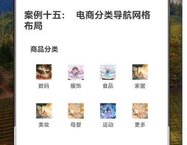
效果演示
1. 概述
在上一篇教程中,我们学习了如何使用HarmonyOS NEXT的GridRow和GridCol组件实现基础的电商分类导航网格布局。本篇教程将在此基础上,深入探讨如何优化和扩展电商分类导航,实现更加灵活、美观和功能丰富的界面。
本教程将涵盖以下内容:
- 响应式布局设计
- 分类项的交互设计
- 动画效果实现
- 主题与样式定制
- 二级分类展示
- GridRow和GridCol的高级配置
2. 响应式布局设计
2.1 断点配置
为了使电商分类导航能够适应不同屏幕尺寸,我们需要配置GridRow的断点和列数:
GridRow({
    columns: {
        xs: 2,  // 超小屏幕设备(如小型手机)使用2列布局
        sm: 3,  // 小屏幕设备(如手机)使用3列布局
        md: 4,  // 中等屏幕设备(如平板)使用4列布局
        lg: 6   // 大屏幕设备(如桌面)使用6列布局
    },
    gutter: { x: 12, y: 16 }  // 设置水平间距为12像素,垂直间距为16像素
}) {
    // 分类项内容
}
2.2 自定义断点
我们可以通过breakpoints属性自定义断点值:
GridRow({
    columns: {
        xs: 2,
        sm: 3,
        md: 4,
        lg: 6
    },
    breakpoints: {
        value: ['320vp', '600vp', '840vp', '1080vp'],
        reference: BreakpointsReference.WindowSize
    },
    gutter: { x: 12, y: 16 }
}) {
    // 分类项内容
}
这里我们自定义了四个断点值:320vp、600vp、840vp和1080vp,并设置参照为窗口尺寸。
2.3 分类项的响应式布局
在不同的屏幕尺寸下,分类项的样式也需要调整:
GridCol({
    span: 1
}) {
    Column() {
        // 小屏幕下使用较小的图标和字体
        if (MediaQueryCondition.SmallDevice()) {
            Image(category.icon)
                .width(32)
                .height(32)
                .margin({ bottom: 4 })

            Text(category.name)
                .fontSize(12)
        } else {
            // 中大屏幕下使用较大的图标和字体
            Image(category.icon)
                .width(48)
                .height(48)
                .margin({ bottom: 8 })

            Text(category.name)
                .fontSize(14)
        }
    }
    .padding(MediaQueryCondition.SmallDevice() ? 8 : 12)
    .backgroundColor('#FFFFFF')
    .borderRadius(8)
    .width('100%')
    .justifyContent(FlexAlign.Center)
}
3. 分类项的交互设计
3.1 点击效果
为分类项添加点击效果,提升用户体验:
@State selectedCategory: string = ''

Column() {
    // 分类项内容
}
.padding(12)
.backgroundColor(category.name === this.selectedCategory ? '#F0F9FF' : '#FFFFFF')
.borderRadius(8)
.width('100%')
.justifyContent(FlexAlign.Center)
.onClick(() => {
    this.selectedCategory = category.name
    // 处理分类点击事件,如跳转到对应分类页面
    console.info(`点击了分类:${category.name}`)
})
3.2 悬停效果
为分类项添加悬停效果,增强交互反馈:
@State hoveredCategory: string = ''

Column() {
    // 分类项内容
}
.padding(12)
.backgroundColor(category.name === this.hoveredCategory ? '#F5F5F5' : '#FFFFFF')
.borderRadius(8)
.width('100%')
.justifyContent(FlexAlign.Center)
.onHover((isHover: boolean) => {
    this.hoveredCategory = isHover ? category.name : ''
})
.onClick(() => {
    this.selectedCategory = category.name
    // 处理分类点击事件
})
4. 动画效果实现
4.1 分类项进入动画
为分类项添加进入动画,使界面更加生动:
@State animationIndex: number = 0

GridRow({
    columns: 4,
    gutter: 12
}) {
    ForEach(this.categories, (category: CategoryType, index: number) => {
        GridCol({ span: 1 }) {
            Column() {
                // 分类项内容
            }
            .padding(12)
            .backgroundColor('#FFFFFF')
            .borderRadius(8)
            .width('100%')
            .justifyContent(FlexAlign.Center)
            .opacity(this.animationIndex > index ? 1 : 0)
            .translate({ x: this.animationIndex > index ? 0 : 20 })
            .transition({
                type: TransitionType.Insert,
                opacity: 1,
                translate: { x: 0 },
                scale: { x: 1, y: 1 },
                delay: 50 * index,
                duration: 300,
                curve: Curve.EaseOut
            })
        }
    })
}

// 在组件挂载后启动动画
aboutToAppear() {
    setTimeout(() => {
        this.animationIndex = this.categories.length
    }, 100)
}
4.2 点击动画
为分类项添加点击动画,增强交互反馈:
@State pressedCategory: string = ''

Column() {
    // 分类项内容
}
.padding(12)
.backgroundColor('#FFFFFF')
.borderRadius(8)
.width('100%')
.justifyContent(FlexAlign.Center)
.scale({ x: category.name === this.pressedCategory ? 0.95 : 1, y: category.name === this.pressedCategory ? 0.95 : 1 })
.onTouch((event: TouchEvent) => {
    if (event.type === TouchType.Down) {
        this.pressedCategory = category.name
    } else if (event.type === TouchType.Up) {
        this.pressedCategory = ''
    }
})
.onClick(() => {
    this.selectedCategory = category.name
    // 处理分类点击事件
})
5. 主题与样式定制
5.1 分类项样式变体
创建不同样式的分类项,增加界面的视觉多样性:
private getCategoryStyle(index: number): Object {
    const styles = [
        { bgColor: '#F0F9FF', borderColor: '#1890FF' },
        { bgColor: '#FFF7E6', borderColor: '#FA8C16' },
        { bgColor: '#F6FFED', borderColor: '#52C41A' },
        { bgColor: '#FFF1F0', borderColor: '#F5222D' }
    ]
    return styles[index % styles.length]
}

Column() {
    // 分类项内容
}
.padding(12)
.backgroundColor(this.getCategoryStyle(index).bgColor)
.border({
    width: 1,
    color: this.getCategoryStyle(index).borderColor,
    style: BorderStyle.Solid
})
.borderRadius(8)
.width('100%')
.justifyContent(FlexAlign.Center)
5.2 自定义主题
添加主题切换功能,支持浅色和深色主题:
@State isDarkMode: boolean = false

// 在标题区域添加主题切换按钮
Row() {
    Text('商品分类')
        .fontSize(18)
        .fontWeight(FontWeight.Bold)
        .layoutWeight(1)
        .fontColor(this.isDarkMode ? '#FFFFFF' : '#000000')

    Toggle({ type: ToggleType.Switch, isOn: this.isDarkMode })
        .onChange((isOn: boolean) => {
            this.isDarkMode = isOn
        })
}
.width('100%')
.margin({ bottom: 16 })

// 根据主题模式设置全局背景色和文本颜色
Column() {
    // 内容
}
.width('100%')
.padding(16)
.backgroundColor(this.isDarkMode ? '#121212' : '#F5F5F5')
然后更新分类项的样式:
Column() {
    Image(category.icon)
        .width(40)
        .height(40)
        .margin({ bottom: 8 })

    Text(category.name)
        .fontSize(14)
        .fontColor(this.isDarkMode ? '#E0E0E0' : '#000000')
}
.padding(12)
.backgroundColor(this.isDarkMode ? '#1E1E1E' : '#FFFFFF')
.borderRadius(8)
.width('100%')
.justifyContent(FlexAlign.Center)
6. 二级分类展示
6.1 二级分类数据结构
扩展分类数据结构,添加二级分类:
interface SubCategoryType {
    name: string;
    icon?: Resource;
}

interface CategoryType {
    name: string;
    icon: Resource;
    subCategories?: SubCategoryType[];
}

private categories: CategoryType[] = [
    {
        name: '数码',
        icon: $r("app.media.big20"),
        subCategories: [
            { name: '手机' },
            { name: '电脑' },
            { name: '相机' },
            { name: '耳机' },
            { name: '平板' },
            { name: '智能手表' }
        ]
    },
    // 其他分类...
]
6.2 二级分类展示实现
当用户点击一级分类时,展示对应的二级分类:
@State selectedCategory: string = ''
@State showSubCategories: boolean = false

build() {
    Column() {
        // 标题
        Text('商品分类')
            .fontSize(18)
            .fontWeight(FontWeight.Bold)
            .margin({ bottom: 16 })
            .width('100%')
            .textAlign(TextAlign.Start)

        // 一级分类网格
        GridRow({ columns: 4, gutter: 12 }) {
            // 一级分类内容
        }

        // 二级分类展示
        if (this.showSubCategories && this.selectedCategory) {
            Column() {
                Row() {
                    Text(this.selectedCategory + '分类')
                        .fontSize(16)
                        .fontWeight(FontWeight.Bold)

                    Blank()

                    Button('关闭')
                        .fontSize(14)
                        .height(32)
                        .backgroundColor('#FFFFFF')
                        .fontColor('#333333')
                        .onClick(() => {
                            this.showSubCategories = false
                        })
                }
                .width('100%')
                .margin({ top: 16, bottom: 12 })

                GridRow({ columns: 3, gutter: 8 }) {
                    ForEach(this.getSubCategories(), (subCategory: SubCategoryType) => {
                        GridCol({ span: 1 }) {
                            Text(subCategory.name)
                                .fontSize(14)
                                .padding(8)
                                .backgroundColor('#FFFFFF')
                                .borderRadius(4)
                                .width('100%')
                                .textAlign(TextAlign.Center)
                        }
                    })
                }
            }
            .width('100%')
            .padding(12)
            .backgroundColor('#F0F0F0')
            .borderRadius(8)
            .margin({ top: 16 })
        }
    }
    .width('100%')
    .padding(16)
}

private getSubCategories(): SubCategoryType[] {
    const category = this.categories.find(item => item.name === this.selectedCategory)
    return category?.subCategories || []
}
7. GridRow和GridCol的高级配置
7.1 嵌套网格
使用嵌套的GridRow和GridCol实现更复杂的布局:
GridRow({ columns: 12 }) {
    // 左侧大分类
    GridCol({ span: 6 }) {
        Column() {
            Image($r("app.media.big01"))
                .width('100%')
                .aspectRatio(1.5)
                .borderRadius(8)

            Text('热门推荐')
                .fontSize(16)
                .fontWeight(FontWeight.Bold)
                .margin({ top: 8 })
        }
        .width('100%')
    }

    // 右侧小分类网格
    GridCol({ span: 6 }) {
        GridRow({ columns: 2, gutter: 8 }) {
            ForEach(this.categories.slice(0, 4), (category: CategoryType) => {
                GridCol({ span: 1 }) {
                    Column() {
                        Image(category.icon)
                            .width(32)
                            .height(32)
                            .margin({ bottom: 4 })

                        Text(category.name)
                            .fontSize(12)
                    }
                    .padding(8)
                    .backgroundColor('#FFFFFF')
                    .borderRadius(8)
                    .width('100%')
                    .justifyContent(FlexAlign.Center)
                }
            })
        }
    }
}
7.2 列偏移
使用offset属性实现列偏移,创建不对称布局:
GridRow({ columns: 12 }) {
    GridCol({ span: 8 }) {
        // 主要分类区域
    }

    GridCol({ span: 3, offset: 1 }) {
        // 侧边推荐区域
    }
}
7.3 列顺序调整
使用order属性调整列的显示顺序:
GridRow({ columns: 3 }) {
    GridCol({ span: 1, order: 2 }) {
        // 内容A,显示顺序为2
    }

    GridCol({ span: 1, order: 3 }) {
        // 内容B,显示顺序为3
    }

    GridCol({ span: 1, order: 1 }) {
        // 内容C,显示顺序为1
    }
}
8. 完整优化代码
下面是电商分类导航网格布局的优化完整代码:
// 电商分类导航网格布局(优化版)
interface SubCategoryType {
    name: string;
    icon?: Resource;
}

interface CategoryType {
    name: string;
    icon: Resource;
    subCategories?: SubCategoryType[];
}

@Component
export struct CategoryGridAdvanced {
    private categories: CategoryType[] = [
        {
            name: '数码',
            icon: $r("app.media.big20"),
            subCategories: [
                { name: '手机' },
                { name: '电脑' },
                { name: '相机' },
                { name: '耳机' },
                { name: '平板' },
                { name: '智能手表' }
            ]
        },
        {
            name: '服饰',
            icon: $r("app.media.big30"),
            subCategories: [
                { name: '男装' },
                { name: '女装' },
                { name: '童装' },
                { name: '内衣' },
                { name: '鞋靴' },
                { name: '箱包' }
            ]
        },
        {
            name: '食品',
            icon: $r("app.media.big26"),
            subCategories: [
                { name: '零食' },
                { name: '饮料' },
                { name: '生鲜' },
                { name: '粮油' },
                { name: '调味品' },
                { name: '进口食品' }
            ]
        },
        {
            name: '家居',
            icon: $r("app.media.big13"),
            subCategories: [
                { name: '家具' },
                { name: '家纺' },
                { name: '灯具' },
                { name: '厨具' },
                { name: '收纳' },
                { name: '装饰品' }
            ]
        },
        {
            name: '美妆',
            icon: $r("app.media.big11"),
            subCategories: [
                { name: '护肤' },
                { name: '彩妆' },
                { name: '香水' },
                { name: '美发' },
                { name: '美甲' },
                { name: '工具' }
            ]
        },
        {
            name: '母婴',
            icon: $r("app.media.big15"),
            subCategories: [
                { name: '奶粉' },
                { name: '尿裤' },
                { name: '玩具' },
                { name: '童车' },
                { name: '童装' },
                { name: '孕产' }
            ]
        },
        {
            name: '运动',
            icon: $r("app.media.big19"),
            subCategories: [
                { name: '跑步' },
                { name: '健身' },
                { name: '球类' },
                { name: '户外' },
                { name: '游泳' },
                { name: '瑜伽' }
            ]
        },
        {
            name: '更多',
            icon: $r("app.media.big14"),
            subCategories: [
                { name: '图书' },
                { name: '文具' },
                { name: '宠物' },
                { name: '汽车' },
                { name: '医药' },
                { name: '家电' }
            ]
        }
    ]

    @State selectedCategory: string = ''
    @State showSubCategories: boolean = false
    @State hoveredCategory: string = ''
    @State pressedCategory: string = ''
    @State animationIndex: number = 0
    @State isDarkMode: boolean = false

    aboutToAppear() {
        setTimeout(() => {
            this.animationIndex = this.categories.length
        }, 100)
    }

    build() {
        Column() {
            // 标题和主题切换
            Row() {
                Text('商品分类')
                    .fontSize(18)
                    .fontWeight(FontWeight.Bold)
                    .layoutWeight(1)
                    .fontColor(this.isDarkMode ? '#FFFFFF' : '#000000')

                Toggle({ type: ToggleType.Switch, isOn: this.isDarkMode })
                    .onChange((isOn: boolean) => {
                        this.isDarkMode = isOn
                    })
            }
            .width('100%')
            .margin({ bottom: 16 })

            // 一级分类网格
            GridRow({
                columns: {
                    xs: 2,  // 超小屏幕设备使用2列布局
                    sm: 3,  // 小屏幕设备使用3列布局
                    md: 4,  // 中等屏幕设备使用4列布局
                    lg: 6   // 大屏幕设备使用6列布局
                },
                gutter: { x: 12, y: 16 },
                breakpoints: {
                    value: ['320vp', '600vp', '840vp', '1080vp'],
                    reference: BreakpointsReference.WindowSize
                }
            }) {
                ForEach(this.categories, (category: CategoryType, index: number) => {
                    GridCol({ span: 1 }) {
                        Column() {
                            // 小屏幕下使用较小的图标和字体
                            if (MediaQueryCondition.SmallDevice()) {
                                Image(category.icon)
                                    .width(32)
                                    .height(32)
                                    .margin({ bottom: 4 })

                                Text(category.name)
                                    .fontSize(12)
                                    .fontColor(this.isDarkMode ? '#E0E0E0' : '#000000')
                            } else {
                                // 中大屏幕下使用较大的图标和字体
                                Image(category.icon)
                                    .width(48)
                                    .height(48)
                                    .margin({ bottom: 8 })

                                Text(category.name)
                                    .fontSize(14)
                                    .fontColor(this.isDarkMode ? '#E0E0E0' : '#000000')
                            }
                        }
                        .padding(MediaQueryCondition.SmallDevice() ? 8 : 12)
                        .backgroundColor(this.isDarkMode ? '#1E1E1E' :
                            (category.name === this.selectedCategory ? '#F0F9FF' :
                                (category.name === this.hoveredCategory ? '#F5F5F5' : '#FFFFFF')))
                        .borderRadius(8)
                        .width('100%')
                        .justifyContent(FlexAlign.Center)
                        .scale({ x: category.name === this.pressedCategory ? 0.95 : 1, y: category.name === this.pressedCategory ? 0.95 : 1 })
                        .opacity(this.animationIndex > index ? 1 : 0)
                        .translate({ x: this.animationIndex > index ? 0 : 20 })
                        .transition({
                            type: TransitionType.Insert,
                            opacity: 1,
                            translate: { x: 0 },
                            scale: { x: 1, y: 1 },
                            delay: 50 * index,
                            duration: 300,
                            curve: Curve.EaseOut
                        })
                        .onHover((isHover: boolean) => {
                            this.hoveredCategory = isHover ? category.name : ''
                        })
                        .onTouch((event: TouchEvent) => {
                            if (event.type === TouchType.Down) {
                                this.pressedCategory = category.name
                            } else if (event.type === TouchType.Up) {
                                this.pressedCategory = ''
                            }
                        })
                        .onClick(() => {
                            this.selectedCategory = category.name
                            this.showSubCategories = true
                            console.info(`点击了分类:${category.name}`)
                        })
                    }
                })
            }

            // 二级分类展示
            if (this.showSubCategories && this.selectedCategory) {
                Column() {
                    Row() {
                        Text(this.selectedCategory + '分类')
                            .fontSize(16)
                            .fontWeight(FontWeight.Bold)
                            .fontColor(this.isDarkMode ? '#E0E0E0' : '#000000')

                        Blank()

                        Button('关闭')
                            .fontSize(14)
                            .height(32)
                            .backgroundColor(this.isDarkMode ? '#333333' : '#FFFFFF')
                            .fontColor(this.isDarkMode ? '#E0E0E0' : '#333333')
                            .onClick(() => {
                                this.showSubCategories = false
                            })
                    }
                    .width('100%')
                    .margin({ top: 16, bottom: 12 })

                    GridRow({ columns: 3, gutter: 8 }) {
                        ForEach(this.getSubCategories(), (subCategory: SubCategoryType) => {
                            GridCol({ span: 1 }) {
                                Text(subCategory.name)
                                    .fontSize(14)
                                    .padding(8)
                                    .backgroundColor(this.isDarkMode ? '#1E1E1E' : '#FFFFFF')
                                    .fontColor(this.isDarkMode ? '#E0E0E0' : '#000000')
                                    .borderRadius(4)
                                    .width('100%')
                                    .textAlign(TextAlign.Center)
                            }
                        })
                    }
                }
                .width('100%')
                .padding(12)
                .backgroundColor(this.isDarkMode ? '#2D2D2D' : '#F0F0F0')
                .borderRadius(8)
                .margin({ top: 16 })
            }
        }
        .width('100%')
        .padding(16)
        .backgroundColor(this.isDarkMode ? '#121212' : '#F5F5F5')
    }

    private getSubCategories(): SubCategoryType[] {
        const category = this.categories.find(item => item.name === this.selectedCategory)
        return category?.subCategories || []
    }
}
9. GridRow和GridCol的高级配置详解
9.1 响应式布局配置
在本案例中,我们使用了GridRow的响应式配置:
GridRow({
    columns: {
        xs: 2,  // 超小屏幕设备使用2列布局
        sm: 3,  // 小屏幕设备使用3列布局
        md: 4,  // 中等屏幕设备使用4列布局
        lg: 6   // 大屏幕设备使用6列布局
    },
    gutter: { x: 12, y: 16 },
    breakpoints: {
        value: ['320vp', '600vp', '840vp', '1080vp'],
        reference: BreakpointsReference.WindowSize
    }
})
这种配置使分类导航能够根据屏幕尺寸自动调整布局:
- 在超小屏幕设备上,分类项以2列布局显示
- 在小屏幕设备上,分类项以3列布局显示
- 在中等屏幕设备上,分类项以4列布局显示
- 在大屏幕设备上,分类项以6列布局显示
9.2 断点配置详解
断点配置是响应式布局的关键:
breakpoints: {
    value: ['320vp', '600vp', '840vp', '1080vp'],
    reference: BreakpointsReference.WindowSize
}
这里定义了四个断点值:
- 320vp:超小屏幕设备(xs)
- 600vp:小屏幕设备(sm)
- 840vp:中等屏幕设备(md)
- 1080vp:大屏幕设备(lg)
reference: BreakpointsReference.WindowSize表示这些断点值是相对于窗口尺寸的。
9.3 嵌套网格详解
在二级分类部分,我们使用了嵌套的GridRow:
GridRow({ columns: 3, gutter: 8 }) {
    ForEach(this.getSubCategories(), (subCategory: SubCategoryType) => {
        GridCol({ span: 1 }) {
            // 二级分类内容
        }
    })
}
这种嵌套网格布局使二级分类的内容排列更加灵活,可以独立于一级分类的网格布局。
10. 响应式布局最佳实践
10.1 移动优先设计
在设计响应式布局时,应采用移动优先的策略:
- 首先为小屏幕设备设计基础布局
- 然后逐步扩展到更大屏幕的布局
这种方法确保在小屏幕设备上有良好的用户体验,同时在大屏幕设备上充分利用额外的空间。
10.2 内容优先级
在不同屏幕尺寸下,应根据内容的重要性调整显示方式:
- 在小屏幕上,只显示最重要的信息,如分类名称和小图标
- 在大屏幕上,可以显示更多详细信息,如更大的图标和更丰富的布局
在本案例中,我们通过MediaQueryCondition.SmallDevice()条件判断,在小屏幕上使用较小的图标和字体,在大屏幕上使用较大的图标和字体。
10.3 断点选择策略
选择断点值时,应考虑常见设备的屏幕尺寸:
- 320vp:小型手机
- 600vp:大型手机和小型平板
- 840vp:平板和小型桌面
- 1080vp:桌面和大屏设备
这些断点值覆盖了大多数常见设备,确保布局在各种设备上都有良好的表现。
11. 总结
本教程详细讲解了如何优化和扩展电商分类导航的网格布局,实现更加灵活、美观和功能丰富的界面。主要内容包括:
- 响应式布局设计:通过配置GridRow的断点和列数,使分类导航能够适应不同屏幕尺寸
- 分类项的交互设计:添加点击效果、悬停效果和点击动画,提升用户体验
- 动画效果实现:为分类项添加进入动画,使界面更加生动
- 主题与样式定制:添加主题切换功能,支持浅色和深色主题
- 二级分类展示:扩展分类数据结构,实现二级分类的展示
- GridRow和GridCol的高级配置:使用嵌套网格、列偏移和列顺序调整,实现更复杂的布局
通过这些优化和扩展,电商分类导航不仅在功能上更加完善,在视觉效果和用户体验上也有了显著提升。这些技术和方法可以应用到各种需要网格布局和响应式设计的场景中,帮助开发者创建更加专业和用户友好的应用界面。
