


[HarmonyOS NEXT 实战案例:电商应用] 进阶篇 - 交互功能与状态管理
项目已开源,开源地址: https://gitcode.com/nutpi/HarmonyosNextCaseStudyTutorial , 欢迎fork & star
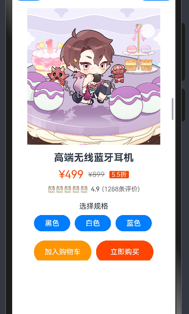
效果演示
引言
在基础篇中,我们学习了如何使用HarmonyOS NEXT的ColumnSplit组件构建电商商品详情页的基本布局。在本篇教程中,我们将进一步探讨如何为商品详情页添加交互功能和状态管理,包括商品规格选择、收藏状态切换、数量调整等功能,使界面更加动态和交互友好。
状态管理概述
在交互式应用中,状态管理是至关重要的。HarmonyOS NEXT提供了多种状态管理机制,如@State、@Prop、@Link等装饰器。在本案例中,我们将主要使用@State装饰器来管理组件内部状态。
| 状态变量 | 类型 | 功能描述 |
|---|---|---|
selectedColor |
string | 当前选中的商品颜色 |
isFavorite |
boolean | 商品是否被收藏 |
quantity |
number | 商品购买数量 |
selectedTab |
string | 当前选中的详情标签 |
代码实现
组件结构与状态定义
首先,我们在组件中定义状态变量:
@Component
export struct EcommerceProductExample {
    @State selectedColor: string = '黑色';
    @State isFavorite: boolean = false;
    @State quantity: number = 1;
    @State selectedTab: string = '商品详情';

    build() {
        // 组件内容
    }
}
外层容器
外层容器结构与基础篇相同,使用Column组件包含标题文本和主要内容区域:
Column() {
    Text('电商商品详情页布局')
        .fontSize(20)
        .fontWeight(FontWeight.Bold)
        .margin({ bottom: 10 })

    ColumnSplit() {
        // ColumnSplit内容
    }
    .height(600)
}
.padding(15)
商品图片区域与收藏功能
在商品图片区域,我们为收藏按钮添加点击事件,实现收藏状态的切换:
Stack() {
    Image($r('app.media.big30'))
        .width('100%')
        .height(300)
        .objectFit(ImageFit.Cover)

    // 收藏按钮
    Button(this.isFavorite ? $r('app.media.big29') : $r('app.media.big28'))
        .width(30)
        .height(30)
        .position({ x: '85%', y: 20 })
        .backgroundColor('#ffffff')
        .opacity(0.8)
        .borderRadius(20)
        .onClick(() => {
            this.isFavorite = !this.isFavorite;
        })
}
.height('45%')
在这个实现中:
- 我们使用三元运算符根据
isFavorite状态选择不同的图标 - 添加
onClick事件处理器,在点击时切换isFavorite状态
商品信息区域与规格选择
在商品信息区域,我们为规格选择按钮添加选中状态和点击事件:
Column() {
    // 商品名称和价格信息(与基础篇相同)

    // 商品规格选择
    Text('选择规格')
        .fontSize(16)
        .margin({ top: 20 })
    Row() {
        ForEach(['黑色', '白色', '蓝色'], (color: string) => {
            Button(color)
                .width(80)
                .height(36)
                .margin({ right: 10 })
                .borderRadius(5)
                .backgroundColor(this.selectedColor === color ? '#ff4500' : '#f5f5f5')
                .fontColor(this.selectedColor === color ? '#ffffff' : '#333333')
                .onClick(() => {
                    this.selectedColor = color;
                })
        })
    }
    .margin({ top: 10 })

    // 数量调整
    Row() {
        Text('数量')
            .fontSize(16)
        Blank()
        Button('-')
            .width(36)
            .height(36)
            .fontSize(18)
            .backgroundColor('#f5f5f5')
            .fontColor('#333333')
            .borderRadius(5)
            .enabled(this.quantity > 1)
            .opacity(this.quantity > 1 ? 1.0 : 0.5)
            .onClick(() => {
                if (this.quantity > 1) {
                    this.quantity--;
                }
            })
        Text(this.quantity.toString())
            .fontSize(16)
            .margin({ left: 10, right: 10 })
            .width(30)
            .textAlign(TextAlign.Center)
        Button('+')
            .width(36)
            .height(36)
            .fontSize(18)
            .backgroundColor('#f5f5f5')
            .fontColor('#333333')
            .borderRadius(5)
            .onClick(() => {
                this.quantity++;
            })
    }
    .width('100%')
    .margin({ top: 20 })

    // 购买按钮
    Row() {
        Button('加入购物车')
            .width('48%')
            .height(50)
            .fontSize(16)
            .backgroundColor('#ff9500')
            .onClick(() => {
                // 加入购物车逻辑
                console.info(`加入购物车:${this.selectedColor},数量:${this.quantity}`);
            })
        Button('立即购买')
            .width('48%')
            .height(50)
            .fontSize(16)
            .backgroundColor('#ff4500')
            .margin({ left: '4%' })
            .onClick(() => {
                // 立即购买逻辑
                console.info(`立即购买:${this.selectedColor},数量:${this.quantity}`);
            })
    }
    .margin({ top: 20 })

    // 详情标签页
    Row() {
        ForEach(['商品详情', '规格参数', '用户评价'], (tab: string) => {
            Text(tab)
                .fontSize(16)
                .fontWeight(this.selectedTab === tab ? FontWeight.Bold : FontWeight.Normal)
                .fontColor(this.selectedTab === tab ? '#ff4500' : '#333333')
                .padding({ left: 15, right: 15, top: 10, bottom: 10 })
                .borderBottom(this.selectedTab === tab ? { width: 2, color: '#ff4500' } : { width: 0 })
                .onClick(() => {
                    this.selectedTab = tab;
                })
        })
    }
    .margin({ top: 20 })
    .width('100%')

    // 详情内容(根据选中的标签显示不同内容)
    if (this.selectedTab === '商品详情') {
        Text('这是一款高端无线蓝牙耳机,采用最新蓝牙5.2技术,支持aptX HD高清音频编码,提供出色的音质和稳定的连接。')
            .fontSize(14)
            .margin({ top: 10 })
    } else if (this.selectedTab === '规格参数') {
        Column() {
            this.buildSpecItem('品牌', '某知名品牌')
            this.buildSpecItem('型号', 'XYZ-123')
            this.buildSpecItem('颜色', '黑色/白色/蓝色')
            this.buildSpecItem('蓝牙版本', '5.2')
            this.buildSpecItem('电池容量', '300mAh')
            this.buildSpecItem('续航时间', '约20小时')
        }
        .margin({ top: 10 })
        .alignItems(HorizontalAlign.Start)
        .width('100%')
    } else {
        Column() {
            this.buildReviewItem('用户A', 5, '音质非常好,续航也很给力!')
            this.buildReviewItem('用户B', 4, '整体不错,就是价格有点贵。')
            this.buildReviewItem('用户C', 5, '外观设计很漂亮,戴着也很舒适。')
        }
        .margin({ top: 10 })
        .alignItems(HorizontalAlign.Start)
        .width('100%')
    }
}
.padding(15)
在这个实现中,我们添加了以下功能:
-
规格选择:
- 根据
selectedColor状态设置按钮的背景色和文字颜色 - 添加
onClick事件处理器,在点击时更新selectedColor状态
- 根据
-
数量调整:
- 添加减少和增加按钮,以及显示当前数量的文本
- 为按钮添加
onClick事件处理器,更新quantity状态 - 当数量为1时,禁用减少按钮
-
购买按钮:
- 为按钮添加
onClick事件处理器,输出选中的颜色和数量
- 为按钮添加
-
详情标签页:
- 添加三个标签:商品详情、规格参数、用户评价
- 根据
selectedTab状态设置标签的样式 - 添加
onClick事件处理器,在点击时更新selectedTab状态 - 根据选中的标签显示不同的内容
辅助方法
为了显示规格参数和用户评价,我们添加了两个辅助方法:
private buildSpecItem(name: string, value: string) {
    Row() {
        Text(name)
            .fontSize(14)
            .fontColor('#666')
            .width('30%')
        Text(value)
            .fontSize(14)
            .fontColor('#333')
            .width('70%')
    }
    .width('100%')
    .padding({ top: 8, bottom: 8 })
    .borderBottom({ width: 1, color: '#f0f0f0' })
}

private buildReviewItem(user: string, rating: number, comment: string) {
    Column() {
        Row() {
            Text(user)
                .fontSize(14)
                .fontWeight(FontWeight.Bold)
            Blank()
            Row() {
                ForEach([1, 2, 3, 4, 5], (index: number) => {
                    Image($r('app.media.01'))
                        .width(16)
                        .height(16)
                        .margin({ right: 2 })
                        .opacity(index <= rating ? 1.0 : 0.3)
                })
            }
        }
        .width('100%')

        Text(comment)
            .fontSize(14)
            .margin({ top: 5 })
    }
    .width('100%')
    .padding({ top: 10, bottom: 10 })
    .borderBottom({ width: 1, color: '#f0f0f0' })
}
这些方法用于构建规格参数项和用户评价项,使代码更加模块化和可维护。
交互功能分析
收藏功能
收藏功能通过isFavorite状态变量来控制:
@State isFavorite: boolean = false;

// 收藏按钮
Button(this.isFavorite ? $r('app.media.big29') : $r('app.media.big28'))
    // 按钮属性
    .onClick(() => {
        this.isFavorite = !this.isFavorite;
    })
当用户点击收藏按钮时,isFavorite状态会切换,按钮图标也会相应地变化。
规格选择
规格选择通过selectedColor状态变量来控制:
@State selectedColor: string = '黑色';

// 规格选择按钮
Button(color)
    // 按钮属性
    .backgroundColor(this.selectedColor === color ? '#ff4500' : '#f5f5f5')
    .fontColor(this.selectedColor === color ? '#ffffff' : '#333333')
    .onClick(() => {
        this.selectedColor = color;
    })
当用户点击规格选择按钮时,selectedColor状态会更新为选中的颜色,按钮样式也会相应地变化。
数量调整
数量调整通过quantity状态变量来控制:
@State quantity: number = 1;

// 减少按钮
Button('-')
    // 按钮属性
    .enabled(this.quantity > 1)
    .opacity(this.quantity > 1 ? 1.0 : 0.5)
    .onClick(() => {
        if (this.quantity > 1) {
            this.quantity--;
        }
    })

// 数量显示
Text(this.quantity.toString())
    // 文本属性

// 增加按钮
Button('+')
    // 按钮属性
    .onClick(() => {
        this.quantity++;
    })
当用户点击减少或增加按钮时,quantity状态会相应地变化,数量显示也会更新。当数量为1时,减少按钮会被禁用。
详情标签页
详情标签页通过selectedTab状态变量来控制:
@State selectedTab: string = '商品详情';

// 标签按钮
Text(tab)
    // 文本属性
    .fontWeight(this.selectedTab === tab ? FontWeight.Bold : FontWeight.Normal)
    .fontColor(this.selectedTab === tab ? '#ff4500' : '#333333')
    .borderBottom(this.selectedTab === tab ? { width: 2, color: '#ff4500' } : { width: 0 })
    .onClick(() => {
        this.selectedTab = tab;
    })

// 详情内容
if (this.selectedTab === '商品详情') {
    // 商品详情内容
} else if (this.selectedTab === '规格参数') {
    // 规格参数内容
} else {
    // 用户评价内容
}
当用户点击标签按钮时,selectedTab状态会更新为选中的标签,标签样式和详情内容也会相应地变化。
状态管理技巧
状态变量的选择
在本案例中,我们使用@State装饰器来管理组件内部状态。@State装饰器适用于组件内部的状态管理,当状态变化时,组件会自动重新渲染。
@State selectedColor: string = '黑色';
@State isFavorite: boolean = false;
@State quantity: number = 1;
@State selectedTab: string = '商品详情';
条件渲染
我们使用条件渲染来根据状态显示不同的内容:
// 根据isFavorite状态选择不同的图标
Button(this.isFavorite ? $r('app.media.big29') : $r('app.media.big28'))

// 根据selectedTab状态显示不同的内容
if (this.selectedTab === '商品详情') {
    // 商品详情内容
} else if (this.selectedTab === '规格参数') {
    // 规格参数内容
} else {
    // 用户评价内容
}
状态更新
我们在事件处理器中更新状态:
// 更新isFavorite状态
.onClick(() => {
    this.isFavorite = !this.isFavorite;
})

// 更新selectedColor状态
.onClick(() => {
    this.selectedColor = color;
})

// 更新quantity状态
.onClick(() => {
    if (this.quantity > 1) {
        this.quantity--;
    }
})

// 更新selectedTab状态
.onClick(() => {
    this.selectedTab = tab;
})
当状态更新时,组件会自动重新渲染,显示最新的状态。
总结
在本教程中,我们学习了如何为电商商品详情页添加交互功能和状态管理,包括商品规格选择、收藏状态切换、数量调整和详情标签页等功能。
