


[HarmonyOS NEXT 实战案例:聊天应用] 基础篇 - 垂直分割布局构建聊天界面
项目已开源,开源地址: https://gitcode.com/nutpi/HarmonyosNextCaseStudyTutorial , 欢迎fork & star
效果演示
引言
聊天应用是现代移动应用中最常见和最重要的应用类型之一。一个设计良好的聊天界面应该能够清晰地展示联系人列表和聊天内容,提供流畅的用户体验。本教程将详细讲解如何使用HarmonyOS NEXT的ColumnSplit组件构建一个聊天应用界面,通过垂直分割布局将界面分为联系人列表和聊天区域两个主要部分。
组件概述
在本案例中,我们将使用以下HarmonyOS NEXT组件:
| 组件名称 | 功能描述 |
|---|---|
ColumnSplit |
垂直分割布局容器,将界面分为左右两部分 |
Column |
垂直布局容器,用于垂直排列子组件 |
Row |
水平布局容器,用于水平排列子组件 |
List |
列表容器,用于显示联系人列表和消息列表 |
ListItem |
列表项组件,用于显示单个联系人或消息 |
Text |
文本组件,用于显示联系人名称、消息内容等 |
Image |
图片组件,用于显示联系人头像 |
TextInput |
文本输入组件,用于输入消息 |
Button |
按钮组件,用于发送消息等操作 |
ForEach |
循环渲染组件,用于渲染联系人列表和消息列表 |
数据模型
在这个聊天应用案例中,我们定义了两个数据类型和三个状态变量:
数据类型
// 定义消息数据类型
interface Message {
    id: number
    content: string
    time: string
    isMe: boolean
}

// 定义联系人数据类型
interface Contact {
    id: number
    name: string
    avatar: Resource
    lastMessage: string
    time: string
    unread: number
}
这些数据类型用于:
Message:表示一条聊天消息,包含消息ID、内容、时间和是否是自己发送的标志Contact:表示一个联系人,包含联系人ID、名称、头像、最后一条消息、时间和未读消息数
状态变量
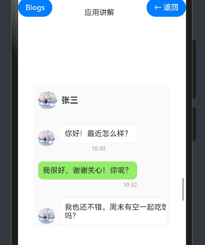
@State messages: Message[] = [
    { id: 1, content: '你好!最近怎么样?', time: '10:30', isMe: false },
    { id: 2, content: '我很好,谢谢关心!你呢?', time: '10:32', isMe: true },
    { id: 3, content: '我也还不错。周末有空一起吃饭吗?', time: '10:33', isMe: false },
    { id: 4, content: '好啊,周六中午怎么样?', time: '10:35', isMe: true },
]
@State newMessage: string = ''
@State contacts: Contact[] = [
    {
        id: 1,
        name: '张三',
        avatar: $r('app.media.big24'),
        lastMessage: '周六中午怎么样?',
        time: '10:35',
        unread: 0
    },
    {
        id: 2,
        name: '李四',
        avatar: $r('app.media.big23'),
        lastMessage: '项目文档已经发给你了',
        time: '昨天',
        unread: 3
    },
    {
        id: 3,
        name: '王五',
        avatar: $r('app.media.big21'),
        lastMessage: '下周会议时间确定了吗?',
        time: '周一',
        unread: 0
    }
]
@State currentContact: number = 1
这些状态变量用于:
messages:存储当前聊天的消息列表newMessage:存储用户正在输入的新消息contacts:存储联系人列表currentContact:存储当前选中的联系人ID
布局结构分析
我们的聊天应用布局采用了垂直分割的方式,将界面分为左右两个部分:
- 左侧:联系人列表区域,占总宽度的35%,包含搜索框和联系人列表
- 右侧:聊天区域,占总宽度的65%,包含聊天标题栏、消息列表和消息输入区域
整体布局结构如下:
Column (整体容器)
└── Text (标题)
└── ColumnSplit (垂直分割布局)
    ├── Column (左侧 - 联系人列表)
    │   ├── TextInput (搜索框)
    │   └── List (联系人列表)
    │       └── ForEach (循环渲染联系人)
    │           └── ListItem (联系人项)
    │               └── Row (联系人信息)
    │                   ├── Image (联系人头像)
    │                   ├── Column (联系人名称和最后消息)
    │                   │   ├── Row (联系人名称和时间)
    │                   │   │   ├── Text (联系人名称)
    │                   │   │   └── Text (时间)
    │                   │   └── Text (最后消息)
    │                   └── Text (未读消息数)
    └── Column (右侧 - 聊天区域)
        ├── Row (聊天标题栏)
        │   ├── Image (联系人头像)
        │   ├── Text (联系人名称)
        │   └── Button (更多按钮)
        ├── Column (消息列表)
        │   └── List (消息列表)
        │       └── ForEach (循环渲染消息)
        │           └── ListItem (消息项)
        │               └── Row (消息内容)
        │                   ├── Image (联系人头像,仅对方消息显示)
        │                   └── Column (消息内容和时间)
        │                       ├── Text (消息内容)
        │                       └── Text (时间)
        └── Row (消息输入区域)
            ├── Button (表情按钮)
            ├── TextInput (消息输入框)
            └── Button (发送按钮)
代码详解
组件定义与状态声明
@Component
export struct ChatAppExample {
    @State messages: Message[] = [
        // 消息数据
    ]
    @State newMessage: string = ''
    @State contacts: Contact[] = [
        // 联系人数据
    ]
    @State currentContact: number = 1

    build() {
        // 组件内容
    }

    private getCurrentContact(): Contact {
        return this.contacts.find(contact => contact.id === this.currentContact) || this.contacts[0]
    }

    private getCurrentTime(): string {
        const now = new Date()
        return `${now.getHours()}:${now.getMinutes().toString().padStart(2, '0')}`
    }
}
我们使用@Component装饰器定义了一个名为ChatAppExample的组件,并使用@State装饰器声明了四个状态变量,用于管理聊天应用的数据。此外,我们还定义了两个私有方法:
getCurrentContact():获取当前选中的联系人对象getCurrentTime():获取当前时间,格式为"小时:分钟"
整体布局结构
Column() {
    Text('聊天应用布局')
        .fontSize(20)
        .fontWeight(FontWeight.Bold)
        .margin({ bottom: 10 })

    ColumnSplit() {
        // 左侧联系人列表
        // 右侧聊天区域
    }
    .height(600)
}
.padding(15)
整体布局使用一个Column组件作为容器,包含一个标题文本和一个ColumnSplit组件。ColumnSplit组件的高度设置为600像素,整个Column容器设置了15像素的内边距。
左侧联系人列表
Column() {
    // 搜索框
    TextInput({ placeholder: '搜索联系人' })
        .width('90%')
        .height(40)
        .margin(10)
        .backgroundColor('#f5f5f5')
        .borderRadius(20)

    // 联系人列表
    List() {
        ForEach(this.contacts, (contact: Contact) => {
            ListItem() {
                Row() {
                    Image(contact.avatar)
                        .width(50)
                        .height(50)
                        .borderRadius(25)
                        .margin({ right: 10 })

                    Column() {
                        Row() {
                            Text(contact.name)
                                .fontSize(16)
                                .fontWeight(FontWeight.Bold)
                                .layoutWeight(1)
                            Text(contact.time)
                                .fontSize(12)
                                .fontColor('#999999')
                        }

                        Text(contact.lastMessage)
                            .fontSize(14)
                            .fontColor('#666666')
                            .maxLines(1)
                            .textOverflow({ overflow: TextOverflow.Ellipsis })
                    }
                    .layoutWeight(1)

                    if (contact.unread > 0) {
                        Text(contact.unread.toString())
                            .fontSize(12)
                            .fontColor('#ffffff')
                            .backgroundColor('#ff0000')
                            .borderRadius(10)
                            .padding(5)
                            .width(20)
                            .height(20)
                            .textAlign(TextAlign.Center)
                    }
                }
                .padding(10)
                .width('100%')
                .backgroundColor(this.currentContact === contact.id ? '#e6f7ff' : '#ffffff')
            }
            .onClick(() => {
                this.currentContact = contact.id
            })
        })
    }
    .width('100%')
    .layoutWeight(1)
}
.width('35%')
.backgroundColor('#ffffff')
左侧联系人列表区域使用一个Column组件,宽度设置为总宽度的35%,背景色为白色。包含以下内容:
-
搜索框:使用
TextInput组件,设置了宽度、高度、外边距、背景色和圆角。 -
联系人列表:使用
List组件,宽度为100%,布局权重为1(占据剩余空间)。使用ForEach组件循环渲染联系人列表,每个联系人使用一个ListItem组件显示。 -
联系人项:每个联系人项使用一个
Row组件水平排列联系人信息,包括:- 联系人头像:使用
Image组件,设置了宽度、高度、圆角和右边距。 - 联系人信息:使用
Column组件垂直排列联系人名称、时间和最后一条消息。 - 未读消息数:如果有未读消息,使用
Text组件显示未读消息数,设置了字体大小、字体颜色、背景色、圆角、内边距、宽度、高度和文本对齐方式。
- 联系人头像:使用
-
选中状态:根据当前选中的联系人ID设置背景色,选中的联系人背景色为浅蓝色,未选中的联系人背景色为白色。
-
点击事件:为每个联系人项添加点击事件,点击时更新当前选中的联系人ID。
右侧聊天区域
Column() {
    // 聊天标题栏
    Row() {
        Image(this.getCurrentContact().avatar)
            .width(40)
            .height(40)
            .borderRadius(20)
            .margin({ right: 10 })

        Text(this.getCurrentContact().name)
            .fontSize(18)
            .fontWeight(FontWeight.Bold)
            .layoutWeight(1)

        Button($r('app.media.01'))
            .width(24)
            .height(24)
            .backgroundColor(Color.Transparent)
    }
    .padding(10)
    .border({
        width: {  top: 0, bottom: 1,  left: 0, right: 0},
        color: '#f0f0f0',
        style: {
            bottom: BorderStyle.Solid,
        }
    })

    // 消息列表
    Column() {
        List() {
            ForEach(this.messages, (message: Message) => {
                ListItem() {
                    if (message.isMe) {
                        // 自己发送的消息
                        Row() {
                            Column() {
                                Text(message.content)
                                    .fontSize(16)
                                    .backgroundColor('#95ec69')
                                    .padding(10)
                                    .borderRadius(10)
                                Text(message.time)
                                    .fontSize(12)
                                    .fontColor('#999999')
                                    .margin({ top: 5 })
                                    .alignSelf(ItemAlign.End)
                            }
                            .margin({ right: 10 })
                        }
                        .justifyContent(FlexAlign.End)
                        .margin({ top: 10, bottom: 10 })
                    } else {
                        // 对方发送的消息
                        Row() {
                            Image(this.getCurrentContact().avatar)
                                .width(36)
                                .height(36)
                                .borderRadius(18)
                                .margin({ right: 10 })

                            Column() {
                                Text(message.content)
                                    .fontSize(16)
                                    .backgroundColor('#ffffff')
                                    .padding(10)
                                    .borderRadius(10)
                                    .border({ width: 1, color: '#f0f0f0' })
                                Text(message.time)
                                    .fontSize(12)
                                    .fontColor('#999999')
                                    .margin({ top: 5 })
                            }
                        }
                        .margin({ top: 10, bottom: 10 })
                    }
                }
            })
        }
        .width('100%')
        .layoutWeight(1)
    }
    .padding(10)

    // 消息输入区域
    Row() {
        Button($r('app.media.02'))
            .width(30)
            .height(30)
            .backgroundColor(Color.Transparent)

        TextInput({ text: this.newMessage, placeholder: '输入消息...' })
            .height(40)
            .layoutWeight(1)
            .margin({ left: 10, right: 10 })
            .borderRadius(20)
            .backgroundColor('#f5f5f5')
            .onChange((value: string) => {
                this.newMessage = value
            })

        Button($r('app.media.03'))
            .width(30)
            .height(30)
            .backgroundColor(Color.Transparent)
            .onClick(() => {
                if (this.newMessage.trim() !== '') {
                    this.messages.push({
                        id: this.messages.length + 1,
                        content: this.newMessage,
                        time: this.getCurrentTime(),
                        isMe: true
                    })
                    this.newMessage = ''
                }
            })
    }
    .padding(10)
    .border({
        width:{top:1,bottom:0,left:0,right:0},
        color:'#f0f0f0',
        style: {
            top: BorderStyle.Solid
        }
    })
}
.backgroundColor('#fafafa')
右侧聊天区域使用一个Column组件,背景色为浅灰色。包含以下内容:
-
聊天标题栏:使用
Row组件水平排列聊天标题栏内容,包括:- 联系人头像:使用
Image组件,显示当前选中联系人的头像。 - 联系人名称:使用
Text组件,显示当前选中联系人的名称。 - 更多按钮:使用
Button组件,显示更多操作的按钮。
整个标题栏设置了内边距和底部边框。
- 联系人头像:使用
-
消息列表:使用
Column组件包裹一个List组件,宽度为100%,布局权重为1(占据剩余空间)。使用ForEach组件循环渲染消息列表,每条消息使用一个ListItem组件显示。 -
消息项:根据消息是否是自己发送的,使用不同的布局:
- 自己发送的消息:使用
Row组件水平排列,靠右对齐。消息内容使用绿色背景,时间显示在消息下方,靠右对齐。 - 对方发送的消息:使用
Row组件水平排列,靠左对齐。包含联系人头像和消息内容,消息内容使用白色背景和灰色边框,时间显示在消息下方。
- 自己发送的消息:使用
-
消息输入区域:使用
Row组件水平排列消息输入区域内容,包括:- 表情按钮:使用
Button组件,显示表情选择按钮。 - 消息输入框:使用
TextInput组件,设置了高度、布局权重、外边距、圆角和背景色。通过onChange事件监听用户输入,并更新newMessage状态变量。 - 发送按钮:使用
Button组件,显示发送消息按钮。通过onClick事件监听用户点击,当消息不为空时,将新消息添加到消息列表中,并清空输入框。
整个输入区域设置了内边距和顶部边框。
- 表情按钮:使用
布局技巧
1. 比例设置
在本案例中,我们使用百分比设置左侧联系人列表区域的宽度:
.width('35%')
这样可以确保在不同屏幕尺寸下,左侧区域始终占据总宽度的35%,右侧区域占据剩余的65%。
2. 布局权重
我们使用layoutWeight属性使某些组件占据剩余空间:
.layoutWeight(1)
这样可以确保这些组件能够自适应地占据剩余空间,使布局更加灵活。
3. 边框与分隔线
我们使用边框属性创建分隔线,使界面结构更加清晰:
.border({
    width: {  top: 0, bottom: 1,  left: 0, right: 0},
    color: '#f0f0f0',
    style: {
        bottom: BorderStyle.Solid,
    }
})
这种方式可以只在需要的边添加边框,而不是所有边都添加,使界面更加简洁。
4. 条件渲染
我们使用条件渲染显示或隐藏某些组件,如未读消息数和不同类型的消息布局:
if (contact.unread > 0) {
    // 显示未读消息数
}

if (message.isMe) {
    // 显示自己发送的消息
} else {
    // 显示对方发送的消息
}
这种方式可以根据数据的不同状态动态调整界面,提供更加个性化的用户体验。
5. 文本溢出处理
对于可能过长的文本,我们使用maxLines和textOverflow属性处理文本溢出:
.maxLines(1)
.textOverflow({ overflow: TextOverflow.Ellipsis })
这样可以确保文本不会超出预定的区域,而是以省略号结尾,保持界面的整洁。
交互实现
1. 联系人选择
.onClick(() => {
    this.currentContact = contact.id
})
我们为每个联系人项添加点击事件,点击时更新当前选中的联系人ID。通过改变背景色,用户可以清楚地看到当前选中的联系人。
2. 消息发送
.onClick(() => {
    if (this.newMessage.trim() !== '') {
        this.messages.push({
            id: this.messages.length + 1,
            content: this.newMessage,
            time: this.getCurrentTime(),
            isMe: true
        })
        this.newMessage = ''
    }
})
我们为发送按钮添加点击事件,点击时检查消息是否为空,如果不为空,则将新消息添加到消息列表中,并清空输入框。新消息包含ID、内容、时间和是否是自己发送的标志。
3. 消息输入
.onChange((value: string) => {
    this.newMessage = value
})
我们为消息输入框添加onChange事件,监听用户输入,并更新newMessage状态变量。
小结
在本教程中,我们详细讲解了如何使用HarmonyOS NEXT的ColumnSplit组件构建一个聊天应用界面。通过垂直分割布局,我们将界面分为联系人列表和聊天区域两个主要部分,使用户能够清晰地看到联系人列表和当前聊天的内容。
