




欢迎关注路条编程网站,通过学习 CSS Grid 网格布局这一系列文章,你将会逐步掌握网格布局的容器和项目、行和列、单元格、网络线等相关的知识。
<style type="text/css">.container {align-items: start | end | center | stretch;}</style>
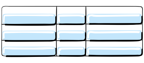
<style type="text/css">.container {align-items: start ;}</style>
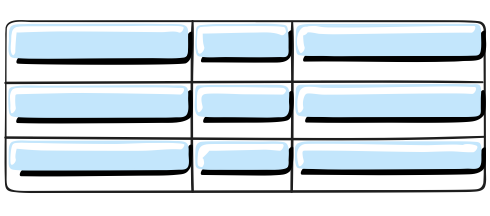
<style type="text/css">.container {align-items: center ;}</style>
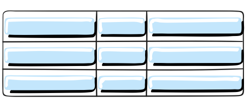
<style type="text/css">.container {align-items: end ;}</style>
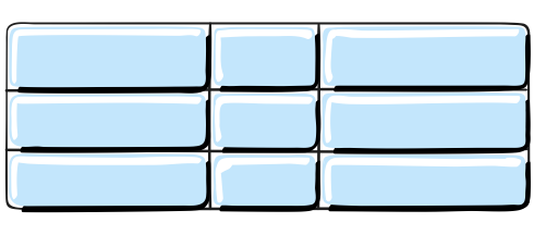
<style type="text/css">.container {align-items: stretch ;}</style>
<style type="text/css">.align-items-end {align-items: end;}</style>
<article class="article ant-col ant-col-xs-24 ant-col-sm-12 ant-col-md-12 ant-col-lg-12 ant-col-xl-6"><div class="card"><div class="container grid-gap-main align-items-end"><div class="box item1">1</div><div class="box item2">2</div><div class="box item3">3</div><div class="box item4">4</div><div class="box item5">5</div><div class="box item6">6</div><div class="box item7">7</div><div class="box item8">8</div><div class="box item9">9</div></div></div></article>
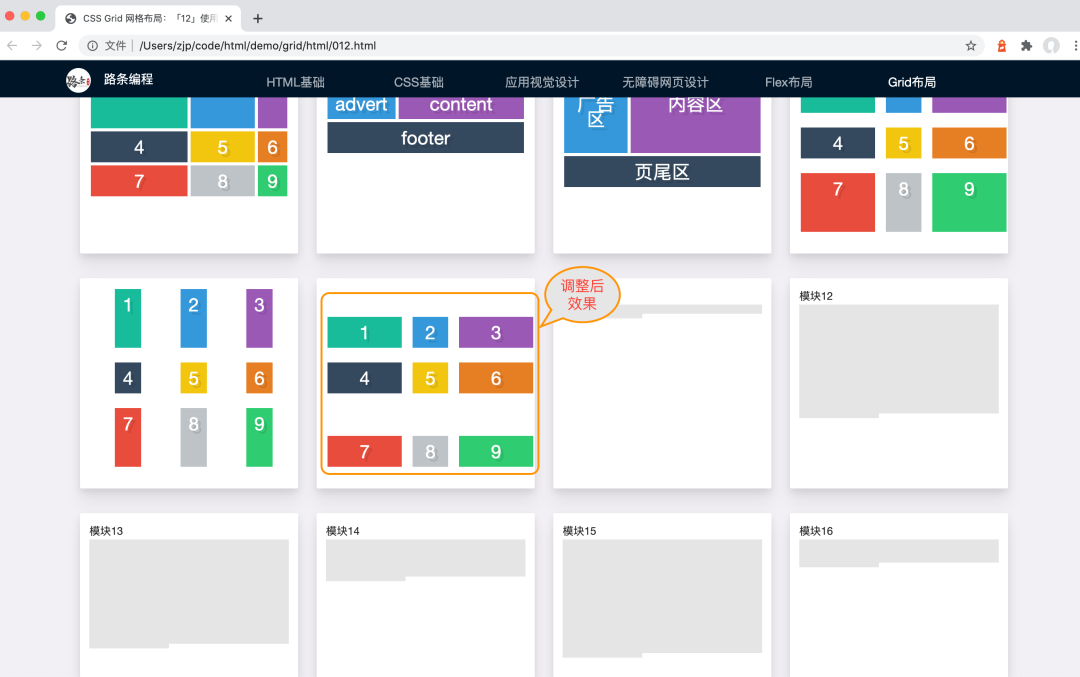
重要提示:示例效果预览,请访问 https://www.icoderoad.com , 完整代码查看及下载,请访问 https://github.com/icoderoad/demo。
今天就讲到这里,如果有问题需要咨询,大家可以直接留言或扫下方二维码关注公众号。也可以添加 happyzjp 微信受邀加入学习社群,我们会尽力为你解答。

作者:路条编程(转载请获本公众号授权,并注明作者与出处)
文章转载自路条编程,如果涉嫌侵权,请发送邮件至:contact@modb.pro进行举报,并提供相关证据,一经查实,墨天轮将立刻删除相关内容。