


基本统计方法
 1import pandas as pd
 2import numpy as np
 3import matplotlib.pyplot as plt
 4import matplotlib
 5import warnings
 6warnings.filterwarnings("ignore")
 7
 8# plt.rcParams['font.sans-serif'] = ['SimHei']  # 显示中文
 9ziti = matplotlib.font_manager.FontProperties(fname='/home/kesci/work/simhei.ttf', size=12) # 显示中文
10plt.rcParams['axes.unicode_minus'] = False    # 显示负号
读取表格数据
1df = pd.read_excel('/home/kesci/input/weather8094/徐家汇气温.xlsx')
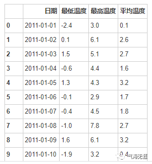
2df
把日期设置为索引
1df = df.set_index('日期')
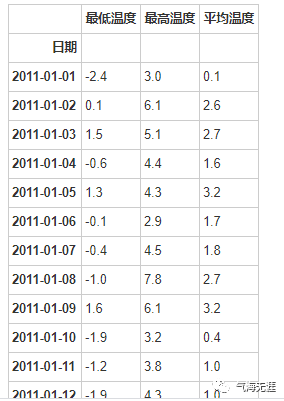
2df
检测缺失值
1print(df.isnull().any())
2
3最低温度    False
4最高温度    False
5平均温度    False
6dtype: bool
1# 单站点2016年7月的日最高气温的最大值、最小值
2print(df['2016-07':'2016-08']['最高温度'].max())
3print(df['2016-07':'2016-08']['最高温度'].min())
140.3
228.2
2、平均值
1# 单站点2016年7月的日最高气温的平均值
2print(df['2016-07':'2016-08']['最高温度'].mean())
输出:
134.41290322580645
3、百分位值
1# 2011-2016年间单站点7月的日最高气温的第10、90百分位值
2df['month'] = df.index.month
3print(np.nanpercentile(df[df['month']==7]['最高温度'],10))
4print(np.nanpercentile(df[df['month']==7]['最高温度'],90))
输出:
128.4
238.2
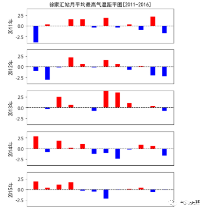
4、距平值
 1# 徐家汇站的气候态:http://www.nmc.cn/publish/forecast/ASH/xujiahui.html
 2tem_high_mean_climate = np.array([8.4,10.1,13.9,19.9,25.2,28.2,32.6,32,28.1,23.3,17.5,11.3])
 3tem_low_mean_climate = np.array([2,3.4,6.7,11.8,17.1,21.5,25.7,25.6,21.8,16.3,10.3,4.1])
 4# 计算2011-2016月最高气温距平
 5tem_high_mean = df.resample('M').mean()['最高温度']
 6# 获取2011-2016年间日最高气温的月平均值的距平值
 7anomaly2011 = tem_high_mean['2011'] - tem_high_mean_climate
 8anomaly2012 = tem_high_mean['2012'] - tem_high_mean_climate
 9anomaly2013 = tem_high_mean['2013'] - tem_high_mean_climate
10anomaly2014 = tem_high_mean['2014'] - tem_high_mean_climate
11anomaly2015 = tem_high_mean['2015'] - tem_high_mean_climate
12anomaly2016 = tem_high_mean['2016'] - tem_high_mean_climate
5、柱状图
1# 定义函数,正为红,负为蓝
2def getcolor(x):
3    colors = []
4    for i in x:
5        if i > 0:
6            colors.append("red")
7        else:
8            colors.append("blue")
9    return colors
绘图
 1# 创建画布
 2fig = plt.figure(figsize=(6,10))
 3# 设置标题
 4plt.title('徐家汇站月平均最高气温距平图[2011-2016]',fontsize=10,fontproperties=ziti)
 5# 关闭坐标轴
 6plt.axis('off')
 7# x轴标签
 8x = ['Jan','Feb','Mar','Apr','May','Jun','July','Aug','Sep','Oct','Nov','Dec']
 9# 添加子图
10ax = fig.add_subplot(611)
11# 柱状图
12ax.bar(x,anomaly2011,width=0.4,color=getcolor(anomaly2011))
13# 绘制水平直线
14plt.axhline(y=0.0, c="k", ls="--", lw=1)
15# 设置y轴范围
16ax.set_ylim(-4,4,2)
17# 隐藏x轴标签
18ax.set_xticks([])
19# 设置y轴标签
20ax.set_ylabel('2011年',fontproperties=ziti)
21
22ax = fig.add_subplot(612)
23ax.bar(x,anomaly2012,width=0.4,color=getcolor(anomaly2012))
24plt.axhline(y=0.0, c="k", ls="--", lw=1)
25ax.set_ylim(-4,4,2)
26ax.set_xticks([])
27ax.set_ylabel('2012年',fontproperties=ziti)
28ax = fig.add_subplot(613)
29ax.bar(x,anomaly2013,width=0.4,color=getcolor(anomaly2013))
30plt.axhline(y=0.0, c="k", ls="--", lw=1)
31ax.set_ylim(-4,4,2)
32ax.set_xticks([])
33ax.set_ylabel('2013年',fontproperties=ziti)
34ax = fig.add_subplot(614)
35ax.bar(x,anomaly2014,width=0.4,color=getcolor(anomaly2014))
36plt.axhline(y=0.0, c="k", ls="--", lw=1)
37ax.set_ylim(-4,4,2)
38ax.set_xticks([])
39ax.set_ylabel('2014年',fontproperties=ziti)
40ax = fig.add_subplot(615)
41ax.bar(x,anomaly2015,width=0.4,color=getcolor(anomaly2015))
42plt.axhline(y=0.0, c="k", ls="--", lw=1)
43ax.set_ylim(-4,4,2)
44ax.set_xticks([])
45ax.set_ylabel('2015年',fontproperties=ziti)
46ax = fig.add_subplot(616)
47ax.bar(x,anomaly2016,width=0.4,color=getcolor(anomaly2016))
48plt.axhline(y=0.0, c="k", ls="--", lw=1)
49ax.set_ylim(-4,4,2)
50ax.set_ylabel('2016年',fontproperties=ziti)
51plt.show()
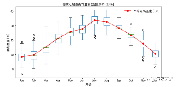
6、箱线图
 1# 2011-2016年间单站点的每月的日最高气温
 2d1 = df[df['month']==1]['最高温度']
 3d2 = df[df['month']==2]['最高温度']
 4d3 = df[df['month']==3]['最高温度']
 5d4 = df[df['month']==4]['最高温度']
 6d5 = df[df['month']==5]['最高温度']
 7d6 = df[df['month']==6]['最高温度']
 8d7 = df[df['month']==7]['最高温度']
 9d8 = df[df['month']==8]['最高温度']
10d9 = df[df['month']==9]['最高温度']
11d10 = df[df['month']==10]['最高温度']
12d11 = df[df['month']==11]['最高温度']
13d12 = df[df['month']==12]['最高温度']
14# 合并表格并设置表头
15data = pd.concat([d1,d2,d3,d4,d5,d6,d7,d8,d9,d10,d11,d12],axis=1,ignore_index=True)
16data.columns = ['Jan','Feb','Mar','Apr','May','Jun','July','Aug','Sep','Oct','Nov','Dec']
 1# 创建画布
 2fig = plt.figure(figsize=(10,5))
 3# 添加子图
 4ax = fig.add_subplot(111)
 5# 绘制箱线图
 6data.boxplot()
 7# 绘制平均值
 8plt.plot(np.arange(1,13,1),np.nanmean(data,axis=0),'ro-',label='平均最高温度(℃)')
 9# x轴标签
10plt.xlabel('月份',fontproperties=ziti)
11# y轴标签
12plt.ylabel('最高温度(℃)',fontproperties=ziti)
13# 添加网格
14plt.grid(False)
15# 添加图例
16plt.legend(frameon=False,prop=ziti)
17# 添加标题
18plt.title('徐家汇站最高气温箱型图[2011-2016]',fontsize=10,fontproperties=ziti)
19# 显示图片
20plt.show()
有问题可以到QQ群里进行讨论,我们在那边等大家。
QQ群号:854684131
文章转载自气海无涯,如果涉嫌侵权,请发送邮件至:contact@modb.pro进行举报,并提供相关证据,一经查实,墨天轮将立刻删除相关内容。
