


在实际开发过程中,我们经常会遇到一些系统原有组件无法满足的情况,而 HarmonyOS 提供了自定义组件的方式,我们使用自定义组件来满足项目需求。

自定义组件是由开发者定义的具有一定特性的组件,通过扩展 Component 或其子类实现,可以精确控制屏幕元素的外观,实现开发者想要达到的效果,也可响应用户的点击、触摸、长按等操作。
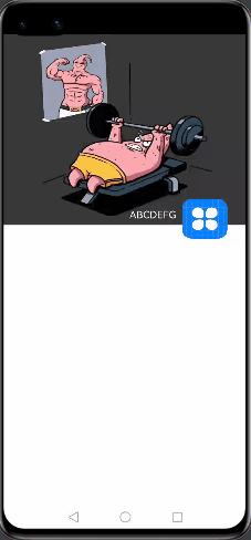
下面通过自定义一个仿微信朋友圈主页的组件来了解一下自定义组件的过程。
关于自定义组件,一般遵循以下几个方式:
①首先,创建一个继承 Component 或其子类的自定义组件类,并添加构造方法,如 MyComponent。
②实现 Component.EstimateSizeListener 接口,在 onEstimateSize 方法中进行组件测量,并通过 setEstimatedSize 方法通知组件。
③自定义组件测量出的大小需通过 setEstimatedSize 通知组件,并且必须返回 true 使测量值生效。
setEstimatedSize 方法的入参携带模式信息,可使用 Component.EstimateSpec.getChildSizeWithMode 方法进行拼接。
⑤自定义 xml 属性,通过构造方法中携带的参数 attrSet,可以获取到在 xml 中配置的属性值,并应用在该自定义组件中。
⑥实现 Component.DrawTask 接口,在 onDraw 方法中执行绘制任务,该方法提供的画布 Canvas,可以精确控制屏幕元素的外观。在执行绘制任务之前,需要定义画笔 Paint。
⑦实现 Component.TouchEventListener 或其他事件的接口,使组件可响应用户输入。
⑧在 xml 文件中创建并配置自定义组件。
在 HarmonyOS 中 Component 是视图的父类,既然组件都是继承 Component 来实现的,那么我们也可以继承它来实现我们想要的视图了,根据具体流程,我们按照示例代码来了解一下大致流程。
创建自定义布局
...
public class MyComponent extends Component implements Component.DrawTask,Component.EstimateSizeListener {
    private Paint paint;
    private Paint paintText;

    private PixelMap bigImage;

    private PixelMap smallImage;

    public MyComponent(Context context) {
        this(context, null);
    }

    public MyComponent(Context context, AttrSet attrSet) {
        this(context, attrSet,"");
    }

    public MyComponent(Context context, AttrSet attrSet, String styleName) {
        super(context, attrSet, styleName);
        init(context);
    }

    public void init(Context context) {
        // 设置测量组件的侦听器
        setEstimateSizeListener(this);
        // 初始化画笔
        initPaint();
        // 添加绘制任务
        addDrawTask(this);
    }

    private void initPaint() {
        paint = new Paint();
        paint.setAntiAlias(true);
        paint.setStrokeCap(Paint.StrokeCap.ROUND_CAP);
        paint.setStyle(Paint.Style.STROKE_STYLE);

        paintText = new Paint();
        paintText.setStrokeCap(Paint.StrokeCap.ROUND_CAP);
        paintText.setStyle(Paint.Style.FILL_STYLE);
        paintText.setColor(Color.WHITE);
        paintText.setTextSize(50);
        paintText.setAntiAlias(true);

        bigImage = PixelMapUtils.createPixelMapByResId(ResourceTable.Media_imageDev, getContext()).get();
        smallImage = PixelMapUtils.createPixelMapByResId(ResourceTable.Media_icon, getContext()).get();

    }

    @Override
    public void addDrawTask(Component.DrawTask task) {
        super.addDrawTask(task);
        task.onDraw(this, mCanvasForTaskOverContent);
    }

    @Override
    public boolean onEstimateSize(int widthEstimateConfig, int heightEstimateConfig) {
        int width = Component.EstimateSpec.getSize(widthEstimateConfig);
        int height = Component.EstimateSpec.getSize(heightEstimateConfig);
        setEstimatedSize(
                Component.EstimateSpec.getChildSizeWithMode(width, width, Component.EstimateSpec.NOT_EXCEED),
                Component.EstimateSpec.getChildSizeWithMode(height, height, Component.EstimateSpec.NOT_EXCEED));
        return true;
    }

    @Override
    public void onDraw(Component component, Canvas canvas) {
        int width = getWidth();
        int center = width / 2;

        float length = (float) (center - Math.sqrt(2) * 1.0f / 2 * center);

        // 获取大图片的大小

        Size bigImageSize = bigImage.getImageInfo().size;
        RectFloat bigImageRect = new RectFloat(0, 0, width,  bigImageSize.height);

        // 获取小图片的大小
        Size smallImageSize = smallImage.getImageInfo().size;
        RectFloat smallImageRect = new RectFloat(length * 5, length * 5 - 50, 1100, 1030);

        canvas.drawPixelMapHolderRect(new PixelMapHolder(bigImage), bigImageRect, paint);
        canvas.drawPixelMapHolderRect(new PixelMapHolder(smallImage), smallImageRect, paint);
        canvas.drawText(paintText,"ABCDEFG",width - length * 3.3f, bigImageSize.height - length * 0.2f);

    }

}
如上代码,我们创建一个 MyComponent 继承 Component ,并且在构造方法中,初始化一些画笔属性,传入默认的图片,当然也可以通过调用接口的方式在引用的地方传入图片。
然后在 ondraw 方法中做具体的画笔操作。通过 canvas.drawPixelMapHolderRect 方法画出一大一小两张可堆叠的图片,并调整好位置参数。
在 Ability 中引用
...
public class ImageAbilitySlice extends AbilitySlice {

    @Override
    protected void onStart(Intent intent) {
        super.onStart(intent);
//        super.setUIContent(ResourceTable.Layout_ability_image_main);
        drawMyComponent();
    }

    private void drawMyComponent() {
        // 声明布局
        ScrollView myLayout = new ScrollView(this);
        DirectionalLayout.LayoutConfig config = new DirectionalLayout.LayoutConfig(
                DirectionalLayout.LayoutConfig.MATCH_PARENT, DirectionalLayout.LayoutConfig.MATCH_PARENT);
        myLayout.setLayoutConfig(config);
        myLayout.setReboundEffect(true);
        MyComponent customComponent = new MyComponent(this);
        myLayout.addComponent(customComponent);
        super.setUIContent(myLayout);
    }

}
在 XML 文件中引用
<?xml version="1.0" encoding="utf-8"?>
<ScrollView
    ohos:id="$+id:dl"
    xmlns:ohos="http://schemas.huawei.com/res/ohos"
    ohos:height="match_parent"
    ohos:width="match_parent"
    ohos:alignment="center"
    ohos:rebound_effect="true"
    ohos:orientation="vertical">

    <com.example.harmonyosdeveloperchenpan.MyComponent
        ohos:id="$+id:myComponent"
        ohos:height="match_parent"
        ohos:width="match_parent"/>

</ScrollView>
需要注意的是,微信朋友圈主页的滑动有下拉回弹效果,所以我们需要设置 ScrollView 的布局属性。
通过在代码中调用 setReboundEffect(true) 或者 xml 中设置 ohos:rebound_effect=“true” 来实现。
作者:陈潘

求分享
求点赞
求在看
