


Dialog 是 HarmonyOS 的提示框,虽然说是很基础的东西,但是里面其实还有很多值得学习交流的地方。

本文会介绍如何使用默认的 Dialog 和自定义 Dialog:
默认 Dialog 的使用方法
自定义 Dialog 组件封装
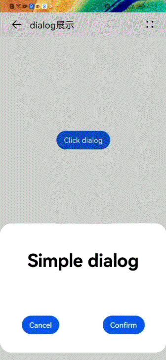
效果展示

默认认 Dialog 的使用
样式:仅支持通用样式中的 width、height、margin、margin-[left|top|right|bottom]、margin-[start|end] 样式。
方法:仅支持 show(弹出对话框),close(关闭对话框)。
 <div class="doc-page">
    <div class="btn-div">
        <button type="capsule" value="Click dialog" class="btn" onclick="showDialog"></button>
    </div>
    <dialog id="simpledialog" class="dialog-main" oncancel="cancelDialog">
        <div class="dialog-div">
            <div class="inner-txt">
                <text class="txt">Simple dialog</text>
            </div>
            <div class="inner-btn">
                <button type="capsule" value="Cancel" onclick="cancelSchedule" class="btn-txt"></button>
                <button type="capsule" value="Confirm" onclick="setSchedule" class="btn-txt"></button>
            </div>
        </div>
    </dialog>
</div>
pairDialog.css:
.doc-page {
    flex-direction: column;
    justify-content: center;
    align-items: center;
}
.btn-div {
    width: 100%;
    height: 200px;
    flex-direction: column;
    align-items: center;
    justify-content: center;
}
.txt {
    color: #000000;
    font-weight: bold;
    font-size: 39px;
}
.dialog-main {
    width: 500px;
}
.dialog-div {
    flex-direction: column;
    align-items: center;
}
.inner-txt {
    width: 400px;
    height: 160px;
    flex-direction: column;
    align-items: center;
    justify-content: space-around;
}
.inner-btn {
    width: 400px;
    height: 120px;
    justify-content: space-around;
    align-items: center;
}
pairDialog.js:
import prompt from '@system.prompt';

export default {
    showDialog(e) {
        this.$element('simpledialog').show()
    },
    cancelDialog(e) {
        prompt.showToast({
            message: 'Dialog cancelled'
        })
    },
    cancelSchedule(e) {
        this.$element('simpledialog').close()
        prompt.showToast({
            message: 'Successfully cancelled'
        })
    },
    setSchedule(e) {
        this.$element('simpledialog').close()
        prompt.showToast({
            message: 'Successfully confirmed'
        })
    }
}
自定义 Dialog 组件封装
pairCustomizeDialog.js:
 // 支持自定义传入内容如下
 props:{
       // 取消
        public_cancel:{
            type:String,
            default:"取消"
        },
        // 确定
        public_sure:{
            type:String,
            default:"确定"
        },
        // 标题
        title:{
            type:String,
            default:"使用指导"
        },
        // 内容
        content:{
            type:Array,
            default:[]
        }
    }
显示 Dialog
<element name="titleBar" src="../../components/titleBar/titleBar.hml"></element>
<element name="pairDialog" src="../../components/titleBar/pairDialog/pairDialog.hml" ></element>
<element name="pairCustomizeDialog" src="../../components/titleBar/pairCustomizeDialog/pairCustomizeDialog.hml" ></element>
<div class="dialog">
        <titleBar title="dialog展示"
                  @back-press="exit" >
        </titleBar>
        <!-- 默认demo   -->
        <pairDialog ></pairDialog>
        <!-- 自定义dialog   -->
        <pairCustomizeDialog  content="{{deviceResource}}"></pairCustomizeDialog>
</div>

👇点击关注鸿蒙技术社区👇
了解鸿蒙一手资讯
点“阅读原文”报名直播课
文章转载自鸿蒙技术社区,如果涉嫌侵权,请发送邮件至:contact@modb.pro进行举报,并提供相关证据,一经查实,墨天轮将立刻删除相关内容。
