


XPopup 是一个弹窗库,可能是 Harmony 平台最好的弹窗库。它从设计的时候就本着实用的原则,兼顾了美观和优雅的交互。用户都喜欢自然舒适的 UI 和交互,希望 XPopup 能带给你一些帮助或者惊喜!

01
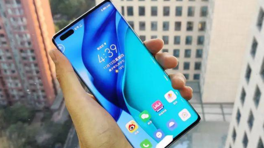
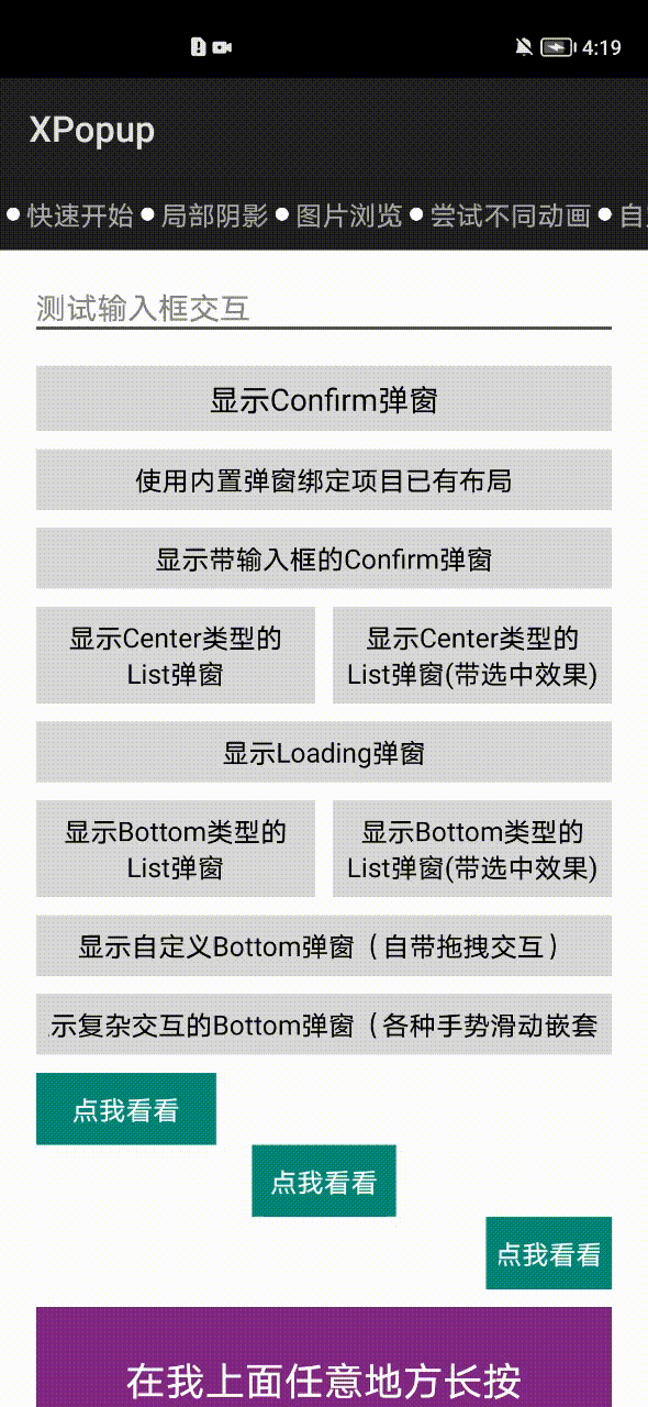
效果一览


全屏弹窗(可作为 Ability 替代品,搭配十几个动画使用更佳):


内置优雅美观的动画器,可搭配弹窗结合使用:
02
依赖
allprojects{
    repositories{
        mavenCentral()
    }
}
implementation 'io.openharmony.tpc.thirdlib:XPopup:1.0.3'
03
如何使用
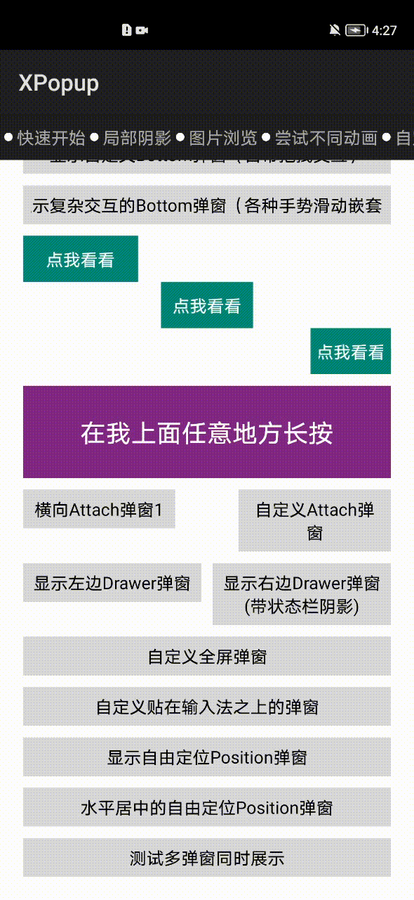
①内置弹窗的使用
显示确认和取消对话框:
new XPopup.Builder(getContext()).asConfirm("我是标题", "我是内容",
        new OnConfirmListener() {
            @Override
            public void onConfirm() {
                toast("click confirm");
            }
        })
        .show();
显示待输入框的确认和取消对话框:
new XPopup.Builder(getContext()).asInputConfirm("我是标题", "请输入内容。",
                            new OnInputConfirmListener() {
                                @Override
                                public void onConfirm(String text) {
                                    toast("input text: " + text);
                                }
                            })
                            .show();
显示中间弹出的列表弹窗:
new XPopup.Builder(getContext())
                            //.maxWidth(600)
                            .asCenterList("请选择一项", new String[]{"条目1", "条目2", "条目3", "条目4"},
                            new OnSelectListener() {
                                @Override
                                public void onSelect(int position, String text) {
                                    toast("click " + text);
                                }
                            })
                            .show();
显示中间弹出的加载框:
new XPopup.Builder(getContext())
                            .asLoading("正在加载中")
                            .show();
显示从底部弹出的列表弹窗:
new XPopup.Builder(getContext())
        .asBottomList("请选择一项", new String[]{"条目1", "条目2", "条目3", "条目4", "条目5"},
                new OnSelectListener() {
                    @Override
                    public void onSelect(int position, String text) {
                        toast("click " + text);
                    }
                })
        .show();
显示依附于某个 Component 或者某个点的弹窗:
new XPopup.Builder(getContext())
        .atView(component)  // 依附于所点击的Component,内部会自动判断在上方或者下方显示
        .asAttachList(new String[]{"分享", "编辑", "不带icon"},
                new int[]{ResourceTable.Media_icon, ResourceTable.Media_icon},
                new OnSelectListener() {
                    @Override
                    public void onSelect(int position, String text) {
                        toast("click " + text);
                    }
                })
        .show();
如果是想依附于某个 Component 的触摸点,则需要先 watch 该 Component,然后当单击或长按触发的时候去显示:
Component component = findComponentById(ResourceTable.Id_btnShowAttachPoint);
// 必须在事件发生前,调用这个方法来监视View的触摸
final XPopup.Builder builder = new XPopup.Builder(getContext()).watchView(component);
component.setLongClickedListener(new LongClickedListener() {
    @Override
    public void onLongClicked(Component component) {
        builder.asAttachList(new String[]{"置顶", "复制", "删除"}, null,
                new OnSelectListener() {
                    @Override
                    public void onSelect(int position, String text) {
                        toast("click " + text);
                    }
                })
                .show();
    }
});
最简单的示例如下:
public class CustomAttachPopup extends HorizontalAttachPopupView {
    public CustomAttachPopup(Context context) {
        super(context, null);
    }
    @Override
    protected int getImplLayoutId() {
        return ResourceTable.Layout_custom_attach_popup;
    }
    @Override
    protected void onCreate() {
        super.onCreate();
        findComponentById(ResourceTable.Id_tv_zan).setClickedListener(new ClickedListener() {
            @Override
            public void onClick(Component component) {
                ToastUtil.showToast(getContext(), "赞");
                dismiss();
            }
        });
        findComponentById(ResourceTable.Id_tv_comment).setClickedListener(new ClickedListener() {
            @Override
            public void onClick(Component component) {
                ToastUtil.showToast(getContext(), "评论");
                dismiss();
            }
        });
    }    // 设置状态栏的高度,用以修正自定义位置弹窗的高度
    @Override
    protected int setStatusBarHeight() {
        return 130;
    }}
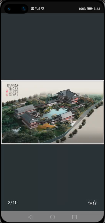
显示大图浏览弹窗:
// 当你点击图片的时候执行以下代码:
// 多图片场景(你有多张图片需要浏览)
new XPopup.Builder(getContext()).asImageViewer(image, position, list,
                            new OnSrcViewUpdateListener() {
                                @Override
                                public void onSrcViewUpdate(ImageViewerPopupView popupView, int position) {
                                    // pager更新当前显示的图片
                                    // 当启用isInfinite时,position会无限增大,需要映射为当前ViewPager中的页
                                    int realPosi = position % list.size();
                                    pager.setCurrentPage(realPosi, false);
                                }
                            }, new ImageLoader()).show();
// 单张图片场景
new XPopup.Builder(getContext())
                .asImageViewer(image, url, new ImageLoader())
                .show();// 图片加载器,XPopup不负责加载图片,需要你实现一个图片加载器传给我,这里以Glide和OkGo为例(可直接复制到项目中):
class ImageLoader implements XPopupImageLoader {
        @Override
        public void loadImage(int position, String url, Image imageView) {
            // 一进入页面就加载图片的话,需要加点延迟
            context.getUITaskDispatcher().delayDispatch(new Runnable() {
                @Override
                public void run() {
                    Glide.with(context)
                            .load(url)
                            .diskCacheStrategy(DiskCacheStrategy.ALL)
                            .into(image);
                }
            }, 50);
        }
        // 必须实现这个方法,用来下载图片。可参照下面的实现,内部保存图片会用到。如果你不需要保存图片这个功能,可以返回null。
        @Override
        public File getImageFile(Context context, String url) {
            try {
                return OkGo.<File>get(url).tag(this).converter(new FileConvert()).adapt().execute().body();
            } catch (Exception e) {
                LogUtil.error(TAG, e.getMessage());
            }
            return null;
        }
    }
关闭弹窗,先拿到弹窗对象,以 Loading 弹窗为例,其他也是一样:
BasePopupView popupView = new XPopup.Builder(getContext())
        .asLoading("正在加载中")
        .show();
执行消失:
//有四个消失方法可供选择:
popupView.dismiss();
 //立即消失
popupView.delayDismiss(300);
 //延时消失,有时候消失过快体验可能不好,可以延时一下
popupView.smartDismiss();
//会等待弹窗的开始动画执行完毕再进行消失,可以防止接口调用过快导致的动画不完整。
popupView.dismissWith({});
//消失动画执行完之后执行某些逻辑
可以这样做:
popupView.dismissWith(new Runnable() {
    @Override
    public void run() {
        // 跳转到新页面
    }});
复用项目已有布局:如果你项目中已经有写好的弹窗布局,而想用 XPopup 提供的动画和交互能力,也是完全没有问题的。
Confirm 弹窗,就是确认和取消弹窗
带输入框的 Confirm 弹窗
Loading 弹窗
带列表的 Attach 弹窗,Center 弹窗和 Bottom 弹窗
假设,你想使用 XPopup 的 Confirm 弹窗,但布局想用自己的,只需要这样设置一下,其他不用动即可:
new XPopup.Builder(getContext())
        .asConfirm(null, "您可以复用项目已有布局,来使用XPopup强大的交互能力和逻辑封装,弹窗的布局完全由你自己控制。\n" +
                        "需要注意的是:你自己的布局必须提供一些控件Id,否则XPopup找不到控件。",
                "关闭", "XPopup牛逼",
                new OnConfirmListener() {
                    @Override
                    public void onConfirm() {
                        toast("click confirm");
                    }
                }, null, false, ResourceTable.Layout_my_confim_popup)//绑定已有布局
        .show();
Confirm 弹窗必须包含的 Text 以及 id 有:tv_title,tv_content,tv_cancel,tv_confirm
带输入框的 Confirm 弹窗在 Confirm 弹窗基础上需要增加一个 id 为 et_input 的 TextField
Loading 弹窗,如果你想显示一个 Loading 文字说明,则必须有一个 id 为 tv_title 的 Text;如果不需要文字说明,则没要求
带列表的弹窗会多一个 bindItemLayout() 方法用来绑定 item 布局
其他不在多说,看 bindLayout 方法说明,会说明要求哪些 id
每种内置弹窗的 bindLayout 和 bindItemLayout 的要求都在方法说明上,无需记忆,用的时候查看下方法的说明即可。
②自定义弹窗
当你自定义弹窗的时候,需要根据需求选择继承:
CenterPopupView
BottomPopupView
AttachPopupView/HorizontalAttachPopupView
DrawerPopupView
PartShadowPopupView
FullScreenPopupView
PositionPopupView 其中之一
每种弹窗的功能和使用场景如下:
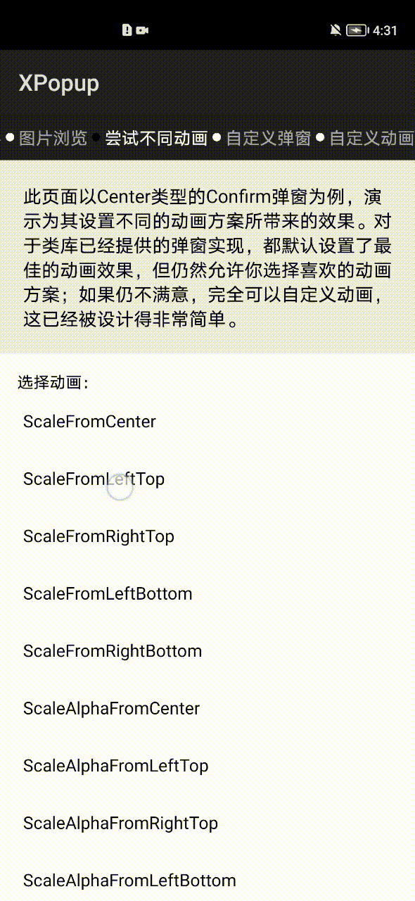
CenterPopupView:中间弹窗的弹窗,比如:确认取消对话框,Loading 弹窗等,如果不满意默认的动画效果,可以设置不同的动画器。
BottomPopupView:从底部弹出的弹窗,比如:从底部弹出的分享弹窗,知乎的从底部弹出的评论弹窗,抖音从底部弹出的评论弹窗。这种弹窗带有智能的嵌套滚动和手势拖动。
AttachPopupView/HorizontalAttachPopupView:Attach 弹窗是需要依附于某个点或者某个 Component 来显示的弹窗;其中 AttachPopupView 会出现在目标的上方或者下方。
如果希望想要微信朋友圈点赞弹窗那样的效果,出现在目标的左边或者右边,则需要继承
HorizontalAttachPopupView 来做。
DrawerPopupView:从界面的左边或者右边弹出的像 DrawerLayout 那样的弹窗,Drawer 弹窗本身是横向滑动的,但对 PageSlider 和 ScrollView 等横向滑动控件做了兼容,在弹窗内部可以放心使用它们。
FullScreenPopupView:全屏弹窗,看起来和 Ability 一样。该弹窗其实是继承 Center 弹窗进行的一种实现,可以设置任意的动画器。
ImageViewerPopupView:大图浏览弹窗。
PositionPopupView:自由定位弹窗,如果你想让弹窗显示在左上角,或者右上角,或者任意位置,并且不需要依附任何 Component,此时你需要它。
自定义弹窗只有 2 个步骤:
根据自己的需求编写一个类继承对应的弹窗。
重写 getImplLayoutId() 返回弹窗的布局,在 onCreate 中像 Ability 那样编写你的逻辑即可。
注意:自定义弹窗本质是一个自定义控件,但是只需重写一个参数的构造,其他的不要重写,所有的自定义弹窗都是这样。
class CustomPopup extends CenterPopupView {
    //注意:自定义弹窗本质是一个自定义控件,但是只需重写一个参数的构造,其他的不要重写,所有的自定义弹窗都是这样
    public CustomPopup(Context context) {
        super(context, null);
    }
    // 返回自定义弹窗的布局
    @Override
    protected int getImplLayoutId() {
        return ResourceTable.Layout_custom_popup;
    }
    // 执行初始化操作,比如:findComponentById,设置点击,或者任何你弹窗内的业务逻辑
    @Override
    protected void onCreate() {
        super.onCreate();
        findComponentById(ResourceTable.Id_tv_close).setClickedListener(new ClickedListener() {
            @Override
            public void onClick(Component component) {
                dismiss(); // 关闭弹窗
            }
        });
    }
    // 设置最大宽度,看需要而定
    @Override
    protected int getMaxWidth() {
        return super.getMaxWidth();
    }
    // 设置最大高度,看需要而定
    @Override
    protected int getMaxHeight() {
        return super.getMaxHeight();
    }
    // 设置自定义动画器,看需要而定
    @Override
    protected PopupAnimator getPopupAnimator() {
        return super.getPopupAnimator();
    }
    // 弹窗的宽度,用来动态设定当前弹窗的宽度,受getMaxWidth()限制
    protected int getPopupWidth() {
        return 0;
    }
    // 弹窗的高度,用来动态设定当前弹窗的高度,受getMaxHeight()限制
    protected int getPopupHeight() {
        return 0;
    }}
@Overrideprotected int getMaxWidth() {
    return 0;
   //返回0表示不限制最大宽度
}
new XPopup.Builder(getContext())
        .asCustom(new CustomPopup(getContext()))
        .show();
public class CustomAttachPopup2 extends AttachPopupView {
    public CustomAttachPopup2(Context context) {
        super(context, null);
    }
    @Override
    protected int getImplLayoutId() {
        return ResourceTable.Layout_custom_attach_popup2;
    }
    // 设置状态栏的高度,用以修正自定义位置弹窗的高度
    @Override
    protected int setStatusBarHeight() {
        return 130;
    }}
public class CustomDrawerPopupView extends DrawerPopupView {
    public CustomDrawerPopupView(Context context) {
        super(context, null);
    }
    @Override
    protected int getImplLayoutId() {
        return ResourceTable.Layout_custom_list_drawer;
    }
    @Override
    protected void onCreate() {
        super.onCreate();
        findComponentById(ResourceTable.Id_btn).setClickedListener(new ClickedListener() {
            @Override
            public void onClick(Component component) {
                toast("nothing!!!");
            }
        });
    }}
new XPopup.Builder(getContext())
        .popupPosition(PopupPosition.Right)//右边
        .asCustom(new CustomDrawerPopupView(getContext()))
        .show();
自定义 Bottom 类型的弹窗会比较常见,默认 Bottom 弹窗带有手势交互和嵌套滚动;如果您不想要手势交互可以调用 enableDrag(false) 方法关闭。
请注意:弹窗的宽高是自适应的,大部分情况下都应该将弹窗布局的高设置为 match_content;除非你希望得到一个高度撑满的弹窗。
public class ZhihuCommentPopup extends BottomPopupView {
    ListContainer listContainer;
    public ZhihuCommentPopup(Context context) {
        super(context, null);
    }
    @Override
    protected int getImplLayoutId() {
        return ResourceTable.Layout_custom_bottom_popup;
    }
    @Override
    protected void onCreate() {
        super.onCreate();
        listContainer = (ListContainer) findComponentById(ResourceTable.Id_listContainer);
        ArrayList<String> strings = new ArrayList<>();
        for (int i = 0; i < 30; i++) {
            strings.add("");
        }
        EasyProvider commonAdapter = new EasyProvider<String>(getContext(), strings, ResourceTable.Layout_adapter_zhihu_comment) {
            @Override
            protected void bind(ViewHolder holder, String itemData, final int position) {}
        };
        listContainer.setItemClickedListener(new ListContainer.ItemClickedListener() {
            @Override
            public void onItemClicked(ListContainer listContainer, Component component, int position, long id) {
                dismiss();
            }
        });
        listContainer.setItemProvider(commonAdapter);
    }
    // 最大高度为Window的0.7
    @Override
    protected int getMaxHeight() {
        return (int) (XPopupUtils.getScreenHeight(getContext()) * .7f);
    }}
public class CustomFullScreenPopup extends FullScreenPopupView {
    public CustomFullScreenPopup(Context context) {
        super(context, null);
    }
    @Override
    protected int getImplLayoutId() {
        return ResourceTable.Layout_custom_fullscreen_popup;
    }
    @Override
    protected void onCreate() {
        super.onCreate();
        // 初始化
    }}
自定义 ImageViewer 弹窗:目前大图浏览弹窗支持在上面添加任意自定义布局和背景颜色,做法是写一个类继承 ImageViewerPopupView 弹窗,然后重写布局即可。
public class CustomImagePopup extends ImageViewerPopupView {
    public CustomImagePopup(Context context) {
        super(context, null);
    }
    @Override
    protected int getImplLayoutId() {
        return ResourceTable.Layout_custom_image_viewer_popup;
    }}
// 自定义的弹窗需要用asCustom来显示,之前的asImageViewer这些方法当然不能用了。
CustomImagePopup viewerPopup = new CustomImagePopup(getContext());
// 自定义的ImageViewer弹窗需要自己手动设置相应的属性,必须设置的有srcView,url和imageLoader。
viewerPopup.setSingleSrcView(image2, url2);
viewerPopup.setXPopupImageLoader(new ImageLoader());
new XPopup.Builder(getContext())
        .asCustom(viewerPopup)
        .show();
public class QQMsgPopup extends PositionPopupView {
    public QQMsgPopup(Context context) {
        super(context, null);
    }
    @Override
    protected int getImplLayoutId() {
        return ResourceTable.Layout_popup_qq_msg;
    }}
自由定位弹窗,默认是显示在屏幕的左上角,你可以通过 offsetX() 和 offsetY() 来控制显示位置。
new XPopup.Builder(getContext())
        .popupAnimation(PopupAnimation.ScaleAlphaFromCenter)
        .isCenterHorizontal(true)
        .offsetY(200)
        .asCustom(new QQMsgPopup(getContext()))
        .show();
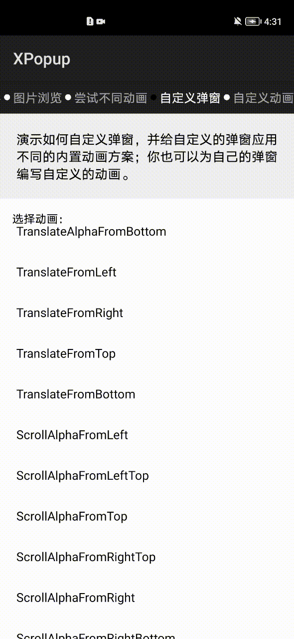
③自定义动画
自定义动画已经被设计得非常简单,动画和弹窗是无关的;这意味着你可以将动画设置给内置弹窗或者自定义弹窗。
继承 PopupAnimator,实现 3 个方法:
如何初始化动画
动画如何开始
动画如何结束
class RotateAnimator extends PopupAnimator {
  @Override
  public void initAnimator() {
      targetView.setScaleX(0.0f);
      targetView.setScaleY(0.0f);
      targetView.setAlpha(0.0f);
      targetView.setRotation(360.0f);
  }
  @Override
  public void animateShow() {
      targetView.createAnimatorProperty().rotate(0.0f).scaleX(1.0f).scaleY(1.0f).alpha(1.0f).setDuration(getDuration()).start();
  }
  @Override
  public void animateDismiss() {
      targetView.createAnimatorProperty().rotate(720.0f).scaleX(0.0f).scaleY(0.0f).alpha(0.0f).setDuration(getDuration()).start();
  }}
new XPopup.Builder(getContext())
        .customAnimator(new RotateAnimator())
        .asConfirm("演示自定义动画", "当前的动画是一个自定义的旋转动画,无论是自定义弹窗还是自定义动画,已经被设计得非常简单;这个动画代码只有6行即可完成!", null)
        .show();
new XPopup.Builder(getContext())
        .customAnimator(new EmptyAnimator(null))
        .asConfirm("演示自定义动画", "当前的动画是一个自定义的旋转动画,无论是自定义弹窗还是自定义动画,已经被设计得非常简单;这个动画代码只有6行即可完成!", null)
        .show();
④常用设置
1.全局设置
设置主色调:默认情况下,XPopup 的主色为灰色,主色作用于 Button 文字,TextField 边框和光标,Check 文字的颜色上。
XPopup.setPrimaryColor(getColor(ResourceTable.Color_colorPrimary));
XPopup.setAnimationDuration(200); // 传入的时长最小为0,动画的时长会影响除Drawer弹窗外的所有弹窗
2.常用设置
new XPopup.Builder(getContext())
        .isDestroyOnDismiss(true) //是否在消失的时候销毁资源,默认false。如果你的弹窗对象只使用一次,非常推荐设置这个,可以杜绝内存泄漏。如果会使用多次,千万不要设置
        .dismissOnBackPressed(true) //按返回键是否关闭弹窗,默认为true
        .dismissOnTouchOutside(true) //点击外部是否关闭弹窗,默认为true
        .autoOpenSoftInput(true) //是否弹窗显示的同时打开输入法,只在包含输入框的弹窗内才有效,默认为false
        .popupAnimation(PopupAnimation.ScaleAlphaFromCenter) //设置内置的动画
        .customAnimator(null) //设置自定义的动画器
        .popupPosition(PopupPosition.Right) //手动指定弹窗出现在目标的什么位置,对Attach和Drawer类型弹窗生效
        .positionByWindowCenter(false) //默认是false,是否以屏幕中心进行定位,默认是false,为false时根据Material范式进行定位,主要影响Attach系列弹窗
        .offsetX(-10) //弹窗在x方向的偏移量        .offsetY(-10) //弹窗在y方向的偏移量
        .maxWidth(10) //设置弹窗的最大宽度,如果重写弹窗的getMaxWidth(),以重写的为准
        .maxHeight(10) //设置弹窗的最大高度,如果重写弹窗的getMaxHeight(),以重写的为准
        .isCenterHorizontal(true) //是否和目标水平居中,比如:默认情况下Attach弹窗依靠着目标的左边或者右边,如果isCenterHorizontal为true,则与目标水平居中对齐
        .isRequestFocus(false) //默认为true,默认情况下弹窗会抢占焦点,目的是为了响应返回按键按下事件;如果为false,则不抢焦点
        .enableDrag(true) //是否启用拖拽,默认为true,目前对Bottom和Drawer弹窗有用
        .isDarkTheme(true)  //是否启用暗色主题        .borderRadius(10)  //为弹窗设置圆角,默认是15,对内置弹窗生效
        .autoDismiss(false) //操作完毕后是否自动关闭弹窗,默认为true;比如点击ConfirmPopup的确认按钮,默认自动关闭;如果为false,则不会关闭
        .setPopupCallback(new SimpleCallback() { //设置显示和隐藏的回调
            @Override            public void onCreated(BasePopupView basePopupView) {
                // 弹窗内部onCreate执行完调用
            }
            @Override
            public void beforeShow(BasePopupView basePopupView) {
                // 每次show之前都会执行
            }
            @Override
            public void onShow(BasePopupView basePopupView) {
                // 完全显示的时候执行
            }
            @Override
            public void onDismiss(BasePopupView basePopupView) {
                // 完全隐藏的时候执行
            }
            // 如果你自己想拦截返回按键事件,则重写这个方法,返回true即可
            @Override
            public boolean onBackPressed(BasePopupView basePopupView) {
                new ToastDialog(getContext()).setText("我拦截的返回按键,按返回键XPopup不会关闭了").show();
                return true; //默认返回false
            }
            //监听弹窗拖拽,适用于能拖拽的弹窗
            @Override
            public void onDrag(BasePopupView popupView, int value, float percent,boolean upOrLeft) {
            }
        })
        .asXXX() //所有的设置项都要写在asXXX()方法调用之前
04
下载链接
https://developer.harmonyos.com/cn/develop/deveco-studio#download
https://gitee.com/openharmony-tpc/XPopup
👇点击关注鸿蒙技术社区👇
专注开源技术,共建鸿蒙生态
点“阅读原文”了解更多
