


本文主要对如何在ggplot2中绘制条形图做一些总结,主要目录如下。其中条形图主要使用geom_col() 图层函数,频数统计条形图主要使用geom_bar() 图层函数,主要内容参考Winston Chang所著的《R数据可视化手册》(第二版)[1]中的第三章。
目录
1.基础条形图 2.簇状条形图 3.堆积条形图 4.堆积条形图(百分比形式) 5.正负条形图 6.频数统计条形图 7.cleveland点图 8.火柴杆图
设置工作路径与加载相关package
setwd("C:\\Users\\Acer\\Desktop")
#install.packages("gcookbook")
#install.packages("ggplot2")
#install.packages("scales")
library(gcookbook)
library(ggplot2)
library(scales)
1、基础条形图
基础条形图主要为一个x轴数据与一个y轴数据,此外以gcookbook包中的pg_mean数据集为例来绘制基础条形图。
#查看数据集
head(pg_mean)
#  group weight
#1  ctrl  5.032
#2  trt1  4.661
#3  trt2  5.526
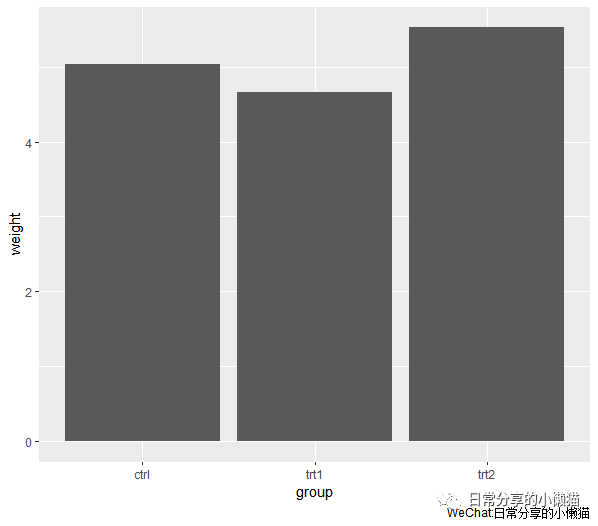
1.1 基础条形图
ggplot(pg_mean, aes(x = group, y = weight)) +
  geom_col()
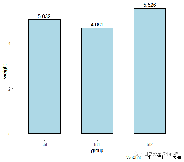
1.2 进一步修饰。geom_col() 为绘制条形图的基础图层,geom_col() 图层函数内的fill、color、width分别调整柱子的填充色、边框色及宽度;geom_text() 为标签图层函数,geom_text() 中的aes() 函数表示对标签进行映射,vjust、size、color、size分别调整字体的上下位置、颜色及大小;theme_few() 为主题图层
ggplot(pg_mean, aes(x = group, y = weight)) +
  geom_col(fill = "lightblue", color = "black", width = 0.6, size = 1) +
  geom_text(aes(label = weight),vjust = -0.5, size = 4.5, color = "black")  +
  theme_few()
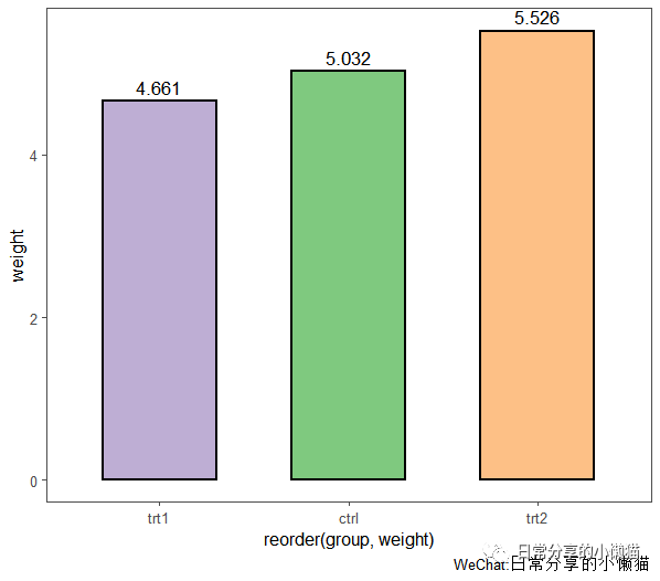
1.3 对x轴的因子进行升序或者降序,同时为每一个柱子设置不同的颜色。使用reorder() 函数对变量进行重新排序。reorder(x,y) 表示根据y变量对x进行升序排列,-y则表示根据y变量对x进行降序排列。使用brewer.pal() 函数对每一个柱子的颜色进行着色
ggplot(pg_mean, aes(x = reorder(group, weight), y = weight)) +
  geom_col(fill = brewer.pal(3,"Accent"), color = "black", width = 0.6, size = 1) +
  geom_text(aes(label = weight),vjust = -0.5, size = 4.5, color = "black") +
  theme_few()
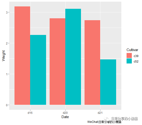
2、簇状条形图
对于多变量条形图,position通常有3种形式,分别为stack(堆积,默认),fill(比例),dodge(簇状)。其中簇状条形图的图层函数为geom_col(position = "dodge")。使用gcookbook包中的cabbage_exp数据集来绘制簇状条形图。
#查看数据
head(cabbage_exp)
#  Cultivar Date Weight        sd  n         se Weight Weight
#1      c39  d16   3.18 0.9566144 10 0.30250803  20.44   0.20
#2      c39  d20   2.80 0.2788867 10 0.08819171  17.99   0.18
#3      c39  d21   2.74 0.9834181 10 0.31098410  17.61   0.18
#4      c52  d16   2.26 0.4452215 10 0.14079141  14.52   0.15
#5      c52  d20   3.11 0.7908505 10 0.25008887  19.99   0.20
#6      c52  d21   1.47 0.2110819 10 0.06674995   9.45   0.09
2.1 基础图形。使用geom_col(position = "dodge") 图层函数绘制基础簇状条形图
ggplot(cabbage_exp, aes(x = Date, y = Weight, fill = Cultivar)) +
  geom_col(position = "dodge")
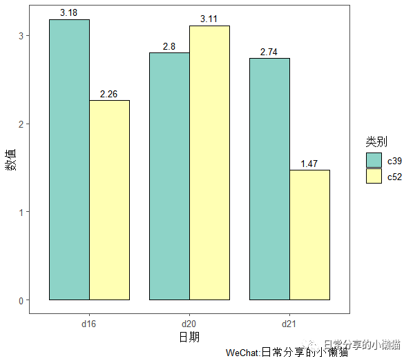
2.2进一步修饰。调整轴标题、颜色、主题等
ggplot(cabbage_exp, aes(x = Date, y = Weight, fill = Cultivar)) +
  geom_col(position = "dodge", color = "black", width = 0.8) +
  scale_fill_brewer(palette = "Set3") +
  geom_text(aes(label = Weight), vjust = -0.5, size = 3.5, position = position_dodge(0.8)) +
  labs(x = "日期", y = "数值", fill = "类别") +
  theme_few()
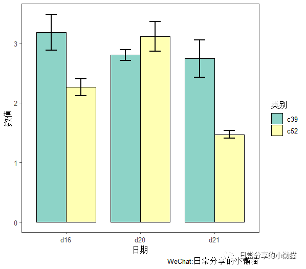
2.3 为簇状条形图添加误差线。使用geom_errorbar() 图层函数来添加误差线(均值-标准差)
ggplot(cabbage_exp, aes(x = Date, y = Weight, fill = Cultivar)) +
  geom_col(position = "dodge", color = "black", width = 0.8) +
  scale_fill_brewer(palette = "Set3") +
  geom_errorbar(aes(x = Date, ymin=Weight-se, ymax=Weight+se),width = 0.3,size = 1, position = position_dodge(0.8)) +
  labs(x = "日期", y = "数值", fill = "类别") +
  theme_few()
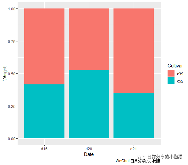
3、堆积条形图
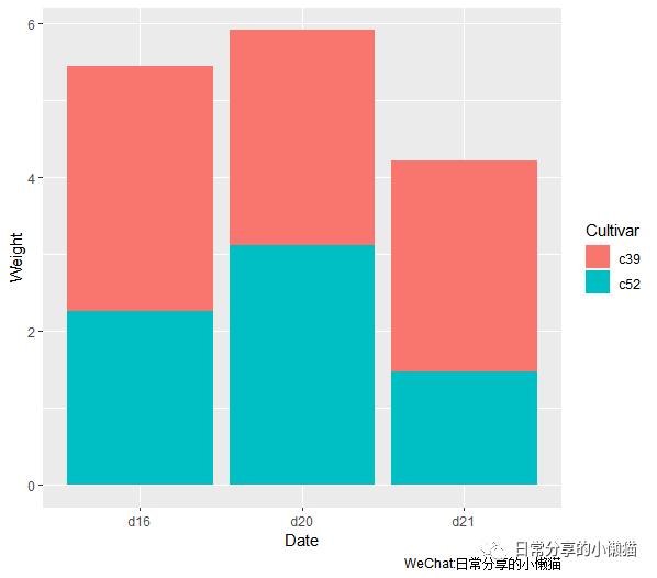
3.1 基础图形。堆积条形图图层函数为geom_col(position = "stack"),一般写作geom_col(),position = "stack" 为默认设置。使用gcookbook包中的cabbage_exp数据集来绘制堆积条形图
ggplot(cabbage_exp, aes(x = Date, y = Weight, fill = Cultivar)) +
  #geom_col(position = "stack") +
  geom_col()
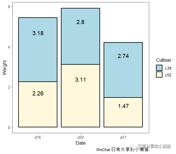
3.2 进一步修饰。使用geom_text() 函数添加数据标签,使用scale_fill_manual() 函数手动指定柱子填充色
ggplot(cabbage_exp, aes(x = Date, y = Weight, fill = Cultivar)) +
  geom_col(position = "stack", color = "black", size = 1) +
  geom_text(aes(label = Weight), size = 5, vjust = 1, position = position_stack(0.8)) +
  scale_fill_manual(values = c("lightblue", "cornsilk")) +
  theme_few()
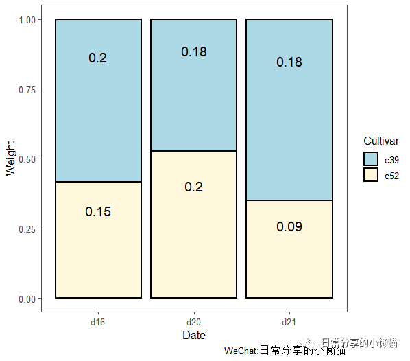
4、堆积条形图(百分比形式)
4.1 基础图形。百分比堆积条形图图层函数为geom_col(position = "fill"),此处以gcookbook包中的cabbage_exp数据集为例来绘制百分比形式的堆积条形图
ggplot(cabbage_exp, aes(x = Date, y = Weight, fill = Cultivar)) +
  geom_col(position = "fill")
4.2 进一步修饰。与堆积条形图修饰过程类似
#计算占比
cabbage_exp$ratio <- round(apply(cabbage_exp[c("Weight")], 2, function(x) x/sum(x)), digits = 2)
#绘图
ggplot(cabbage_exp, aes(x = Date, y = Weight, fill = Cultivar)) +
  geom_col(position = "fill", color = "black", size = 1) +
  geom_text(aes(label = ratio), size = 5, vjust = 1, position = position_fill(0.8)) +
  scale_fill_manual(values = c("lightblue", "cornsilk")) +
  theme_few()
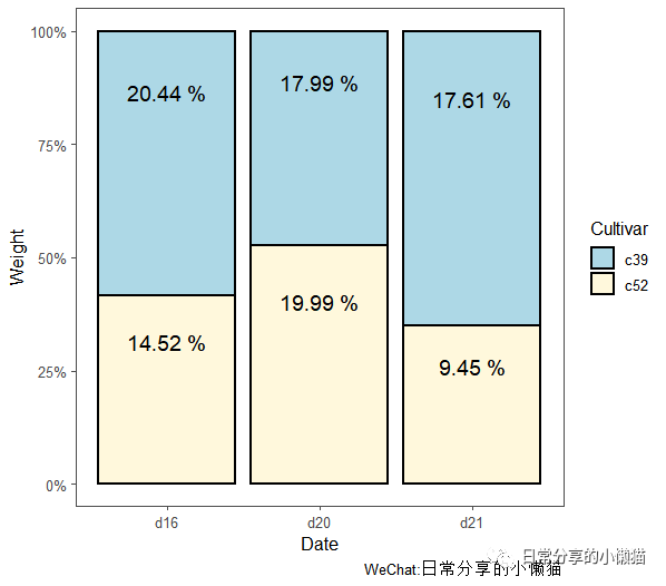
4.3 修改y轴刻度形式。将y轴0~1刻度形式改为0%~100%刻度形式
#计算百分比
cabbage_exp$prop <- round(apply(cabbage_exp[c("Weight")],2, function(x) x/sum(x) * 100), digits = 2)#计算百分比
#绘图
ggplot(cabbage_exp, aes(x = Date, y = Weight, fill = Cultivar)) +
  geom_col(position = "fill", color = "black", size = 1) +
  geom_text(aes(label = paste(prop, "%")), size = 5, vjust = 1, position = position_fill(0.8)) +
  scale_y_continuous(labels = scales::percent) +
  scale_fill_manual(values = c("lightblue", "cornsilk")) +
  theme_few()
5、正负条形图
以某地区一年12个月的月平均气温为例,绘制正负条形图。数据可在后台回复【20220120-1】获得。
temper <- read.csv("climate.csv") #读入数据
#生成一列新的数据以便于着色,其中大于等于0为TRYE,否则为FALSE
temper$pos <- ifelse(temper$temp >= 0, TRUE, FALSE)
#对month进行因子化
temper$month <- factor(temper$month, levels = temper$month)
head(temper)
#  month  temp   pos
#1   1月 -16.9 FALSE
#2   2月 -11.4 FALSE
#3   3月  -1.1 FALSE
#4   4月   7.5  TRUE
#5   5月  15.6  TRUE
#6   6月  19.9  TRUE
5.1 基础图形
#基础图形
ggplot(temper, aes(x = month, y = temp, fill = pos)) +
  geom_col()
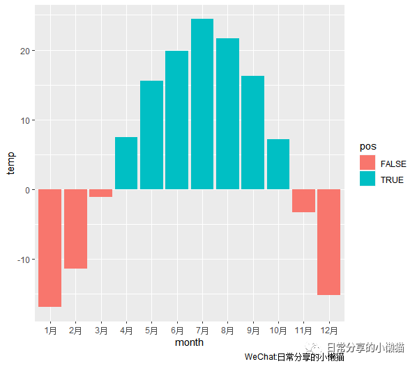
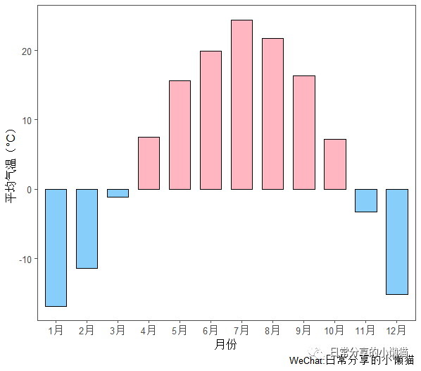
5.2 进一步修饰。对正值与负值调整颜色,并去除图例
ggplot(temper, aes(x = month, y = temp, fill = pos)) +
  geom_col(color = "black", width = 0.7) +
  scale_fill_manual(values = c("LightSkyBlue", "LightPink"), guide = "none") +
  labs(x = "月份", y = "平均气温(°C)") +
  theme_few()
6、频数统计条形图
以R中自带的diamonds数据为例,展示如何利用geom_bar() 绘制频数统计条形图。此处以diamonds中的color数据列为例。
head(diamonds)
# A tibble: 6 x 10
#  carat cut       color clarity depth table price     x     y     z
#  <dbl> <ord>     <ord> <ord>   <dbl> <dbl> <int> <dbl> <dbl> <dbl>
#1  0.23 Ideal     E     SI2      61.5    55   326  3.95  3.98  2.43
#2  0.21 Premium   E     SI1      59.8    61   326  3.89  3.84  2.31
#3  0.23 Good      E     VS1      56.9    65   327  4.05  4.07  2.31
#4  0.29 Premium   I     VS2      62.4    58   334  4.2   4.23  2.63
#5  0.31 Good      J     SI2      63.3    58   335  4.34  4.35  2.75
#6  0.24 Very Good J     VVS2     62.8    57   336  3.94  3.96  2.48
str(diamonds)
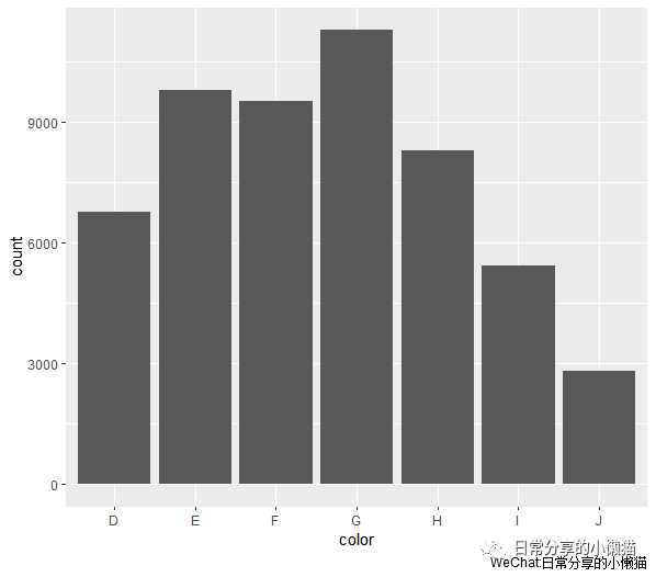
6.1 基础图形。使用geom_bar() 图层函数
ggplot(diamonds, aes(x = color)) +
  geom_bar()
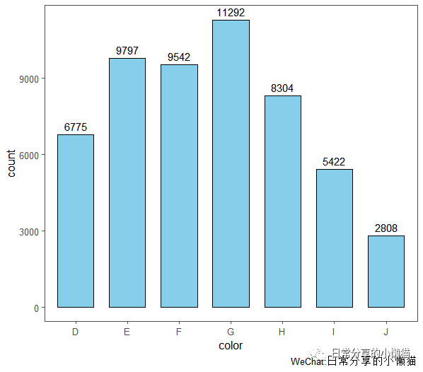
6.2 进一步修饰。调整标签、轴标题、颜色等,注意此处显示数据标签与基础条形图的区别
ggplot(diamonds, aes(x = color)) +
  geom_bar(fill = "SkyBlue", color = "black", width = 0.7) +
  geom_text(stat='count', aes(label= ..count..), vjust = -0.5) +
  theme_few()
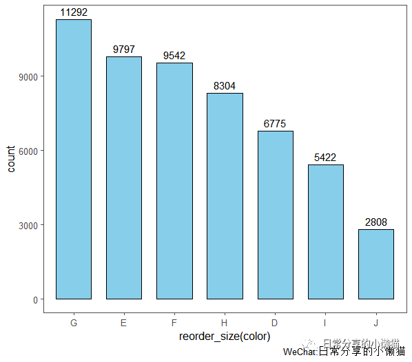
6.3 对x轴因子进行排序或者升序排列。首先定义一个排序函数,其次将排序函数用于color变量上
#定义排序函数。如果想升序排列,则decreasing = FALSE
reorder_size <- function(x) {
  factor(x, levels = names(sort(table(x), decreasing = TRUE)))
}
#绘图
ggplot(diamonds, aes(x = reorder_size(color))) +
  geom_bar(fill = "SkyBlue", color = "black", width = 0.7) +
  geom_text(stat='count', aes(label= ..count..), vjust = -0.5) +
  theme_few()
7、cleveland点图
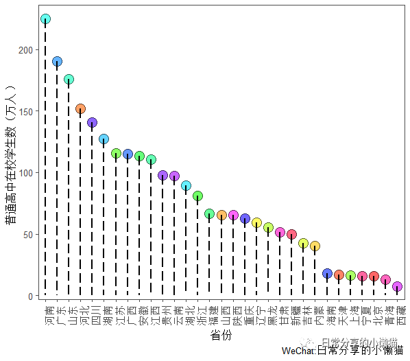
cleveland点图是条形图的替代方案,当数据量较大时,可以在一定程度上避免条形图带来的视觉混乱。以国家统计局[2]官方网站上关于2020年我国31个省份普通高中在校学生数量(单位:万人)数据(未包含港澳台数据)为例,绘制cleveland点图。数据可在国家统计局官网网站下载,或后台回复【20220120-2】获取。
#读入数据
cleve <- read.csv("cleveland.csv")
7.1 基础图形
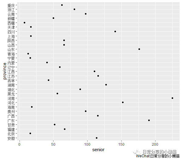
ggplot(cleve, aes(x = senior, y = province)) +
  geom_point()
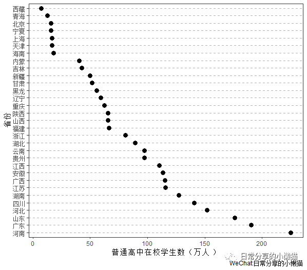
7.2 进一步修饰。对数据进行排序,修改背景、主题等,并去除一些网格线
ggplot(cleve, aes(x = senior, y = reorder(province, -senior))) +
  geom_point(size = 3) +
  theme_bw() +
  theme(panel.grid.major.x = element_blank(), #去除x轴主网格线
        panel.grid.minor.x = element_blank(), #去除x轴次网格线
        panel.grid.major.y = element_line(colour = "grey70", linetype = "dashed")) + #对y轴主网格线的颜色、线条类型进行调整
  labs(y = "省份", x = "普通高中在校学生数(万人)")
8、火柴杆图
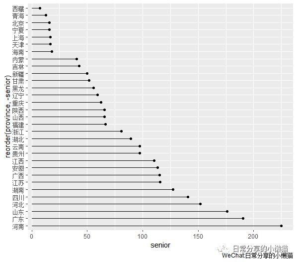
8.1 基础图形。使用geom_point() 与geom_segment() 图层函数,geom_segment() 用于绘制给定起点和终点坐标的直线
ggplot(cleve, aes(x = senior, y = reorder(province, -senior))) +
  geom_point() +
  geom_segment(aes(yend = province), xend = 0) #对yend进行映射,将xend设为0
8.2 进一步修饰。调整端点颜色、大小、绘图主题等
ggplot(cleve, aes(x = senior, y = reorder(province, -senior))) +
  geom_point(size = 3.5, color = "red") +
  geom_segment(aes(yend = province), xend = 0, size = 1) +
  labs(y = "省份", x = "普通高中在校学生数(万人)") +
  theme_few()
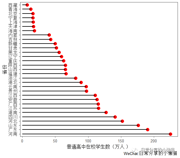
8.3 调整线段类型、端点颜色等
ggplot(cleve, aes(y = senior, x = reorder(province, -senior))) +
  geom_point(size = 5, shape = 21, fill = rainbow(31), color = "black", alpha = 0.6) +
  geom_segment(aes(xend = province), yend = 0, size = 1, linetype = "longdash") +
  labs(x = "省份", y = "普通高中在校学生数(万人)") +
  theme_few() +
  theme(axis.text.x = element_text(angle = 90)) #x轴刻度标签旋转90度
9、其他
关于条形图的绘制可进一步参考Winston Chang所著的R Graphics Cookbook,中文版为《R数据可视化手册》。
如有帮助请多多点赞哦!
参考资料
Winston Chang著,王佳,林枫等,译: R数据可视化手册(第二版)[M].人民邮电出版社,2021
[2]国家统计局: https://data.stats.gov.cn/index.htm
