


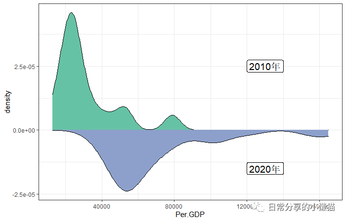
本文主要展示如何利用R语言中的ggplot2绘制镜像密度图(Mirror density)[1]。效果如下图所示。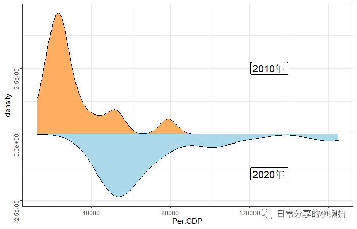
1、数据准备
以国家统计局[2]官网上关于2010、2020年我国31个省份人均GDP(未包含港澳台数据)为例,展示镜像密度图的绘制过程,数据可在国家统计局官网获取。
setwd("C:\\Users\\Acer\\Desktop\\常用数据")
library(ggplot2)
mydata <- read.csv("mirrordensity.csv")
head(mydata)
#  province  y2020 y2010
#1     北京 164889 78307
#2     天津 101614 54053
#3     河北  48564 25308
#4     山西  50528 25434
#5     内蒙  72062 33262
#6     辽宁  58872 31888
str(mydata)
#'data.frame': 31 obs. of  3 variables:
# $ province: chr  "北京" "天津" "河北" "山西" ...
# $ y2020   : int  164889 101614 48564 50528 72062 58872 50800 42635 155768 121231 ...
# $ y2010   : int  78307 54053 25308 25434 33262 31888 23370 21694 79396 52787 ...
2、图形绘制
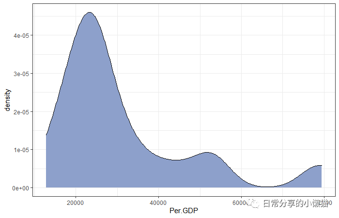
2.1 基础图形。绘制单独一个年份的密度图
ggplot(mydata, aes(x = y2010)) +
  geom_density(fill = "#8DA0CB") +
  theme_bw() +
  xlab("Per.GDP")
2.2 镜像密度图。绘制两个年份的镜像密度图
ggplot(mydata, aes(x=x) ) +
  geom_density( aes(x = y2010, y = ..density..), fill="#66C2A5") +
  geom_label( aes(x=130000, y=0.000025, label="2010年"),size = 5) +
  geom_density( aes(x = y2020, y = -..density..), fill= "#8DA0CB") +
  geom_label( aes(x=130000, y=-0.000015, label="2020年"),size = 5) +
  theme_bw() +
  scale_fill_brewer(palette = "Set2") +
  xlab("Per.GDP")
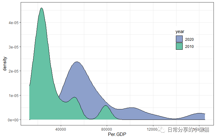
2.3 将两个年份的密度图放置同一坐标轴内
mydata2 <- reshape2::melt(mydata,id.vars=c("province"),variable.name="year", value.name="Per.GDP")
mydata2$year <- factor(mydata2$year,levels = c("y2020", "y2010"),labels = c("2020","2010"))
head(mydata2)
  province year Per.GDP
#1     北京 2020  164889
#2     天津 2020  101614
#3     河北 2020   48564
#4     山西 2020   50528
#5     内蒙 2020   72062
#6     辽宁 2020   58872
str(mydata2)
#'data.frame': 62 obs. of  3 variables:
# $ province: chr  "北京" "天津" "河北" "山西" ...
# $ year    : Factor w/ 2 levels "2020","2010": 1 1 1 1 1 1 1 1 1 1 ...
# $ Per.GDP : int  164889 101614 48564 50528 72062 58872 50800 42635 155768 121231 ...

ggplot(mydata2, aes(x = Per.GDP ,fill = year)) +
  geom_density() +
  theme_bw() +
  #scale_fill_brewer(palette = "Set3") +
  scale_fill_manual(values = c("#8DA0CB", "#66C2A5"))
  theme(legend.position = c(0.85,0.7))

3、其他
更多绘图方法可阅读公众号其他推文。此外,关于ggplot2绘制密度图可进一步阅读R语言绘图 | 多期核密度图绘制,关于使用stata绘制密度图可进一步阅读Stata绘图 | Stata绘制多期(年)核密度图。
如有帮助请多多点赞哦!
参考资料
Mirror density chart with ggplot2: https://r-graph-gallery.com/density_mirror_ggplot2.html
[2]国家统计局: https://data.stats.gov.cn/index.htm
文章转载自日常分享的小懒猫,如果涉嫌侵权,请发送邮件至:contact@modb.pro进行举报,并提供相关证据,一经查实,墨天轮将立刻删除相关内容。
