


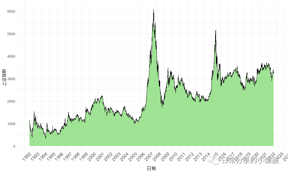
面积图(Area chart) 可用于表示数量随时间的变化程度,是论文或报告中一种常见图形。本文以上证指数为例,展示如何利用ggplot2绘制面积图。图形效果如下图所示: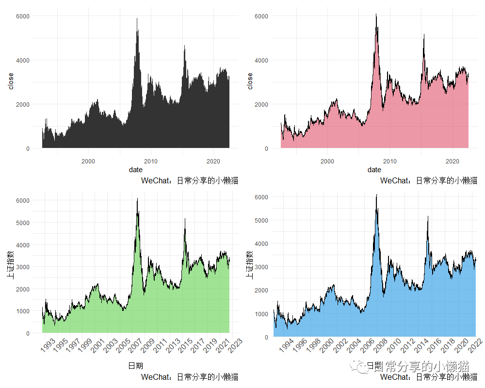
1、数据准备
以1992年7月27日至2022年7月25日上证指数收盘价为例,绘制该时间段内上证指数变化的面积图。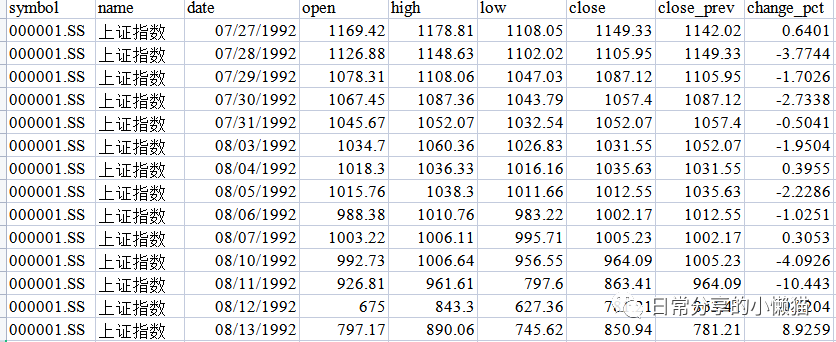
setwd("C:\\Users\\Acer\\Desktop")
library(ggplot2)
shanghai <- readxl::read_xlsx("上证指数.xlsx")
head(shanghai)
# A tibble: 6 x 9
#  symbol    name     date                 open  high   low close close_prev change_pct
#  <chr>     <chr>    <dttm>              <dbl> <dbl> <dbl> <dbl>      <dbl>      <dbl>
#1 000001.SS 上证指数 1992-07-27 00:00:00 1169. 1179. 1108. 1149.      1142.      0.640
#2 000001.SS 上证指数 1992-07-28 00:00:00 1127. 1149. 1102. 1106.      1149.     -3.77
#3 000001.SS 上证指数 1992-07-29 00:00:00 1078. 1108. 1047. 1087.      1106.     -1.70
#4 000001.SS 上证指数 1992-07-30 00:00:00 1067. 1087. 1044. 1057.      1087.     -2.73
#5 000001.SS 上证指数 1992-07-31 00:00:00 1046. 1052. 1033. 1052.      1057.     -0.504
#6 000001.SS 上证指数 1992-08-03 00:00:00 1035. 1060. 1027. 1032.      1052.     -1.95
str(shanghai)
#tibble [7,313 x 9] (S3: tbl_df/tbl/data.frame)
# $ symbol    : chr [1:7313] "000001.SS" "000001.SS" "000001.SS" "000001.SS" ...
# $ name      : chr [1:7313] "上证指数" "上证指数" "上证指数" "上证指数" ...
# $ date      : POSIXct[1:7313], format: "1992-07-27" "1992-07-28" "1992-07-29" "1992-07-30" ...
# $ open      : num [1:7313] 1169 1127 1078 1067 1046 ...
# $ high      : num [1:7313] 1179 1149 1108 1087 1052 ...
# $ low       : num [1:7313] 1108 1102 1047 1044 1033 ...
# $ close     : num [1:7313] 1149 1106 1087 1057 1052 ...
# $ close_prev: num [1:7313] 1142 1149 1106 1087 1057 ...
# $ change_pct: num [1:7313] 0.64 -3.774 -1.703 -2.734 -0.504 ...
2、图形绘制
以date(日期
)为x轴变量,close(收盘价
)为y轴变量,绘制面积图。
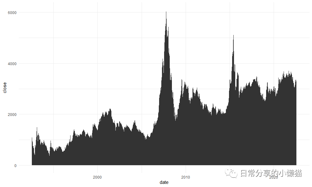
2.1 基础图形
ggplot(shanghai, aes(x = date, y = close)) +
  geom_area()
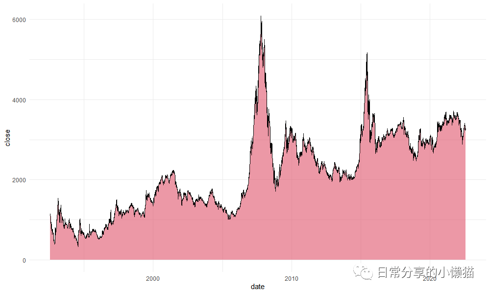
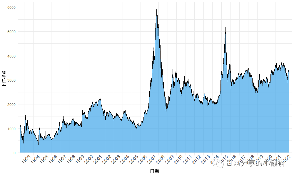
2.2 调整geom_area() 绘图参数。
ggplot(shanghai, aes(x = date, y = close)) +
  geom_area(fill = 2, alpha = 0.6, color = "black", lwd = 0.5, linetype = 1)
2.3 修改x轴与y轴标签及刻度。
ggplot(shanghai, aes(x = date, y = close)) +
  geom_area(fill = 3, alpha = 0.6, color = "black", lwd = 0.5, linetype = 1) +
  scale_x_datetime(date_breaks = "1 year", date_labels = "%Y") +
  scale_y_continuous(breaks = seq(0, 6000, 1000)) +
  theme(axis.text.x = element_text(angle = 45, size = 12),
        panel.grid.minor.x = element_blank()) +
  labs(x = "日期", y = "上证指数")
2.4 进一步修饰。
ggplot(shanghai, aes(x = date, y = close)) +
  geom_area(fill = 4, alpha = 0.6, color = "black", lwd = 0.5, linetype = 1) +
  scale_x_datetime(date_breaks = "1 year", date_labels = "%Y", expand = c(0.01, 0)) +
  scale_y_continuous(breaks = seq(0, 6000, 1000), expand = c(0.02, 0)) +
  theme(axis.text.x = element_text(angle = 45, size = 12),
        panel.grid.minor.x = element_blank()) +
  labs(x = "日期", y = "上证指数")
3、其他
其他绘图方法可进一步阅读公众号其他文章。
如有帮助请多多点赞哦!
文章转载自日常分享的小懒猫,如果涉嫌侵权,请发送邮件至:contact@modb.pro进行举报,并提供相关证据,一经查实,墨天轮将立刻删除相关内容。
