


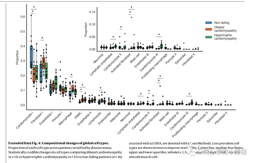
本文主要展示如何利用R语言绘制来自nature期刊Single-nucleus profiling of human dilated and hypertrophic cardiomyopathy[1]一文中的Extended Data Fig.4。该图由散点图、箱线图等组成,用于展示细胞类型组成变化状况,同时该图又由两幅图组成,需要对图进行拼接。如下图所示: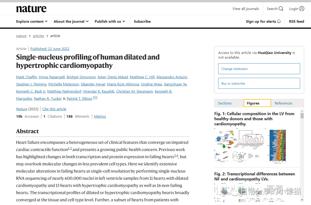
1、图形绘制
library(patchwork)
library(ggplot2)
library(dplyr)
ed.fig4 <- readxl::read_xlsx("41586_2022_4817_MOESM11_ESM.xlsx")
head(ed.fig4)
#  CellType        Patient Disease     Proportion
#  <chr>           <chr>   <chr>            <dbl>
#1 Cardiomyocyte I P1515   Non-failing      0.260
#2 Cardiomyocyte I P1516   Non-failing      0.261
#3 Cardiomyocyte I P1539   Non-failing      0.291
#4 Cardiomyocyte I P1540   Non-failing      0.468
#5 Cardiomyocyte I P1547   Non-failing      0.379
#6 Cardiomyocyte I P1549   Non-failing      0.280
str(ed.fig4)
#tibble [882 x 4] (S3: tbl_df/tbl/data.frame)
# $ CellType  : chr [1:882] "Cardiomyocyte I" "Cardiomyocyte I" "Cardiomyocyte I" "Cardiomyocyte I" ...
# $ Patient   : chr [1:882] "P1515" "P1516" "P1539" "P1540" ...
# $ Disease   : chr [1:882] "Non-failing" "Non-failing" "Non-failing" "Non-failing" ...
# $ Proportion: num [1:882] 0.26 0.261 0.291 0.468 0.379 ...
# 因子化
ed.fig4$CellType <- factor(ed.fig4$CellType, levels = ed.fig4$CellType %>% unique())
ed.fig4$Disease <- factor(ed.fig4$Disease, levels = ed.fig4$Disease %>% unique())

# 主图
plot1 <-
ggplot(ed.fig4, aes(CellType, Proportion, fill = Disease)) +
  geom_boxplot(outlier.shape = NA) + #outlier.shape取消箱线图外的点
  geom_point(aes(group = Disease), position = position_dodge(width = 0.8), show.legend = FALSE) +
  theme_classic() +
  scale_y_continuous(breaks = seq(0, 0.9,0.1) ) +
  scale_fill_manual(values = c("#3D7CA5", "#CB5D28", "#40955A"),
                    labels = c("Non-failing", "Dilated\ncardiomyopathy", "Hypertrophic\ncardiomyopathy")) +
  guides(fill= guide_legend(title = NULL)) + #remove legend title
  theme(legend.position = c(0.92, 0.7),
        legend.text = element_text(lineheight = 1.2, size = 11),
        legend.key.height = unit(1, "cm"),
        axis.line = element_line(size = 1),
        axis.title = element_text(size = 15),
        axis.ticks = element_blank(),
        axis.text = element_text(size = 12),
        axis.text.x = element_text(angle = 45, hjust = 1)) +
  labs(x = "")

# 附图
 plot2 <-
 ggplot(ed.fig4, aes(CellType, Proportion, fill = Disease)) +
   geom_boxplot(outlier.shape = NA) + #outlier.shape取消箱线图外的点
   geom_point(aes(group = Disease) ,position = position_dodge(width = 0.8)) +
   theme_classic() +
   scale_y_continuous(breaks = seq(0, 0.15,0.05), limits = c(0,0.15) ) +
   scale_x_discrete(breaks = levels(ed.fig4$CellType),
                    limits = c(levels(ed.fig4$CellType)[11:21])) +
   scale_fill_manual(values = c("#3D7CA5", "#CB5D28", "#40955A")) +
   theme(legend.position = "none",
         axis.line = element_line(size = 1),
         axis.title = element_text(size = 15),
         axis.ticks = element_blank(),
         axis.text = element_text(size = 12),
         axis.text.x = element_text(angle = 45, hjust = 1)) +
  labs(x = "")

#拼图
plot1 + inset_element(plot2, 0.25,0.20,0.85,1)
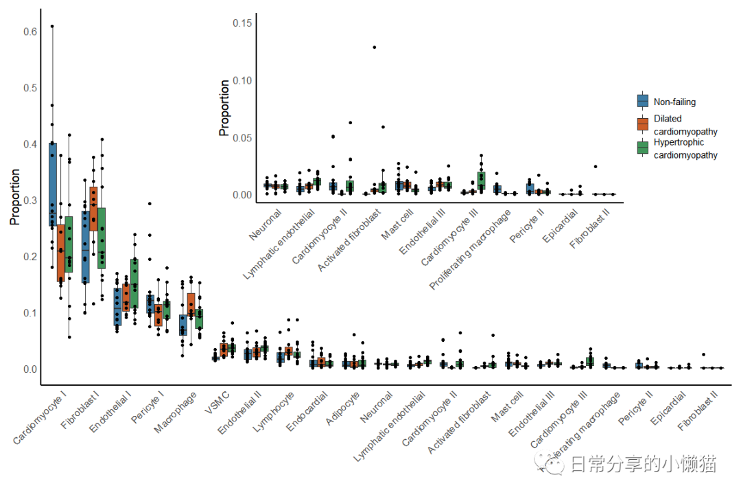
该图使用scCODA方法对细胞组成变化进行检验,目前在R中未发现该方法,因此未进行该部分复现。如有需要可使用Python进行该方法分析,具体可参考scCODA - Compositional analysis of single-cell data[2]。关于该图有2个关键点,一是散点图的分组,需要重新在geom_point() 函数中分配group映射,以及设置position参数。二是组图时需要使用到patchwork包中的inset_element() 函数,注意调整上下左右的参数以使图到合适位置,此外,该图的一些细节,关于隐藏箱线图异常点、图例高度的调整等也需值得关注。
2、其他
其他绘图方法可进一步阅读公众号其他文章。
如有帮助请多多点赞哦!
参考资料
Chaffin, M., Papangeli, I., Simonson, B. et al. Single-nucleus profiling of human dilated and hypertrophic cardiomyopathy. Nature (2022): https://doi.org/10.1038/s41586-022-04817-8
[2]scCODA: https://sccoda.readthedocs.io/en/latest/getting_started.html
文章转载自日常分享的小懒猫,如果涉嫌侵权,请发送邮件至:contact@modb.pro进行举报,并提供相关证据,一经查实,墨天轮将立刻删除相关内容。
