


Plotly Express是对 Plotly.py 的高级封装,内置了大量实用、现代的绘图模板,用户只需调用简单的API函数,即可快速生成漂亮的互动图表,可满足90%以上的应用场景。
本文借助Plotly Express提供的几个样例库进行密度图、小提琴图、箱线图、地图、趋势图,还有用于实现数据预探索的各种关系图、直方图等基本图形的实现。
plotly介于seaborn和pyechart之间,在表达丰富度形式上优于seaborn,在定制化程度上高于pyechart。
代码示例
1. import plotly.express as px
2. df = px.data.iris().query('species_id==1')
3. # marginal_x–'rug' 密度图, 'box' 箱线图, 'violin' 小提琴图, or 'histogram'直方图。
4. # 如果设置,则在主图上方绘制一个水平子图,以可视化x分布。
5. # marginal_y–地毯、盒子、小提琴或柱状图中的一种。
6. # 如果设置,则在主图的右侧绘制一个垂直子图,以显示y分布。
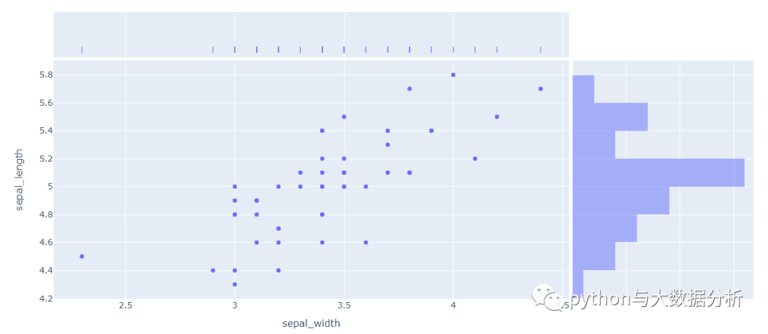
7. # 鸢尾花类型=1的sepal_width,sepal_length散点图,x轴为密度图,y轴为直方图
8. fig = px.scatter(df, x="sepal_width", y="sepal_length",
9. marginal_x="rug", marginal_y="histogram")
10. fig.show()
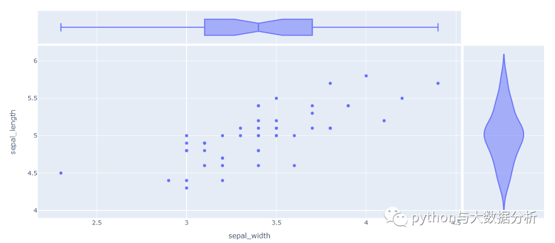
13.  # 鸢尾花类型=1的sepal_width,sepal_length散点图,x轴为箱线图,y轴为小提琴图

14.  fig = px.scatter(df, x="sepal_width", y="sepal_length",

15.  marginal_x="box", marginal_y="violin")

16.  fig.show()
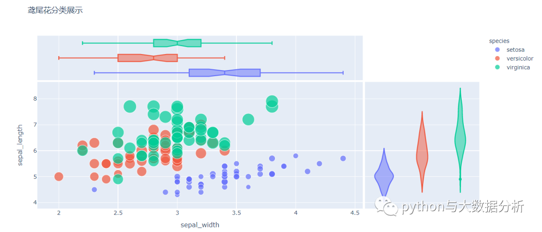
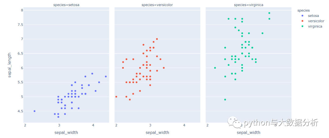
19.  df = px.data.iris()

20.  # 所有花卉,x轴为箱线图,y轴为小提琴图,颜色以鸢尾花类型分类

21.  fig = px.scatter(df, x="sepal_width", y="sepal_length",

22.  color="species", size='petal_length',

23.  hover_data=['petal_width'], hover_name="species",

24.  title="鸢尾花分类展示",

25.  marginal_x="box", marginal_y="violin")

26.  fig.show()
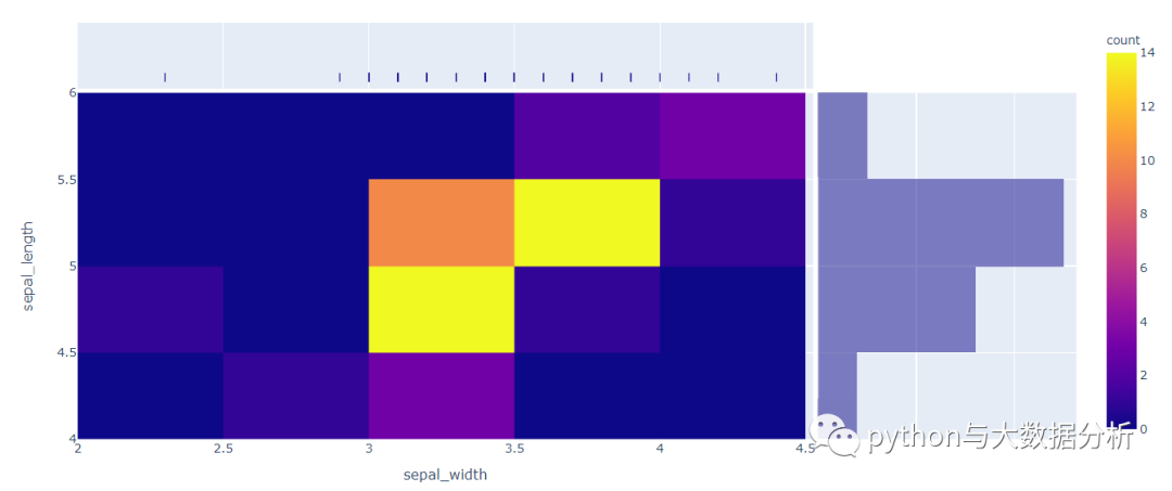
29.  # 密度热力图,鸢尾花类型=1的sepal_width,sepal_length散点图,x轴为密度图,y轴为直方图

30.  fig = px.density_heatmap(df.query('species_id==1'),

31.  x="sepal_width", y="sepal_length",

32.  marginal_x="rug",

33.  marginal_y="histogram"

34.  )

35.  fig.show()
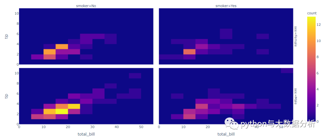
38.  # 密度热力图,行轴用sex,列轴用smoker进行多维度展示

39.  df = px.data.tips()

40.  fig = px.density_heatmap(df, x="total_bill", y="tip",

41.  facet_row="sex", facet_col="smoker")

42.  fig.show()
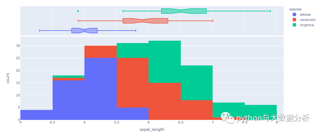
44.  df = px.data.iris()

45.  # 直方图,只有x轴,箱线图

46.  fig = px.histogram(df, x="sepal_length", color="species",

47.  marginal="box")

48.  fig.show()
51.  # 在原有直方图基础上,增加20个区间

52.  fig = px.histogram(df, x="sepal_length", color="species",

53.  marginal="box" ,nbins=20)

54.  fig.show()
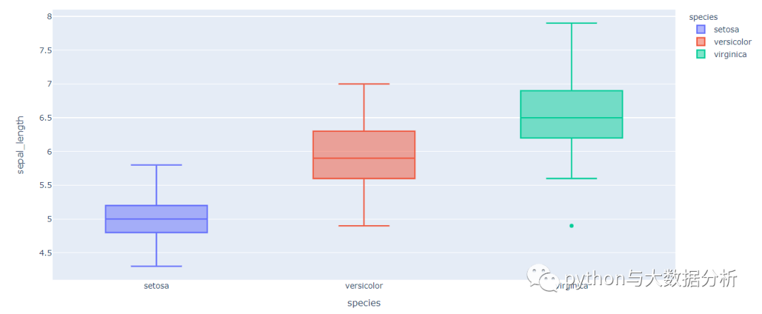
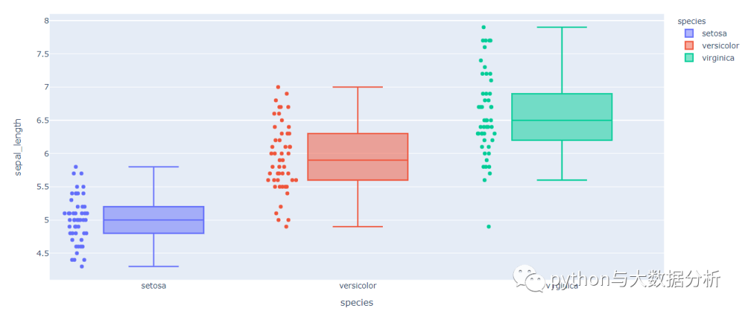
57.  # 箱线图

58.  fig = px.box(df, x="species", y="sepal_length",

59.  color='species')

60.  fig.show()
63.  # 在箱线图上追加散点

64.  fig = px.box(df, x="species", y="sepal_length",

65.  color='species',points='all')

66.  fig.show()
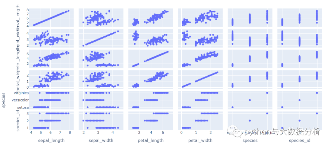
69.  # 散点图矩阵,不指定列会把所有列带出来展示

70.  df = px.data.iris()

71.  fig = px.scatter_matrix(df)

72.  fig.show()
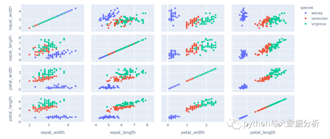
75.  # 散点图矩阵,以鸢尾花颜色分类

76.  fig = px.scatter_matrix(df,

77.  dimensions=["sepal_width", "sepal_length",

78.  "petal_width", "petal_length"],

79.  color="species")

80.  fig.show()
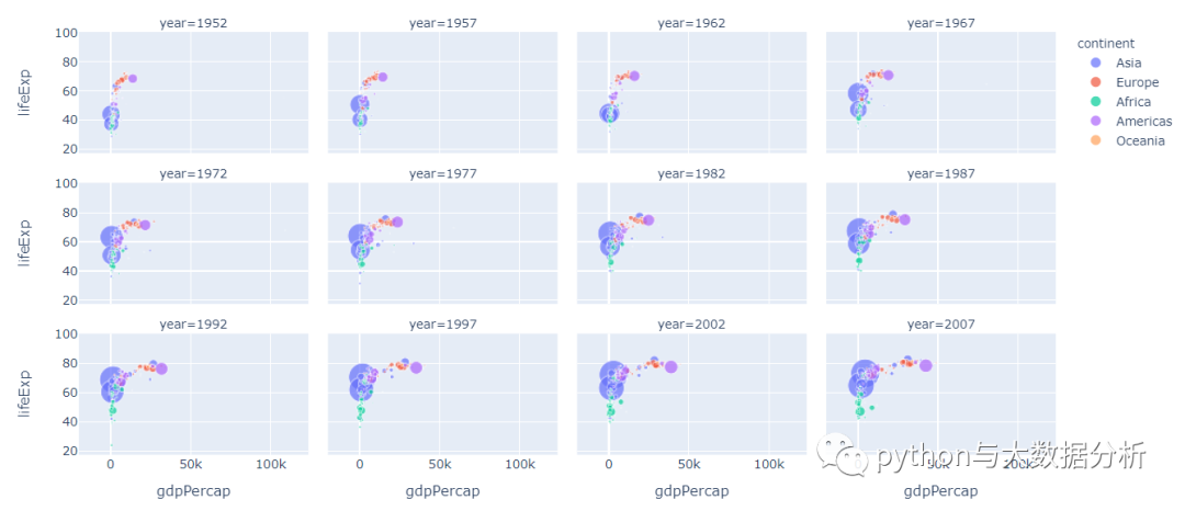
83.  # 散点图,用年份做列分割,每行限定4列

84.  df = px.data.gapminder()

85.  fig = px.scatter(df, x='gdpPercap', y='lifeExp', color='continent', size='pop',

86.  facet_col='year', facet_col_wrap=4)

87.  fig.show()
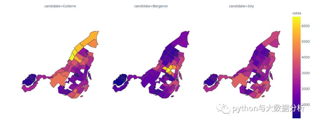
90.  # 地图展示,不过精确度太差

91.  df = px.data.election()

92.  # pandas.melt(frame, id_vars=None, value_vars=None,

93.  # var_name=None, value_name='value', col_level=None)

94.  # 参数解释:宽数据--->>长数据

95.  # frame:要处理的数据集。

96.  # id_vars:不需要被转换的列名。

97.  # value_vars:需要转换的列名,如果剩下的列全部都要转换,就不用写了。

98.  # var_name和value_name是自定义设置对应的列名。

99.  # col_level :如果列是MultiIndex,则使用此级别。

100.  df = df.melt(id_vars="district", value_vars=["Coderre", "Bergeron", "Joly"],

101.  var_name="candidate", value_name="votes")

102.  # 获取地图

103.  geojson = px.data.election_geojson()

104.  # 地图展示

105.  fig = px.choropleth(df, geojson=geojson, color="votes", facet_col="candidate",

106.  locations="district", featureidkey="properties.district",

107.  projection="mercator"

108.  )

109.  fig.update_geos(fitbounds="locations", visible=False)

110.  fig.show()
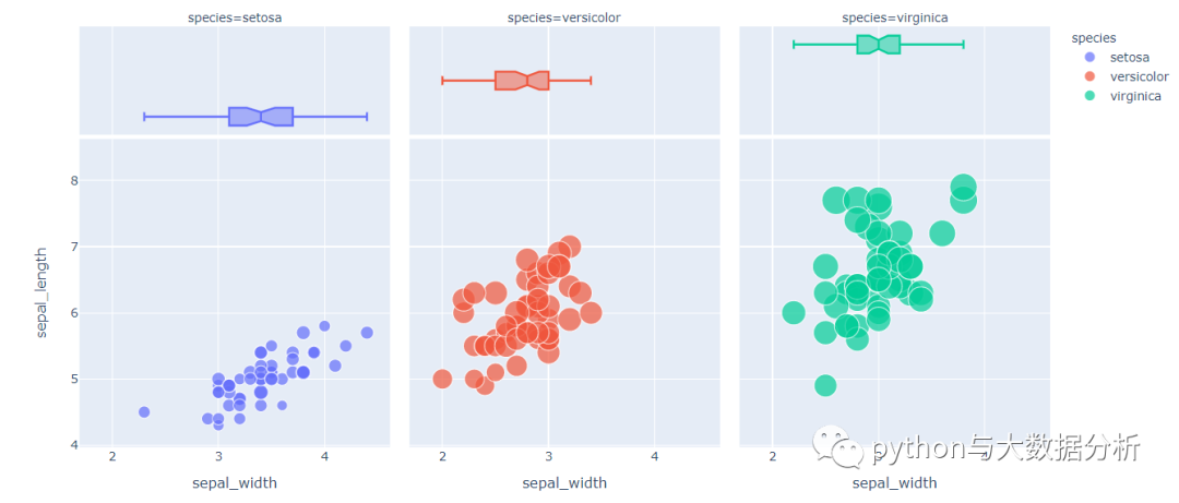
113.  # 条带图

114.  df = px.data.iris()

115.  fig = px.strip(df, x="sepal_width", y="sepal_length",

116.  color="species", facet_col="species")

117.  fig.show()
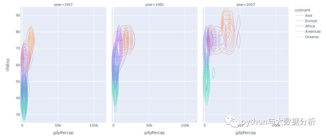
120.  # 密度轮廓图

121.  df = px.data.gapminder().query("year == 2007 | year==1957 | year==1982")

122.  fig = px.density_contour(df, x="gdpPercap", y="lifeExp", z="pop",

123.  facet_col="year",color="continent")

124.  fig.show()
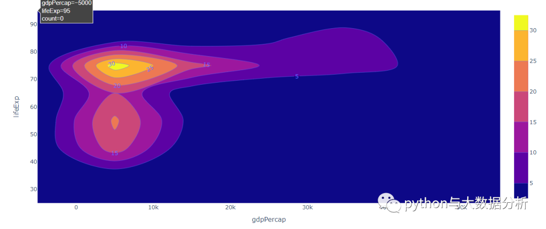
127.  df = px.data.gapminder().query("year == 2007")

128.  fig = px.density_contour(df, x="gdpPercap", y="lifeExp", z="pop")

129.  fig.update_traces(contours_coloring="fill",

130.  contours_showlabels = True)

131.  fig.show()
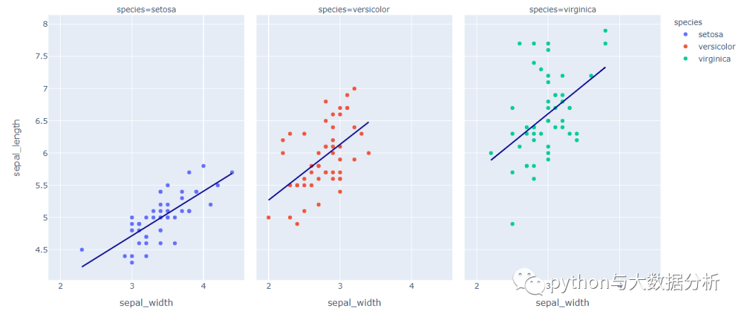
134.  # 散点图加趋势线图

135.  df = px.data.tips()

136.  fig = px.scatter(

137.  df, x='total_bill', y='tip', opacity=0.65,

138.  trendline='ols', trendline_color_override='darkblue'

139.  )

140.  # 散点图加趋势线图

141.  df = px.data.iris()

142.  fig = px.scatter(df, x="sepal_width", y="sepal_length",

143.  color="species", facet_col="species",

144.  trendline='ols',

145.  trendline_color_override='darkblue')

146.  fig.show()
最后请多多关注,谢谢!

最后修改时间:2021-03-01 08:27:15
文章转载自追梦IT人,如果涉嫌侵权,请发送邮件至:contact@modb.pro进行举报,并提供相关证据,一经查实,墨天轮将立刻删除相关内容。
