Pandas
是非常常见的数据分析工具,我们一般都会处理好处理数据然后使用searbon
或matplotlib
来进行绘制。但在Pandas
内部就已经集成了matplotlib
,本文将展示Pandas
内部的画图方法。
画图类型
在Pandas
中内置的画图方法如下几类,基本上都是常见的画图方法。每种方法底层也是使用的matplotlib
。
line
: line plot (default)bar
: vertical bar plotbarh
: horizontal bar plothist
: histogrambox
: boxplotdensity/kde
: Density Estimationarea
: area plotpie
: pie plotscatter
: scatter plothexbin
: hexbin plot
在进行画图时我们有两种调用方法:
df = pd.DataFrame({
    'sales': [3, 3, 3, 9, 10, 6],
    'signups': [4, 5, 6, 10, 12, 13],
    'visits': [20, 42, 28, 62, 81, 50],
}, index=pd.date_range(start='2018/01/01', end='2018/07/01', freq='M'))

# 方法1,这种方法是高层API,需要制定kind
df.plot(kind='area')

# 方法2,这种方法是底层API
df.plot.area()
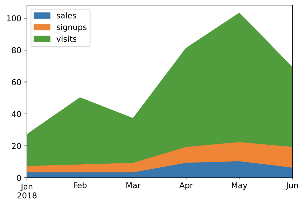
面积图(area)
面积图直观地显示定量数据下面的区域面积,该函数包装了 matplotlib 的area函数。
https://pandas.pydata.org/docs/reference/api/pandas.DataFrame.plot.area.html
# 默认为面积堆叠
df.plot(kind='area')
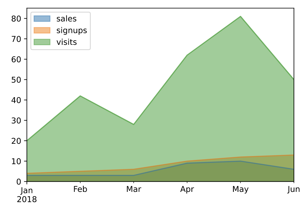
# 设置面积不堆叠
df.plot.area(stacked=False)
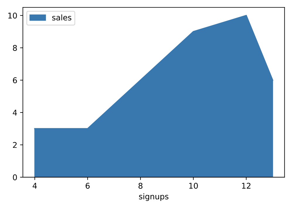
# 手动指定坐标轴
df.plot.area(y='sales', x='signups')
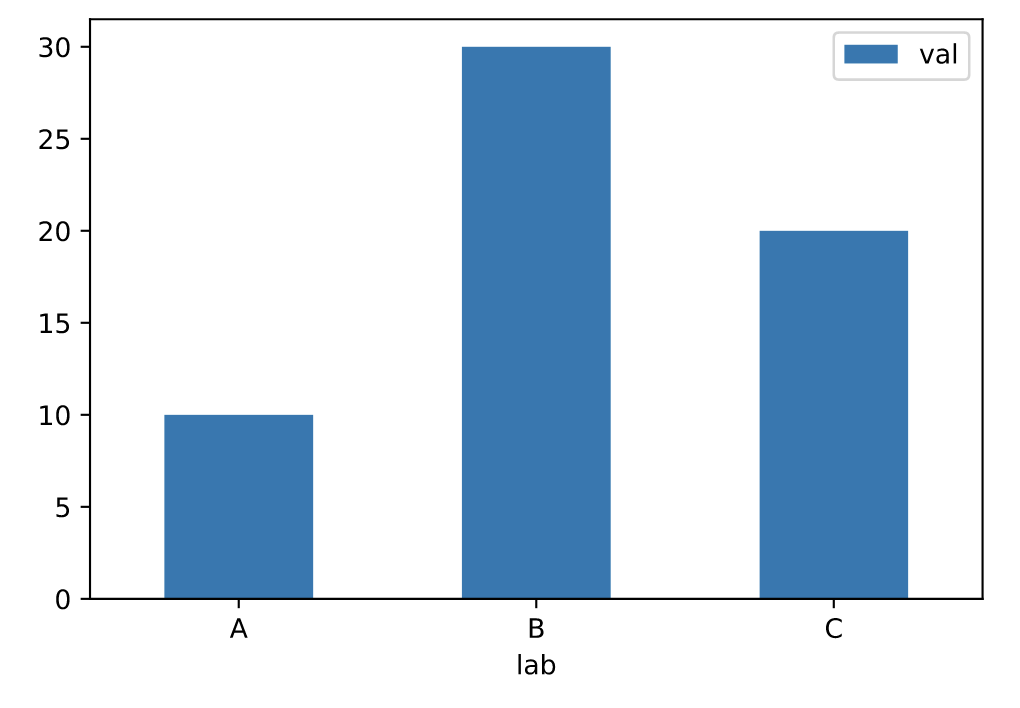
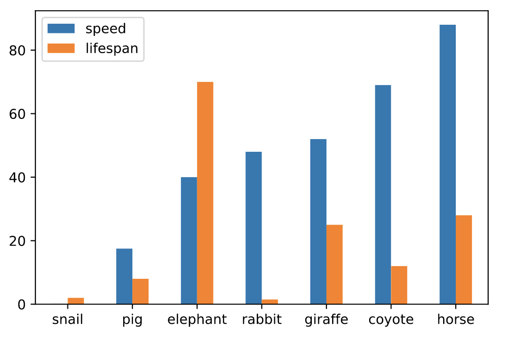
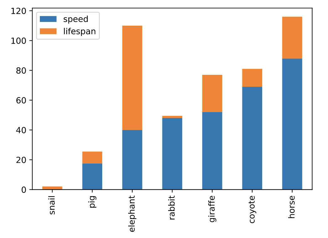
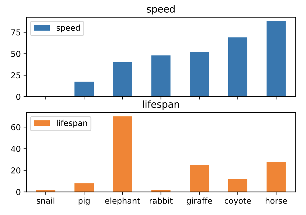
条形图(bar)
条形图是一种用矩形条显示分类数据的图,矩形条的长度与它们所代表的值成比例。条形图显示离散类别之间的比较。图的一个轴显示比较的特定类别,另一个轴表示测量值。
https://pandas.pydata.org/docs/reference/api/pandas.DataFrame.plot.bar.html
df = pd.DataFrame({'lab':['A', 'B', 'C'], 'val':[10, 30, 20]})
# 手动设置坐标轴
ax = df.plot.bar(x='lab', y='val', rot=0)
# 并排绘制
df.plot.bar(rot=0)
# 堆叠绘制
df.plot.bar(stacked=True)
# 分图绘制
axes = df.plot.bar(rot=0, subplots=True)
axes[0].legend(loc=2)
axes[1].legend(loc=2)
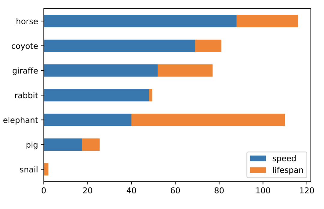
水平条形图(barh)
水平条形图是用矩形条形表示定量数据的图表,矩形条形的长度与它们所代表的值成正比。条形图显示离散类别之间的比较。
# 并排绘制
df.plot.barh(rot=0)

# 堆叠绘制
df.plot.barh(stacked=True)
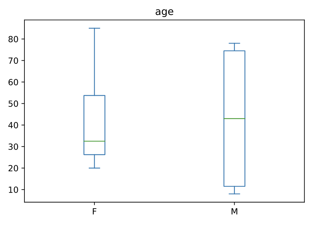
箱线图(boxplot)
箱线图是一种通过四分位数以图形方式描绘数值数据组的方法。该框从数据的 Q1 到 Q3 四分位值延伸,在中位数 (Q2) 处有一条线。
age_list = [8, 10, 12, 14, 72, 74, 76, 78, 20, 25, 30, 35, 60, 85]
df = pd.DataFrame({"gender": list("MMMMMMMMFFFFFF"), "age": age_list})
ax = df.plot.box(column="age", by="gender", figsize=(10, 8))
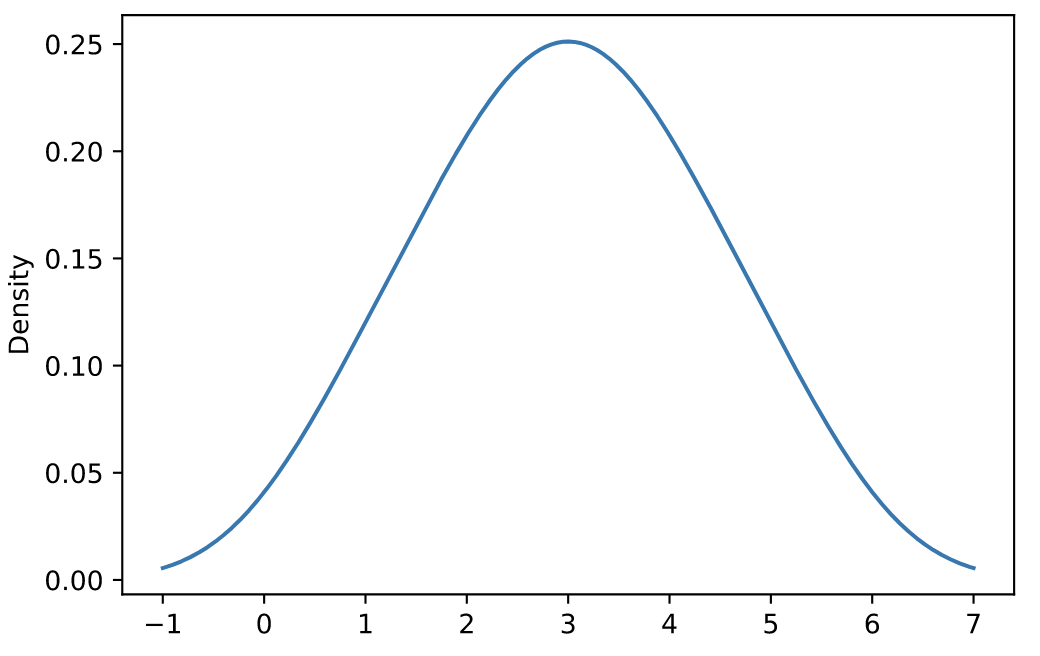
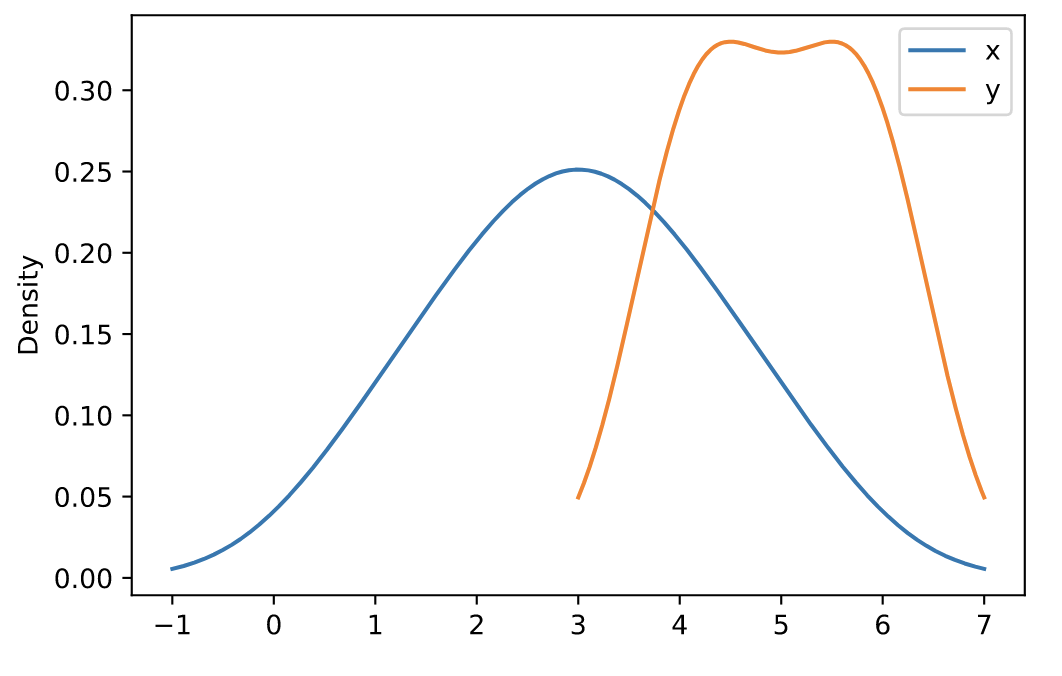
密度图(density)
核密度估计 (KDE) 是一种估计随机变量的概率密度函数 (PDF) 的非参数方法。
https://pandas.pydata.org/docs/reference/api/pandas.DataFrame.plot.density.html
s = pd.Series([1, 2, 2.5, 3, 3.5, 4, 5])
ax = s.plot.kde()
df = pd.DataFrame({
    'x': [1, 2, 2.5, 3, 3.5, 4, 5],
    'y': [4, 4, 4.5, 5, 5.5, 6, 6],
})
ax = df.plot.kde()
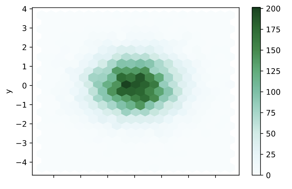
六边形图(hexbin)
和热力图类似,具体的颜色按照密度来进行展示。但形状使用六边形图代替。
https://pandas.pydata.org/docs/reference/api/pandas.DataFrame.plot.hexbin.html
n = 10000
df = pd.DataFrame({'x': np.random.randn(n),
                   'y': np.random.randn(n)})

ax = df.plot.hexbin(x='x', y='y', gridsize=20)
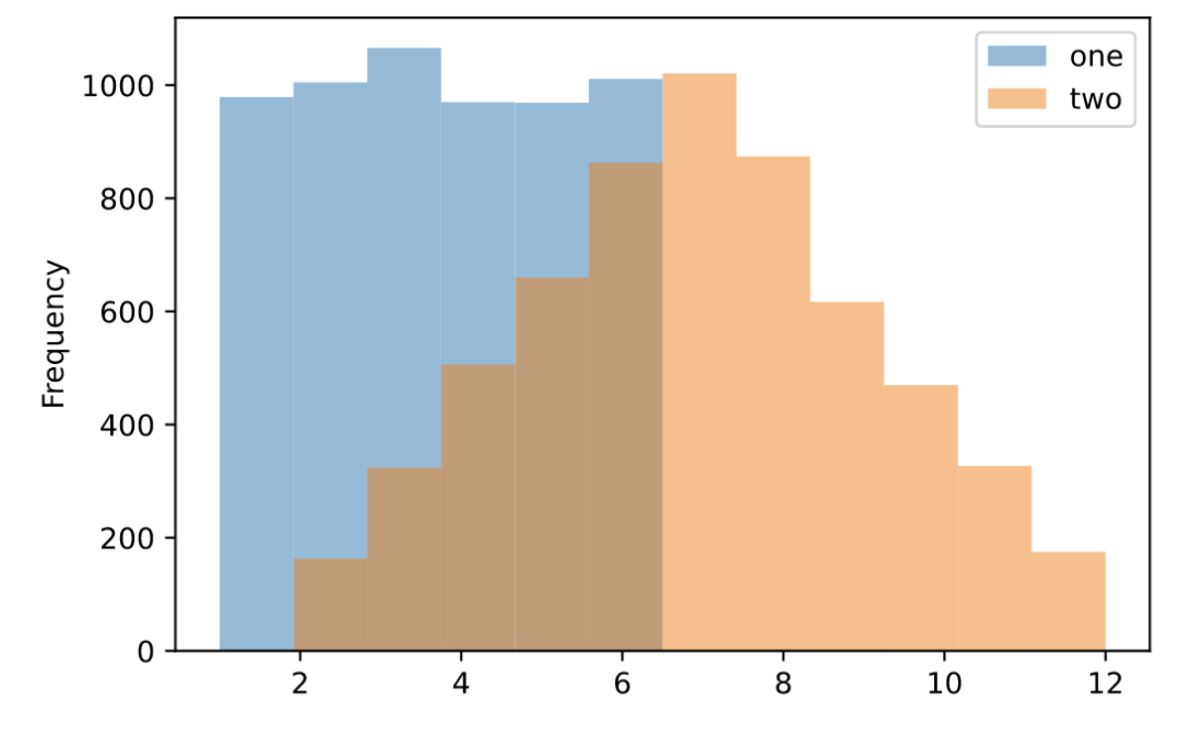
直方图(hist)
https://pandas.pydata.org/docs/reference/api/pandas.DataFrame.plot.hist.html
df = pd.DataFrame(
    np.random.randint(1, 7, 6000),
    columns = ['one'])
df['two'] = df['one'] + np.random.randint(1, 7, 6000)

ax = df.plot.hist(bins=12, alpha=0.5)
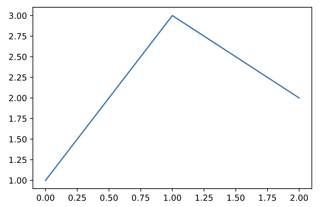
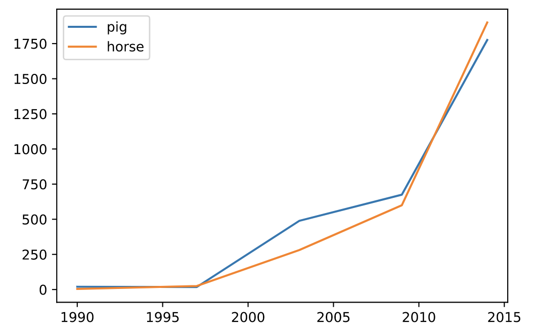
折线图(line)
https://pandas.pydata.org/docs/reference/api/pandas.DataFrame.plot.line.html
s = pd.Series([1, 3, 2])
s.plot.line()
df = pd.DataFrame({
   'pig': [20, 18, 489, 675, 1776],
   'horse': [4, 25, 281, 600, 1900]
   }, index=[1990, 1997, 2003, 2009, 2014])

lines = df.plot.line()
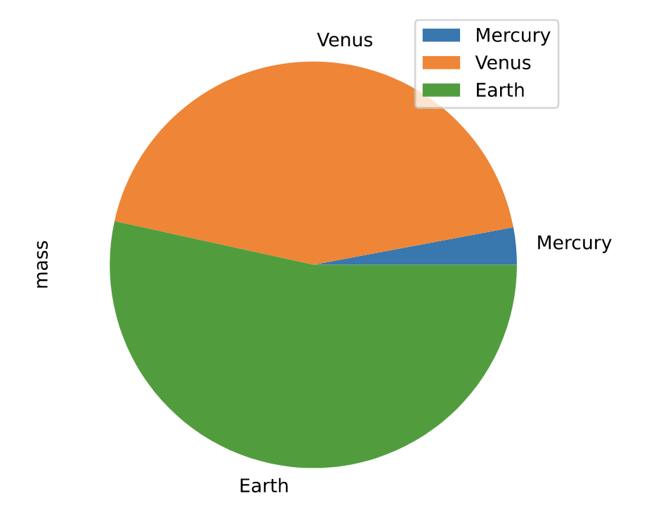
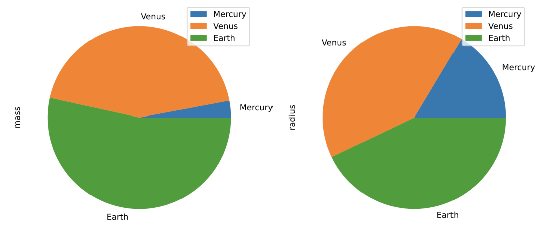
饼图(pie)
https://pandas.pydata.org/docs/reference/api/pandas.DataFrame.plot.pie.html
df = pd.DataFrame({'mass': [0.330, 4.87 , 5.97],
                   'radius': [2439.7, 6051.8, 6378.1]},
                  index=['Mercury', 'Venus', 'Earth'])

plot = df.plot.pie(y='mass', figsize=(5, 5))
# 默认使用index进行分组
df.plot.pie(subplots=True, figsize=(11, 6))
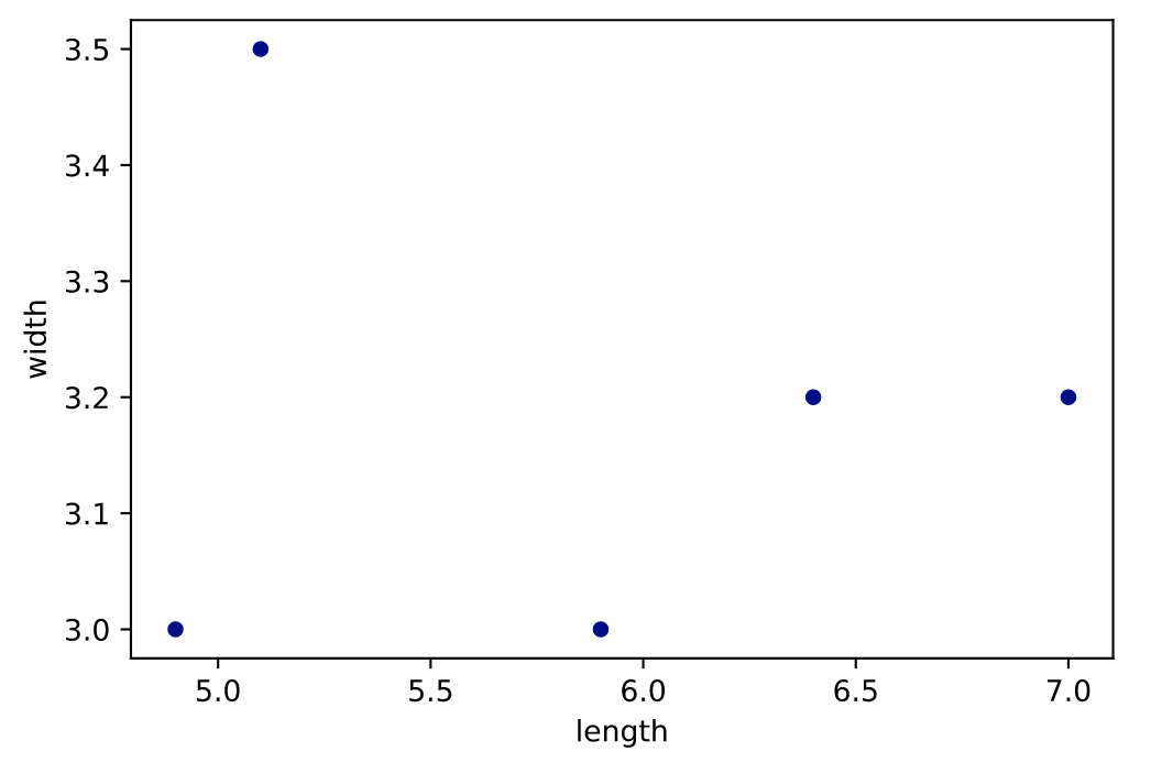
散点图(scatter)
https://pandas.pydata.org/docs/reference/api/pandas.DataFrame.plot.scatter.html
df = pd.DataFrame([[5.1, 3.5, 0], [4.9, 3.0, 0], [7.0, 3.2, 1],
                   [6.4, 3.2, 1], [5.9, 3.0, 2]],
                  columns=['length', 'width', 'species'])

ax1 = df.plot.scatter(x='length',y='width', c='DarkBlue')
# 竞赛交流群 邀请函 #

添加Coggle小助手微信(ID : coggle666)
每天Kaggle算法竞赛、干货资讯汇总
与 24000+来自竞赛爱好者一起交流~