


本文主要结合上一期R语言绘图|带误差线的箱线图内容,继续展示如何在ggplot2中为箱线图添加均值。
1、图形绘制
以R语言中自带的diamonds数据为例,绘制不同颜色(color)
钻石价格(price)
的箱线图,并添加均值
标识。
library(ggplot2)
library(dplyr)
head(diamonds)
#  carat cut       color clarity depth table price     x     y     z
#  <dbl> <ord>     <ord> <ord>   <dbl> <dbl> <int> <dbl> <dbl> <dbl>
#1  0.23 Ideal     E     SI2      61.5    55   326  3.95  3.98  2.43
#2  0.21 Premium   E     SI1      59.8    61   326  3.89  3.84  2.31
#3  0.23 Good      E     VS1      56.9    65   327  4.05  4.07  2.31
#4  0.29 Premium   I     VS2      62.4    58   334  4.2   4.23  2.63
#5  0.31 Good      J     SI2      63.3    58   335  4.34  4.35  2.75
#6  0.24 Very Good J     VVS2     62.8    57   336  3.94  3.96  2.48
# 绘图
ggplot(diamonds, aes(color, price, fill = color )) +
  stat_boxplot(geom = "errorbar", width = 0.4) + #添加误差线
  geom_boxplot() +
  stat_summary(fun = "mean", shape = 24, color = "black",size = 0.8, fill = "red") + #添加均值
  scale_fill_brewer()
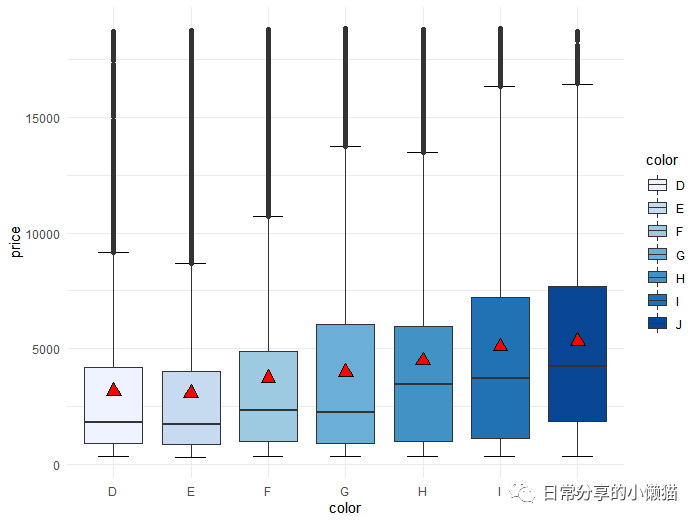
计算均值
diamonds %>% group_by(color) %>% summarise(mean = mean(price))
#  color  mean
#1 D     3170.
#2 E     3077.
#3 F     3725.
#4 G     3999.
#5 H     4487.
#6 I     5092.
#7 J     5324.
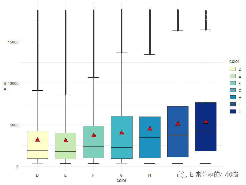
修改颜色
ggplot(diamonds, aes(color, price, fill = color )) +
  stat_boxplot(geom = "errorbar", width = 0.4) +
  geom_boxplot() +
  stat_summary(fun = "mean", shape = 24, color = "black",size = 0.8, fill = "red") +
  scale_fill_brewer(palette = "YlGnBu")
2、其他
关于箱线图的更多绘制方法可进一步查看R语言绘图|箱线图(多变量、分组、分面)或R语言绘图|带误差线的箱线图。其他绘图方法可进一步阅读公众号其他文章。
如有帮助请多多点赞哦!
文章转载自日常分享的小懒猫,如果涉嫌侵权,请发送邮件至:contact@modb.pro进行举报,并提供相关证据,一经查实,墨天轮将立刻删除相关内容。
