


一起来画图!
这次的图片信息由小维提供,代码其实早在6月份就写好了,只不过我一直忘了整理出来,先说声抱歉~
本次模仿的图片来源于文章本次要模仿的图片来源于文章:Single-cell transcriptomic analysis reveals circadian rhythm disruption associated with poor prognosis and drug-resistance in lung adenocarcinoma 的fig3i

Figure 3. Cell-cell ligand-receptor (LRs) and cytokine-related pathway network analysis.
I Interaction of cytokine pathway activity with malignant cells, T cell markers and macrophage markers. The activity of 36 cytokine signaling in CRDhigh malignant cells (red bars in upper panel) or LUAD samples (cyan bars, bottom panel) positively correlate (r > 0.2 & p < 0.01) with T cell markers (purple bars, right panel) and macrophage markers (yellow bars, left panel).
图片看着非常炫酷,线的颜色代表细胞-细胞类别,bar颜色代表不同的细胞类别,连线代表r > 0.2 & p < 0.01的相关性。其实这种连线图在各种文章中非常常见,这里说下我对于连线图数据准备的一些认识:
连线图最重要的只有一点,就是起点和终点,中间线的粗细、长短、颜色,端点的大小,颜色其实都是附加属性。如何理解连线图?最好的学习工具是cytoscape,它的设计内核就是起点-终点。
下面我就开始模仿一下原文的图~
这里要介绍一个巨好用的画连线图的包:crosslink

模仿数据
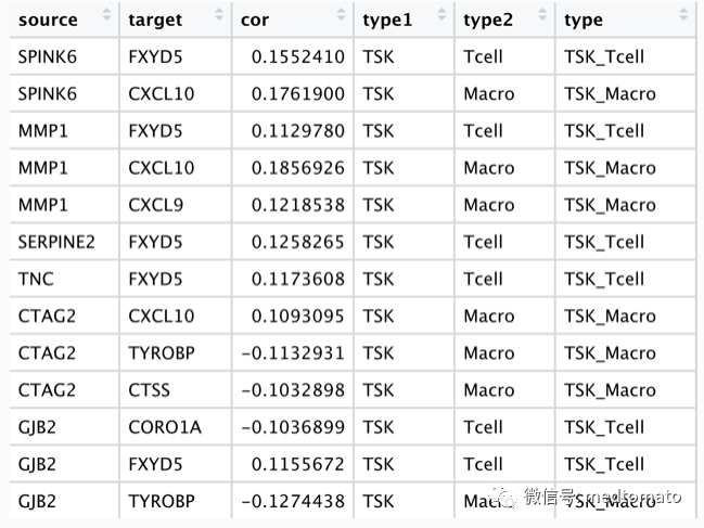
# remotes::install_github("zzwch/crosslink", build_vignettes = TRUE)library(Seurat)library(dplyr)library(crosslink)library(ggthemes)# 这里我直接使用课上的数据load("scRNA.rds")load("sc_marker.Rds")top20<-sc.marker %>% group_by(cluster) %>% top_n(20,wt=avg_log2FC)ave_ex<-AverageExpression(scRNA)ave_ex<-ave_ex$RNATSK.mk<-subset(top20,cluster=="TSK")$geneNKB.mk<-subset(top20,cluster=="Normal_KC_Basal")$geneT.mk<-subset(top20,cluster=="Tcell")$geneMac.mk<-subset(top20,cluster=="Mac")$geneex<-as.data.frame(scRNA@assays$RNA@counts)ex<-ex[c(TSK.mk,NKB.mk,T.mk,Mac.mk),]# 创建端点node<-data.frame(id=c(TSK.mk,NKB.mk,T.mk,Mac.mk),type=c(rep("TSK",20),rep("Normal",20),rep("Tcell",20),rep("Macro",20)))# 计算各个端点的相关性df<-c()for (i in c(TSK.mk,NKB.mk)) {xx<-as.numeric(ex[i,])dd<-do.call(rbind,lapply(c(T.mk,Mac.mk), function(x){dd <- cor.test(as.numeric(ex[x,]),xx,type="spearman")data.frame(source=i,target=x,cor=dd$estimate,p.value=dd$p.value)}))df<-rbind(df,dd)}df2<-subset(df,abs(cor)>=0.1)# 起点-终点-相关性edge<-data.frame(source=df2$source,target=df2$target,cor=df2$cor)# 加上节点属性for (i in 1:nrow(edge)) {edge$type1[i]<-node[which(node$id==edge$source[i]),"type"]edge$type2[i]<-node[which(node$id==edge$target[i]),"type"]edge$type<-paste0(edge$type1,"_",edge$type2)}
## crosslink projectcl <- crosslink(node,edge,cross.by="type")cl@nodes$degree<-1cl %>% cl_plot()
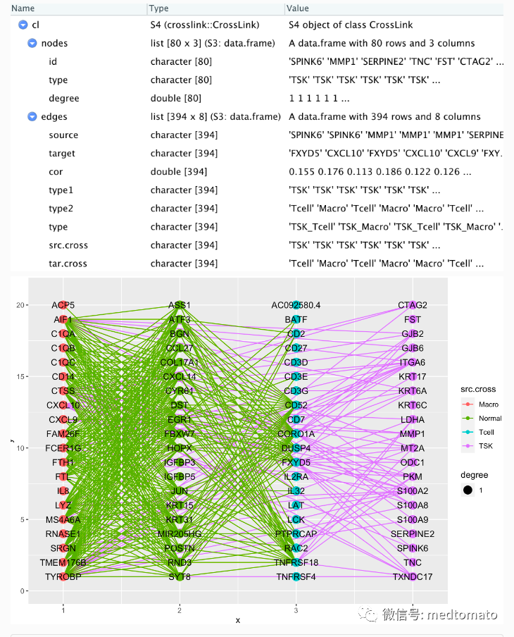
cl <- set_header(cl,header=unique(get_cross(cl)$cross))cl %>% layout_polygon(crosses = c("TSK","Tcell","Normal","Macro"),layout_based = "default") %>%tf_rotate(crosses= c("TSK","Tcell","Normal","Macro"),angle = rep(45,4),layout="default") %>%tf_shift(x=0.2*(-1),y=1.5,crosses=c("TSK","Tcell"),layout="default") -> clcl %>% cl_plot()

已经有大致的样子了!
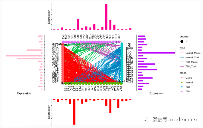
# Top plotTSK1<-data.frame(gene=TSK.mk,exp=as.numeric(ave_ex[TSK.mk,"TSK"]))Tcell1<-data.frame(gene=T.mk,exp=as.numeric(ave_ex[T.mk,"Tcell"]))Normal1<-data.frame(gene=NKB.mk,exp=as.numeric(ave_ex[NKB.mk,"Normal_KC_Basal"]))Macro1<-data.frame(gene=Mac.mk,exp=as.numeric(ave_ex[Mac.mk,"Mac"]))theme_classic() +theme(axis.text = element_blank(),axis.line.x = element_blank(),axis.ticks.x = element_blank()) ->theme_use2topAnn <- TSK1 %>%ggplot(mapping = aes(x=gene,y=exp)) +geom_bar(fill = "#E7298A",stat = "identity",width = 0.5) +labs(x = NULL, y = "Expression") +theme_use2topAnn# Bottom plotbotAnn <- Normal1 %>%ggplot(mapping = aes(x=gene,y=-exp)) +geom_bar(fill = "red",stat = "identity",width = 0.5) +labs(x = NULL, y = "Expression") +theme_use2botAnn# right plotrgtAnn <- Tcell1 %>%ggplot(mapping = aes(x=gene,y=exp)) +geom_bar(fill = "purple",stat = "identity",width = 0.5) +labs(x = NULL, y = "Expression") +theme_use2 +coord_flip()rgtAnnleftAnn <- Macro1 %>%ggplot(mapping = aes(x=gene,y=-exp)) +geom_bar(fill = "pink",stat = "identity",width = 0.5) +labs(x = NULL, y = "Expression") +scale_x_discrete(position = "top")+theme_use2 +coord_flip()leftAnnmid=cl_plot(cl,link = list(mapping = aes(color = type),scale = list(color = scale_color_manual(values = RColorBrewer::brewer.pal(8, "Set1")[c(1:5,7:9)]))),label = list(color="black",angle=c(rep(0,20),rep(90,20),rep(0,20),rep(90,20)),nudge_x=c(rep(-2,20),rep(0,20),rep(2,20),rep(0,20)),nudge_y=c(rep(0,20),rep(-2,20),rep(0,20),rep(2,20)),hjust=c(rep(1,20),rep(1,20),rep(0,20),rep(0,20))))+theme_void()p <- mid

拼凑一下:
topAnn + leftAnn + p + rgtAnn + botAnn+patchwork::plot_layout(ncol = 3, nrow = 3,widths = c(0.5, 1, 0.5),heights = c(0.5, 1, 0.5),guides = "collect",design = c(patchwork::area(1,2,1,2),patchwork::area(2,1,2,1),patchwork::area(2,2,2,2),patchwork::area(2,3,2,3),patchwork::area(3,2,3,2)))
好像还可以,但我个人是比较不喜欢打代码的,我尝试一下用cytoscape试试看:首先把edge文件写出来
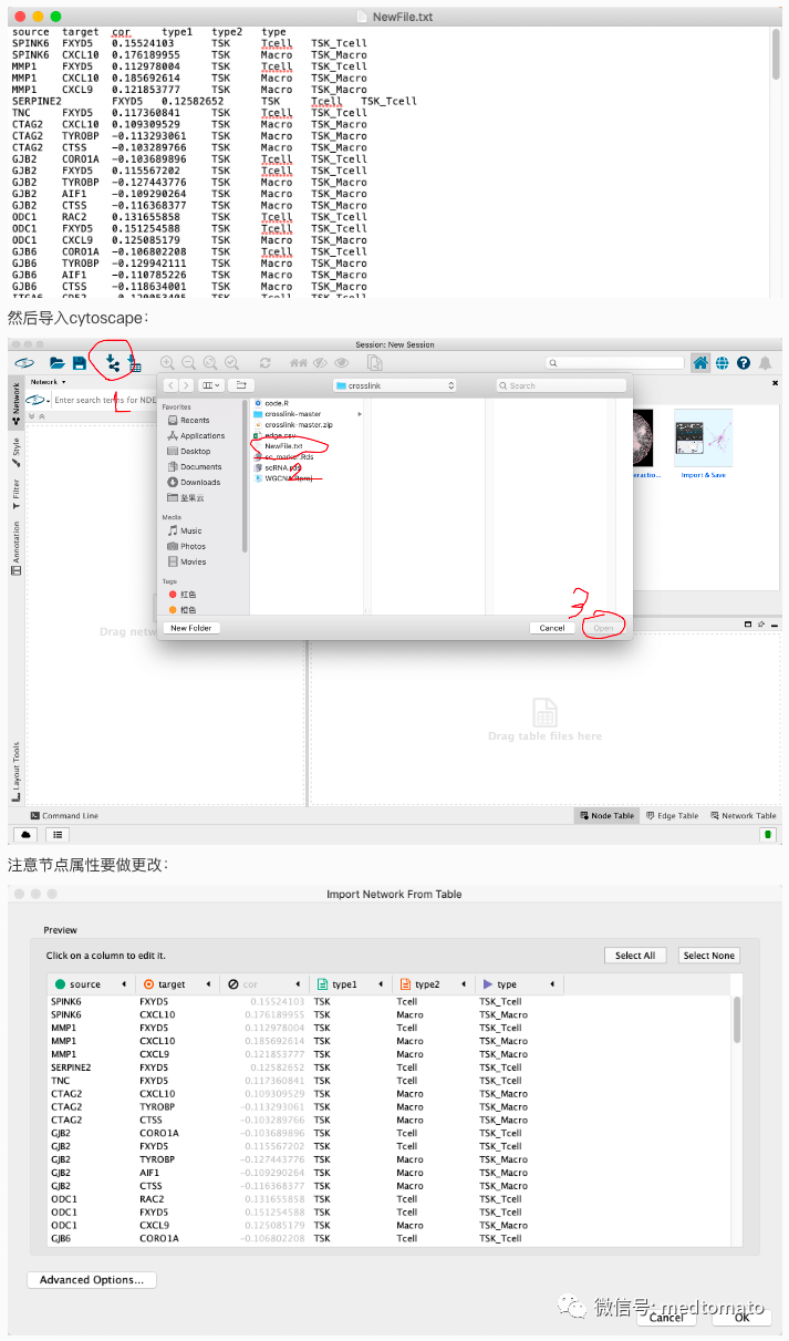
导入之后是这样的:

然后再把节点信息导入进去,简单调整一下:

Cytoscape真方便啊

最后的cytoscape如果不会画可以问我,如果问的人太多的话我就录个屏演示一下~
