


一 多次plot
需求:再添加一个城市的温度变化
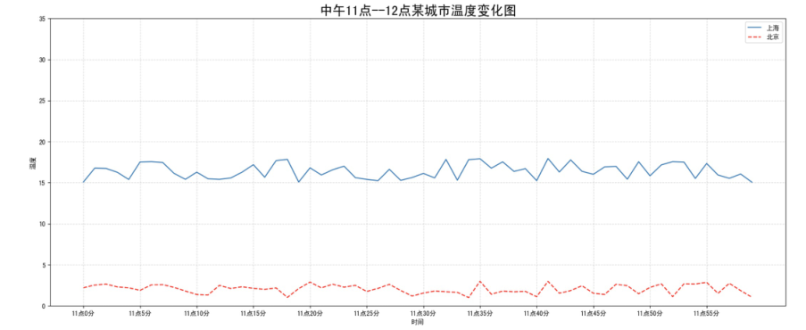
收集到北京当天温度变化情况,温度在1度到3度。怎么去添加另一个在同一坐标系当中的不同图形,其实很简单只需要再次plot即可,但是需要区分线条,如下显示:
# 增加北京的温度数据
y_beijing = [random.uniform(1, 3) for i in x]

# 绘制折线图
plt.plot(x, y_shanghai)
# 使用多次plot可以画多个折线
plt.plot(x, y_beijing, color='r', linestyle='--')
我们仔细观察,用到了两个新的地方,一个是对于不同的折线展示效果,一个是添加图例。
二 设置图形风格
颜色字符 | 风格字符 |
r 红色 | - 实线 |
g 绿色 | - - 虚线 |
b 蓝色 | -. 点划线 |
w 白色 | : 点虚线 |
c 青色 | ' ' 留空、空格 |
m 洋红 | |
y 黄色 | |
k 黑色 |
三 显示图例
注意:如果只在plt.plot()中设置label还不能最终显示出图例,还需要通过plt.legend()将图例显示出来。
# 绘制折线图
plt.plot(x, y_shanghai, label="上海") # 使用多次plot可以画多个折线
plt.plot(x, y_beijing, color='r', linestyle='--', label="北京")

# 显示图例
plt.legend(loc="best")
Location String | Location Code |
'best' | 0 |
'upper right' | 1 |
'upper left' | 2 |
'lower left' | 3 |
'lower right' | 4 |
'right' | 5 |
'center left' | 6 |
'center right' | 7 |
'lower center' | 8 |
'upper center' | 9 |
'center' | 10 |
完整代码:
# 0.准备数据
x = range(60)
y_shanghai = [random.uniform(15, 18) for i in x]
y_beijing = [random.uniform(1,3) for i in x]

# 1.创建画布
plt.figure(figsize=(20, 8), dpi=100)

# 2.绘制图像
plt.plot(x, y_shanghai, label="上海")
plt.plot(x, y_beijing, color="r", linestyle="--", label="北京")

# 2.1 添加x,y轴刻度# 构造x,y轴刻度标签
x_ticks_label = ["11点{}分".format(i) for i in x]
y_ticks = range(40)

# 刻度显示
plt.xticks(x[::5], x_ticks_label[::5])
plt.yticks(y_ticks[::5])

# 2.2 添加网格显示
plt.grid(True, linestyle="--", alpha=0.5)

# 2.3 添加描述信息
plt.xlabel("时间")
plt.ylabel("温度")
plt.title("中午11点--12点某城市温度变化图", fontsize=20)

# 2.4 图像保存
plt.savefig("./test.png")

# 2.5 添加图例
plt.legend(loc=0)

# 3.图像显示
plt.show()
文章转载自Coder陈,如果涉嫌侵权,请发送邮件至:contact@modb.pro进行举报,并提供相关证据,一经查实,墨天轮将立刻删除相关内容。
