


本文主要介绍如何利用R语言绘制带误差线的散点图,即散点误差图,用于展示每组数据的分布状况,其中圆点为每组数据均值,上下误差线为均值加减一个标准差。图形来自chiplot[1]网站,如下图所示。更多内容可关注微信公众号【日常分享的小懒猫】。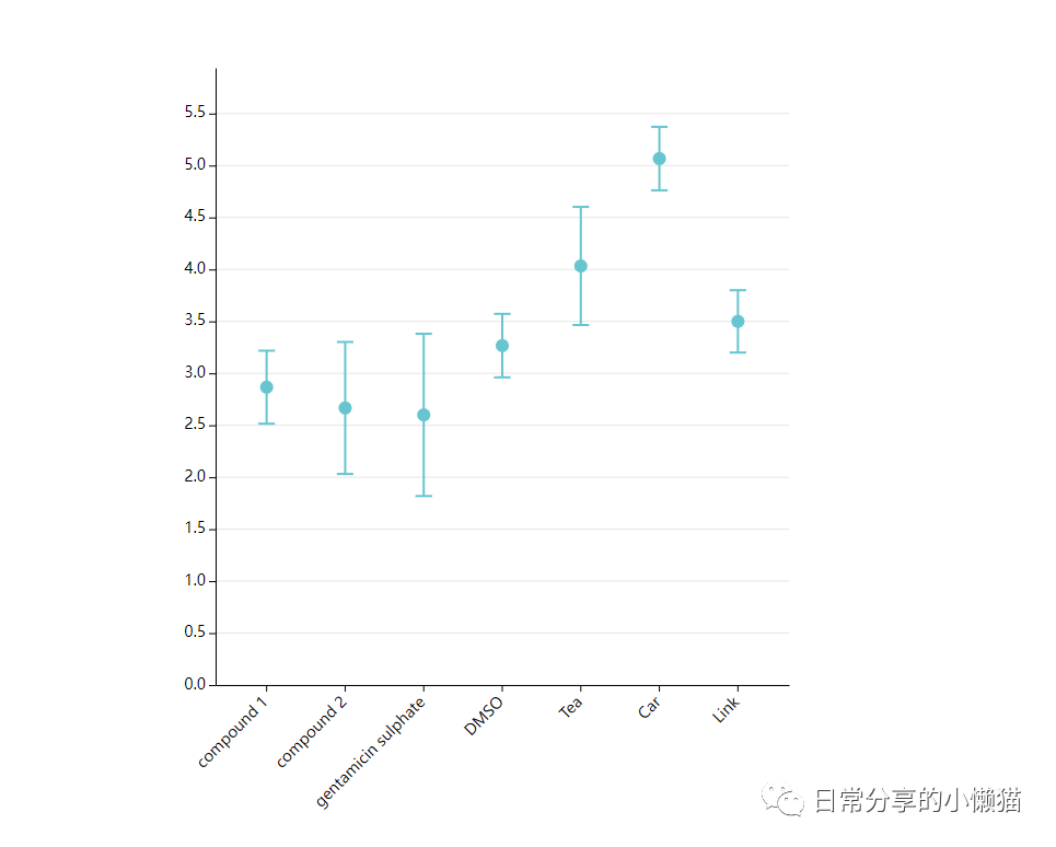
1、数据准备
数据可在chiplot网站自主下载。或后台回复【20221020】进行下载。
setwd("C:/Users/Acer/Desktop")
library(tidyverse)
data <- read.table("散点误差图.tsv", sep = "\t", header = TRUE)
head(data)
#      group1 compound.1 compound.2 gentamicin.sulphate DMSO Tea Car Link
#1 diameter 1        2.9        3.4                 2.2  3.2 4.5 5.4  3.8
#2 diameter 2        3.2        2.3                 2.1  3.0 3.4 5.0  3.5
#3 diameter 3        2.5        2.3                 3.5  3.6 4.2 4.8  3.2
df <- data %>% reshape2::melt(id.vars = "group1", variable.name = "type", value.name = "value")
df$overall = "Wechat:日常分享的小懒猫"
df
#       group1                type value                  overall
#1  diameter 1          compound.1   2.9 Wechat:日常分享的小懒猫
#2  diameter 2          compound.1   3.2 Wechat:日常分享的小懒猫
#3  diameter 3          compound.1   2.5 Wechat:日常分享的小懒猫
#4  diameter 1          compound.2   3.4 Wechat:日常分享的小懒猫
#5  diameter 2          compound.2   2.3 Wechat:日常分享的小懒猫
#6  diameter 3          compound.2   2.3 Wechat:日常分享的小懒猫
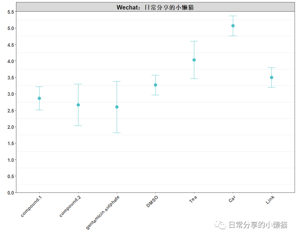
2、图形绘制
ggplot(df, aes(type, value)) +
  stat_summary(fun.data = mean_sdl, fun.args = list(mult = 1),color = "#4FC1C7", geom = "errorbar", width = 0.2) + #添加误差线
  stat_summary(fun = "mean", shape = 19, color = "#4FC1C7", size = 0.8) + #添加均值
  scale_y_continuous(breaks = seq(0, 5.5, 0.5), limits = c(0, 5.5), expand = c(0,0)) +
  facet_wrap(~overall) + #add title
  labs(x = "", y = "") +
  theme_bw() +
  theme(
    text = element_text(face = "bold"),
    panel.grid.major.y = element_blank(),
    panel.grid.major.x = element_blank(),
    axis.text.x = element_text(angle = 45, size = 12, hjust = 1),
    axis.text.y = element_text(size = 12),
    strip.text = element_text(size = 15))
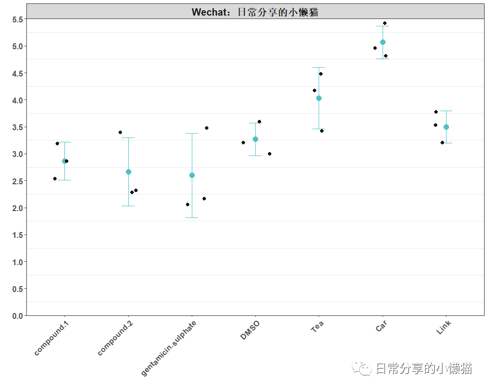
添加点
ggplot(df, aes(type, value)) +
  stat_summary(fun.data = mean_sdl, fun.args = list(mult = 1),color = "#4FC1C7", geom = "errorbar", width = 0.2) + #添加误差线
  stat_summary(fun = "mean", shape = 19, color = "#4FC1C7", size = 0.8) + #添加均值
  geom_jitter(position = position_jitter(0.25), shape = 19, color = "black", size = 2, alpha = 0.9) +
  scale_y_continuous(breaks = seq(0, 5.5, 0.5), limits = c(0, 5.5), expand = c(0,0)) +
  facet_wrap(~overall) + #add title
  labs(x = "", y = "") +
  theme_bw() +
  theme(
    text = element_text(face = "bold"),
    panel.grid.major.y = element_blank(),
    panel.grid.major.x = element_blank(),
    axis.text.x = element_text(angle = 45, size = 12, hjust = 1),
    axis.text.y = element_text(size = 12),
    strip.text = element_text(size = 15))
计算每组数据的均值与标准差
#计算每组数据均值
df %>% group_by(type) %>% summarise(mean = mean(value))
#  type                   sd
#1 compound.1          0.351
#2 compound.2          0.635
#3 gentamicin.sulphate 0.781
#4 DMSO                0.306
#5 Tea                 0.569
#6 Car                 0.306
#7 Link                0.300
#计算每组数据标准差
df %>% group_by(type) %>% summarise(sd = sd(value))
#  type                 mean
#1 compound.1           2.87
#2 compound.2           2.67
#3 gentamicin.sulphate  2.6
#4 DMSO                 3.27
#5 Tea                  4.03
#6 Car                  5.07
#7 Link                 3.5
3、其他
关于该图形的交互式绘图可以进一步在chiplot网站上点击尝试。更多R语言绘图内容可关注微信公众号【日常分享的小懒猫】。
如有帮助请多多点赞哦!
参考资料
chiplot: https://www.chiplot.online/
文章转载自日常分享的小懒猫,如果涉嫌侵权,请发送邮件至:contact@modb.pro进行举报,并提供相关证据,一经查实,墨天轮将立刻删除相关内容。
