


前言
随着智能物联的兴起,万物物联已经成为大趋势,各个大厂都在推出自己的物联网平台打造物联网生态圈抢占市场,本框架就是基于华为hilink平台UI设计标准开发的一套前端UI框架,虽然说hilink平台有着自己的拖拽开发工具,但很难应付各种客户的定制需求,使用本框架就能自己基于客户需求自定义开发hilink应用。
说明文档地址
demo
开发指南
安装
npm安装hilink-ui框架
npm install hi-link-ui引入hilink-ui
在main.js中进行如下配置
import Vue from 'vue'
import HiLinkUI from 'hi-link-ui'
import 'hi-link-ui/packages/style/index.scss'
import App from './App.vue'


Vue.use(HiLinkUI);

Vue.config.productionTip = false

new Vue({
  render: h => h(App),
}).$mount('#app')
主题切换
hilink平台支持主题跟据手机深色模式是否启用来进行切换,在切换处调用 this.$switchTheme() 函数
this.$switchTheme('dark');//切换到深色模式
this.$switchTheme('light');//切换到正常模式
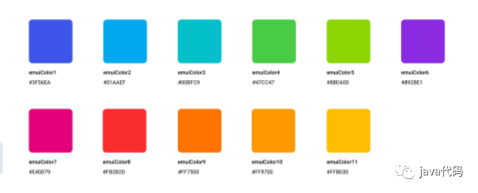
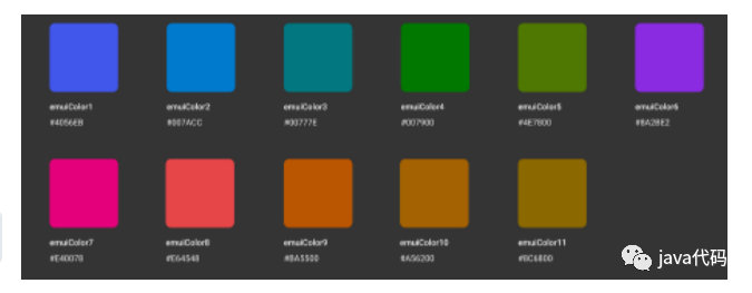
色彩
状态文字颜色
正常模式状态文本颜色
深色模式状态文本颜色
框架已做好主题切换适配,直接使用下面css到对应文本上
.hi-color-1
.hi-color-2
.hi-color-3
.hi-color-4
.hi-color-5
.hi-color-6
.hi-color-7
.hi-color-8
.hi-color-9
.hi-color-10
.hi-color-11
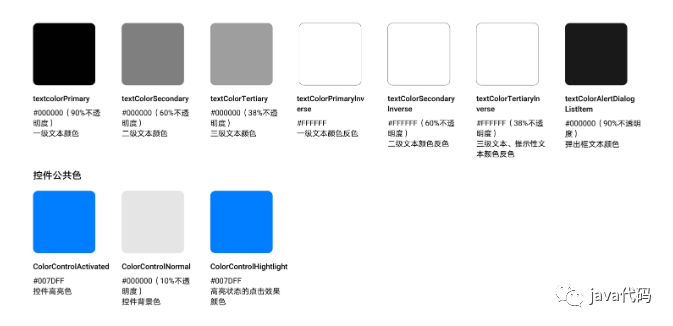
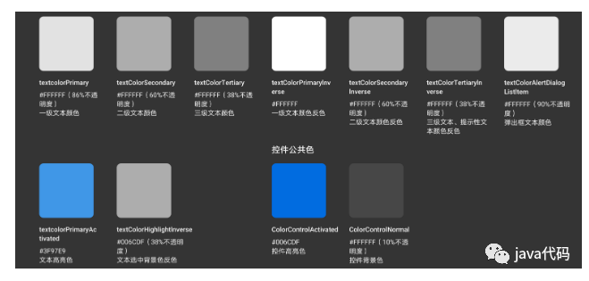
文本颜色
正常模式文本颜色
生色模式文本颜色
框架已做好主题切换适配,直接使用下面css到对应文本上
/* ==================
        文本颜色
 ==================== */

/*一级文本颜色*/
.text-color-one {
  @include text_color_one($text-color-one-light);
}

/*二级文本颜色*/
.text-color-two {
  @include text_color_two($text-color-two-light);
}

/*三级文本颜色*/
.text-color-three {
  @include text_color_three($text-color-three-light);
}

/*弹出框文本颜色*/
.text-color-dialog{
  @include text_color_one($text-color-one-light);
}

/* ==================
       控件公共色
 ==================== */

/*控件高亮色、高亮状态点击效果颜色*/
.widget-bg-highlight,.widget-bg-highlight-click{
  @include widget_bg_highlight($widget-bg-highlight-light)
}

/*控件背景色*/
.widget-bg{
  @include widget_bg($widget-bg-light);
}

/* ==================
        按钮颜色
 ==================== */
.hi-btn-color-red{
  color: #e64548;
}

.hi-btn-color-blue{
  color: #3f97e9;
}
组件
layout布局
该组件使用flex布局
基础布局
基础栅栏布局
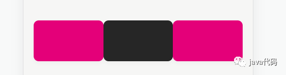
span为分栏所占比例
<hi-row >
  <hi-col :span="1" >
    <hi-card style="background-color: #e40079;"></hi-card>
  </hi-col>
  <hi-col :span="1">
    <hi-card style="background-color: #262626;"></hi-card>
  </hi-col>
  <hi-col :span="1">
    <hi-card style="background-color: #e40079;"></hi-card>
  </hi-col>
</hi-row>
分栏间隔
分栏之间存在间隔
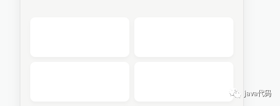
padding为栅栏之间的间距,类型可以是Number和String,Number时单位为px,String时则是跟据所传入数据的单位而定
<hi-row :padding="8">
  <hi-col :span="1">
    <hi-card></hi-card>
  </hi-col>
  <hi-col :span="1">
    <hi-card></hi-card>
  </hi-col>
</hi-row>

<hi-row :padding="8">
  <hi-col :span="1">
    <hi-card ></hi-card>
  </hi-col>
  <hi-col :span="1">
    <hi-card></hi-card>
  </hi-col>
</hi-row>
混合模式
可将不同栅格布局的栏位集合到一起
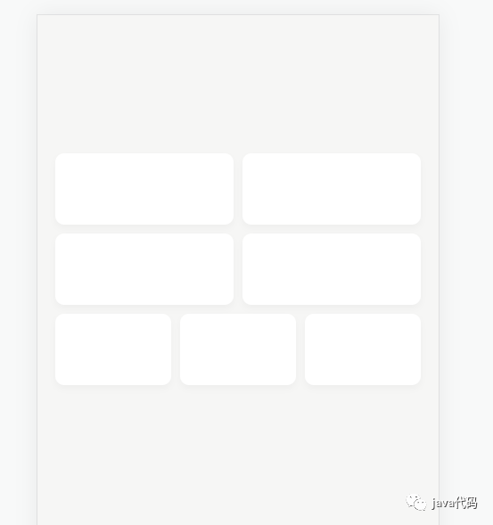
<hi-row :padding="8">
  <hi-col :span="1"><hi-card></hi-card></hi-col>
  <hi-col :span="1"><hi-card></hi-card></hi-col>
</hi-row>
<hi-row :padding="8">
  <hi-col :span="1"><hi-card ></hi-card></hi-col>
  <hi-col :span="1"><hi-card></hi-card></hi-col>
</hi-row>
<hi-row :padding="8">
  <hi-col :span="1"><hi-card ></hi-card></hi-col>
  <hi-col :span="1"><hi-card></hi-card></hi-col>
  <hi-col :span="1"><hi-card></hi-card></hi-col>
</hi-row>
Row Attributes
| 参数 | 说明 | 类型 | 可选值 | 默认值 |
|---|---|---|---|---|
| padding | 设置内部栅栏间距 | [String,Number] | -- | 0 |
| tag | 自定义元素标签 | String | -- | div |
| is-vertical-line | 是否显示栅栏边框 | Boolean | -- | false |
Col Attributes
| 参数 | 说明 | 类型 | 可选值 | 默认值 |
|---|---|---|---|---|
| span | 在row中占比权重 | Number | -- | 1 |
| tag | 自定义元素标签 | String | -- | div |
Card 卡片
卡片样式控件
使用方式
卡片控件自动圆角,符合设计文档需求,并可以通过padding自定义内边距,通过height定义高度
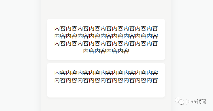
<hi-card padding="1rem" height="auto">
  <span>内容内容内容内容内容内容内容内容内容内容内容内容内容内容内容内容内容内容内容内容内容内容内容内容内容内容内容内容内容内容内容</span>
</hi-card>
<hi-card padding="1rem" height="4rem">
  <span>内容内容内容内容内容内容内容内容内容内容内容内容内容内容内容内容内容内容</span>
</hi-card>
Card Attributes
| 参数 | 说明 | 类型 | 可选值 | 默认值 |
|---|---|---|---|---|
| padding | 设置卡片内边距 | [Number,String] | -- | 0 |
| height | 设置卡片高度 | [Number,String] | -- | 4rem |
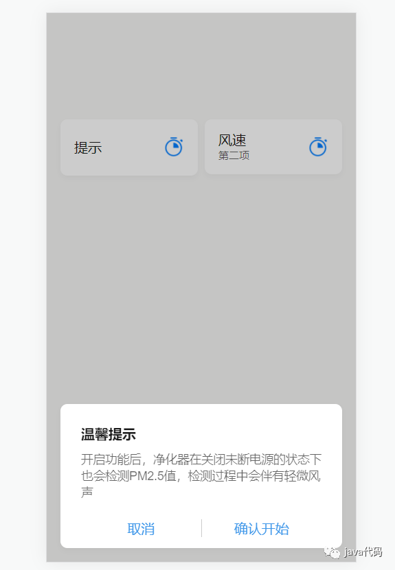
Dialog 弹窗
使用方式
Dialog 弹出一个自定义弹框
<template>
  <hi-card >
    <hi-row class="item2" :padding="0">
      <hi-col :span="1">
        <div class="item1-div">
          <div class="text-color-one model-title-main-size" @click="showDialog = true">
              提示
    	  </div>
        </div>
      </hi-col>
      <hi-col :span="1">
        <img src="/img/appoint_on.png" class="item-logo">
      </hi-col>
    </hi-row>
  </hi-card>
  <hi-dialog
      :visible="showDialog"
      :bottom="16"
      title="温馨提示" @openDialog="openDialog">
    <div slot="dialog-body">
      开启功能后,净化器在关闭未断电源的状态下也会检测PM2.5值,检测过程中会伴有轻微风声
    </div>
    <div slot="dialog-foot">
      <hi-row is-vertical-line :padding="0">
        <hi-col :span="1" class="hi-btn-color-blue">
          <span @click="showDialog = false">取消</span>
        </hi-col>
        <hi-col :span="1" class="hi-btn-color-blue">
          确认开始
        </hi-col>
      </hi-row>
    </div>
  </hi-dialog>
</template>

<script>
    export default {
      data(){
        showDialog:false
      }
    }
</script>
Dialog Attributes
| 参数 | 说明 | 类型 | 可选值 | 默认值 |
|---|---|---|---|---|
| title | 标题 | String | -- | '' |
| visible | 是否显示 | Boolean | -- | false |
| bottom | 距离底部距离(px) | Number | -- | null |
| top | 距离顶部距离(px) | Number | -- | null |
Dropdown 下拉菜单
使用方式
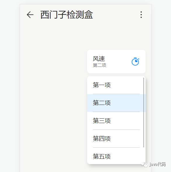
<template>
 <hi-card>
    <hi-dropdown :list="dropdownList" v-model="id">
      <span slot="content">
        <hi-row class="item2" :padding="0">
          <hi-col :span="1">
            <div class="item2-div">
              <div class="text-color-one model-title-main-size">风速</div>
              <div class="text-color-two model-title-subtitle-size">{{getName(this.id)}}</div>
            </div>
          </hi-col>
          <hi-col :span="1">
            <img src="/img/appoint_on.png" class="item-logo">
          </hi-col>
        </hi-row>
      </span>
    </hi-dropdown>
  </hi-card>
</template>


<script>
    export default {
      data(){
    	return{
            id:1,
            dropdownList:[
            {
              id:0,
              name:'第一项'
            },
            {
              id:1,
              name:'第二项'
            },
            {
              id:2,
              name:'第三项'
            },
            {
              id:3,
              name:'第四项'
            },
            {
              id:4,
              name:'第五项'
            },
            {
              id:5,
              name:'第六项'
            }
          ]
        }
      },
  	  methods:{
        getName(id){
          for (let i = 0; i < this.dropdownList.length; i++) {
            if (id == this.dropdownList[i].id){return this.dropdownList[i].name}
          }
        }
      }
    }
</script>
Dropdown Attributes
| 参数 | 说明 | 类型 | 可选值 | 默认值 |
|---|---|---|---|---|
| v-model | 绑定值 | Boolean String Number | -- | -- |
| list | 选择列表 | Array | -- | [] |
Header 头部栏
使用方式
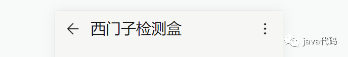
<template>
	<hi-header back more :style="{marginTop:statusBarHeight+'px'} " @toBack="toBack" @toMore="toMore">
      <span slot="title">西门子检测盒</span>
    </hi-header>
</template>


<script>
    export default {
        data(){
            return{
                statusBarHeight:0
            }
        },
        mounted(){
            if (window.hilink){
                  window.getStatusBarHeight = res => {
                    console.log(res)
                    let data = JSON.parse(res);
                    this.statusBarHeight = data.statusBarHeight;
                  }
                  window.hilink.getStatusBarHeight('getStatusBarHeight');
                  window.hilink.setTitleVisible(false);
            }
        },
        methods:{
            toBack(){
      			console.log('toBack')
            },
            toMore(){
                console.log('toMore')
            }
        }
    }
</script>
Header Attributes
| 参数 | 说明 | 类型 | 可选值 | 默认值 |
|---|---|---|---|---|
| back | 是否显示返回按钮 | Boolean | -- | true |
| more | 是否显示更多按钮 | Boolean | -- | true |
Header Events
| 事件名称 | 说明 | 回调参数 |
|---|---|---|
| toBack | 返回按钮点击监听 | -- |
| toMore | 更多按钮点击监听 | -- |
Loading 加载框
使用方式
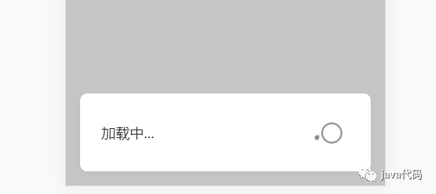
调用load.close()方法能关闭加载框
export default {
    mounted(){
        let load = this.$loading({
          msg:'加载中...'
        })
        setTimeout(()=>{
            load.close();
        },1000)
    }
}
Loading Options
| 参数 | 说明 | 类型 | 可选值 | 默认值 |
|---|---|---|---|---|
| msg | 加载框提示内容 | String | -- | '' |
MessageBox 消息框
Confirm 确认框
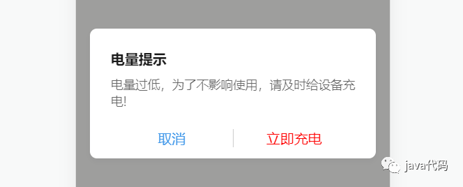
export default {
    mounted(){
        this.$messageBox.confirm({
            title:'电量提示',
            msg:"电量过低,为了不影响使用,请及时给设备充电!",
            confirmText:"立即充电",
            confirmColor:"red"
        }).then((res)=>{
            console.log("点击确认");
        },(err)=>{
            console.log("点击取消");
        })
    }
}
Confirm Options
| 参数 | 说明 | 类型 | 可选值 | 默认值 |
|---|---|---|---|---|
| title | 确认框标题 | String | -- | '' |
| msg | 确认框内容 | String | -- | '' |
| confirmText | 确认按钮文字 | String | -- | 确认 |
| cancelText | 取消按钮文字 | String | -- | 取消 |
| confirmColor | 确认按钮文字颜色 | String | -- | '' |
| cancelColor | 取消按钮文字颜色 | String | -- | '' |
TimePicker 日期选择弹框
使用方式
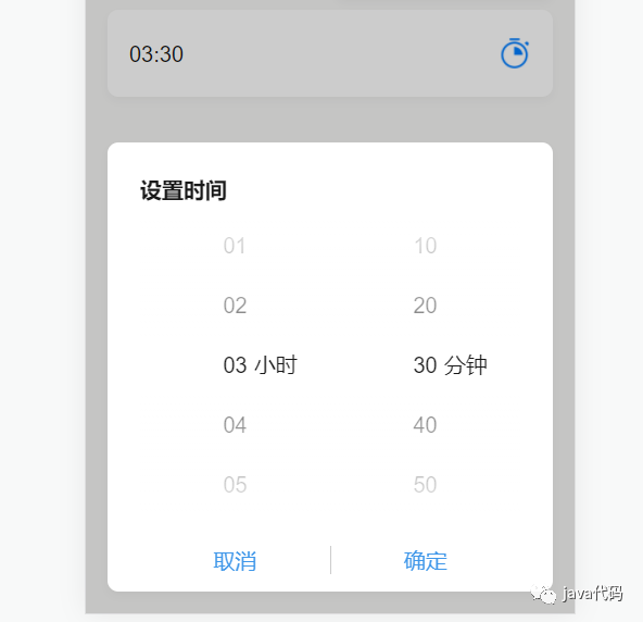
<template>
    <div>
		<hi-card >
            <hi-row class="item2" :padding="0">
              <hi-col :span="1">
                <div class="item1-div">
                  <div class="text-color-one model-title-main-size" @click="showTimeDialog = true">{{ time?time:'时间' }}</div>
                </div>
              </hi-col>
              <hi-col :span="1">
                <img src="/img/appoint_on.png" class="item-logo">
              </hi-col>
            </hi-row>
        </hi-card>
        <hi-time-picker :visible="showTimeDialog" title="设置时间" @confirm="timeConfirm" v-model="time">
    	</hi-time-picker>
    </div>

</template>


<script>
	export default {
        data(){
            return{
                time:'03:30',
                showTimeDialog:false
            }
        },
        methods:{
            timeConfirm(type,val){
                this.showTimeDialog = false
            }
        }
    }
</script>
TimePicker Attributes
| 参数 | 说明 | 类型 | 可选值 | 默认值 |
|---|---|---|---|---|
| title | 日期选择弹框标题 | String | -- | '' |
| visible | 日期选择弹框开关 | Boolean | -- | false |
| v-model | 绑定值 | Boolean String Number | -- | -- |
TimePicker Events
| 事件名称 | 说明 | 回调参数 |
|---|---|---|
| confirm | 获取弹框按钮点击监听 | type:'success'成功按钮,'confirm'取消按钮;val:返回值 |
Product 产品展示
使用方式
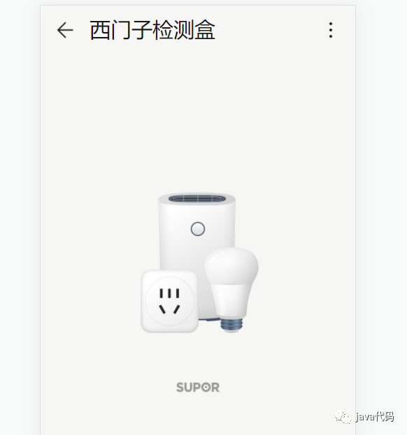
<template>
	<hi-product
        class="logo"
        :bigUrl="'/img/ic_public_default.png'"
        :miniUrl="'/img/logo-supor.png'"></hi-product>
</template>
Product Attributes
| 参数 | 说明 | 类型 | 可选值 | 默认值 |
|---|---|---|---|---|
| bigUrl | 产品图片地址 | String | -- | '' |
| miniUrl | 品牌图片地址 | String | -- | '' |
| black | 图片是否偏暗 | Boolean | -- | false |
Progress 滑块
使用方式
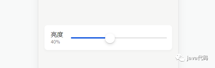
<template>
  <hi-card>
    <hi-row>
      <hi-col :span="1">
        <div class="item3-div">
          <div class="text-color-one model-title-main-size">亮度</div>
          <div class="text-color-two model-title-subtitle-size" style="margin-top: 0.125rem">{{progressVal*10}}%</div>
        </div>
      </hi-col>
      <hi-col :span="4">
        <div style="padding-right: 1rem;">
          <hi-progress class="item3-rang" :min="0" :max="10" v-model="progressVal"></hi-progress>
        </div>
      </hi-col>
    </hi-row>
  </hi-card>
</template>


<script>
export default {
    data(){
        return{
            progressVal:3
        }
    }
}
</script>
Progress Attributes
| 参数 | 说明 | 类型 | 可选值 | 默认值 |
|---|---|---|---|---|
| v-model | 绑定值 | Boolean String Number | -- | -- |
| min | 最小值 | Number | -- | 0 |
| max | 最大值 | Number | -- | 0 |
Swipe 轮播
使用方式
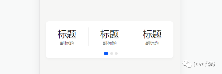
<template>
  <hi-card :height="95">
    <hi-swipe :height="70">
      <div slot="swipe-item">
        <div class="swipe-item" v-for="(item,index) in 3" :key="index">
          <hi-row
              :padding="0"
              is-vertical-line
              style="margin-top: 1rem;">
            <hi-col :span="1" v-for="(item1,index1) in 3" :key="index1">
              <div class="model-content-title-size text-color-one">标题</div>
              <div class="model-title-subtitle-size text-color-two">副标题</div>
            </hi-col>
          </hi-row>
        </div>
      </div>
    </hi-swipe>
  </hi-card>
</template>
Swipe Attributes
| 参数 | 说明 | 类型 | 可选值 | 默认值 |
|---|---|---|---|---|
| height | 控件高度(px) | Number | -- | 200 |
Switch 开关
使用方式
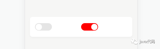
<template>
  <hi-card>
    <hi-row>
      <hi-col :span="1" style="margin-top: 1.25rem;margin-left: 1rem;">
        <hi-switch v-model="switchState" @change="switchChange"></hi-switch>
      </hi-col>
      <hi-col :span="1" style="margin-top: 1.25rem;margin-right: 1rem;">
        <hi-switch
            v-model="switchState1"
            no-color="red"></hi-switch>
      </hi-col>
    </hi-row>
  </hi-card>
</template>

<script>
export default {
    data(){
        return{
            switchState:false,
            switchState1:false,
        }
    },
    methods:{
        switchChange(val){
      		console.log(val)
        }
    }
}
</script>
Switch Attributes
| 参数 | 说明 | 类型 | 可选值 | 默认值 |
|---|---|---|---|---|
| no-color | 打开状态背景颜色 | String | -- | 跟随系统 |
| off-color | 关闭状态背景颜色 | String | -- | 跟随系统 |
| v-model | 绑定值 | Boolean String / Number | -- | -- |
Switch Events
| 事件名称 | 说明 | 回调参数 |
|---|---|---|
| change | 监听切换状态 | val:切换状态 |
Toast 提示框
警告提示
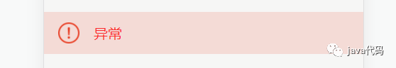
export default {
    mounted(){
        this.$toast({
          msg:'异常'
        })
    }
}
文章转载自java代码,如果涉嫌侵权,请发送邮件至:contact@modb.pro进行举报,并提供相关证据,一经查实,墨天轮将立刻删除相关内容。
