


起因
最近接手了一个vue3项目,echarts用的是"vue-echarts": “^6.0.0”,每次查看文档的时候痛苦不已,找一个配置要花费大量时间,所以这篇文章,主要就是为了记录比较常见的一些配置。
主要会写三种图的配置项:圆环图、直线图、柱状图
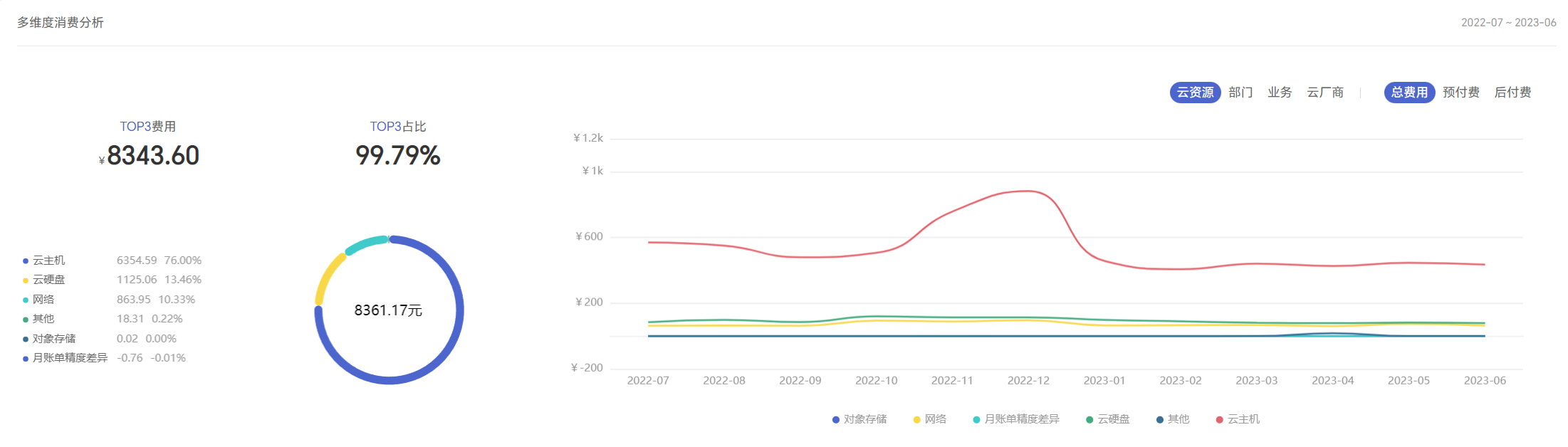
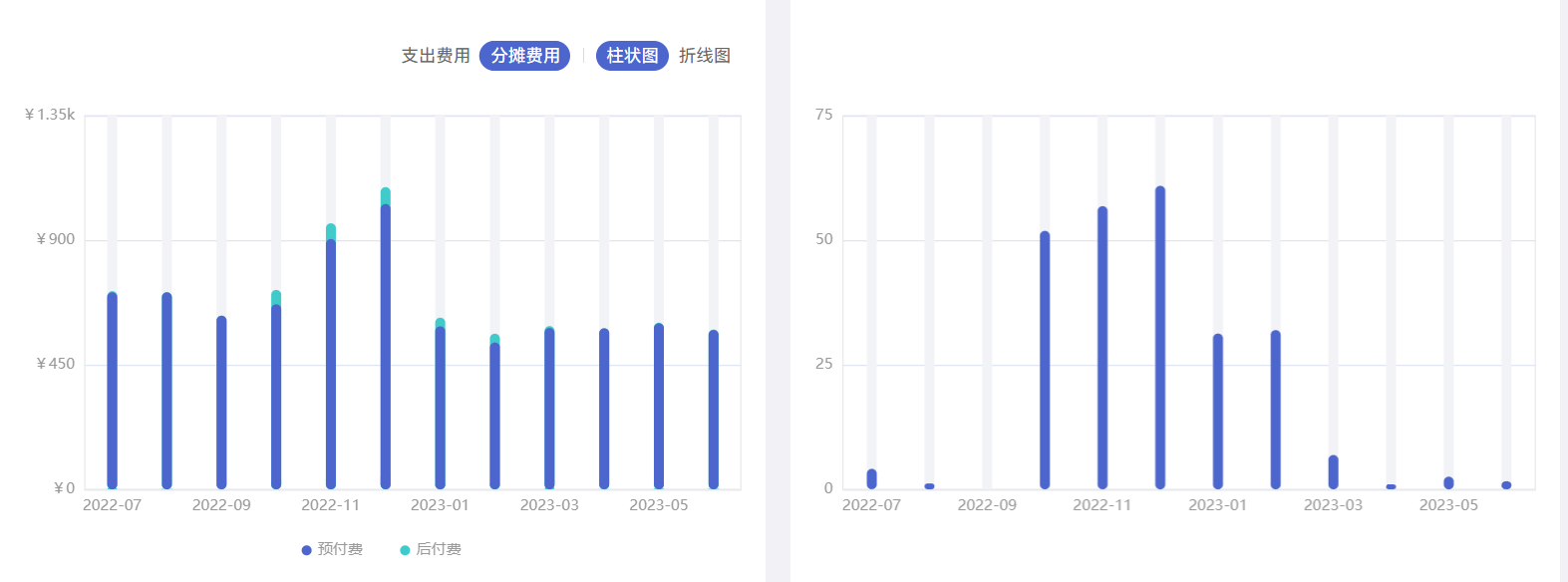
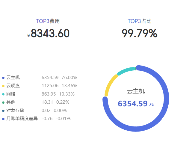
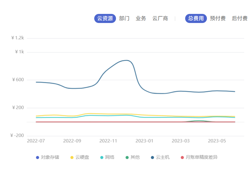
效果图:
使用vue-echarts
在package.json中的dependencies里面加一行"vue-echarts": “^6.0.0”,然后npm install,进行安装,这是最简单的。
npm(推荐方式)
npm install echarts vue-echarts
CDN
在 HTML 文件按如下方式依次引入 echarts 和 vue-echarts:
<script src="https://cdn.jsdelivr.net/npm/echarts@4.1.0/dist/echarts.js"></script>
<script src="https://cdn.jsdelivr.net/npm/vue-echarts@4.0.2"></script>
在main.js中引入
import VueCharts from 'vue-echarts'
app.component('app-chart', VueCharts) //使用的时候用<app-chart></app-chart>
官方文档(写的不详细,很多都是让跳转到echarts官网,再去查找)vue-echarts官网地址点这里
圆环图
<template>
  <div>
    <app-chart :option="state.pieOption" style="height: 300px;" :autoresize="true"></app-chart>
  </div>
</template>
<script setup>
import { reactive, onMounted } from 'vue'
const state = reactive({
  pieOption: {},
})
onMounted(() => {
  getCostSubItemAnalysis()
})
const getCostSubItemAnalysis= () => {
  state.loading = true
  proxy.$apollo.query().then(res => {
    if (!res.loading && res.data) {
      state.costSubItemData = res.data.getCostSubItemAnalysis
      getPieChart(state.costSubItemData.subItems) //从接口中请求到数据
    }
  }).finally(() => {
    state.loading = false
  })
}
const getPieChart = (chartData) => {
  let newArr = []
  let legendWidth = 46 //该参数是为了让左侧图例文字对齐,给了文字宽度
  let totalLeft = '67%' //圆环中间总额距离左边的距离
  chartData?.forEach((item, index) => { //传过来的数据剔除为0的数据
    if (item.cost !== 0) newArr.push(item)
  })
  let total = 0  //计算总额
  newArr = newArr?.map(item => {
    total += Number(item.cost.toFixed(2)) //总额相加保留两位小数
    if (item.name.length > 6) legendWidth = 86 //如果图例名称大于六个文字,宽度给86,否则给46
    if (total >= 10000) totalLeft = '66%' //如果总额大于10000,圆环中间总额距离左边的距离为66%,否则为67%
    return { value: item.cost.toFixed(2), name: resource[item.name] ? resource[item.name] : item.name }
  })
  state.pieOption = {
    color: ['#4C66CE', '#F8D849', '#40CBCA', '#42AB7F', '#386F95', '#E2646C'], // 圆环图图例、每区域颜色
    legend: { // 图例
      orient: 'vertical',// 布局方式,默认为水平布局,可选为:'horizontal' ¦ 'vertical'
      x: 'left',// 水平安放位置,默认为全图居中,可选为:'center' ¦ 'left' ¦ 'right'¦ {number}(x坐标,单位px)
      y: 'center',// 垂直安放位置,默认为全图顶端,可选为:'top' ¦ 'bottom' ¦ 'center'¦ {number}(y坐标,单位px)
      itemWidth: 6,// 图例图形宽度
      itemHeight: 6,// 图例图形高度
      itemGap: 8,// 图例每项之间的间隔。横向布局时为水平间隔,纵向布局时为纵向间隔。
      icon: 'circle', // 图例项的icon,ECharts 提供的标记类型包括'circle', 'rect', 'roundRect', 'triangle', 'diamond', 'pin', 'arrow', 'none',可以通过 'image://url' 设置为图片,其中 URL 为图片的链接,或者 dataURI。
      textStyle: {// 图例的公用文本样式
        color: '#999999', //文字的颜色
        fontSize: 14, //文字的大小
        fontWeight: 400, //文字的字重
        rich: { // 在 rich 里面,可以自定义富文本样式。利用富文本样式,可以在标签中做出非常丰富的效果,在文本中,可以对部分文本采用 rich 中定义样式,这里需要在文本中使用标记符号:`{styleName|text content text content}` 标记样式名。注意,换行仍是使用 '\n'。
          a: {//styleName
            width: legendWidth,
            color: '#666666'
          },
          b: {
            color: '#999999'
          },
          c: {
            color: '#999999'
          }
        }
      },
      formatter: function (name) {
        let total = 0
        let tarValue = null
        for (let i = 0; i < newArr.length; i++) {
          total += Number(newArr[i].value || 0)
          if (name === newArr[i].name) {
            tarValue = Number(newArr[i].value || 0)
          }
        }
        const p = (Number(tarValue / total) * 100).toFixed(2)
        var arr = [
          '{a|' + name + '}',
          '{b|' + tarValue + '}',
          '{c|' + p + '%}'
        ]
        return arr.join('  ')
      }
    },
    graphic: { // graphic 是原生图形元素组件。可以支持的图形元素包括:image, text, circle, sector, ring, polygon, polyline, rect, line, bezierCurve, arc, group,
      type: 'text',// 用这个在圆环中间显示总金额
      left: totalLeft, //距离容器左边的距离
      top: '48%',
      style: {
        text: total.toFixed(2) + '元', // 总金额保留两位小数
        fontSize: 16, // 总金额字体大小
        color: '#333',
        fontWeight: 400
      }
    },
    series: [
      {
        type: 'pie', // 图表类型  bar:柱状图   line:折线图   pie:饼图
        radius: ['50%', '56%'], // 饼图的半径。可以为如下类型:number:直接指定外半径值。string:例如,'20%',表示外半径为可视区尺寸(容器高宽中较小一项)的 20% 长度。Array.<number|string>:数组的第一项是内半径,第二项是外半径。每一项遵从上述 number string 的描述。
        center: ['74%', '50%'], // 饼图的中心(圆心)坐标,数组的第一项是横坐标,第二项是纵坐标。支持设置成百分比,设置成百分比时第一项是相对于容器宽度,第二项是相对于容器高度。
        avoidLabelOverlap: false, // 是否启用防止标签重叠策略,默认开启,在标签拥挤重叠的情况下会挪动各个标签的位置,防止标签间的重叠。
        minAngle: 1,//最小的角度,防止出现为0时,样式出错的情况
        itemStyle: { // 图形样式
          borderColor: '#fff', // 图形的描边颜色。支持的颜色格式同 color,不支持回调函数。
          borderWidth: 0, // 描边线宽。为 0 时无描边。
          borderRadius: 10 // 用于指定饼图扇形区块的内外圆角半径,支持设置固定数值或者相对于扇形区块的半径的百分比值
        },
        label: { // 饼图图形上的文本标签,可用于说明图形的一些数据信息,比如值,名称等。
          normal: {
            show: false,
            formatter: '{name|{b}}\n\n{value|{c}} {money|元}', // 标签内容格式器,支持字符串模板和回调函数两种形式,字符串模板与回调函数返回的字符串均支持用 \n 换行。
            position: 'center',
            width: 130,
            lineHight: 30,
            backgroundColor: '#ffffff',
            rich: {
              name: {
                fontSize: 16,
                color: '#333',
                fontWeight: 400
              },
              value: {
                fontSize: 20,
                color: 'inherit',
                fontWeight: 600
              },
              money: {
                fontSize: 12,
                color: 'inherit',
                fontWeight: 600
              }
            }
          },
          show: false,
          position: 'center' // 标签的位置,可选:'outside',饼图扇区外侧,通过视觉引导线连到相应的扇区。'inside'饼图扇区内部。'inner' 同 'inside'。'center'在饼图中心位置。
        },
        emphasis: { // 高亮状态的扇区和标签样式
          label: {
            show: true,
            fontSize: 16,
            fontWeight: '400'
          }
        },
        labelLine: { // 标签的视觉引导线配置
          show: false
        },
        labelLayout: function (params) { // 标签的统一布局配置。该配置项是在每个系列默认的标签布局基础上,统一调整标签的(x, y)位置,标签对齐等属性以实现想要的标签布局效果。
          const isLeft = params.labelRect.x < 50
          const points = params.labelLinePoints
          if (!points) return
          points[2][0] = isLeft
            ? params.labelRect.x
            : params.labelRect.x + params.labelRect.width
          return {
            labelLinePoints: points // 默认引导线的位置,目前只有饼图(pie)和漏斗图(funnel)有默认标签位置,如果没有该值则为 null
          }
        },
        data: newArr?.map(item => { // 系列中的数据内容数组。数组项可以为单个数值
          return {
            name: item.name,
            value: item.value
          }
        })
      }
    ]
  }
}
</script>
折线图
<template>
  <div>
    <app-chart :option="state.option" style="height: 350px;" :autoresize="true"></app-chart>
  </div>
</template>
<script setup>
import { reactive, onMounted } from 'vue'
const state = reactive({
  option: {},
})
onMounted(() => {
  getCostSubItemAnalysis()
})
const getCostSubItemAnalysis= () => {
  state.loading = true
  proxy.$apollo.query().then(res => {
    if (!res.loading && res.data) {
      state.costSubItemData = res.data.getCostSubItemAnalysis
      getLineChart(state.costSubItemData.trend) //从接口中请求到数据
    }
  }).finally(() => {
    state.loading = false
  })
}
const getLineChart= (chartData) => {
  if (!chartData.series) chartData.series = []
  const maxArr = []
  const legend = []
  const series = chartData.series?.map(item => {
    const lineData = []
    item.data.forEach(subitem => {
      lineData.push(Math.abs(subitem)) // Math.abs计算一个数的绝对值
    })
    maxArr.push(Math.max.apply(null, lineData))
    legend.push({
      name: resource[item.name] ? resource[item.name] : item.name
    })
    return {
      name: resource[item.name] ? resource[item.name] : item.name,
      type: 'line',
      smooth: true,
      symbol: item.data.length > 1 ? 'none' : 'circle',
      data: item.data.map(subitem => subitem.toFixed(2))
    }
  })
  let max = 0
  max = Math.ceil(Math.max.apply(null, maxArr) * 1.2) > 0 ? Math.ceil(Math.max.apply(null, maxArr) * 1.2) : 3
  state.option = {
    color: ['#4C66CE', '#F8D849', '#40CBCA', '#42AB7F', '#386F95', '#E2646C'],
    grid: { // 直角坐标系内绘图网格,单个 grid 内最多可以放置上下两个 X 轴,左右两个 Y 轴. 可以在网格上绘制折线图,柱状图,散点图(气泡图)。
      left: '36px', // grid 组件离容器左侧的距离。
      right: '36px',
      top: '24px',
      bottom: '48px',
      containLabel: true //grid 区域是否包含坐标轴的刻度标签
    },
    legend: {// 下方图例
      itemWidth: 8,
      itemHeight: 8,
      icon: 'circle',
      data: legend,
      left: 'center',
      bottom: '0',
      itemGap: 30,
      textStyle: {
        color: '#999999',
        fontSize: 12,
        fontWeight: 400
      }
    },
    tooltip: { // 提示框组件
      trigger: 'axis' // 触发类型。可选:'item'数据项图形触发,主要在散点图,饼图等无类目轴的图表中使用。'axis'坐标轴触发,主要在柱状图,折线图等会使用类目轴的图表中使用。'none'什么都不触发。
    },
    xAxis: {
      axisLine: { // x轴线设置
        lineStyle: {
          type: 'solid',
          color: '#E9E9EB', // x线的颜色
          width: '1' // 坐标线的宽度
        }
      },
      axisLabel: { // x轴字体颜色
        textStyle: {
          color: '#999999'
        }
      },
      axisTick: { // 去掉x轴刻度
        show: false
      },
      type: 'category', // 坐标轴类型。可选:'value' 数值轴,适用于连续数据。'category' 类目轴,适用于离散的类目数据。为该类型时类目数据可自动从 series.data 或 dataset.source 中取,或者可通过 xAxis.data 设置类目数据。'time' 时间轴,适用于连续的时序数据,与数值轴相比时间轴带有时间的格式化,在刻度计算上也有所不同,例如会根据跨度的范围来决定使用月,星期,日还是小时范围的刻度。'log' 对数轴。适用于对数数据。
      data: chartData.xAxis?.map(item => {
        return props.periodType === 'day'
        ? moment(item * 1000).format('yyyy-MM-DD') : props.periodType === 'quarter'
        ? moment(item * 1000).format('yyyy') + '-' + transferDate[moment(item * 1000).format('MM')] : props.periodType === 'month'
        ? moment(item * 1000).format('yyyy-MM') : moment(item * 1000).format('yyyy')
      })
    },
    yAxis: {
      type: 'value',
      max: formatIntervalandMax(max, 3).max, // 坐标轴刻度最大值
      interval: formatIntervalandMax(max, 3).interval, // 强制设置坐标轴分割间隔
      axisLabel: {// 坐标轴刻度标签的相关设置
        formatter: (value) => {
          return value >= 1000 ? `¥${value / 1000}k` : `¥${value}`
        },
        textStyle: { // y轴字体颜色
          color: '#999999'
        }
      },
      splitLine: { // 保留网格线
        show: true,
        lineStyle: {
          type: 'solid',
          color: '#E5E6EB', // y线的颜色
          width: '1' // 坐标线的宽度
        }
      }
    },
    series: series
  }
}
</script>
重叠(堆叠)柱状图
<template>
  <div>
    <app-chart :option="state.barOption" style="height: 380px;" :autoresize="true"></app-chart>
  </div>
</template>
<script setup>
import { reactive, onMounted } from 'vue'
const state = reactive({
  barOption: {}
})
onMounted(() => {
  getCostTrend()
})
const getCostTrend = () => {
  state.loading = true
  proxy.$apollo.query().then(res => {
    if (!res.loading && res.data) {
      state.loading = false
      state.resourceAnalysisData = res.data.getCostDynamicResourceAnalysis //从接口中请求到数据
     getBarChart(state.lineCost.trend)
    }
  }).finally(() => {
    state.loading = false
  })
}

const getBarChart = (chartData) => {
  const lineData = []
  const onDemand = [] // 后付费的数据
  const reserved = [] // 先付费的数据
  const total = [] // 总额的数据

  chartData.series[0]?.data.forEach(item => {
    lineData.push(Math.abs(item.total))
    onDemand.push(item.onDemand.toFixed(2))
    reserved.push(item.reserved.toFixed(2))
    total.push((item.onDemand + item.reserved).toFixed(2))
  })
  const series = [
    {
      barGap: '-100%', //不同系列的柱间距离,为百分比(如 '30%',表示柱子宽度的 30%)。如果想要两个系列的柱子重叠,可以设置 barGap 为 '-100%'。这在用柱子做背景的时候有用。
      name: '总数',
      stack: 'total', //数据堆叠,同个类目轴上系列配置相同的 stack 值可以堆叠放置。
      type: 'bar',
      barWidth: '8px', //柱条的宽度,不设时自适应。
      itemStyle: {
        color: '#40CBCA',//柱条的颜色
        barBorderRadius: 5 //柱条的圆角半径,单位px,支持传入数组分别指定 4 个圆角半径。
      },
      data: total
    },
    {
      barGap: '-100%',
      name: '后付费',
      type: 'bar',
      barWidth: '8px',
      itemStyle: {
        color: '#40CBCA',
        barBorderRadius: 5
      },
      data: onDemand
    },
    {
      name: '预付费',
      type: 'bar',
      barWidth: '8px',
      showBackground: true, //是否显示柱条的背景色。
      backgroundStyle: { // 每一个柱条的背景样式。需要将 showBackground 设置为 true 时才有效。
        color: '#F2F3F7'
      },
      itemStyle: {
        color: '#4C66CE',
        barBorderRadius: 5
      },
      data: reserved
    }
  ]
  let max = 0
  max = Math.ceil(Math.max.apply(null, lineData) * 1.2) > 0 ? Math.ceil(Math.max.apply(null, lineData) * 1.2) : 3 // 计算y轴刻度最大值
  state.barOption = {
    legend: { //设置图例样式
      selectedMode: false, // 图例禁止点击
      itemWidth: 8,
      itemHeight: 8,
      icon: 'circle',
      data: ['预付费', '后付费'],
      left: 'center',
      bottom: '0',
      itemGap: 30,
      textStyle: {
        color: '#999999',
        fontSize: 12,
        fontWeight: 400
      }
    },
    grid: { // 直角坐标系内绘图网格,单个 grid 内最多可以放置上下两个 X 轴,左右两个 Y 轴. 可以在网格上绘制折线图,柱状图,散点图(气泡图)。
      left: '20px',
      right: '20px',
      top: '20px',
      bottom: '40px',
      containLabel: true,// grid 区域是否包含坐标轴的刻度标签
      show: true,
      borderWidth: '1', // 网格的边框线宽
      borderColor: '#E9E9EB' // 网格的边框颜色
    },
    tooltip: {// 提示框组件
      trigger: 'axis' // 触发类型。可选:'item'数据项图形触发,主要在散点图,饼图等无类目轴的图表中使用。'axis'坐标轴触发,主要在柱状图,折线图等会使用类目轴的图表中使用。'none'什么都不触发。
      axisPointer: { // 坐标轴指示器配置项
        type: 'shadow' //指示器类型。可选'line' 直线指示器'shadow' 阴影指示器'none' 无指示器'cross' 十字准星指示器。其实是种简写,表示启用两个正交的轴的 axisPointer。
      },
      formatter: function (params) {
        let total = 0
        let axisValue = ''
        params.splice(0, 1)
        params.forEach(item => {
          total += Number(item.value)
          axisValue = item.axisValue
        })
        let tooltipVal = `<div>${axisValue}</div><div>当前总金额 -- ¥${total.toFixed(2)}</div>`
        params.forEach(item => {
          tooltipVal += `<div>${item.marker}<span style="margin-left: 4px;">${item.seriesName}</span><span style="margin-left: 16px; display: inline-block; min-width: 100px;">¥${item.value}</span><span>${total ? (Number(item.value) / total * 100).toFixed(2) + '%' : '--'}</span></div>`
        })
        return tooltipVal
      }
    },
    xAxis: {
      type: 'category',
      axisLabel: {
        textStyle: {
          color: '#999999'
        }
      },
      axisTick: { // 刻度
        show: false
      },
      axisLine: { // 轴线
        lineStyle: {
          color: '#E9E9EB',
          width: 1
        }
      },
      data: chartData.xAxis.map(item => {
        return props.periodType === 'day'
        ? moment(item * 1000).format('yyyy-MM-DD') : props.periodType === 'quarter'
        ? moment(item * 1000).format('yyyy') + '-' + transferDate[moment(item * 1000).format('MM')] : props.periodType === 'month'
        ? moment(item * 1000).format('yyyy-MM') : moment(item * 1000).format('yyyy')
      })
    },
    yAxis: {
      max: formatIntervalandMax(max, 3).max, //y轴刻度最大值
      interval: formatIntervalandMax(max, 3).interval, // 强制设置坐标轴分割间隔
      type: 'value', // 坐标轴类型。可选:'value' 数值轴,适用于连续数据。'category' 类目轴,适用于离散的类目数据。为该类型时类目数据可自动从 series.data 或 dataset.source 中取,或者可通过 xAxis.data 设置类目数据。'time' 时间轴,适用于连续的时序数据,与数值轴相比时间轴带有时间的格式化,在刻度计算上也有所不同,例如会根据跨度的范围来决定使用月,星期,日还是小时范围的刻度。'log' 对数轴。适用于对数数据。
      axisLabel: {
        formatter: (value) => {
          return value >= 1000 ? `¥${value / 1000}k` : `¥${value}`
        },
        textStyle: { // y轴字体颜色
          color: '#999999'
        }
      }
    },
    series: series
  }
}
</script>
柱状图
<template>
  <div>
    <app-chart :option="state.option" style="height: 380px;" :autoresize="true"></app-chart>
  </div>
</template>
<script setup>
import { reactive, onMounted } from 'vue'
const state = reactive({
  option: {}
})
onMounted(() => {
  getCostDynamicResourceAnalysis()
})
const getCostDynamicResourceAnalysis = () => {
  state.loading = true
  proxy.$apollo.query().then(res => {
    if (!res.loading && res.data) {
      state.loading = false
      state.resourceAnalysisData = res.data.getCostDynamicResourceAnalysis //从接口中请求到数据
      getLineChart(state.resourceAnalysisData.trend)
    }
  }).finally(() => {
    state.loading = false
  })
}

const getLineChart = (chartData) => {
  let max = 0
  const lineData = []
  chartData.series[0]?.data.forEach(item => {
    lineData.push(Math.abs(item))
  })
  max = Math.ceil(Math.max.apply(null, lineData) * 1.2) > 0 ? Math.ceil(Math.max.apply(null, lineData) * 1.2) : 3
  state.option = {
    grid: {
      left: '20px',
      right: '20px',
      top: '20px',
      bottom: '40px',
      containLabel: true,
      show: true,
      borderWidth: '1',
      borderColor: '#E9E9EB'
    },
    tooltip: {
      trigger: 'axis',
      axisPointer: { //坐标轴指示器配置项
        type: 'shadow' //指示器类型。可选'line' 直线指示器'shadow' 阴影指示器'none' 无指示器'cross' 十字准星指示器。其实是种简写,表示启用两个正交的轴的 axisPointer。
      }
    },
    xAxis: {
      type: 'category',
      axisLabel: {// x轴字体颜色
        textStyle: {
          color: '#999999'
        }
      },
      axisTick: { // 刻度
        show: false
      },
      axisLine: { // 轴线
        lineStyle: {
          color: '#E9E9EB',
          width: 1
        }
      },
      data: chartData.xAxis.map(item => {
        return props.periodType === 'day'
        ? moment(item * 1000).format('yyyy-MM-DD') : props.periodType === 'quarter'
        ? moment(item * 1000).format('yyyy') + '-' + transferDate[moment(item * 1000).format('MM')] : props.periodType === 'month'
        ? moment(item * 1000).format('yyyy-MM') : moment(item * 1000).format('yyyy')
      })
    },
    yAxis: {
      max: formatIntervalandMax(max, 3).max,//y轴刻度最大值
      interval: formatIntervalandMax(max, 3).interval,// 强制设置坐标轴分割间隔
      type: 'value', // 坐标轴类型。可选:'value' 数值轴,适用于连续数据。'category' 类目轴,适用于离散的类目数据。为该类型时类目数据可自动从 series.data 或 dataset.source 中取,或者可通过 xAxis.data 设置类目数据。'time' 时间轴,适用于连续的时序数据,与数值轴相比时间轴带有时间的格式化,在刻度计算上也有所不同,例如会根据跨度的范围来决定使用月,星期,日还是小时范围的刻度。'log' 对数轴。适用于对数数据。
      axisLabel: {// y轴字体颜色
        textStyle: {
          color: '#999999'
        }
      }
    },
    series: [
      {
        data: chartData.series[0]?.data.map(item => item.toFixed(2)),
        type: 'bar',
        barWidth: '8px',
        showBackground: true,
        backgroundStyle: {
          color: '#F2F3F7'
        },
        itemStyle: {
          color: '#4C66CE',
          barBorderRadius: 5
        }
      }
    ]
  }
}
</script>
最后修改时间:2023-06-14 09:47:24
「喜欢这篇文章,您的关注和赞赏是给作者最好的鼓励」
关注作者
【版权声明】本文为墨天轮用户原创内容,转载时必须标注文章的来源(墨天轮),文章链接,文章作者等基本信息,否则作者和墨天轮有权追究责任。如果您发现墨天轮中有涉嫌抄袭或者侵权的内容,欢迎发送邮件至:contact@modb.pro进行举报,并提供相关证据,一经查实,墨天轮将立刻删除相关内容。
