


介绍
这些图表根据可视化目标的7个不同情景进行分组。例如,如果要想象两个变量之间的关系,请查看“关联”部分下的图表。或者,如果您想要显示值如何随时间变化,请查看“变化”部分,依此类推。
有效图表的重要特征:
在不歪曲事实的情况下传达正确和必要的信息。
设计简单,您不必太费力就能理解它。
从审美角度支持信息而不是掩盖信息。
信息没有超负荷。
但更多的是抛砖引玉,希望对你们有所帮助。
感谢各位的鼓励与支持🌹🌹🌹,往期文章都在最后梳理出来了(●'◡'●)
接下来就以问题的形式展开梳理👇
变化(Change)
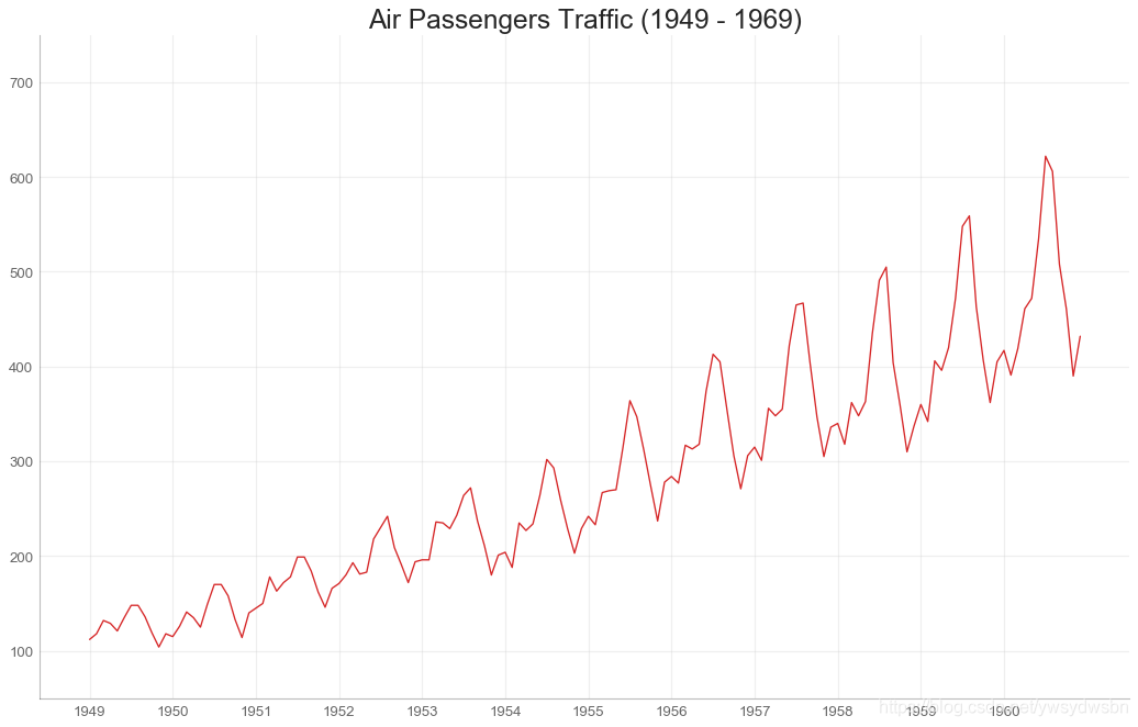
时间序列图(time series plot)
# Import Datadf = pd.read_csv('https://github.com/selva86/datasets/raw/master/AirPassengers.csv')# Draw Plotplt.figure(figsize=(16,10), dpi= 80)plt.plot('date', 'traffic', data=df, color='tab:red')# Decorationplt.ylim(50, 750)xtick_location = df.index.tolist()[::12]xtick_labels = [x[-4:] for x in df.date.tolist()[::12]]plt.xticks(ticks=xtick_location, labels=xtick_labels, rotation=0, fontsize=12, horizontalalignment='center', alpha=.7)plt.yticks(fontsize=12, alpha=.7)plt.title("Air Passengers Traffic (1949 - 1969)", fontsize=22)plt.grid(axis='both', alpha=.3)# Remove bordersplt.gca().spines["top"].set_alpha(0.0)plt.gca().spines["bottom"].set_alpha(0.3)plt.gca().spines["right"].set_alpha(0.0)plt.gca().spines["left"].set_alpha(0.3)plt.show()
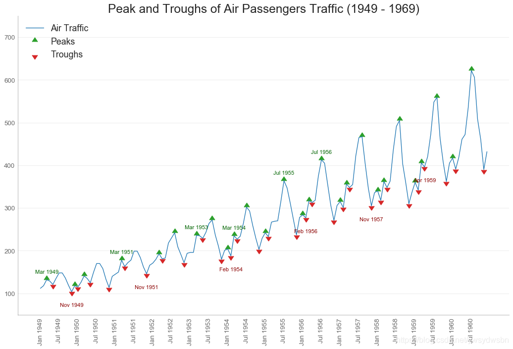
带波峰波谷标记的时序图
# Import Datadf = pd.read_csv('https://github.com/selva86/datasets/raw/master/AirPassengers.csv')# Get the Peaks and Troughsdata = df['traffic'].valuesdoublediff = np.diff(np.sign(np.diff(data)))peak_locations = np.where(doublediff == -2)[0] + 1doublediff2 = np.diff(np.sign(np.diff(-1*data)))trough_locations = np.where(doublediff2 == -2)[0] + 1# Draw Plotplt.figure(figsize=(16,10), dpi= 80)plt.plot('date', 'traffic', data=df, color='tab:blue', label='Air Traffic')plt.scatter(df.date[peak_locations], df.traffic[peak_locations], marker=mpl.markers.CARETUPBASE, color='tab:green', s=100, label='Peaks')plt.scatter(df.date[trough_locations], df.traffic[trough_locations], marker=mpl.markers.CARETDOWNBASE, color='tab:red', s=100, label='Troughs')# Annotatefor t, p in zip(trough_locations[1::5], peak_locations[::3]):plt.text(df.date[p], df.traffic[p]+15, df.date[p], horizontalalignment='center', color='darkgreen')plt.text(df.date[t], df.traffic[t]-35, df.date[t], horizontalalignment='center', color='darkred')# Decorationplt.ylim(50,750)xtick_location = df.index.tolist()[::6]xtick_labels = df.date.tolist()[::6]plt.xticks(ticks=xtick_location, labels=xtick_labels, rotation=90, fontsize=12, alpha=.7)plt.title("Peak and Troughs of Air Passengers Traffic (1949 - 1969)", fontsize=22)plt.yticks(fontsize=12, alpha=.7)# Lighten bordersplt.gca().spines["top"].set_alpha(.0)plt.gca().spines["bottom"].set_alpha(.3)plt.gca().spines["right"].set_alpha(.0)plt.gca().spines["left"].set_alpha(.3)plt.legend(loc='upper left')plt.grid(axis='y', alpha=.3)plt.show()
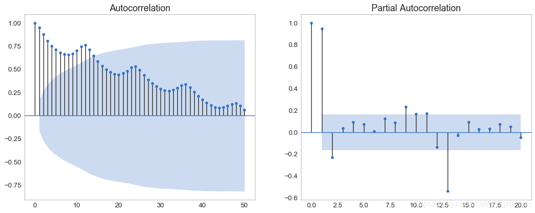
自相关和部分自相关图
自相关图(ACF图)显示时间序列与其自身滞后的相关性。每条垂直线(在自相关图上)表示系列与滞后0之间的滞后之间的相关性。图中的蓝色阴影区域是显着性水平。那些位于蓝线之上的滞后是显着的滞后。
对于空乘旅客,我们看到多达14个滞后跨越蓝线,因此非常重要。这意味着,14年前的航空旅客交通量对今天的交通状况有影响。
PACF在另一方面显示了任何给定滞后(时间序列)与当前序列的自相关,但是删除了滞后的贡献。
from statsmodels.graphics.tsaplots import plot_acf, plot_pacf# Import Datadf = pd.read_csv('https://github.com/selva86/datasets/raw/master/AirPassengers.csv')# Draw Plotfig, (ax1, ax2) = plt.subplots(1, 2,figsize=(16,6), dpi= 80)plot_acf(df.traffic.tolist(), ax=ax1, lags=50)plot_pacf(df.traffic.tolist(), ax=ax2, lags=20)# Decorate# lighten the bordersax1.spines["top"].set_alpha(.3); ax2.spines["top"].set_alpha(.3)ax1.spines["bottom"].set_alpha(.3); ax2.spines["bottom"].set_alpha(.3)ax1.spines["right"].set_alpha(.3); ax2.spines["right"].set_alpha(.3)ax1.spines["left"].set_alpha(.3); ax2.spines["left"].set_alpha(.3)# font size of tick labelsax1.tick_params(axis='both', labelsize=12)ax2.tick_params(axis='both', labelsize=12)plt.show()
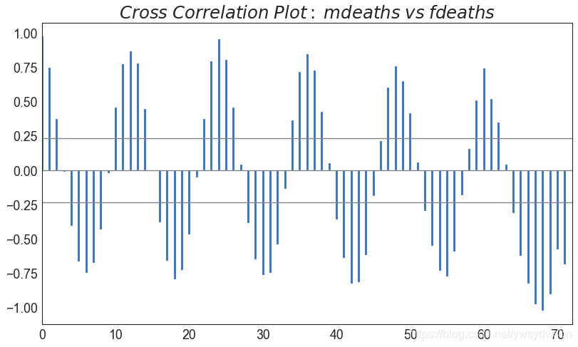
交叉相关图(cross correlation plot)
import statsmodels.tsa.stattools as stattools# Import Datadf = pd.read_csv('https://github.com/selva86/datasets/raw/master/mortality.csv')x = df['mdeaths']y = df['fdeaths']# Compute Cross Correlationsccs = stattools.ccf(x, y)[:100]nlags = len(ccs)# Compute the Significance level# ref: https://stats.stackexchange.com/questions/3115/cross-correlation-significance-in-r/3128#3128conf_level = 2 np.sqrt(nlags)# Draw Plotplt.figure(figsize=(12,7), dpi= 80)plt.hlines(0, xmin=0, xmax=100, color='gray') # 0 axisplt.hlines(conf_level, xmin=0, xmax=100, color='gray')plt.hlines(-conf_level, xmin=0, xmax=100, color='gray')plt.bar(x=np.arange(len(ccs)), height=ccs, width=.3)# Decorationplt.title('$Cross\; Correlation\; Plot:\; mdeaths\; vs\; fdeaths$', fontsize=22)plt.xlim(0,len(ccs))plt.show()
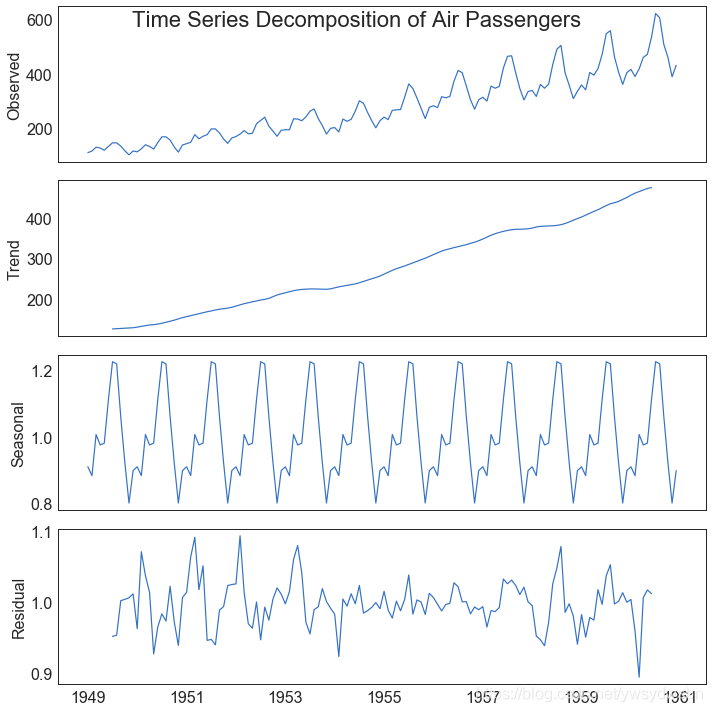
时间序列分解图(time series decomposition plot)
from statsmodels.tsa.seasonal import seasonal_decomposefrom dateutil.parser import parse# Import Datadf = pd.read_csv('https://github.com/selva86/datasets/raw/master/AirPassengers.csv')dates = pd.DatetimeIndex([parse(d).strftime('%Y-%m-01') for d in df['date']])df.set_index(dates, inplace=True)# Decomposeresult = seasonal_decompose(df['traffic'], model='multiplicative')# Plotplt.rcParams.update({'figure.figsize': (10,10)})result.plot().suptitle('Time Series Decomposition of Air Passengers')plt.show()
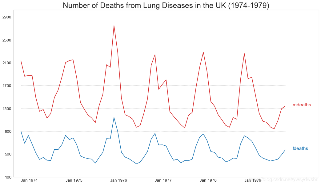
多个时间序列(multiple time series)
# Import Datadf = pd.read_csv('https://github.com/selva86/datasets/raw/master/mortality.csv')# Define the upper limit, lower limit, interval of Y axis and colorsy_LL = 100y_UL = int(df.iloc[:, 1:].max().max()*1.1)y_interval = 400mycolors = ['tab:red', 'tab:blue', 'tab:green', 'tab:orange']# Draw Plot and Annotatefig, ax = plt.subplots(1,1,figsize=(16, 9), dpi= 80)columns = df.columns[1:]for i, column in enumerate(columns):# 原文此处有误,Python数据之道 备注# 访问 liyangbit.com , 查看本文完整内容plt.plot(df.date.values, df[column].values, lw=1.5, color=mycolors[i])plt.text(df.shape[0]+1, df[column].values[-1], column, fontsize=14, color=mycolors[i])# Draw Tick linesfor y in range(y_LL, y_UL, y_interval):plt.hlines(y, xmin=0, xmax=71, colors='black', alpha=0.3, linestyles="--", lw=0.5)# Decorationsplt.tick_params(axis="both", which="both", bottom=False, top=False,labelbottom=True, left=False, right=False, labelleft=True)# Lighten bordersplt.gca().spines["top"].set_alpha(.3)plt.gca().spines["bottom"].set_alpha(.3)plt.gca().spines["right"].set_alpha(.3)plt.gca().spines["left"].set_alpha(.3)plt.title('Number of Deaths from Lung Diseases in the UK (1974-1979)', fontsize=22)plt.yticks(range(y_LL, y_UL, y_interval), [str(y) for y in range(y_LL, y_UL, y_interval)], fontsize=12)plt.xticks(range(0, df.shape[0], 12), df.date.values[::12], horizontalalignment='left', fontsize=12)plt.ylim(y_LL, y_UL)plt.xlim(-2, 80)plt.show()
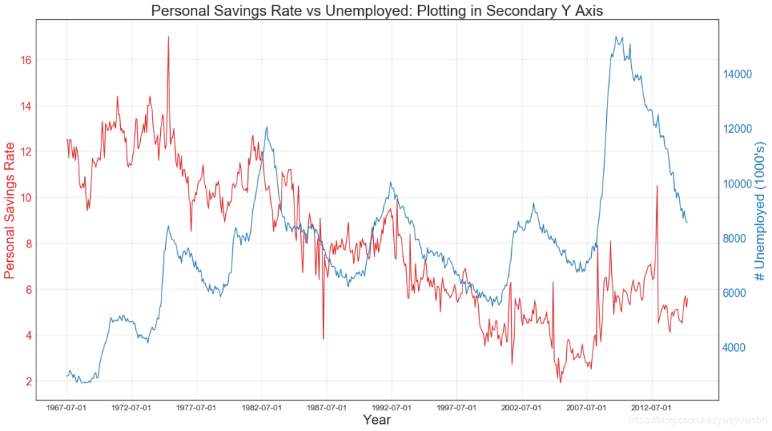
使用辅助Y轴来绘制不同范围的图形
# Import Datadf = pd.read_csv("https://github.com/selva86/datasets/raw/master/economics.csv")x = df['date']y1 = df['psavert']y2 = df['unemploy']# Plot Line1 (Left Y Axis)fig, ax1 = plt.subplots(1,1,figsize=(16,9), dpi= 80)ax1.plot(x, y1, color='tab:red')# Plot Line2 (Right Y Axis)ax2 = ax1.twinx() # instantiate a second axes that shares the same x-axisax2.plot(x, y2, color='tab:blue')# Decorations# ax1 (left Y axis)ax1.set_xlabel('Year', fontsize=20)ax1.tick_params(axis='x', rotation=0, labelsize=12)ax1.set_ylabel('Personal Savings Rate', color='tab:red', fontsize=20)ax1.tick_params(axis='y', rotation=0, labelcolor='tab:red' )ax1.grid(alpha=.4)# ax2 (right Y axis)ax2.set_ylabel("# Unemployed (1000's)", color='tab:blue', fontsize=20)ax2.tick_params(axis='y', labelcolor='tab:blue')ax2.set_xticks(np.arange(0, len(x), 60))ax2.set_xticklabels(x[::60], rotation=90, fontdict={'fontsize':10})ax2.set_title("Personal Savings Rate vs Unemployed: Plotting in Secondary Y Axis", fontsize=22)fig.tight_layout()plt.show()
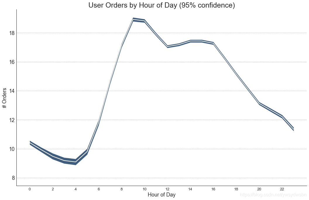
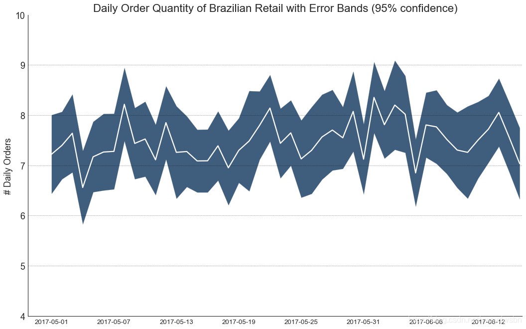
带有误差带的时间序列图
如果您有一个时间序列数据集,每个时间点(日期/时间戳)有多个观测值,则可以构建带有误差带的时间序列。您可以在下面看到一些基于每天不同时间订单的示例。另一个关于45天持续到达的订单数量的例子。
在该方法中,订单数量的平均值由白线表示。并且计算95%置信区间并围绕均值绘制。
from scipy.stats import sem# Import Datadf = pd.read_csv("https://raw.githubusercontent.com/selva86/datasets/master/user_orders_hourofday.csv")df_mean = df.groupby('order_hour_of_day').quantity.mean()df_se = df.groupby('order_hour_of_day').quantity.apply(sem).mul(1.96)# Plotplt.figure(figsize=(16,10), dpi= 80)plt.ylabel("# Orders", fontsize=16)x = df_mean.indexplt.plot(x, df_mean, color="white", lw=2)plt.fill_between(x, df_mean - df_se, df_mean + df_se, color="#3F5D7D")# Decorations# Lighten bordersplt.gca().spines["top"].set_alpha(0)plt.gca().spines["bottom"].set_alpha(1)plt.gca().spines["right"].set_alpha(0)plt.gca().spines["left"].set_alpha(1)plt.xticks(x[::2], [str(d) for d in x[::2]] , fontsize=12)plt.title("User Orders by Hour of Day (95% confidence)", fontsize=22)plt.xlabel("Hour of Day")s, e = plt.gca().get_xlim()plt.xlim(s, e)# Draw Horizontal Tick linesfor y in range(8, 20, 2):plt.hlines(y, xmin=s, xmax=e, colors='black', alpha=0.5, linestyles="--", lw=0.5)plt.show()
# "Data Source: https://www.kaggle.com/olistbr/brazilian-ecommerce#olist_orders_dataset.csv"from dateutil.parser import parsefrom scipy.stats import sem# Import Datadf_raw = pd.read_csv('https://raw.githubusercontent.com/selva86/datasets/master/orders_45d.csv',parse_dates=['purchase_time', 'purchase_date'])# Prepare Data: Daily Mean and SE Bandsdf_mean = df_raw.groupby('purchase_date').quantity.mean()df_se = df_raw.groupby('purchase_date').quantity.apply(sem).mul(1.96)# Plotplt.figure(figsize=(16,10), dpi= 80)plt.ylabel("# Daily Orders", fontsize=16)x = [d.date().strftime('%Y-%m-%d') for d in df_mean.index]plt.plot(x, df_mean, color="white", lw=2)plt.fill_between(x, df_mean - df_se, df_mean + df_se, color="#3F5D7D")# Decorations# Lighten bordersplt.gca().spines["top"].set_alpha(0)plt.gca().spines["bottom"].set_alpha(1)plt.gca().spines["right"].set_alpha(0)plt.gca().spines["left"].set_alpha(1)plt.xticks(x[::6], [str(d) for d in x[::6]] , fontsize=12)plt.title("Daily Order Quantity of Brazilian Retail with Error Bands (95% confidence)", fontsize=20)# Axis limitss, e = plt.gca().get_xlim()plt.xlim(s, e-2)plt.ylim(4, 10)# Draw Horizontal Tick linesfor y in range(5, 10, 1):plt.hlines(y, xmin=s, xmax=e, colors='black', alpha=0.5, linestyles="--", lw=0.5)plt.show()
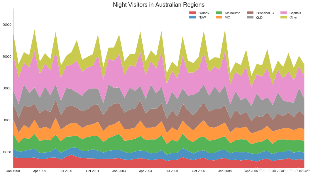
堆积面积图(stacked area chart)
# Import Datadf = pd.read_csv('https://raw.githubusercontent.com/selva86/datasets/master/nightvisitors.csv')# Decide Colorsmycolors = ['tab:red', 'tab:blue', 'tab:green', 'tab:orange', 'tab:brown', 'tab:grey', 'tab:pink', 'tab:olive']# Draw Plot and Annotatefig, ax = plt.subplots(1,1,figsize=(16, 9), dpi= 80)columns = df.columns[1:]labs = columns.values.tolist()# Prepare datax = df['yearmon'].values.tolist()y0 = df[columns[0]].values.tolist()y1 = df[columns[1]].values.tolist()y2 = df[columns[2]].values.tolist()y3 = df[columns[3]].values.tolist()y4 = df[columns[4]].values.tolist()y5 = df[columns[5]].values.tolist()y6 = df[columns[6]].values.tolist()y7 = df[columns[7]].values.tolist()y = np.vstack([y0, y2, y4, y6, y7, y5, y1, y3])# Plot for each columnlabs = columns.values.tolist()ax = plt.gca()ax.stackplot(x, y, labels=labs, colors=mycolors, alpha=0.8)# Decorationsax.set_title('Night Visitors in Australian Regions', fontsize=18)ax.set(ylim=[0, 100000])ax.legend(fontsize=10, ncol=4)plt.xticks(x[::5], fontsize=10, horizontalalignment='center')plt.yticks(np.arange(10000, 100000, 20000), fontsize=10)plt.xlim(x[0], x[-1])# Lighten bordersplt.gca().spines["top"].set_alpha(0)plt.gca().spines["bottom"].set_alpha(.3)plt.gca().spines["right"].set_alpha(0)plt.gca().spines["left"].set_alpha(.3)plt.show()
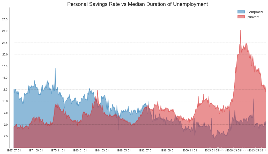
未堆积的面积图(area chart unstacked)
# Import Datadf = pd.read_csv("https://github.com/selva86/datasets/raw/master/economics.csv")# Prepare Datax = df['date'].values.tolist()y1 = df['psavert'].values.tolist()y2 = df['uempmed'].values.tolist()mycolors = ['tab:red', 'tab:blue', 'tab:green', 'tab:orange', 'tab:brown', 'tab:grey', 'tab:pink', 'tab:olive']columns = ['psavert', 'uempmed']# Draw Plotfig, ax = plt.subplots(1, 1, figsize=(16,9), dpi= 80)ax.fill_between(x, y1=y1, y2=0, label=columns[1], alpha=0.5, color=mycolors[1], linewidth=2)ax.fill_between(x, y1=y2, y2=0, label=columns[0], alpha=0.5, color=mycolors[0], linewidth=2)# Decorationsax.set_title('Personal Savings Rate vs Median Duration of Unemployment', fontsize=18)ax.set(ylim=[0, 30])ax.legend(loc='best', fontsize=12)plt.xticks(x[::50], fontsize=10, horizontalalignment='center')plt.yticks(np.arange(2.5, 30.0, 2.5), fontsize=10)plt.xlim(-10, x[-1])# Draw Tick linesfor y in np.arange(2.5, 30.0, 2.5):plt.hlines(y, xmin=0, xmax=len(x), colors='black', alpha=0.3, linestyles="--", lw=0.5)# Lighten bordersplt.gca().spines["top"].set_alpha(0)plt.gca().spines["bottom"].set_alpha(.3)plt.gca().spines["right"].set_alpha(0)plt.gca().spines["left"].set_alpha(.3)plt.show()
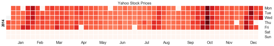
日历热力图(calendar heat map)
# 导入资源库:pip install calmapimport matplotlib as mplimport calmap# Import Datadf = pd.read_csv("https://raw.githubusercontent.com/selva86/datasets/master/yahoo.csv", parse_dates=['date'])df.set_index('date', inplace=True)# Plotplt.figure(figsize=(16,10), dpi= 80)calmap.calendarplot(df['2014']['VIX.Close'], fig_kws={'figsize': (16,10)}, yearlabel_kws={'color':'black', 'fontsize':14}, subplot_kws={'title':'Yahoo Stock Prices'})plt.show()
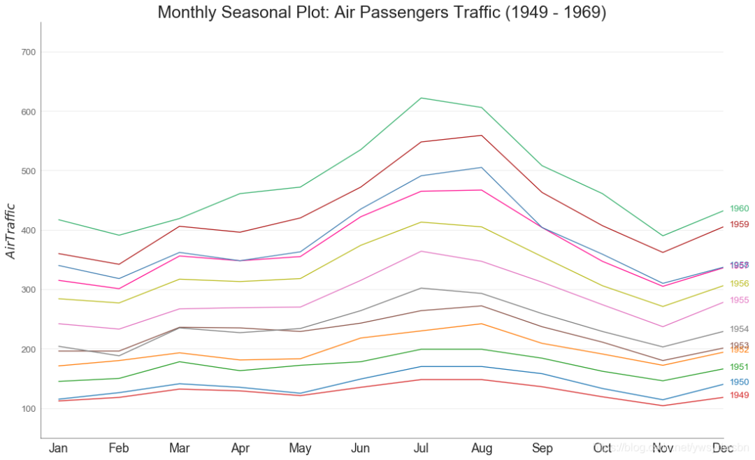
季节图(seasonal plot)
from dateutil.parser import parse# Import Datadf = pd.read_csv('https://github.com/selva86/datasets/raw/master/AirPassengers.csv')# Prepare datadf['year'] = [parse(d).year for d in df.date]df['month'] = [parse(d).strftime('%b') for d in df.date]years = df['year'].unique()# Draw Plotmycolors = ['tab:red', 'tab:blue', 'tab:green', 'tab:orange', 'tab:brown', 'tab:grey', 'tab:pink', 'tab:olive', 'deeppink', 'steelblue', 'firebrick', 'mediumseagreen']plt.figure(figsize=(16,10), dpi= 80)for i, y in enumerate(years):plt.plot('month', 'traffic', data=df.loc[df.year==y, :], color=mycolors[i], label=y)plt.text(df.loc[df.year==y, :].shape[0]-.9, df.loc[df.year==y, 'traffic'][-1:].values[0], y, fontsize=12, color=mycolors[i])# Decorationplt.ylim(50,750)plt.xlim(-0.3, 11)plt.ylabel('$Air Traffic$')plt.yticks(fontsize=12, alpha=.7)plt.title("Monthly Seasonal Plot: Air Passengers Traffic (1949 - 1969)", fontsize=22)plt.grid(axis='y', alpha=.3)# Remove bordersplt.gca().spines["top"].set_alpha(0.0)plt.gca().spines["bottom"].set_alpha(0.5)plt.gca().spines["right"].set_alpha(0.0)plt.gca().spines["left"].set_alpha(0.5)# plt.legend(loc='upper right', ncol=2, fontsize=12)plt.show()
分组(Groups)
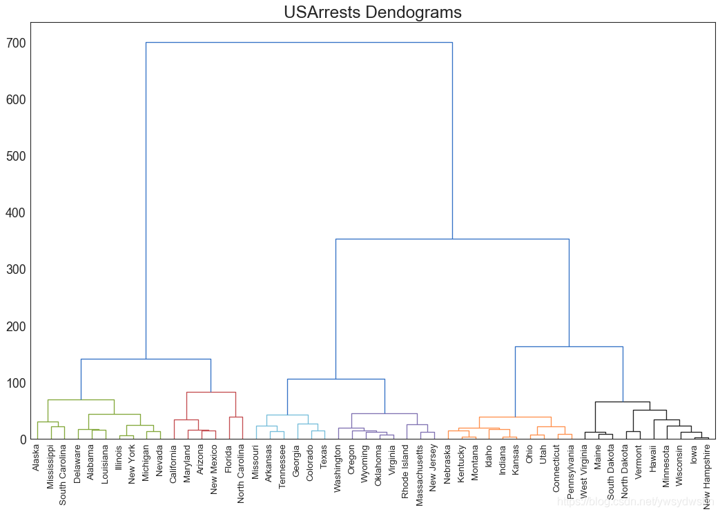
树状图(dendrogram)
import scipy.cluster.hierarchy as shc# Import Datadf = pd.read_csv('https://raw.githubusercontent.com/selva86/datasets/master/USArrests.csv')# Plotplt.figure(figsize=(16, 10), dpi= 80)plt.title("USArrests Dendograms", fontsize=22)dend = shc.dendrogram(shc.linkage(df[['Murder', 'Assault', 'UrbanPop', 'Rape']], method='ward'), labels=df.State.values, color_threshold=100)plt.xticks(fontsize=12)plt.show()
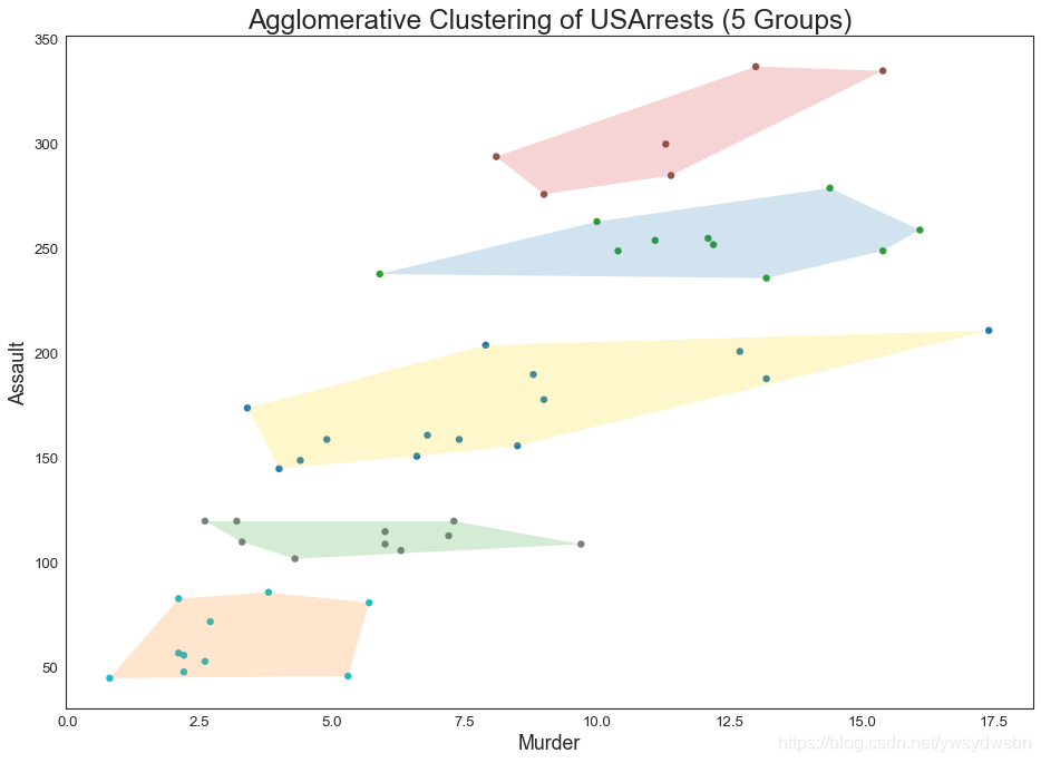
簇状图(cluster chart)
from sklearn.cluster import AgglomerativeClusteringfrom scipy.spatial import ConvexHull# Import Datadf = pd.read_csv('https://raw.githubusercontent.com/selva86/datasets/master/USArrests.csv')# Agglomerative Clusteringcluster = AgglomerativeClustering(n_clusters=5, affinity='euclidean', linkage='ward')cluster.fit_predict(df[['Murder', 'Assault', 'UrbanPop', 'Rape']])# Plotplt.figure(figsize=(14, 10), dpi= 80)plt.scatter(df.iloc[:,0], df.iloc[:,1], c=cluster.labels_, cmap='tab10')# Encircledef encircle(x,y, ax=None, **kw):if not ax: ax=plt.gca()p = np.c_[x,y]hull = ConvexHull(p)poly = plt.Polygon(p[hull.vertices,:], **kw)ax.add_patch(poly)# Draw polygon surrounding verticesencircle(df.loc[cluster.labels_ == 0, 'Murder'], df.loc[cluster.labels_ == 0, 'Assault'], ec="k", fc="gold", alpha=0.2, linewidth=0)encircle(df.loc[cluster.labels_ == 1, 'Murder'], df.loc[cluster.labels_ == 1, 'Assault'], ec="k", fc="tab:blue", alpha=0.2, linewidth=0)encircle(df.loc[cluster.labels_ == 2, 'Murder'], df.loc[cluster.labels_ == 2, 'Assault'], ec="k", fc="tab:red", alpha=0.2, linewidth=0)encircle(df.loc[cluster.labels_ == 3, 'Murder'], df.loc[cluster.labels_ == 3, 'Assault'], ec="k", fc="tab:green", alpha=0.2, linewidth=0)encircle(df.loc[cluster.labels_ == 4, 'Murder'], df.loc[cluster.labels_ == 4, 'Assault'], ec="k", fc="tab:orange", alpha=0.2, linewidth=0)# Decorationsplt.xlabel('Murder'); plt.xticks(fontsize=12)plt.ylabel('Assault'); plt.yticks(fontsize=12)plt.title('Agglomerative Clustering of USArrests (5 Groups)', fontsize=22)plt.show()
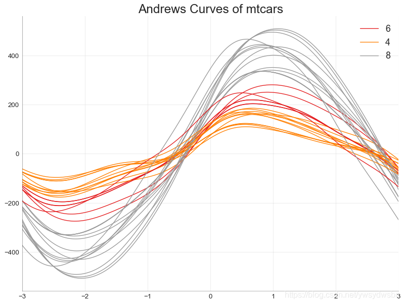
安德鲁斯曲线(andrews curve)
安德鲁斯曲线有助于可视化是否存在基于给定分组的数字特征的固有分组
。如果要素(数据集中的列)无法区分组(cyl),那么这些线将不会很好地隔离,如下所示。
from pandas.plotting import andrews_curves# Importdf = pd.read_csv("https://github.com/selva86/datasets/raw/master/mtcars.csv")df.drop(['cars', 'carname'], axis=1, inplace=True)# Plotplt.figure(figsize=(12,9), dpi= 80)andrews_curves(df, 'cyl', colormap='Set1')# Lighten bordersplt.gca().spines["top"].set_alpha(0)plt.gca().spines["bottom"].set_alpha(.3)plt.gca().spines["right"].set_alpha(0)plt.gca().spines["left"].set_alpha(.3)plt.title('Andrews Curves of mtcars', fontsize=22)plt.xlim(-3,3)plt.grid(alpha=0.3)plt.xticks(fontsize=12)plt.yticks(fontsize=12)plt.show()
平行坐标(parallel coordinates)
from pandas.plotting import parallel_coordinates# Import Datadf_final = pd.read_csv("https://raw.githubusercontent.com/selva86/datasets/master/diamonds_filter.csv")# Plotplt.figure(figsize=(12,9), dpi= 80)parallel_coordinates(df_final, 'cut', colormap='Dark2')# Lighten bordersplt.gca().spines["top"].set_alpha(0)plt.gca().spines["bottom"].set_alpha(.3)plt.gca().spines["right"].set_alpha(0)plt.gca().spines["left"].set_alpha(.3)plt.title('Parallel Coordinated of Diamonds', fontsize=22)plt.grid(alpha=0.3)plt.xticks(fontsize=12)plt.yticks(fontsize=12)plt.show()
「❤️ 感谢大家」
如果你觉得这篇内容对你挺有有帮助的话:
点赞支持下吧,让更多的人也能看到这篇内容(收藏不点赞,都是耍流氓 -_-) 欢迎在留言区与我分享你的想法,也欢迎你在留言区记录你的思考过程。 觉得不错的话,也可以阅读近期梳理的文章(感谢各位的鼓励与支持🌹🌹🌹): 计算机下SSL安全网络通信(420+👍) 梦魇回生的博客:https://gain-wyj.cn/(680+👍) 【震惊】手把手教你用python做绘图工具(580+👍) 【算法分析】——快速幂算法(160+👍) 数据可视化:利用Python和Echarts制作“用户消费行为分析”可视化大屏🚀🚀🚀(210+👍) 手把手教你进行pip换源(230+👍) 用python实现前向分词最大匹配算法(220+👍) 教你用python操作摄像头以及对视频流的处理(240+👍) 汇总超全的Matplotlib可视化最有价值的 50 个图表(附完整 Python 源代码)(一)(240+👍) 小程序云开发项目的创建与配置(240+👍)


点分享

点点赞

点在看

文章转载自做一个柔情的程序猿,如果涉嫌侵权,请发送邮件至:contact@modb.pro进行举报,并提供相关证据,一经查实,墨天轮将立刻删除相关内容。
