


公众号:尤而小屋
作者:Peter
编辑:Peter
大家好,我是Peter~
今天介绍的是如何利用Plotly来绘制面积图,主要还是基于两种方法:
基于plotly_express实现 基于plotly.graph_objects实现

一、扩展阅读
Plotly的文章会形成连载系列,前面9篇Plotly可视化文章分别是:
酷炫!36张图爱上高级可视化神器Plotly_Express Plotly玩转散点图 Plotly玩转饼图 Plotly玩转漏斗图 Plotly玩转柱状图 Plotly玩转气泡图 Plotly玩转股票图 Plotly玩转甘特图 Plotly玩转箱型图

二、导入库
import pandas as pd
import plotly.express as px
import plotly.graph_objects as go
三、基于px实现
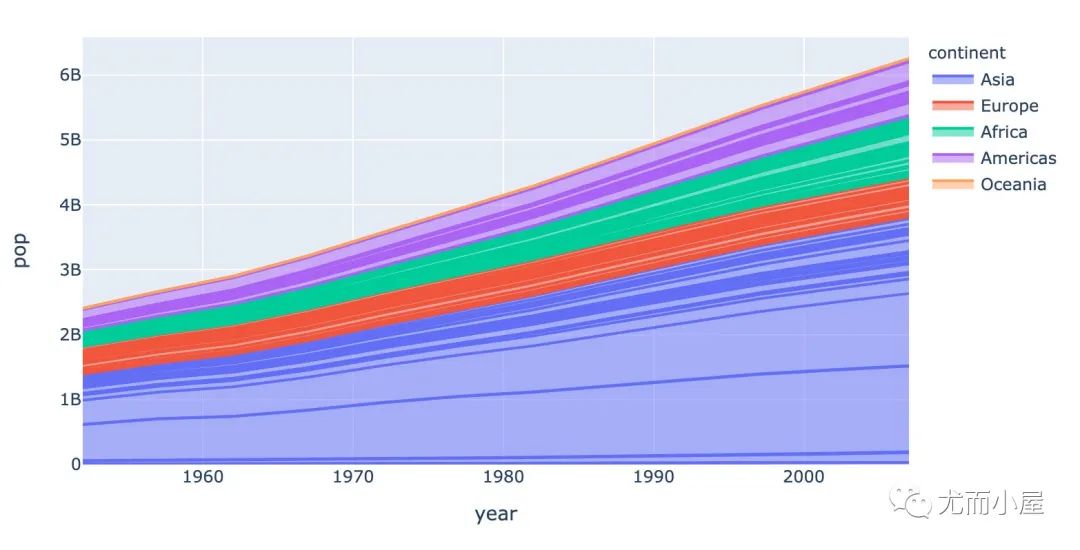
px.area creates a stacked area plot. Each filled area corresponds to one value of the column given by the line_group parameter.
px.area实现的是一个堆叠的面积图。每个填充的部分是通过给定的line_group参数来确定的,下面案例中采用的是自带的gdp数据集:
# 以GDP数据说明

gdp = px.data.gapminder()
gdp.head()
| country | continent | year | lifeExp | pop | gdpPercap | iso_alpha | iso_num | |
|---|---|---|---|---|---|---|---|---|
| 0 | Afghanistan | Asia | 1952 | 28.801 | 8425333 | 779.445314 | AFG | 4 |
| 1 | Afghanistan | Asia | 1957 | 30.332 | 9240934 | 820.853030 | AFG | 4 |
| 2 | Afghanistan | Asia | 1962 | 31.997 | 10267083 | 853.100710 | AFG | 4 |
| 3 | Afghanistan | Asia | 1967 | 34.020 | 11537966 | 836.197138 | AFG | 4 |
| 4 | Afghanistan | Asia | 1972 | 36.088 | 13079460 | 739.981106 | AFG | 4 |
fig = px.area(
    gdp,   # 待绘图数据
    x='year',  # 指定x\y轴和颜色,以及线性组别
    y='pop',
    color='continent',
    line_group="country"  # 关键参数
    )

fig.show()
四、基于go实现
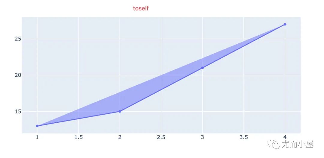
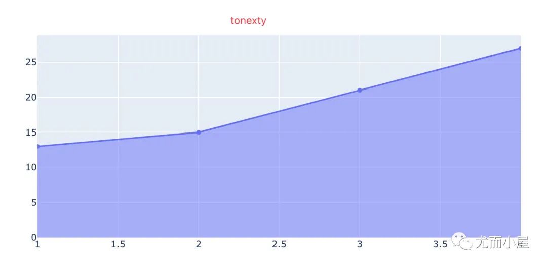
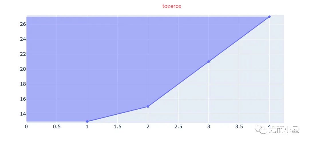
4.1 基础面积图
import plotly.graph_objects as go
fig = go.Figure()
# 7种填充方式:['none', 'tozeroy', 'tozerox', 'tonexty', 'tonextx','toself', 'tonext']
fig.add_trace(go.Scatter(
x=[1, 2, 3, 4],
y=[13, 15, 21, 27],
fill='toself',
name='toself'
))
fig.add_trace(go.Scatter(
x=[1, 2, 3, 4],
y=[13, 15, 21, 27],
fill='tonexty',
name='tonexty'
))
fig.add_trace(go.Scatter(
x=[1, 2, 3, 4],
y=[13, 15, 21, 27],
fill='tozerox',
name='tozerox' # 紧贴着Y轴填充
))
fig.add_trace(go.Scatter(
x=[1, 2, 3, 4],
y=[13, 15, 21, 27],
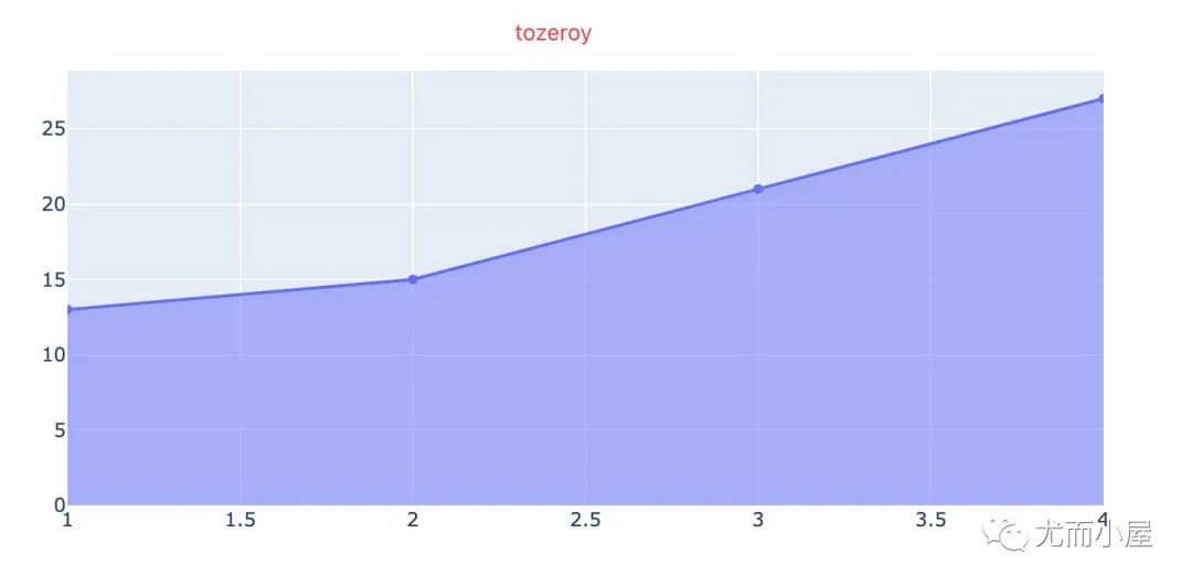
fill='tozeroy',
name='tozeroy' # 紧贴着x轴填充
))
fig.show()
不同填充方式的图形显示:
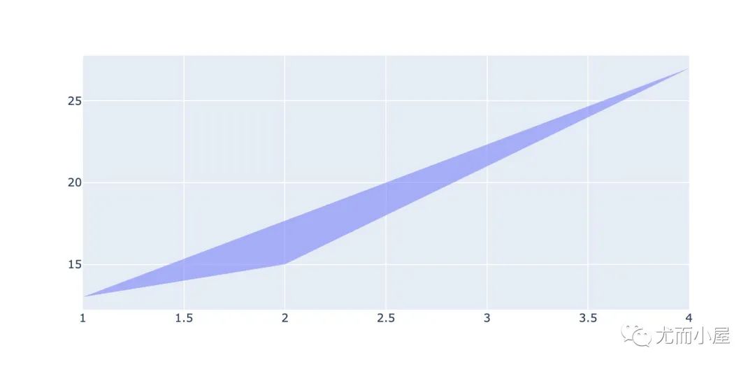
4.2 边界问题
有时候我们需要去掉边界的显示,采用的是mode参数,使用方法是;
lines、markers、text之间的组合 使用none,表示不显示边界
# 如何取消边界线:加上参数mode='none'

import plotly.graph_objects as go

fig = go.Figure()

# 7种填充方式:['none', 'tozeroy', 'tozerox', 'tonexty', 'tonextx','toself', 'tonext']

fig.add_trace(go.Scatter(
    x=[1, 2, 3, 4],
    y=[13, 15, 21, 27],
    fill='tonext',
    mode='none',   # 参数:['lines', 'markers', 'text']的组合,或者none
    name='tonext'
    ))

fig.show()
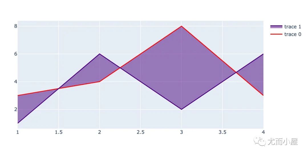
五、内部填充面积图
import plotly.graph_objects as go

fig = go.Figure()

fig.add_trace(go.Scatter(
    x=[1, 2, 3, 4],
    y=[3, 4, 8, 3],
    fill=None,
    mode='lines',
    line_color='red',  # trace0
))

fig.add_trace(go.Scatter(
    x=[1, 2, 3, 4],
    y=[1, 6, 2, 6],
    fill='tonexty',
    mode='lines',
    line_color='indigo'))  # trace1

fig.show()
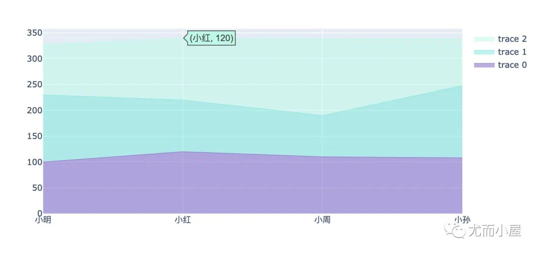
六、堆叠面积图
通过数据堆叠的方式来显示数据
import plotly.graph_objects as go

x = ["小明","小红","小周","小孙"]

fig = go.Figure()

fig.add_trace(go.Scatter(
    x=x,
    y=[100,120,110,108],  # 语文
    hoverinfo = 'x+y',  # 悬停显示的信息
    mode='lines',
    line=dict(width=0.5,color='rgb(121,90,200)'),
    stackgroup='one'   # 默认是堆叠分组统计
))

fig.add_trace(go.Scatter(
    x=x,
    y=[130,100,80,140],  # 数学
    hoverinfo = 'x+y',
    mode='lines',
    line=dict(width=0.5,color='rgb(121,231,219)'),
    stackgroup='one'   #
))

fig.add_trace(go.Scatter(
    x=x,
    y=[98,120,149,91],  # 英语
    hoverinfo = 'x+y',
    mode='lines',
    line=dict(width=0.5,color='rgb(191,249,230)'),
    stackgroup='one'
))

# fig.update_layout(yaxis_range=(0, 100))
fig.show()
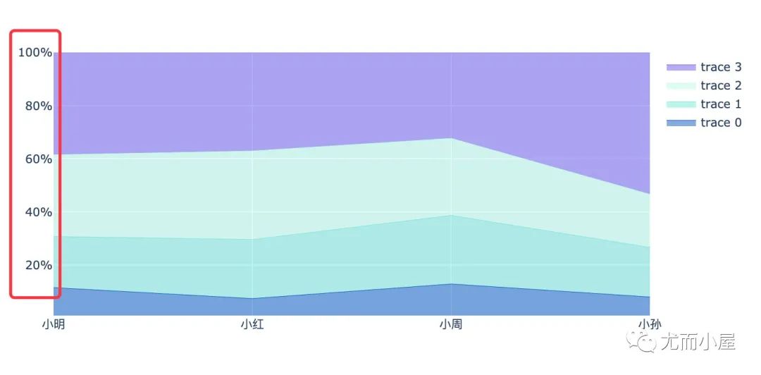
七、归一化堆叠面积图
表示的是每个图形占据的百分比
import plotly.graph_objects as go

x = ["小明","小红","小周","小孙"]

fig = go.Figure()

fig.add_trace(go.Scatter(
    x=x,
    y=[30,20,40,30],  # 语文
    hoverinfo = 'x+y',
    mode='lines',
    line=dict(width=0.5,color='rgb(11,90,200)'),
    stackgroup='one',
    groupnorm='percent'   # 重点参数:分组归一化,选择百分比
))

fig.add_trace(go.Scatter(
    x=x,
    y=[50,60,80,70],  # 数学
    hoverinfo = 'x+y',
    mode='lines',
    line=dict(width=0.5,color='rgb(121,231,219)'),
    stackgroup='one'   # 默认是堆叠分组统计
))

fig.add_trace(go.Scatter(
    x=x,
    y=[80,90,90,75],  # 英语
    hoverinfo = 'x+y',
    mode='lines',
    line=dict(width=0.5,color='rgb(191,249,230)'),
    stackgroup='one'
))

fig.add_trace(go.Scatter(
    x=x,
    y=[100,100,100,200],  # 英语
    hoverinfo = 'x+y',
    mode='lines',
    line=dict(width=0.5,color='rgb(111,90,241)'),
    stackgroup='one'
))

fig.update_layout(
    showlegend=True, # 是否显示图例,默认是显示的
#     xaxis_type='category',
    yaxis=dict(
    type='linear',
    range=[1, 100],  # y轴范围
    ticksuffix='%'))  # 标记后缀

fig.show()
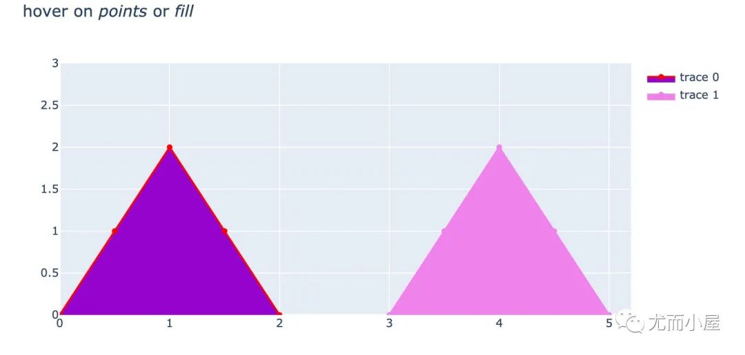
八、选择悬停信息
表示的我们在面积图填充的时候,可以选择悬停显示的数据;悬停表示的是:当光标放上去的时候会显示的数据。下面例子中有两种显示方案:
填充部分和数据点都显示 只在数据点悬停显示
import plotly.graph_objects as go

fig = go.Figure()
fig.add_trace(go.Scatter(
    x=[0,0.5,1,1.5,2],   # 绘图数据
    y=[0,1,2,1,0],
    fill='toself',   # 填充方式和颜色
    fillcolor='darkviolet',
    hoveron = 'points+fills',   # 悬停位置:点和内部填充部分都悬停显示
    line_color='red',  # 线色
    text="Points + Fills",  # 文本显示
    hoverinfo = 'text+x+y'  # 指定悬停信息
))

fig.add_trace(go.Scatter(
    x=[3,3.5,4,4.5,5],
    y=[0,1,2,1,0],
    fill='toself',
    fillcolor = 'violet',
    hoveron='points',   #  只在点上悬停
    line_color='violet',
    text="Points only",    # 只显示点
    hoverinfo='text+x+y'
))

fig.update_layout(
    title = "hover on <i>points</i> or <i>fill</i>",  # 通过HTML标签语法的格式来生成标题
    xaxis_range = [0,5.2],  # 两个轴的数据范围
    yaxis_range = [0,3]
)

#fig.show()
推荐阅读
酷炫!36张图爱上高级可视化神器Plotly_Express
一切看似逝去的,都不曾离开,你所给与的爱与温暖,让我执着地守护着这里
文章转载自尤而小屋,如果涉嫌侵权,请发送邮件至:contact@modb.pro进行举报,并提供相关证据,一经查实,墨天轮将立刻删除相关内容。
